Toolbars
Toolbars display frequently used actions relevant to the current page.
Overview · Specs · Guidelines · Accessibility
Use cases
People should be able to the following with assistive technology:
- Navigate and activate any actions in the toolbar
- Select a destination from a menu
- Activate a back button
- Maintain access to toolbar controls when the content is scrolled or collapsed
Interaction & style
The toolbar has no interactions by default. All interactions are with the elements placed inside.
Touch
- When tapping on an icon button in the toolbar, a touch ripple appears, indicating interaction feedback.
Touch: Tap
Cursor
- When hovered, the hover state provides a visual cue to the user that the element is interactive.
- When clicked (in both active and inactive states), a ripple appears, showing the user feedback.
Cursor: Hover, Click
Initial focus
Focus lands on the first interactive element.
Use Tab to navigate through all other actions.
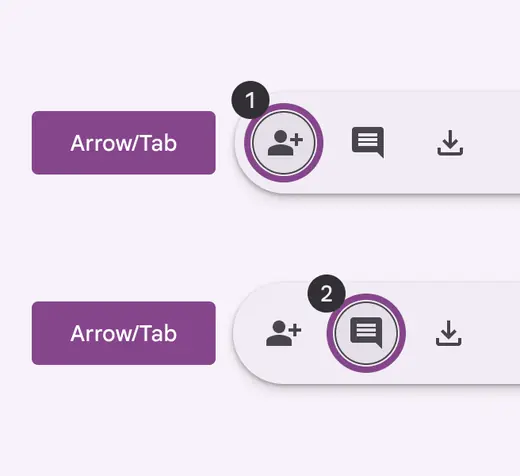
Use Tab to navigate through interactive elements
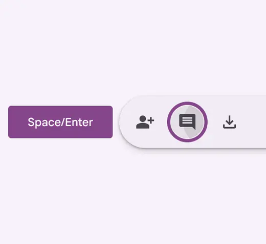
Use Space or Enter to activate actions
Keyboard navigation
| Keys | Actions |
|---|---|
| Tab or Arrows | Navigate between interactive elements |
| Space or Enter | Activate the focused element |
Labeling elements
On web, the toolbar container should have the toolbar role.
On mobile, it can be a generic container.
All actions inside the toolbar should follow their respective accessibility guidelines.
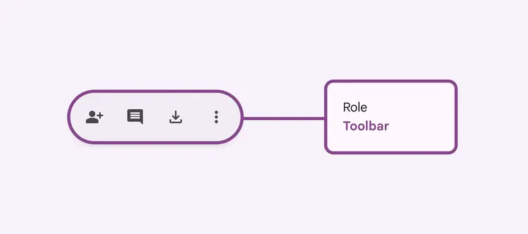
On web, use the toolbar role