Customizing Material
Customization creates unique branded products with familiar patterns and accessible interactions

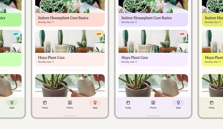
Dynamic color makes personal devices feel personal
M3 opens up new possibilities for both brand colors and individual color preferences to converge in one-of-a-kind experiences. The color system embraces the need for color to reflect an app’s design sensibility, while also honoring the settings that individuals choose for themselves.
By enabling dynamic color, an app can retain the colors that define and differentiate a product, while also giving users more control over the styles that matter most to them.
Applying a brand color system
With dynamic color and M3 color schemes, your app’s colors automatically adapt and integrate with user settings.
M3 supports systematic applications of custom parameters to help define and maintain the styles that convey your brand.
The color system automatically handles critical adjustments that provide accessible color contrast, legibility, interaction states, and component structure. Dynamic color also works for custom (non-Material) components.
Apps can take on an array of colors from baseline schemes, user-generated dynamic colors, or custom colors
Get started
To take advantage of personalization features, you’ll need to build a custom color scheme with the M3 color system.
In order for your app to respect a user's device and app-level settings, you'll implement a custom theme that user-generated color schemes can map to.
Additionally, using a custom theme ensures that your app has a fallback color scheme available for users who don't enable dynamic color.
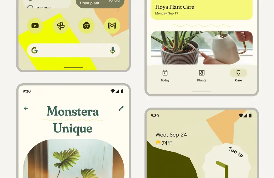
A user-generated color scheme can flow through apps that use a custom theme
Set-up and tutorials
Dynamic color is both a user setting and a developer choice. You can apply dynamic color selectively to work alongside your brand color scheme. For example, a profile or account screen in your app can reflect a user’s color scheme settings, adding individuality to a personal space in an app.
Set-up
- Your existing brand parameters can be integrated with Material Design for consistent application across your product
- You can also start from scratch with Material Design and create a new, complete color system for a project
Dynamic color tutorial
The dynamic color codelab is a hands-on walkthrough that helps visualize how designs and brand colors interact with dynamic color. It helps take you to the next steps in applying color to your designs using the Material Theme Builder plugin for Figma.
Material Theme Builder
With built-in code export, the Material Theme Builder Figma plugin makes it easy to visualize your designs, migrate to the M3 color system, and take advantage of dynamic color.
The Material Theme Builder creates color and type tokens that can be exported into multiple code formats. Tokens are an important tool for creating and maintaining a source of truth for style values. The Figma plugin creates tokens in the form of Figma styles to connect with existing mock-ups, brand style guides, and even design systems.
Material tokens are ready to use in formatted theme files, including Design System Package (DSP). A DSP is a cross-platform file format that represents design system information. Learn more about design tokens.
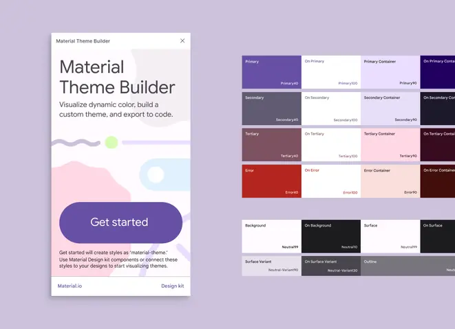
The Material Theme Builder Figma plugin helps you create custom color schemes and export to multiple code formats
Custom color schemes
The Material Theme Builder helps create custom color experiences, whether you're working with established brand parameters or have yet to define your app's colors.
In the Material Theme Builder you can identify and input one or more color to define your color scheme. Adding a second or third color is optional and will influence the resulting color scheme.
Mapping your app colors to the custom scheme's source colors aligns the roles and logic of dynamic color in M3.
Brand colors can be added to the tool as a single-use color or as a complete brand palette with a range of tones that lend consistent, comprehensive color expression across your app.
If your app uses a single brand color or a limited brand palette, you can input your primary brand color as your custom color scheme's source color. The input color will be used to generate a scheme that provides you with complementary tones to round out a scheme.
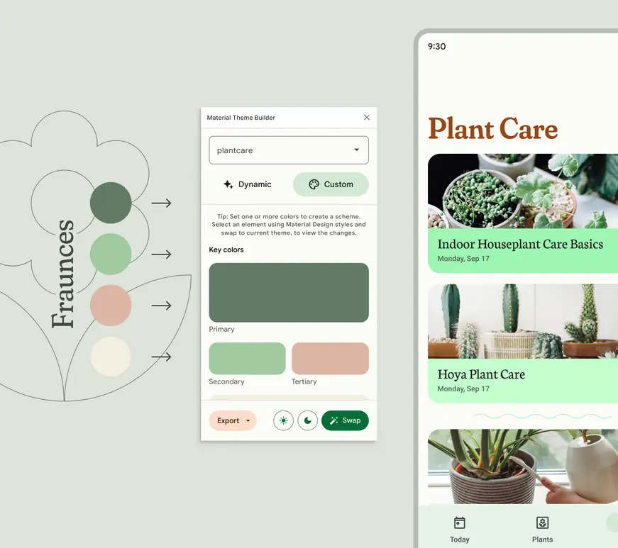
Examples of brand attributes (left) that can be used to generate and apply a dynamic color scheme (right)
Color roles
Depending on the purpose in a UI, key colors are assigned roles that map to elements in components. The five essential color groups with role assignments are:
- Primary
- Secondary
- Tertiary
- Neutral
- Neutral Variant
An input color generates a tonal palette that's used to fill the range of color roles needed, such as primary, on-primary, and primary container. Learn more about using color roles
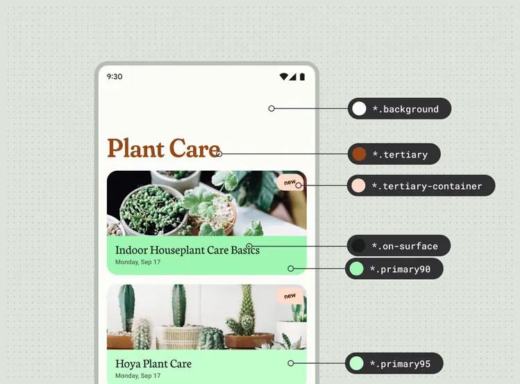
Examples of color roles in the Plant Care UI mapped to design tokens