Scaffold
A fundamental UI design structure that provides a standard platform for assembling key components
Overview · Bars · Rails · Panes
Rails
Rails are the next level in layout after bars, filling the perimeter space surrounding panes or floating above them.
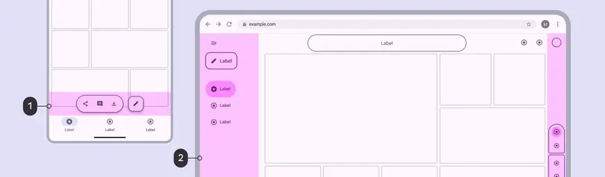
Rails occupy the spaces immediately adjacent to bars:
- A toolbar sits above the navigation bar
- A navigation rail and companion rail occupy the leading and trailing sides of a large window
On compact screens, the top and bottom rail regions can be used for components like:
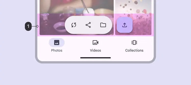
- On mobile, a toolbar can float in the rail region
On larger screens, there are rails on the sides of the screen (as well as top and bottom). The leading side rail region commonly holds the navigation rail.

At larger breakpoints, the leading rail region can be occupied by an expanded navigation rail
The rail region on the trailing side of a large screen can hold supporting controls or actions that modify or relate to the content in a pane.

The rail region can also be occupied by a vertical toolbar or other controls
In XR, rail components can become orbiters, which float outside the visible content area.

In full space, an XR navigation rail can float outside the main content as an orbiter