Typography
Use typography to make content readable and beautiful
Overview · Fonts · Type scale & tokens · Applying type · Editorial treatments

- M3 type scale has 30 type styles: 15 baseline and 15 emphasized
- Use variable fonts for more control over expression in editorial treatments
- Use Material tokens to easily define font, line height, size, tracking, weight, and more
Availability & resources
This shows where the type scale is available and implemented into Material components.
| Type | Link | Status |
|---|---|---|
| Design | Design Kit | Available |
| Design | Google Fonts | Available |
| Implementation | Flutter | Available |
| Implementation | Jetpack Compose | Available |
| Implementation | Jetpack Compose: Expressive | Available |
| Implementation | Android Views (MDC-Android) | Available |
| Implementation | Android Views (MDC-Android): Expressive | Available |
| Implementation | Web | Available |
| Implementation | Web: Expressive | Unavailable |
Updates
Aug 2026
Language script height support
Material’s type scale can adapt line height automatically based on language script height category: small, medium, large, and extra large.
Components can then adapt their size based on these language heights.
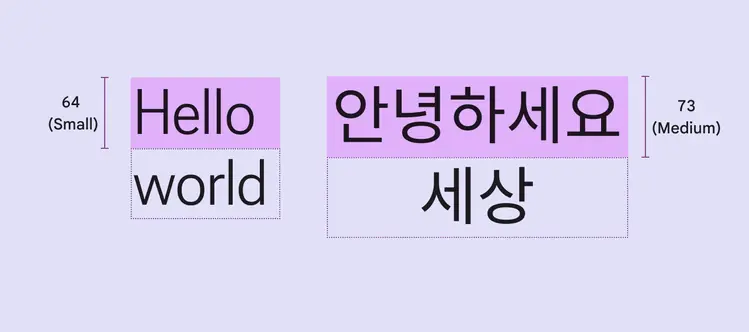
Line heights for styles like display large can automatically adapt to language height
M3 Expressive update
May 2025
Updated M3 type scale with emphasized styles
Material’s type scale includes fifteen baseline type styles, the same as before, and fifteen new emphasized type styles.
The emphasized type styles add more expression to highlighted moments.
Roboto Flex can be used on its own to show a range of emotional states, but is not yet part of the M3 typescale.
More on how to use emphasized styles
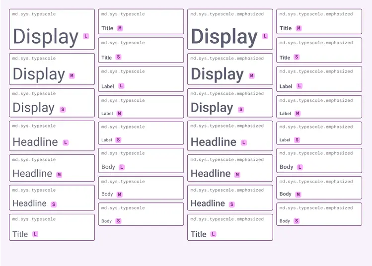
The expressive type scale includes fifteen baseline type styles and fifteen emphasized type styles
Emphasized type style tokens
Design tokens offer an improved way to define typography in products by assigning an element's type style by a configurable value, rather than a set value.
Emphasized tokens allow for clearer hierarchies and prioritized components within a layout.
Type roles describe size—such as small, medium, and large—enabling them to adapt and respond to the device or context.
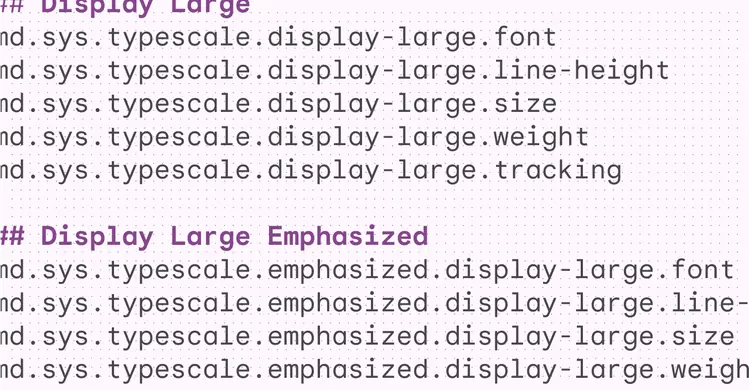
Typography tokens describe scalable size that adapts to devices or settings, including updating the style on boldness
Google Design: Making Google Sans Flex
Learn how seven design problems shaped Google’s iconic typeface — from inception to going open-source.
Read the article on design.google
Google Sans Flex can morph into an impressive range of styles, powered by its six variable axes
Previous updates
Variable fonts
Roboto Flex, Roboto Serif, & Roboto Mono
Updated considerations for using variable fonts and different combinations of their customizable axes, including grade, width, weight, slant, and optical size.
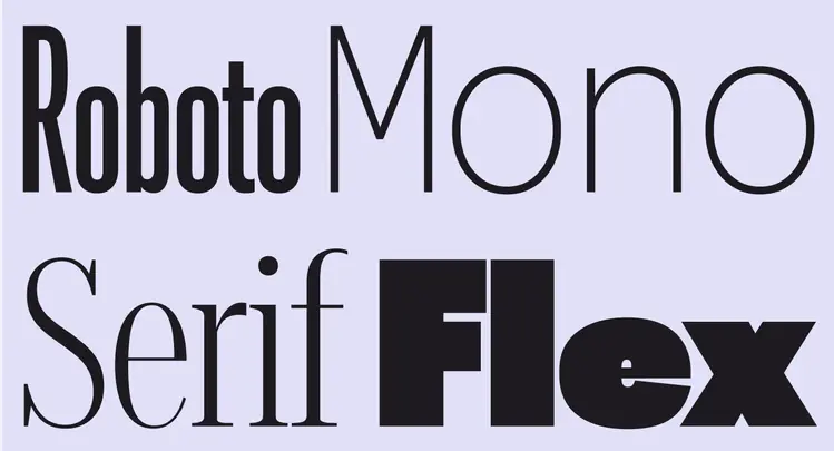
Roboto Flex, Roboto Serif, and Roboto Mono have a fluid range of axes, like weight, across all optical sizes
Style roles
Type styles are defined by five roles: display, headline, title, body, and label.
These names are more descriptive, allowing for easier matching of type style to use case.
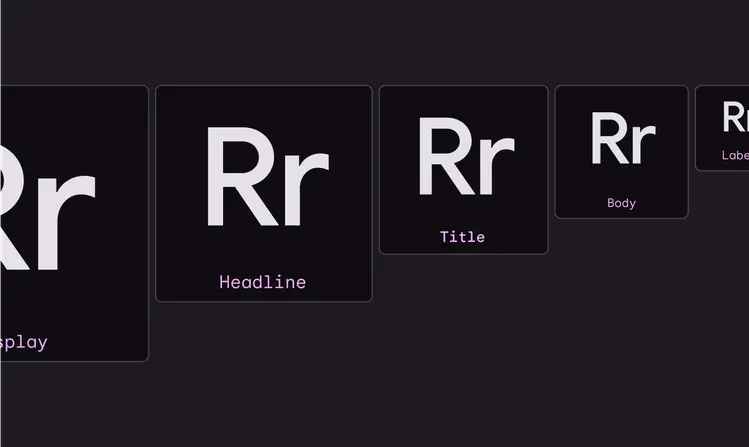
M3 has five distinct type styles: display, headline, title, body, and label