Scaffold
A fundamental UI design structure that provides a standard platform for assembling key components
Overview · Bars · Rails · Panes
Bars
Bars frame the screen to help people navigate through a product. They typically contain an app bar or bottom navigation bar.
Bars can span a single pane or across the full width of a window.
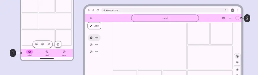
- A navigation bar occupies the bottom bar region on mobile
- An app bar occupies the top bar region on the web
App bars are placed at the top of the screen to help people navigate, providing a title and 1–2 essential actions like search or back.

- The app bar sits at the top of the screen, outside of the safety region
Navigation bars let people switch between 3–5 primary UI views at compact or medium breakpoints.
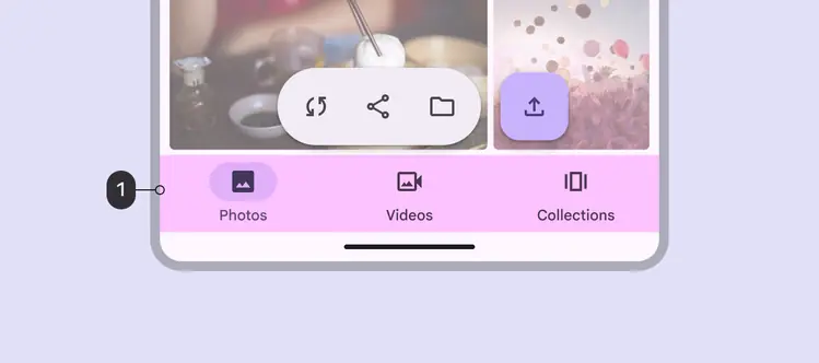
- The navigation bar sits at the bottom of the screen, above the safety region
Safety region
Bars are placed adjacent to the safety regions, which contain system UI elements.
The safety region shouldn’t contain primary content.

- The safety region—at the top and bottom edges of the screen on compact devices—protect system UI elements