Dialogs
Dialogs provide important prompts in a user flow. Use dialogs to make sure users act on information
Overview · Specs · Guidelines · Accessibility
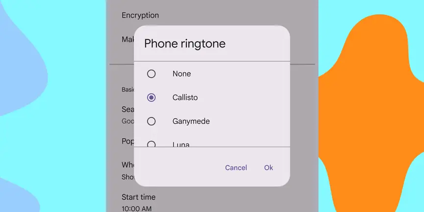
- Use dialogs to make sure users act on information
- Two variants: basic and full-screen
- Should be dedicated to completing a single task
- Can also display information relevant to the task
- Commonly used to confirm high-risk actions like deleting progress
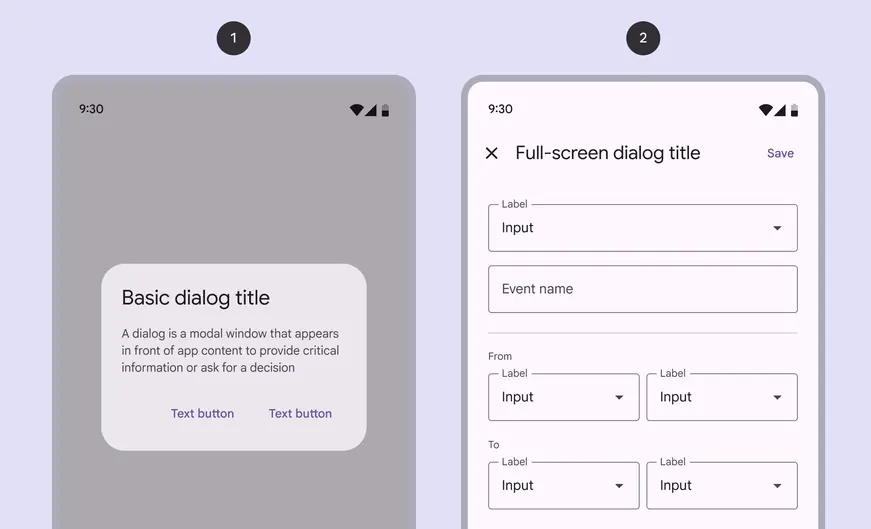
- Basic dialog
- Full-screen dialog
Availability & resources
| Type | Resource | Status |
|---|---|---|
| Design | Design Kit (Figma) | Available |
| Implementation | Flutter | Available |
| Implementation | Jetpack Compose | Available |
| Implementation | Android Views (MDC-Android) | Available |
| Implementation | Web | Available |
Differences from M2
- Color: New color mappings and compatibility with dynamic color
- Layout: Greater padding to account for the increased corner-radius and title size
- Position: Option for custom basic dialog positioning
- Shape: Increased corner-radius
- Typography: Larger and darker headline
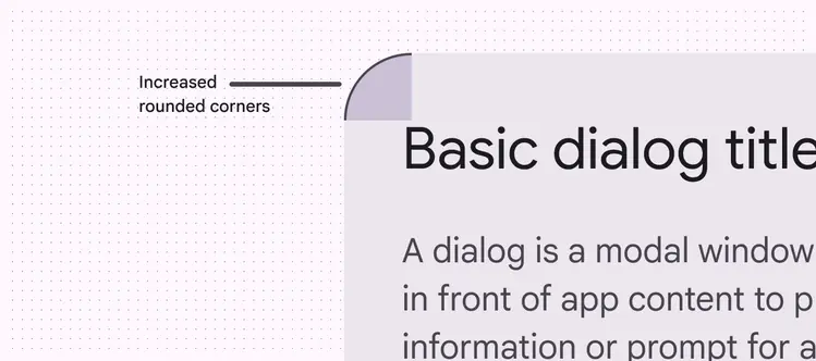
New updates to color, layout, position, shape, and typography