Progress indicators
Progress indicators inform users about the status of ongoing processes, such as loading an app. It show the status of a process in real time.
Overview · Specs · Guidelines · Accessibility
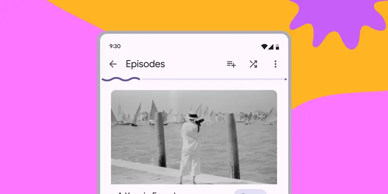
- Two variants: linear and circular
- Use the same configuration for all instances of a process (like loading)
- They capture attention through motion
- Option to apply a wave to the active track for use cases that would benefit from increased expressiveness
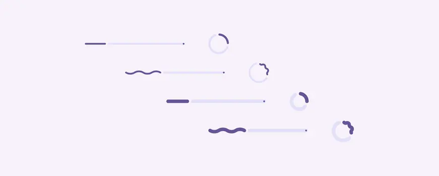
Linear and circular progress indicators have visual configurations for shape and thickness
Availability & resources
| Type | Resource | Status |
|---|---|---|
| Design | Design Kit (Figma) | Available |
| Implementation | Flutter | Available |
| Implementation | Jetpack Compose | Available |
| Implementation | Jetpack Compose: Expressive | Available |
| Implementation | Android Views (MDC-Android) | Available |
| Implementation | Android Views (MDC-Android): Expressive | Available |
| Implementation | Web | Available |
| Implementation | Web: Expressive | Unavailable |
M3 Expressive update
Aug 2024
The progress indicators have configurations for height and wavy shape. Choose the visual style that best fits your product. More on M3 Expressive
- Track height: Configurable
- Shape: Wavy
Progress indicators have a new rounded, colorful style, and more configurations to choose from, including a wavy shape and variable track height
Previous updates
Dec 2023: Non-text contrast (NTC)
- Anatomy: Added an end stop indicator to improve accessibility
- Contrast: Higher contrast between track and active indicator to enhance the perception of progress
- Motion: New motion behavior
- Shape: Rounded corners

Progress indicators have a new rounded, colorful style
Differences from M2
July 2022: Added to Material 3
- Color: New color mappings and compatibility with dynamic color
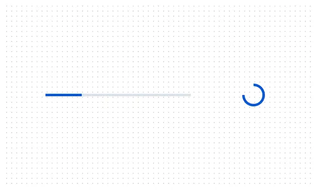
M2: Progress indicators have a boxier, neutral style
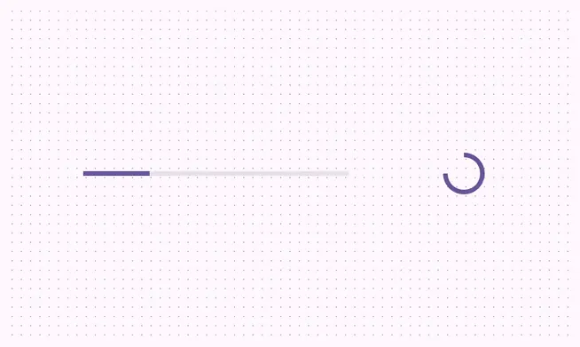
M3: Progress indicators are compatible with dynamic color