Usability
Usability focuses on making products intuitive and easy to understand for everyone
Overview · Applying M3 Expressive
Key takeaways
- Emphasize key actions to create effective visual hierarchy
- Leverage expressive design tactics to improve usability
- Don't overwhelm the user with too much visual information
- Test and iterate to validate designs
Usability helps create digital products that are easy to use and engaging. By leveraging M3 Expressive design tactics like containment, size, shape, color, and typography, designers can guide users through experiences and emphasize key actions to create intuitive, usable products.
What is usability?
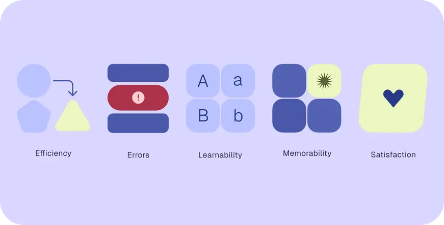
The Nielsen Norman Group defines usability by how effectively users interact with a product through five aspects:
| Aspect | Definition |
|---|---|
| Efficiency | Users can efficiently complete tasks and goals |
| Errors | Proper design reduces the likelihood of mistakes, and users can easily correct any errors that do occur |
| Learnability | New users learn to use the product and complete tasks easily, even if it’s the first time they’re using it |
| Memorability | When users come back to a product, they remember how to use it |
| Satisfaction | Users are satisfied with the designed experience |
How is usability different from accessibility?
Accessibility focuses on making products accessible for people with disabilities. Accessible experiences are perceivable, operable, understandable and robust, and support people who use assistive technology. More on accessibility
Usability focuses on making products intuitive and easy to understand for everyone.
Usability design tactics
There are many ways to design for usability; not all design tactics need to be combined at the same time. An effective combination of design tactics can:
- Make a product easily understood, learnable, and memorable
- Help people quickly identify what do to next
- Minimize distractions to focus on the task
Start by creating a strong visual hierarchy to emphasize important information by using color, size, spacing, placement, containment, and other tactics. Then add unique emphasis to celebrate success or progress, by adding illustrations, scale, shapes, and shape morph.
Color & color contrast
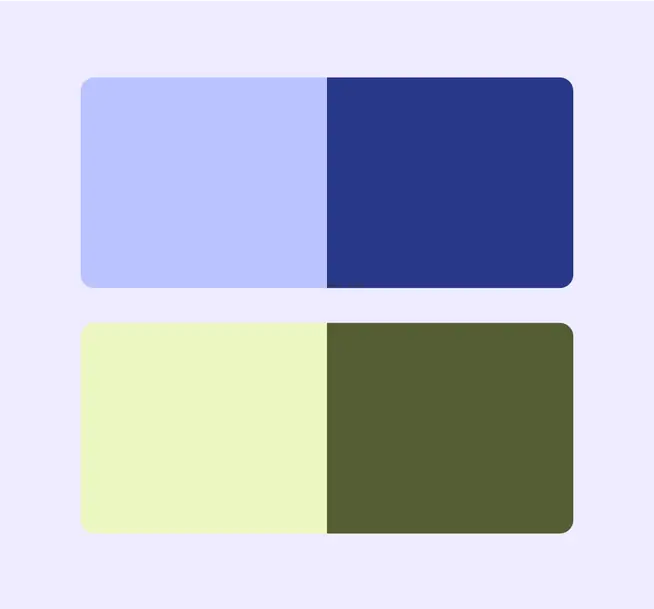
Use eye-catching primary and secondary colors to create hierarchy and emphasize key actions. Instead of similar colors, try using contrasting colors, like purple and green. Colors should always follow basic accessibility guidelines.
Tip: Material Design’s dynamic color roles automatically create color palettes with proper emphasis and accessible contrast ratios.
More on Color & color contrast
Containment & grouping content
Group related elements in subtle containers to make them easier to understand. Break content into manageable sections using containment, spacing, and headings.

Motion
Motion emphasizes key moments or unique experiences. However, use it sparingly since motion can be distracting.
Shape & shape morph
The Material shape library has 35 shapes to apply to designs. Shapes are often used to mask imagery or fill empty space.
Shape:
- Adds emphasis and delight
- Guides focus
- Differentiates containers, buttons and animations
- Signals interaction
- Sets emotional tone
Every shape can morph into another in the set. Shape morph is also applied when interacting with components like buttons. Shape morph:
- Communicates interaction states, like selected, tap, swipe, scroll, release, long press
- Emphasize actions in progress
More on shape & shape morph

Size
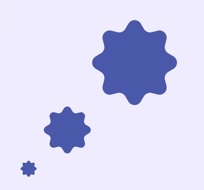
The size and scale of elements shows their level of importance. The most important action or the main call to action (CTA) should be the largest element.
Using larger sizes for key actions dramatically increases usability and makes products more efficient. Users are satisfied, they make fewer errors, and find the products to be more learnable.
Typography
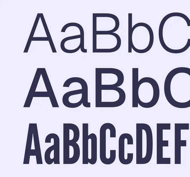
Type can separate different hierarchies of information. More important information might use one font and less important or supplemental content might use another.
- The largest, most legible text on the screen could signal a primary action
- Smaller text signals secondary or tertiary action
- Group similar content by using the same font style
Design based on primary goals
Primary goals are the main tasks to use a product successfully, like starting a process or making decisions, so they need the strongest emphasis. Secondary and tertiary goals add to the experience of the product but aren’t required, like viewing statuses or settings. Identify primary, secondary, and tertiary goals by considering product needs and user satisfaction.
To guide people to the primary goal while ensuring that other goals are still discoverable, try:
- Creating a strong visual hierarchy with size, color, and other design tactics
- Simplifying to one primary task on each page, leveraging empty space to focus attention
- Making core actions recognizable and easily reachable, like using large buttons for the most frequent actions
- Designing a harmonious experience that is aesthetically pleasing and easy to understand
- Not using too many expressive tactics at the same time as they can be distracting
Iterate
Test, iterate, and gather feedback early and often from a range of users and contexts to validate design choices and minimize errors. User testing offers valuable insights into how users perceive and interact with the usability of the product experience.