Checkbox
Checkboxes allow users to select one or more items from a set. Checkboxes can turn an option on or off.
Overview · Specs · Guidelines · Accessibility
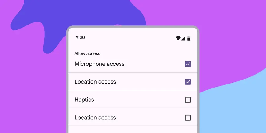
- Use checkboxes (instead of switches or radio buttons) if multiple options can be selected from a list
- Label should be scannable
- Selected items are more prominent than unselected items

Unselected, selected (hover), and indeterminate checkboxes
Availability & resources
| Type | Resource | Status |
|---|---|---|
| Design | Design Kit (Figma) | Available |
| Implementation | Flutter | Available |
| Implementation | Jetpack Compose | Available |
| Implementation | Android Views (MDC-Android) | Available |
| Implementation | Web | Available |
Differences from M2
- Color: New color mappings and compatibility with dynamic color
- States: New indeterminate states as well as error states for unselected, selected, and indeterminate

M2

M3