Badges
Badges are used as indicators to convey dynamic information, such as counts or status. A badge can include labels or numbers.
Overview · Specs · Guidelines · Accessibility
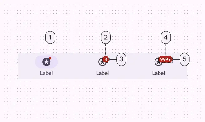
Navigation bar
- Small badge
- Large badge container
- Large badge label
- Large badge maximum character count container
- Large badge maximum character count label
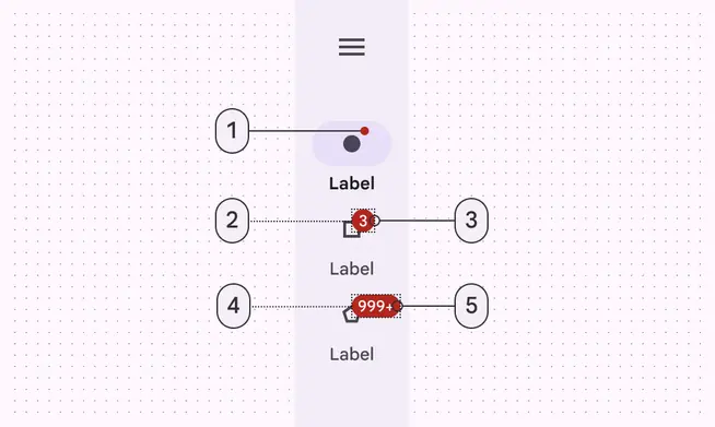
Navigation rail
- Small badge
- Large badge container
- Large badge label
- Large badge maximum character count container
- Large badge maximum character count label
Tokens & specs
Browse the component elements, attributes, tokens, and their values.
Design tokens
Token table
Machine-readable relationship table
Badges tokens · 1 token set · 13 tokens · live token table · DSDB TOKEN_TABLE.59a1b3a9a90ca8b3
- Default context: Theme: Light · Platform: Android · Audience: 3P · Font: Static · Contrast: Default · iOS dark theme elevation: None · iOS weight setting: Default
- Not configurable here (group default used): Motion scheme: Standard · Language height: Small
- Other contexts: Theme: Dark · Contrast: Medium contrast, High contrast. "Other contexts" lists values that differ from the default when only that one context changes.
- Reference chain: aliases from the token to its source value (
token → alias → … → value). "—" means the token holds a literal value.
Badges · md.comp.badge · 13 tokens
For badges.
| Group | Token | Type | Reference chain | Resolved value | Other contexts |
|---|---|---|---|---|---|
| Enabled › Container | md.comp.badge.color | Color | md.sys.color.error → md.ref.palette.error40 | #B3261E | Dark: #F2B8B5 via md.ref.palette.error80Medium contrast: #8C1D18 via md.ref.palette.error30High contrast: #601410 via md.ref.palette.error20 |
| Enabled › Container | md.comp.badge.shape | Shape | md.sys.shape.corner.full | Circular (fully rounded) | — |
| Enabled › Container | md.comp.badge.size | Length | — | 6dp | — |
| Enabled › Container | md.comp.badge.large.color | Color | md.sys.color.error → md.ref.palette.error40 | #B3261E | Dark: #F2B8B5 via md.ref.palette.error80Medium contrast: #8C1D18 via md.ref.palette.error30High contrast: #601410 via md.ref.palette.error20 |
| Enabled › Container | md.comp.badge.large.shape | Shape | md.sys.shape.corner.full | Circular (fully rounded) | — |
| Enabled › Container | md.comp.badge.large.size | Length | — | 16dp | — |
| Enabled › Label text | md.comp.badge.large.label-text.color | Color | md.sys.color.on-error → md.ref.palette.error100 | #FFFFFF | Dark: #601410 via md.ref.palette.error20 |
| Enabled › Label text | md.comp.badge.large.label-text.font | Font names | md.sys.typescale.label-small.font → md.ref.typeface.plain | Roboto | — |
| Enabled › Label text | md.comp.badge.large.label-text.line-height | Line height | md.sys.typescale.label-small.line-height | 16pt | — |
| Enabled › Label text | md.comp.badge.large.label-text.size | Font size | md.sys.typescale.label-small.size | 11pt | — |
| Enabled › Label text | md.comp.badge.large.label-text.tracking | Font tracking | md.sys.typescale.label-small.tracking | 0.5pt | — |
| Enabled › Label text | md.comp.badge.large.label-text.weight | Font weight | md.sys.typescale.label-small.weight → md.ref.typeface.weight-medium | 500 | — |
| Enabled › Label text | md.comp.badge.large.label-text.type | Typography | composite font names: md.comp.badge.large.label-text.font → md.sys.typescale.label-small.font → md.ref.typeface.plainfont weight: md.comp.badge.large.label-text.weight → md.sys.typescale.label-small.weight → md.ref.typeface.weight-mediumfont size: md.comp.badge.large.label-text.size → md.sys.typescale.label-small.sizeline height: md.comp.badge.large.label-text.line-height → md.sys.typescale.label-small.line-heightfont tracking: md.comp.badge.large.label-text.tracking → md.sys.typescale.label-small.tracking | Roboto · weight 500 · size 11pt · line height 16pt · tracking 0.5pt | — |
Color
Color values are implemented through design tokens. For design, this means working with color values that correspond with tokens. For implementation, a color value will be a token that references a value. Learn more about design tokens
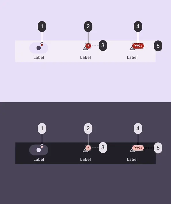
Badge color roles used for light and dark schemes in navigation bar:
- Error
- Error
- On error
- On error
- Error
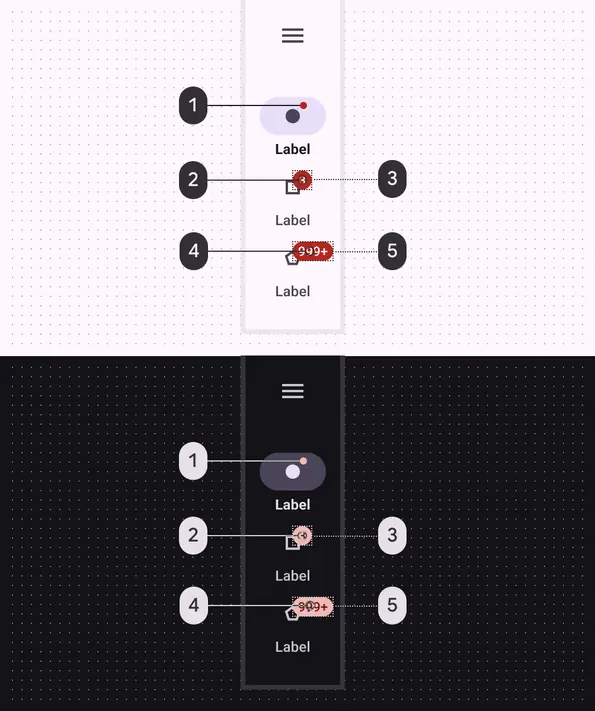
Badge color roles used for light and dark schemes in navigation rail:
- Error
- On error
- Error
- On error
- Error
Measurements
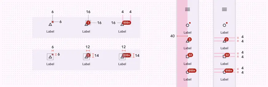
Badge padding and size measurements
| Attribute | Value |
|---|---|
| Small badge shape | 3dp corner radius |
| Small badge size (HxW) | 6dp |
| Large badge shape | 8dp corner radius |
| Large badge one digit size (HxW) | 16dp |
| Large badge max character count size (HxW) | 16x34dp |
| Small badge: distance from top trailing icon corner to bottom leading badge corner (HxW) | 6x6dp |
| Large badge: distance from top trailing icon corner to bottom leading badge corner (HxW) | 14x12dp |
| Large badge padding between badge and text container | 4dp |
Configuration
Different badges are shown on navigation destinations in various states.
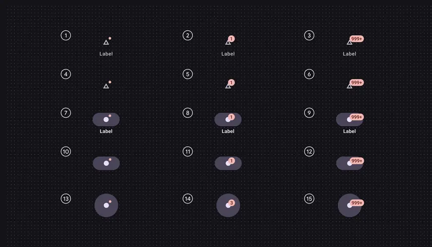
- Inactive with label - small badge
- Inactive with label - large badge
- Inactive with label - large badge max character count
- Inactive - small badge
- Inactive - large badge
- Inactive - large badge max character count
- Active with label - small badge
- Active with label - large badge
- Active with label - large badge max character count
- Active nav bar no label - small badge
- Active nav bar no label - large badge
- Active nav bar no label - large badge max character count
- Active nav rail no label - small badge
- Active nav rail no label - large badge
- Active nav rail no label - large badge max character count