---
url: /components/toolbars/accessibility.md
description: Toolbars display frequently used actions relevant to the current page.
---
# Toolbars
Toolbars display frequently used actions relevant to the current page.
[Overview](overview.md) · [Specs](specs.md) · [Guidelines](guidelines.md) · **Accessibility**
## Use cases
People should be able to the following with assistive technology:
* Navigate and activate any actions in the toolbar
* Select a destination from a menu
* Activate a back button
* Maintain access to toolbar controls when the content is scrolled or collapsed
## Interaction & style
The toolbar has no interactions by default. All interactions are with the elements placed inside.
**Touch**
* When tapping on an icon button in the toolbar, a touch ripple appears, indicating interaction feedback.
Touch: Tap
**Cursor**
* When hovered, the hover state provides a visual cue to the user that the element is interactive.
* When clicked (in both active and inactive states), a ripple appears, showing the user feedback.
Cursor: Hover, Click
### Initial focus
Focus lands on the first interactive element.
Use **Tab** to navigate through all other actions.
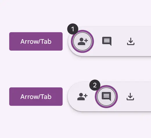
Use **Tab** to navigate through interactive elements
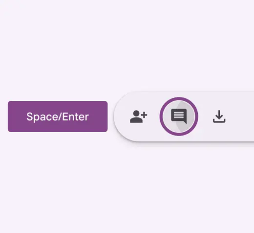
Use **Space** or **Enter** to activate actions
## Keyboard navigation
| Keys | Actions |
| -------------- | ------------------------------------- |
| Tab or Arrows | Navigate between interactive elements |
| Space or Enter | Activate the focused element |
### Labeling elements
On web, the toolbar container should have the **toolbar** role.
On mobile, it can be a generic container.
All actions inside the toolbar should follow their respective accessibility guidelines.
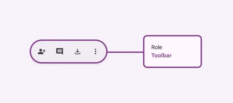
On web, use the **toolbar** role