XR components
Learn how Material 3 Expressive components adapt to extended reality devices
Overview · App bars · Dialogs · Nav bar · Nav rail · Toolbars
Note
XR guidelines are primarily intended for designers. Find what’s implemented in code in the design kit.
Extended reality (XR) interfaces have special design requirements, like showing apps in 3D space. Material has an XR toolbar with custom specs and guidance. Read XR developer documentation for more details.
Variants
There is one toolbar orbiter. It closely aligns with the floating toolbar. It can be configured to be horizontal or vertical. Go to XR toolbar API reference
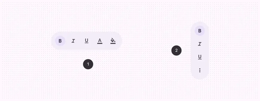
- Horizontal floating toolbar
- Vertical floating toolbar
Anatomy
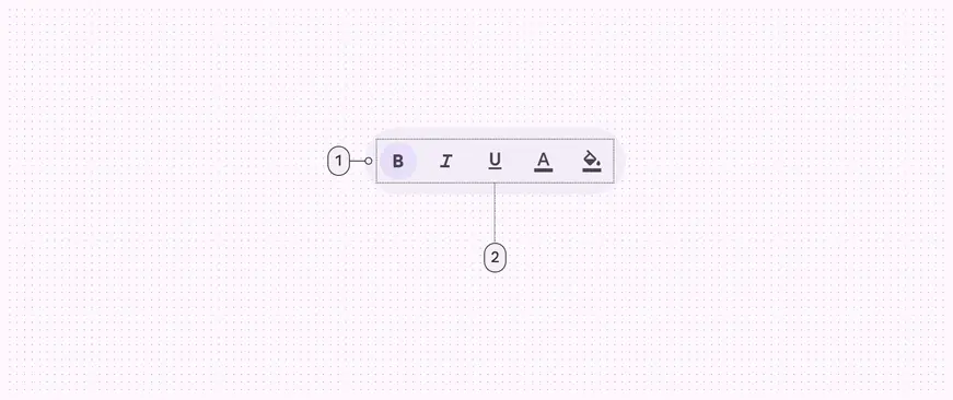
- Container
- Placed components
Color & elevation
XR uses color to communicate the elevation of UI elements and orbiters. With spatial elevation, the toolbar displays above the spatial panel on the Z-axis. Elevated toolbars can use any of these color options:
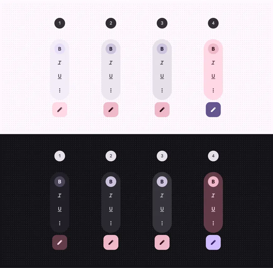
- Surface container
- Surface container high
- Surface container highest
- Tertiary container
Measurements
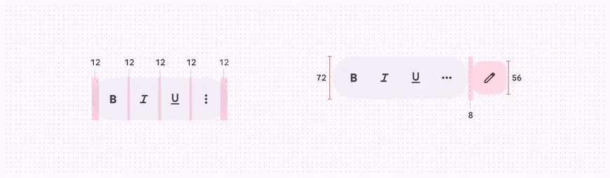
Measurements for toolbar orbiters

Padding for toolbar orbiters
Usage
A toolbar can appear in an orbiter for a more immersive experience. Currently, this spatial capability is only available in full space. In home space, use a regular toolbar on the same plane as the body content to mimic a 2D experience.
A toolbar’s behavior and placement changes from a 2D to a 3D experience
Behavior
Local context (recommended)
When placed in local context, the toolbar orbiter is centered at the bottom of the spatial panel it controls.
It repositions in response to layout or content changes.
In most cases, toolbars should be placed in local context. The orbiter is centered and anchored to the bottom of the panel it controls.
Global context
When placed in global context, the toolbar orbiter is centered at the bottom of the app.
It stays anchored to the app during layout or content changes.
Caution
In global context, toolbar orbiters are centered and anchored to the bottom of the app. This use case is less common, as toolbars usually contain actions that control a specific panel.
Expand & collapse
Toolbar orbiters with more than five items can expand and collapse to reveal or hide additional content.
When a toolbar orbiter expands, it stays within the bounds of the adjacent spatial panel.
Alternatively, more complex toolbars can be split into multiple toolbars.
Toolbar orbiters can expand to reveal additional content, but should stay within the bounds of the adjacent spatial panel
Additional toolbars
In some cases, full space apps can have more than one toolbar orbiter, placed in either global or local context.
Caution
Limit the use of multiple toolbars to rare cases when additional spatialization improves usability
Placement
Offset & inset positioning
In full space, a toolbar orbiter can be positioned adjacent to or overlap a spatial panel.
Do
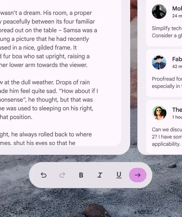
The recommended toolbar orbiter position from the spatial panel is:
- Offset by 20dp or
- Inset by 12dp
Don't
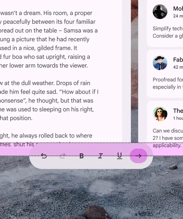
To prevent content obstruction, don’t overlap the toolbar orbiter and spatial panel above 12dp
Horizontal alignment
Do
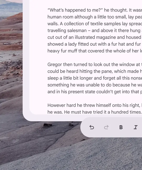
Always align the toolbar orbiter within the horizontal bounds of nearby spatial panels
Don't
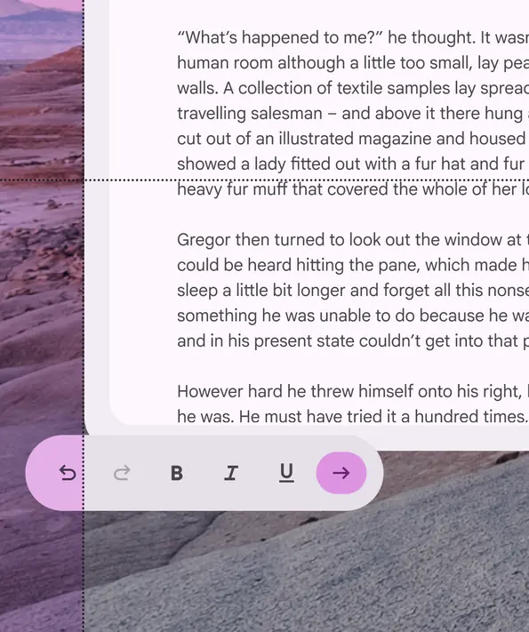
The toolbar orbiter shouldn’t exceed the width of adjacent spatial panels
Vertical alignment
Do
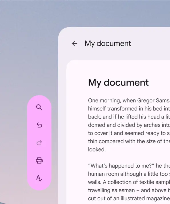
Always align the toolbar orbiter within the vertical bounds of nearby spatial panels
Don't
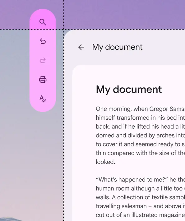
The toolbar orbiter shouldn’t exceed the height of adjacent spatial panels
Spatial panel alignment
By default, toolbar orbiters are center-aligned to the spatial panel. Their placement can be adjusted to accommodate specific user needs, such as improved ergonomics or right-to-left (RTL) languages.
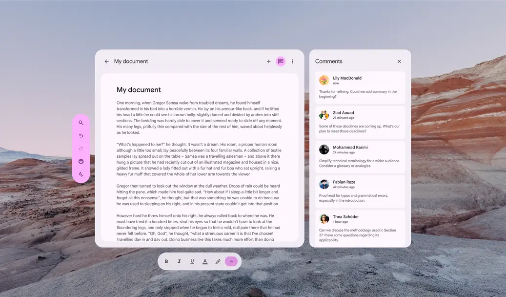
Depending on the configuration (horizontal or vertical) of the toolbar orbiter, it can align to the center, left, right, top, or bottom of a spatial panel
Avoid placing a vertical toolbar orbiter between spatial panels.
This negatively affects the interface structure and can make it difficult to find.
Don't
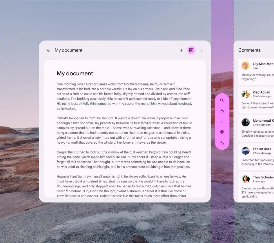
Don't place a vertical toolbar orbiter between spatial panels
Accessibility considerations
XR accessibility guidelines are still evolving. XR toolbars should follow applicable Material toolbar accessibility standards.