Design for immersive XR
Resources and guidance for immersive extended reality (XR) devices
Overview · Interaction · Layout · Accessibility
In XR, a layout extends beyond the screen into the physical world. Spatial panels, 3D models, and an immersive environment can be arranged anywhere on an infinite canvas.
Unlike mobile layouts which are constrained by screen edges, XR layouts must account for:
- Depth on the Z-axis
- Viewing distance
- A person's field of view
An XR headset display can fully occlude the real world. This allows for complete immersion, with the physical environment replaced by a virtual one.
XR layout basics
The fundamental building block of an Android XR app is the spatial panel. Panels serve as containers for UI elements and can be spatially elevated alongside orbiters, 3D models, and environments.
Note
Spatial panels are available in full space only. They aren't currently available in home space.
Spatial panels
In full space, spatial panels are flexible canvases that can contain UI elements, media, and spatial video.
They often serve as the anchor for 3D models and orbiters.
Navigation UI can float in orbiters outside of a spatial panel
Size & position
Full space supports panel placement in both passthrough and virtual environments.
By default, spatial panels launch:
- Size: 1024x720dp
- 1.75 meters away from a person
- With 32dp rounded corners
In full space, panels have no minimum size. The maximum panel size is 2560x1800dp.
When people switch from full space to home space, spatial panels usually stay in the same predictable position.
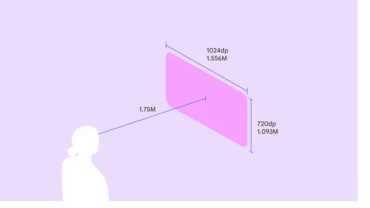
At a 1.75 meter launch distance, a spatial panel's size is 1024x720dp
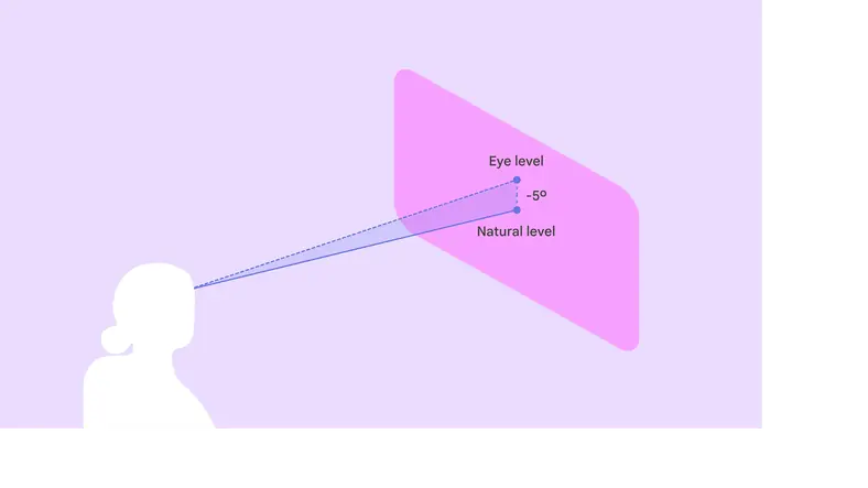
Place the panel's vertical center 5° below eye level to maximize comfort
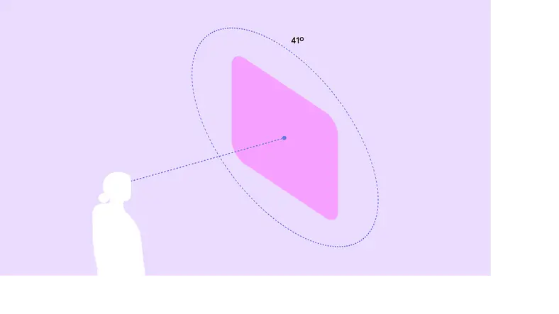
Place primary content in the center 41° of a person’s field of view
Adaptive design
Spatial panels dynamically scale based on their distance from a person.
Material 3 components use adaptive design to ensure content automatically scales and reflows to remain legible and comfortable at any distance or angle.
To avoid system UI conflicts, stay within default movement limits:
- Minimum depth: 0.75 meter
- Maximum depth: 5 meters
A person can scale a spatial panel up or down so it's large enough to see clearly, no matter the distance. When they move the panel, Android XR automatically scales its size.
Grouping panels
In full space, an app can be broken up into multiple spatial panels, arranged in a flat, curved, or arbitrary layout.
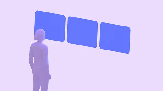
Flat layout: Panels are arranged in a straight line. Best for comparing information side by side.
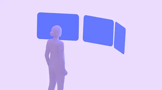
Curved layout: Panels curve around the person. Best for immersive media or wide-format dashboards.

Arbitrary layout: Panels are placed freely in space. Best for multi-tasking.
Orbiters
An orbiter is a floating element that accompanies a spatial panel.
Use orbiters for navigation UI that needs to stay accessible without obscuring the main content.
Material XR components automatically adapt into orbiters.
A navigation rail transforms into an orbiter in XR to give the UI more space
Spatial elevation & depth
Use the Z-axis to create volumetric UI. Unlike 2D elevation which uses shadows, volumetric UI uses actual depth.
- Spatial elevation can create hierarchy, bring active elements forward, and push background elements back
- Layering can separate UI layers physically. For example, a scrim can float several centimeters behind a dialog box.
A dialog using spatial elevation in Android XR
Behavior
Anchoring
In passthrough, layouts can interact with the physical world:
- World-locked: Panels stay in a specific spot in the room, like a music player anchored to a table
- Head-locked: Avoid locking UI directly to the person's head view, as it can feel jarring. Instead, use a lazy follow behavior where the UI gently drifts to catch up with the person's movement.
In passthrough, a spatial panel can be attached to a specific location in the real world, such as a table
Color contrast & dimming
When using standard surface tokens, panels automatically handle contrast:
- Passthrough: If the physical room is bright, the system dims the background to ensure the UI remains legible
- Virtual environments: Panels adapt to the lighting of the virtual world
Use bright, high-contrast colors to ensure the UI stands out against different backgrounds