Switch
Switches toggle the selection of an item on or off. Switches are the best way to let users adjust settings.
Overview · Specs · Guidelines · Accessibility
Use cases
People should be able to do the following with assistive technology:
- Navigate to a switch with a keyboard or switch input
- Toggle the switch on and off
- Get appropriate feedback based on input type documented under Interaction & style
Interaction & style
The switch handle increases in size to indicate interactivity for both touch and cursor control interactions.
Touch
When tapped or dragged, the handle size grows, providing interaction feedback.
Cursor
When hovered (in both on and off states), the hover area grows, providing a visual cue that the handle is interactive. When clicked, the handle size grows.
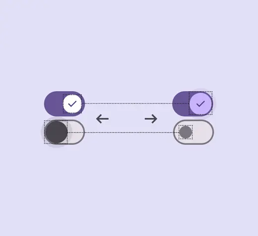
Touch: Tap, Drag
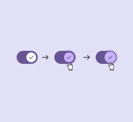
Cursor: Hover, Click
Avoid applying density by default
Don't apply density to switches by default — this lowers their targets below our best practice of 48x48 CSS pixels. Instead, give people a way to choose a higher density, like selecting a denser layout or changing the theme.
To ensure that this density setting can easily be reverted when it's active, keep all targets to change it at a minimum 48x48 CSS pixels each.
Initial focus
Initial focus lands directly on the switch’s handle, since it’s the primary interactive element of the component.
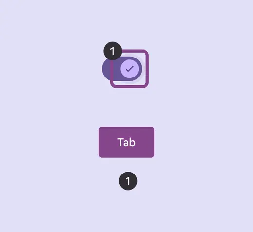
Focus lands on the switch handle
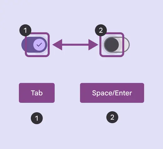
The switch is toggled using Space or Enter
Keyboard navigation
| Keys | Actions |
|---|---|
| Tab | Focus lands on the switch handle |
| Space or Enter | Toggles the handle on and off |
Labeling elements
The accessibility label for a switch uses the adjacent label text if implemented correctly.
Assistive tech such as a screen reader will read the UI text followed by the component’s role.
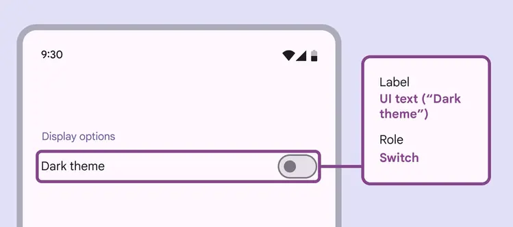
A switch’s accessibility label can incorporate its adjacent UI text
When the visible UI text is ambiguous, accessibility labels need to be more descriptive. For example, a switch visibly labelled Photo album would benefit from additional information to clarify the switch’s function.
Consider making the adjacent label text more descriptive when possible. This reduces the need for different accessibility text.
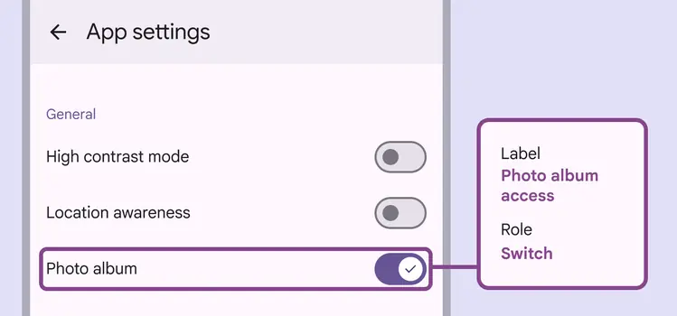
While the visible label text reads Photo album, the accessibility label for this switch clarifies its function: Photo album access