Badges
Badges are used as indicators to convey dynamic information, such as counts or status. A badge can include labels or numbers.
Overview · Specs · Guidelines · Accessibility

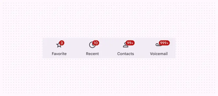
Large badges and a small badge in a navigation bar
Usage
Badges are used to indicate a notification, item count, or other information relating to a navigation destination. They are placed on the ending edge of icons, typically within other components.
There are two variants:
- Small badge
- Large badge
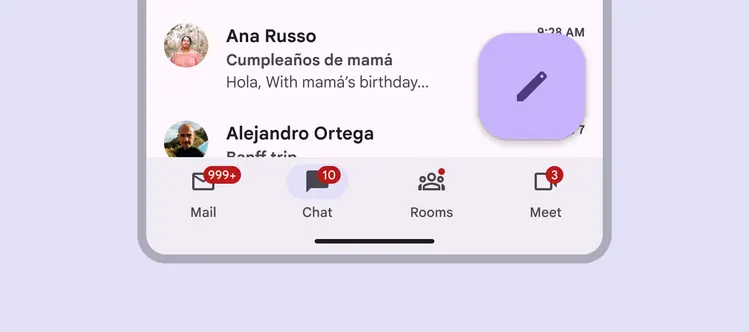
Navigation bar with four badges
A small badge is a simple circle, used to indicate an unread notification.
A large badge contains label text communicating item count information.
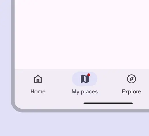
Small badge
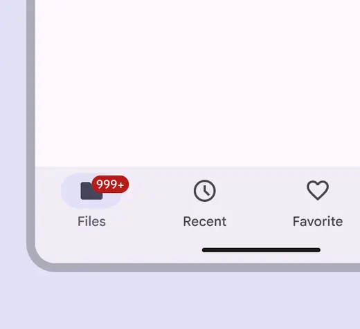
Large badge
With other components
Badges are most commonly used within other components, such as navigation bar, navigation rail, app bars, and tabs.
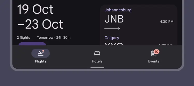
In navigation bars, hide the badge once the destination has been selected
Anatomy

- Small badge
- Large badge container
- Large badge label
Container
There are two container options for the badge:
- Small badge with no text
- Large badge with text
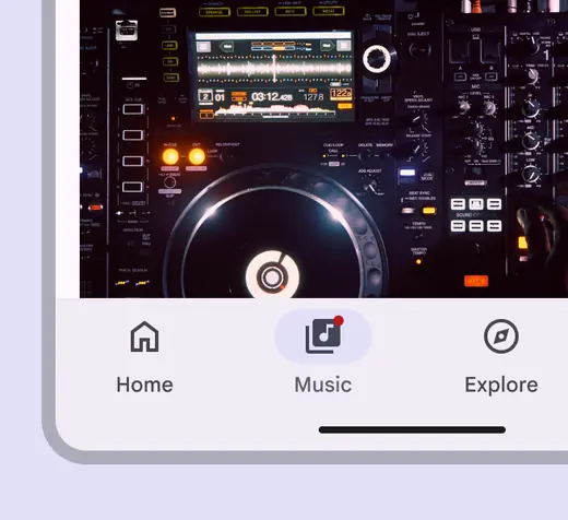
A small badge uses only shape to indicate a status change or new notification

A large badge displays a number within a container to indicate a quantifiable status change related to a destination
Badge containers are anchored inside the icon bounding box. As the number count increases for large badges, their width expands, but keeps the same placement.
Badges use a color intended to stand out against labels, icons, and navigation elements. Use the default color mapping to avoid color conflict issues.
Do
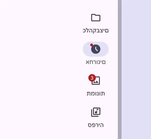
Change the position of the badge for right-to-left languages
Don't
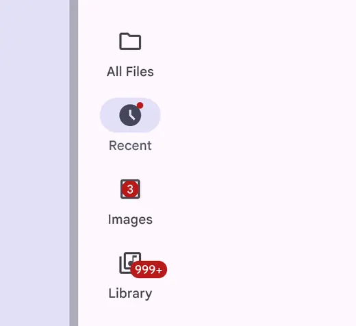
Badges have fixed positions. Don’t change the position of the badge arbitrarily or place the badge over the icon.
Do
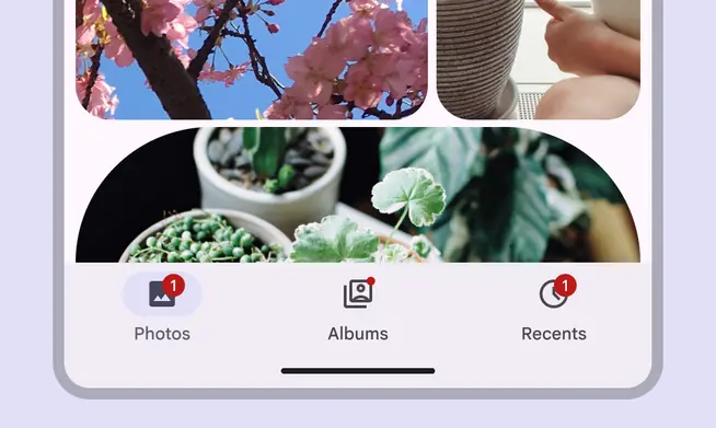
Use the default badge color
Don't

Avoid using custom color roles for the badge container and label text. If custom roles are necessary, make sure they have contrast of at least 3:1.
Label text
Label large badges with counts or a status. The maximum number of characters within large badge label text is four, including a + to indicate more.
Large badges with one to four characters
Use the recommended maximum character count to ensure labels don’t extend beyond the badge container.
Do
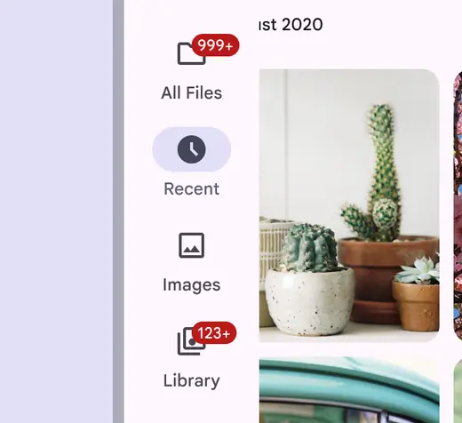
Truncate badge labels as needed
Don't
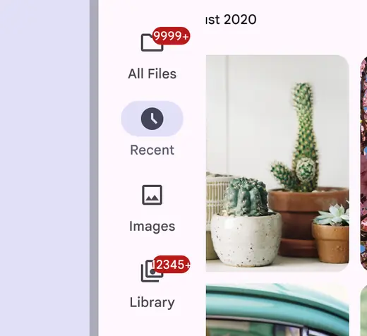
Don’t let the badge get cut off or collide with another element
Placement
Do

Use a large badge to show count information when visual collisions aren’t an issue, such as in a navigation rail
Caution
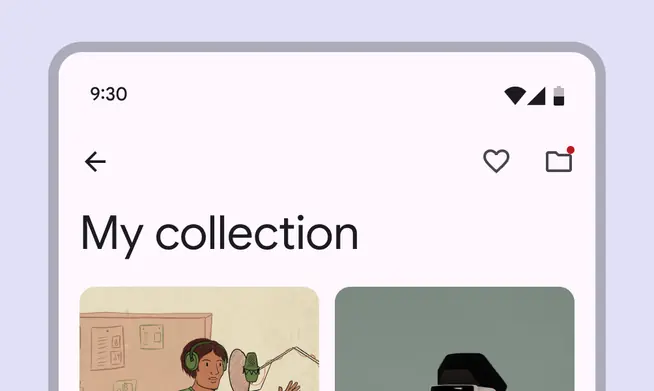
Use a small badge when spaces are tightly constrained, such as app bars. Small badges won’t run into the edge of the screen.
Do

When an icon with a badge is followed by text or another element, place a large badge at the trailing edge
Don't

Avoid using a large badge when it might overlap with a trailing element. Either place it at the trailing edge or use a small badge instead.