Side sheets
Side sheets are surfaces containing supplementary content or actions to support tasks as part of a flow.
Overview · Specs · Guidelines · Accessibility
Tokens & specs
Browse the component elements, attributes, tokens, and their values. Learn more about design tokens
Design tokens
Token table
Machine-readable relationship table
Side sheets tokens · 1 token set · 31 tokens · live token table · DSDB TOKEN_TABLE.06c2c925cf96adca
- Default context: Theme: Light · Platform: Android · Audience: 3P · Font: Static · Contrast: Default · iOS dark theme elevation: None · iOS weight setting: Default
- Not configurable here (group default used): Motion scheme: Standard · Language height: Small
- Other contexts: Theme: Dark · Contrast: Medium contrast, High contrast. "Other contexts" lists values that differ from the default when only that one context changes.
- Reference chain: aliases from the token to its source value (
token → alias → … → value). "—" means the token holds a literal value.
Sheets - Side · md.comp.sheet.side · 31 tokens
For side sheets.
| Group | Token | Type | Reference chain | Resolved value | Other contexts |
|---|---|---|---|---|---|
| Enabled › Container | md.comp.sheet.side.docked.container.color (deprecated) | Color | md.sys.color.surface → md.ref.palette.neutral98 | #FEF7FF | Dark: #141218 via md.ref.palette.neutral6 |
| Enabled › Container | md.comp.sheet.side.docked.modal.container.color | Color | md.sys.color.surface-container-low → md.ref.palette.neutral96 | #F7F2FA | Dark: #1D1B20 via md.ref.palette.neutral10 |
| Enabled › Container | md.comp.sheet.side.docked.standard.container.color | Color | md.sys.color.surface → md.ref.palette.neutral98 | #FEF7FF | Dark: #141218 via md.ref.palette.neutral6 |
| Enabled › Container | md.comp.sheet.side.docked.container.surface-tint-layer.color (deprecated) | Color | md.sys.color.surface-tint → md.sys.color.primary → md.ref.palette.primary40 | #6750A4 | Dark: #D0BCFF via md.ref.palette.primary80Medium contrast: #4F378B via md.ref.palette.primary30High contrast: #381E72 via md.ref.palette.primary20 |
| Enabled › Container | md.comp.sheet.side.docked.modal.container.elevation | Elevation | md.sys.elevation.level1 | 1dp | — |
| Enabled › Container | md.comp.sheet.side.docked.standard.container.elevation | Elevation | md.sys.elevation.level0 | 0dp | — |
| Enabled › Container | md.comp.sheet.side.docked.container.height | Length | — | 100% | — |
| Enabled › Container | md.comp.sheet.side.docked.container.shape | Shape | md.sys.shape.corner.none | Rounded corners 0dp | — |
| Enabled › Container | md.comp.sheet.side.detached.container.shape | Shape | md.sys.shape.corner.large | Rounded corners 16dp | — |
| Enabled › Container | md.comp.sheet.side.docked.container.width | Length | — | 256dp | — |
| Enabled › Container | md.comp.sheet.side.docked.modal.container.shape | Shape | md.sys.shape.corner.large.start | Rounded corners: top-left 16dp, bottom-left 16dp | — |
| Enabled › Headline | md.comp.sheet.side.docked.headline.color | Color | md.sys.color.on-surface-variant → md.ref.palette.neutral-variant30 | #49454F | Dark: #CAC4D0 via md.ref.palette.neutral-variant80Medium contrast: #322F37 via md.ref.palette.neutral-variant20High contrast: #000000 via md.ref.palette.neutral-variant0 |
| Enabled › Headline | md.comp.sheet.side.docked.headline.font | Font names | md.sys.typescale.title-large.font → md.ref.typeface.brand | Roboto | — |
| Enabled › Headline | md.comp.sheet.side.docked.headline.line-height | Line height | md.sys.typescale.title-large.line-height | 28pt | — |
| Enabled › Headline | md.comp.sheet.side.docked.headline.size | Font size | md.sys.typescale.title-large.size | 22pt | — |
| Enabled › Headline | md.comp.sheet.side.docked.headline.tracking | Font tracking | md.sys.typescale.title-large.tracking | 0pt | — |
| Enabled › Headline | md.comp.sheet.side.docked.headline.weight | Font weight | md.sys.typescale.title-large.weight → md.ref.typeface.weight-regular | 400 | — |
| Enabled › Headline | md.comp.sheet.side.docked.headline.type | Typography | composite font names: md.comp.sheet.side.docked.headline.font → md.sys.typescale.title-large.font → md.ref.typeface.brandfont weight: md.comp.sheet.side.docked.headline.weight → md.sys.typescale.title-large.weight → md.ref.typeface.weight-regularfont size: md.comp.sheet.side.docked.headline.size → md.sys.typescale.title-large.sizeline height: md.comp.sheet.side.docked.headline.line-height → md.sys.typescale.title-large.line-heightfont tracking: md.comp.sheet.side.docked.headline.tracking → md.sys.typescale.title-large.tracking | Roboto · weight 400 · size 22pt · line height 28pt · tracking 0pt | — |
| Enabled › Divider | md.comp.sheet.side.docked.divider.color | Color | md.sys.color.outline → md.ref.palette.neutral-variant50 | #79747E | Dark: #938F99 via md.ref.palette.neutral-variant60Medium contrast: #49454F via md.ref.palette.neutral-variant30High contrast: #322F37 via md.ref.palette.neutral-variant20 |
| Hovered › Label text | md.comp.sheet.side.docked.action.hover.label-text.color | Color | md.sys.color.primary → md.ref.palette.primary40 | #6750A4 | Dark: #D0BCFF via md.ref.palette.primary80Medium contrast: #4F378B via md.ref.palette.primary30High contrast: #381E72 via md.ref.palette.primary20 |
| Hovered › State layer | md.comp.sheet.side.docked.action.hover.state-layer.color | Color | md.sys.color.primary → md.ref.palette.primary40 | #6750A4 | Dark: #D0BCFF via md.ref.palette.primary80Medium contrast: #4F378B via md.ref.palette.primary30High contrast: #381E72 via md.ref.palette.primary20 |
| Hovered › State layer | md.comp.sheet.side.docked.action.hover.state-layer.opacity | Opacity | md.sys.state.hover.state-layer-opacity | 0.08 | — |
| Focused › Label text | md.comp.sheet.side.docked.action.focus.label-text.color | Color | md.sys.color.primary → md.ref.palette.primary40 | #6750A4 | Dark: #D0BCFF via md.ref.palette.primary80Medium contrast: #4F378B via md.ref.palette.primary30High contrast: #381E72 via md.ref.palette.primary20 |
| Focused › State layer | md.comp.sheet.side.docked.action.focus.state-layer.color | Color | md.sys.color.primary → md.ref.palette.primary40 | #6750A4 | Dark: #D0BCFF via md.ref.palette.primary80Medium contrast: #4F378B via md.ref.palette.primary30High contrast: #381E72 via md.ref.palette.primary20 |
| Focused › State layer | md.comp.sheet.side.docked.action.focus.state-layer.opacity | Opacity | md.sys.state.focus.state-layer-opacity | 0.1 | — |
| Focused › Focus indicator | md.comp.sheet.side.docked.focus.indicator.color | Color | md.sys.color.secondary → md.ref.palette.secondary40 | #625B71 | Dark: #CCC2DC via md.ref.palette.secondary80Medium contrast: #4A4458 via md.ref.palette.secondary30High contrast: #332D41 via md.ref.palette.secondary20 |
| Focused › Focus indicator | md.comp.sheet.side.docked.focus.indicator.thickness | Length | md.sys.state.focus-indicator.thickness | 3dp | — |
| Focused › Focus indicator | md.comp.sheet.side.docked.focus.indicator.outline.offset | Length | md.sys.state.focus-indicator.outer-offset | 2dp | — |
| Pressed (ripple) › Label text | md.comp.sheet.side.docked.action.pressed.label-text.color | Color | md.sys.color.primary → md.ref.palette.primary40 | #6750A4 | Dark: #D0BCFF via md.ref.palette.primary80Medium contrast: #4F378B via md.ref.palette.primary30High contrast: #381E72 via md.ref.palette.primary20 |
| Pressed (ripple) › State layer | md.comp.sheet.side.docked.action.pressed.state-layer.color | Color | md.sys.color.primary → md.ref.palette.primary40 | #6750A4 | Dark: #D0BCFF via md.ref.palette.primary80Medium contrast: #4F378B via md.ref.palette.primary30High contrast: #381E72 via md.ref.palette.primary20 |
| Pressed (ripple) › State layer | md.comp.sheet.side.docked.action.pressed.state-layer.opacity | Opacity | md.sys.state.pressed.state-layer-opacity | 0.1 | — |
Standard side sheet
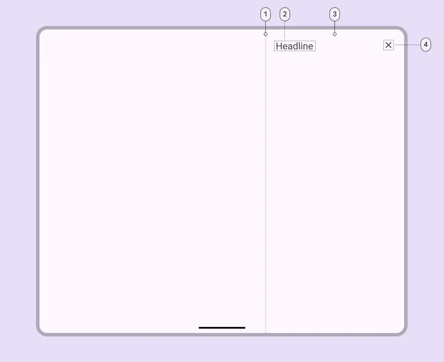
- Divider (optional)
- Headline
- Container
- Close icon button
Standard side sheet color
Color values are implemented through design tokens. For design, this means working with color values that correspond with tokens. For implementation, a color value will be a token that references a value. Learn more about design tokens
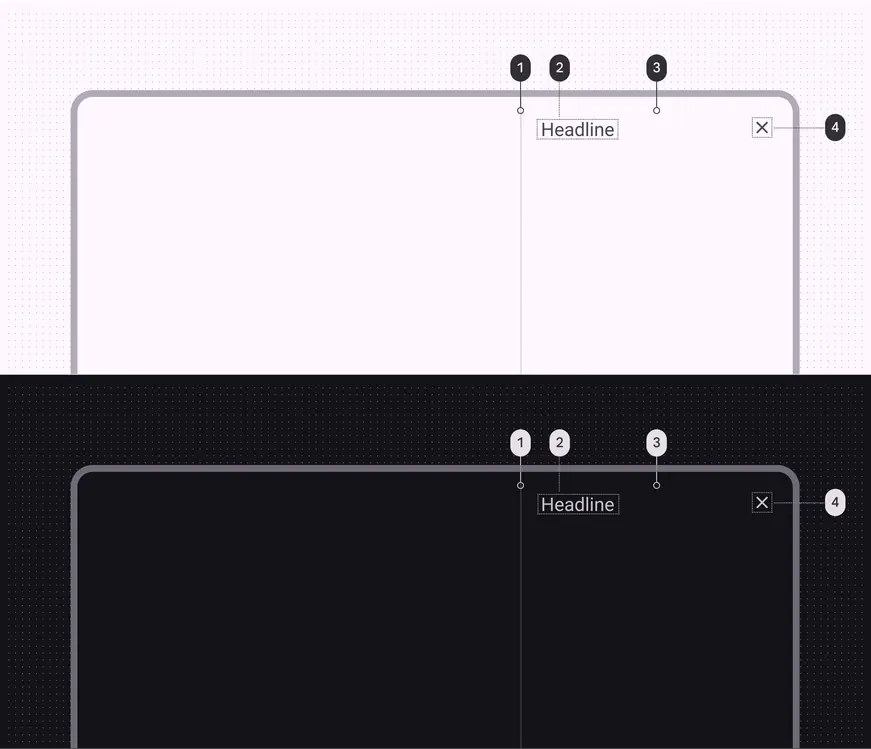
Side sheet color roles used for light and dark themes:
- Outline variant
- On surface variant
- Surface
- On surface variant
Standard side sheet measurements
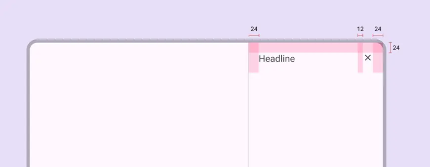
Side sheet padding and size measurements
| Attribute | Value |
|---|---|
| Start/end padding | 24dp |
| Padding between top elements | 12dp |
| Bottom actions height | 72dp |
| Bottom actions top padding | 16dp |
| Bottom actions bottom padding | 24dp |
| Bottom actions alignment (horizontal) | Left |
| Max-width | 400dp |
| Margins (when detached) | 16dp |
Modal side sheet
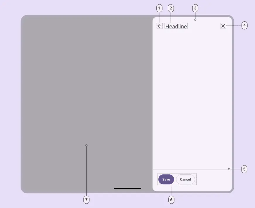
- Back icon button (optional)
- Headline
- Container
- Close icon button
- Divider (optional)
- Action buttons (optional)
- Scrim
Modal side sheet color
Color values are implemented through design tokens. For design, this means working with color values that correspond with tokens. For implementation, a color value will be a token that references a value. Learn more about design tokens.
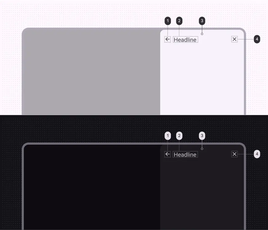
Side sheet color roles used for light and dark themes:
- On surface variant
- On surface variant
- Surface container low
- On surface variant
Modal side sheet measurements
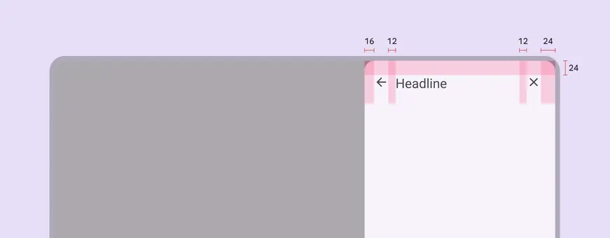
Modal side sheet padding and size measurements
| Attribute | Value |
|---|---|
| Start/end padding | 24dp |
| Start padding with icon | 16dp |
| Padding between top elements | 12dp |
| Bottom actions height | 72dp |
| Bottom actions top padding | 16dp |
| Bottom actions bottom padding | 24dp |
| Bottom actions alignment (horizontal) | Left |
| Max-width | 400dp |
| Margins (when detached) | 16dp |