Menus
Menus display a list of choices on a temporary surface. Menus can open from a variety of components, including icon buttons and text fields.
Overview · Specs · Guidelines · Accessibility
Use cases
People should be able to do the following using assistive technology:
- Navigate to, open, and close a menu
- Navigate between and select menu items
Interaction & style
Menu items need certain cues to clearly show when they're selected:
- By default, menu items change shape and color when selected
- The default color contrast is 3:1 between selected and unselected menu items
- It's recommended to include another visual cue, like a checkmark
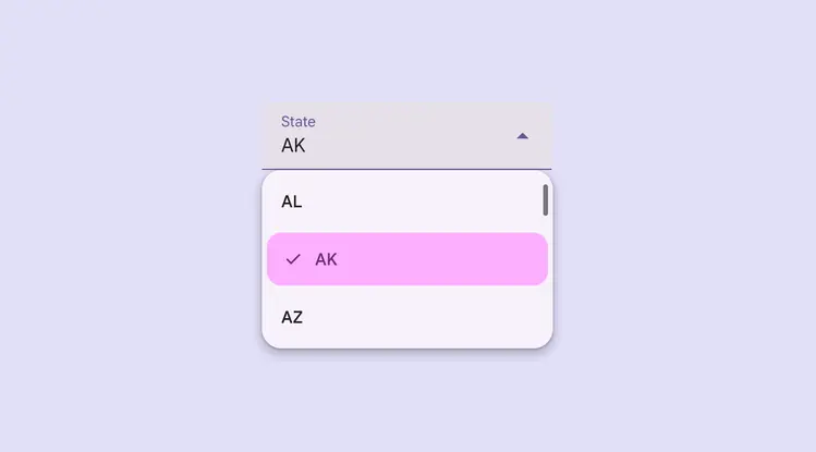
Use multiple visual cues like color, shape, and icons to show that an item is selected
Flexibility & slots
Use caution when adding slots to menus:
- Make sure the menu remains accessible
- Elements must follow the rules and interaction patterns of the menu component
- Keep the same menu item padding
- Targets should be 48x48dp or larger
Don't add buttons, switches, or other direct actions into the menu item. Nested elements should only perform one action. Adding multiple actions can break keyboard navigation and screen reader functionality.
Caution
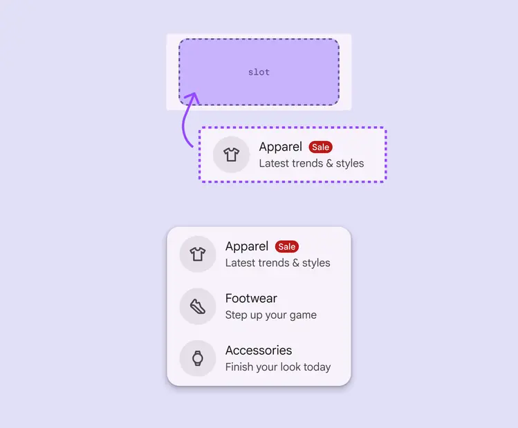
Reserve the use of slots for use cases that maintain the menu’s accessibility and functionality
Focus
Initial focus
When a menu opens, focus should be placed on the first menu item. This allows people using a keyboard or other assistive technologies to begin navigating the menu immediately.
Exiting a menu
People expect to exit a menu by:
- Selecting an option
- Tapping Escape or outside of the menu
- Using the system back button
Where focus is placed after closing the menu depends on the app.
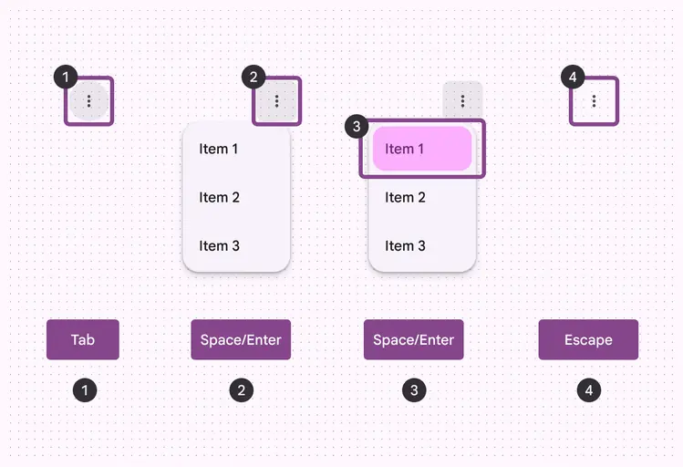
Keyboard navigation on Android and web:
- Tab to select a menu item
- Space or Enter to open a menu
- Space or Enter to select a menu item
- Escape to close a menu
Keyboard navigation
| Keys | Actions |
|---|---|
| Tab | Focus lands on menu |
| Space or Enter | For closed menus: Opens menu or submenu For open menus: Selects a menu item |
| Up and Down arrows | For closed menus: Opens menu For open menus: Moves focus to the next item |
| Left and Right arrows | Opens or closes a submenu |
| Letters | Focus moves to the next menu item starting with letter |
| Escape | Closes menu |
Interactability
Disabled menu items can receive focus but aren't selectable.
Dividers and gaps can't receive focus.
Do
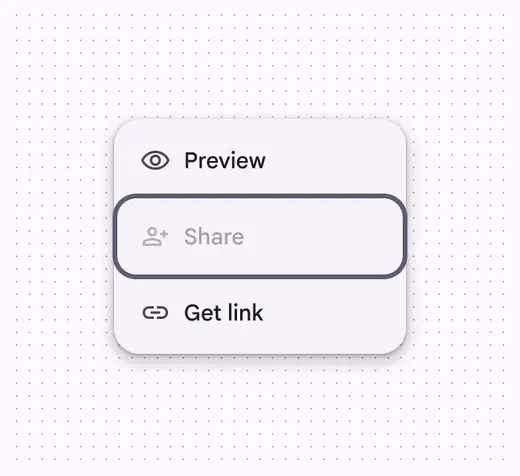
Disabled menu items can receive focus
Don't
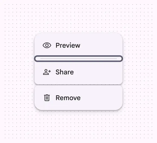
A divider or gap can’t receive focus
Labeling elements
Accessibility labels are used with assistive technology devices like screen readers.
The accessibility label should be the same as the menu item text.
The role is dependent on platform.
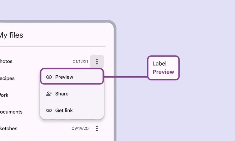
The menu item’s accessibility label aligns with the UI text
| Element | A11y label | Role (Web) | Role (Android Views) | Role (Jetpack Compose) |
|---|---|---|---|---|
| Menu item text | Preview | Menu item | Generic actionable element | Generic actionable element |
For menu items with text and an icon, the icon’s accessibility label should be marked as decorative to avoid redundant verbalizations.
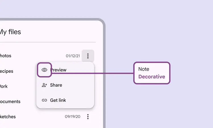
For menu items with text and an icon, the icon’s accessibility label is decorative