Switch
Switches toggle the selection of an item on or off. Switches are the best way to let users adjust settings.
Overview · Specs · Guidelines · Accessibility
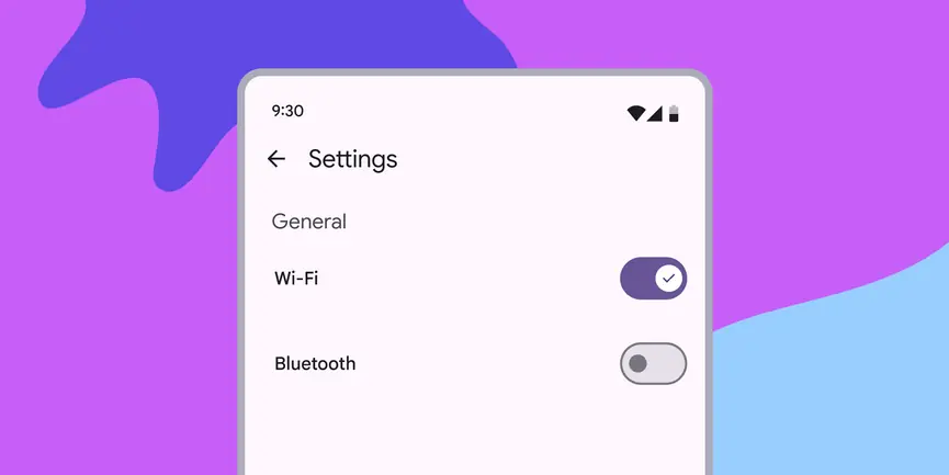
- Use switches (not radio buttons) if the items in a list can be independently controlled
- Switches are the best way to let people adjust settings
- Make sure the switch’s selection (on or off) is visible at a glance

Switches can be toggled on and off
Availability & resources
| Type | Resource | Status |
|---|---|---|
| Design | Design Kit (Figma) | Available |
| Implementation | Flutter | Available |
| Implementation | Jetpack Compose | Available |
| Implementation | Android Views (MDC-Android) | Available |
| Implementation | Web | Available |
Differences from M2
- Accessibility: Visual presentation is more accessible
- Color: New color mappings meet Material's non-text-contrast requirements in addition to compatibility with dynamic color
- Icons: Ability to have an optional icon within the switch handle
- Layout: Track is taller and wider

M2: Switches have a circular handle that extends beyond the edge of the track
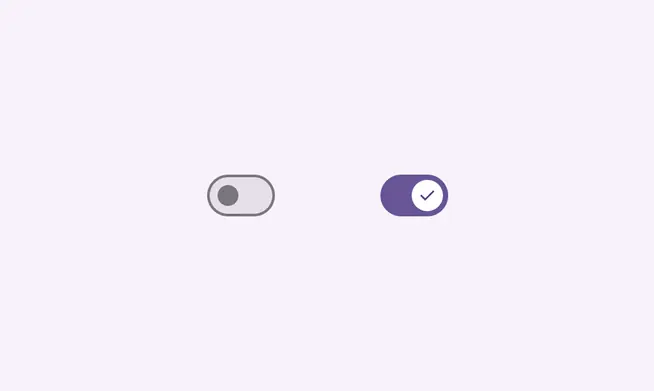
M3: Switches have a taller and wider track, new color mappings, and the ability to show an icon in the handle