Progress indicators
Progress indicators inform users about the status of ongoing processes, such as loading an app. It show the status of a process in real time.
Overview · Specs · Guidelines · Accessibility
Progress indicators communicate the status of an ongoing process
Usage
Use progress indicators to show the status of ongoing processes, such as loading an app, submitting a form, or saving updates.
When multiple items are loading, use a single progress indicator to show progress for the group. Don’t add progress indicators to every activity.
Do
Indicate overall progress of a group of items
Don't
Don’t show the progress of each activity in a group
Choose a loading or progress indicator that corresponds to the expected wait time and kind of process.
If the wait is very long, consider allowing people to navigate away from the page while the process finishes up.
| Expected wait time | Recommendation |
|---|---|
| Instant (under 200ms) | No indicator |
| Short (between 200ms and 5s) | Loading indicator |
| Long (Over 5s) | Progress indicator |
Instant (under 200ms): Display the content immediately
Short (between 200ms and 5s): Use a loading indicator
Long (over 5s): Use a progress indicator
There are two variants of progress indicators:
- Linear
- Circular
Linear indicators are best when placed on the edge of a container.
Circular indicators are best when centered in an element.
A process should be represented by the same variant of progress indicator throughout the product. For example, if refreshing uses a circular indicator in one place, it should use circular indicators everywhere.
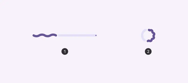
- Linear indicator
- Circular indicator
Progress indicators behave differently based on the time of progress being tracked:
- Determinate: Known progress and wait time
- Indeterminate: Unknown progress and wait time
When using a determinate indicator, the indicator must accurately represent the progress of what it's measuring.
Use indeterminate indicators to show that a process is happening, but the wait time is unknown.
- Determinate progress indicators fill from 0% to 100%
- Indeterminate progress indicators move along a fixed track, growing and shrinking in size
As more information about a process becomes available, a progress indicator should change from indeterminate to determinate.
A linear progress indicator changes from indeterminate to determinate while loading a screen
Anatomy
- Active indicator
- Track
- Stop indicator
Active indicator
The active indicator shows the progress that has been made so far.
In indeterminate processes, it grows and shrinks along the track repeatedly.
Linear indicators animate from the leading to the trailing edge along the track. Circular indicators animate from the top of the track, clockwise by default.
The active indicator appears as soon as progress begins. At low percentages where space is limited, this should appear as a dot to help people understand that there’s progress underway.
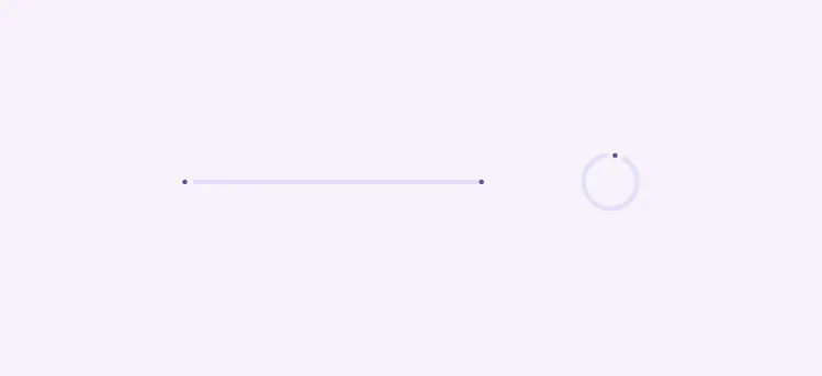
When progress first begins, the active indicator appears as a dot
The active indicator has two shape options: flat and wavy. Use the shape that best fits the product’s tone.
The wavy shape can make longer processes feel less static and is best used when a more expressive style is appropriate.
When using the wavy shape, the overall height of the component changes. At very small sizes, the wavy shape may not be as visible.
Wavy linear indicators increase the height of the overall container
Stop indicator
The stop indicator is a 4dp circle that marks the end of a linear determinate progress indicator to meet Material's accessibility standards.
It's not used for indeterminate or circular progress indicators.
The stop indicator is required if the track has a contrast below 3:1 with its container or the surface behind the container.
Do
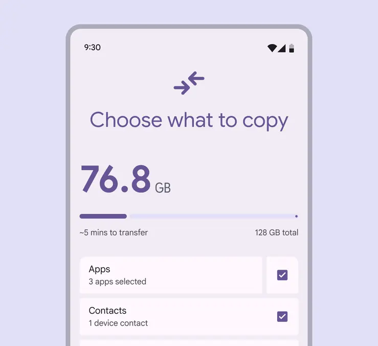
Use a stop indicator when placing the progress indicator inside a container with low contrast
Caution
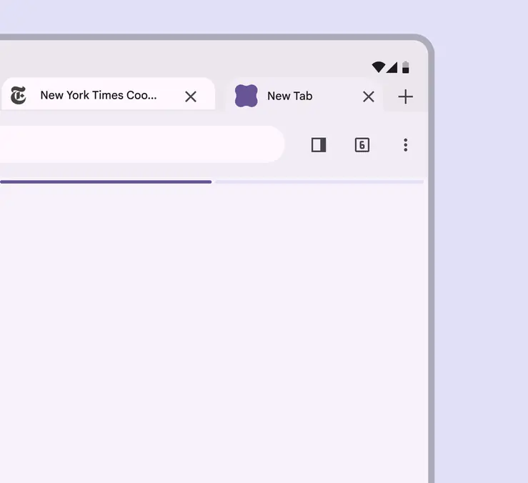
Only remove the end stop indicator if there's a visual contrast of at least 3:1 with surrounding surfaces
Placement
Place a linear progress indicator along the edge of a container that’s loading. If the container changes shape, place it on the edge that animates. It can also be placed in the middle of a container.
Use a single progress indicator at the top of a page to show progress of the whole group. Don’t add one for every element unless they’re activated independently.
When at the top of a screen, a progress indicator shows that all of the page content is loading
When attached to a card, a progress indicator shows that just the card content is loading
A progress indicator on the expanding edge of a card shows that the edge may expand to show the loaded content
Circular progress indicators should be centered directly on the container or page that's loading, such as a button or card.
When loading more items on a page, place the circular progress indicator in the empty space where the new content will appear, not overlapping existing content.
However, if the content does not take long to load, consider using a loading indicator instead.
A circular progress indicator can show that the page is loading
A circular progress indicator can show where new items will appear on a page. A loading indicator also works well in this space.
Progress indicators in buttons
A circular indicator can be placed in a button to show that the button’s action is currently in progress.
In very small buttons, use the flat shape since the wavy shape is not as visible at that size.
To ensure a minimum 3:1 contrast ratio, change the active indicator color to be the same color as the button’s icon or label text, and remove the track.
Do
Use circular indicators for short, indeterminate activities under 5 seconds
Don't
Avoid applying progress indicators to every button in a list
Responsive layout
Right-to-left languages
Linear progress indicators should be mirrored horizontally for products using right-to-left (RTL) languages.
Circular progress indicators don’t need to be mirrored.
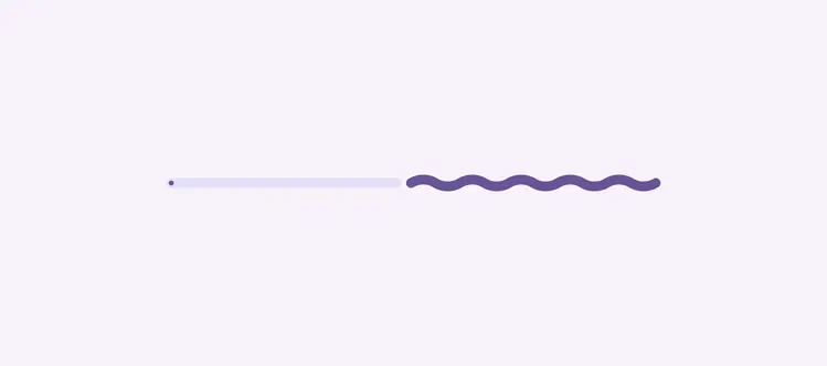
Linear progress indicators can flow from right to left in right-to-left (RTL) languages
Large screens
Circular progress indicators have flexible sizes. They can range from 24dp to 240dp, depending on the placement and the breakpoint. Avoid exceeding the minimum and maximum sizes.
Reserve very large progress indicators for large and extra-large windows, such as desktop.
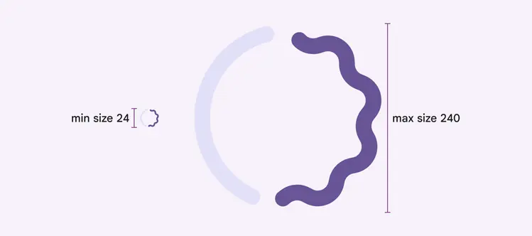
The waveform should scale with the size so the proportions look the same across sizes
Linear progress indicators dynamically adjust to fit the width of the window or element they’re placed within, such as a card. They shouldn’t be used in any elements smaller than 40dp.
The padding on each end should be 4dp minimum, but can be modified.
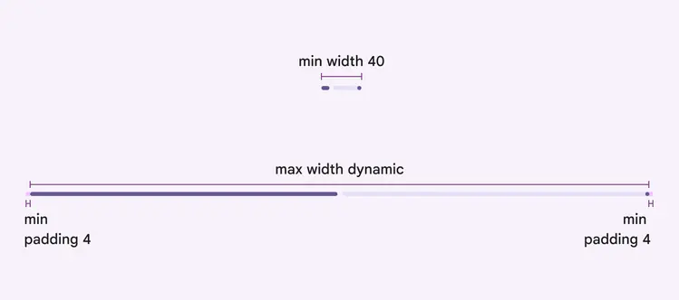
The linear progress indicator should always span the width of the UI element it’s placed within