Canonical layout examples
Canonical layout examples are designs for common screen layouts across all breakpoints
Overview · Feed · List-detail · Supporting pane

Canonical layout examples demonstrate how to implement the layout scaffold. They’re also available in code to provide a strong starting point for your product.
Each layout example considers common use cases and components to address expectations and user needs for how products adapt across breakpoints (previously window size classes).
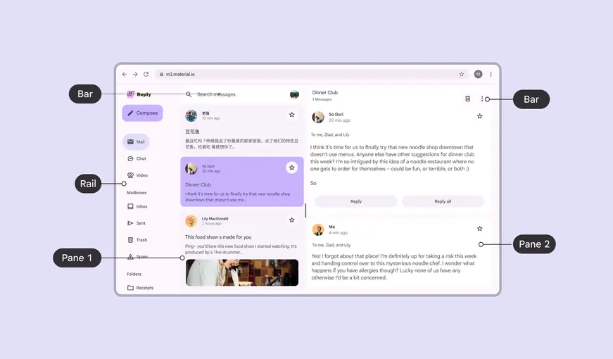
A layout scaffold can include bar, rail, and pane regions
Availability & resources
| Type | Resource | Status |
|---|---|---|
| Design | M3 Design Kit (Figma) | Available |
| Implementation | Jetpack Compose: Canonical layouts | Available |
| Implementation | Android Views (MDC-Android): Canonical layouts | Available |
| Implementation |
Examples
There are three canonical layout examples: feed, list-detail, and supporting pane. Each example has configurations for compact, medium, and expanded breakpoints.
Use these canonical examples as a starting point to create layouts for a product.
Feed
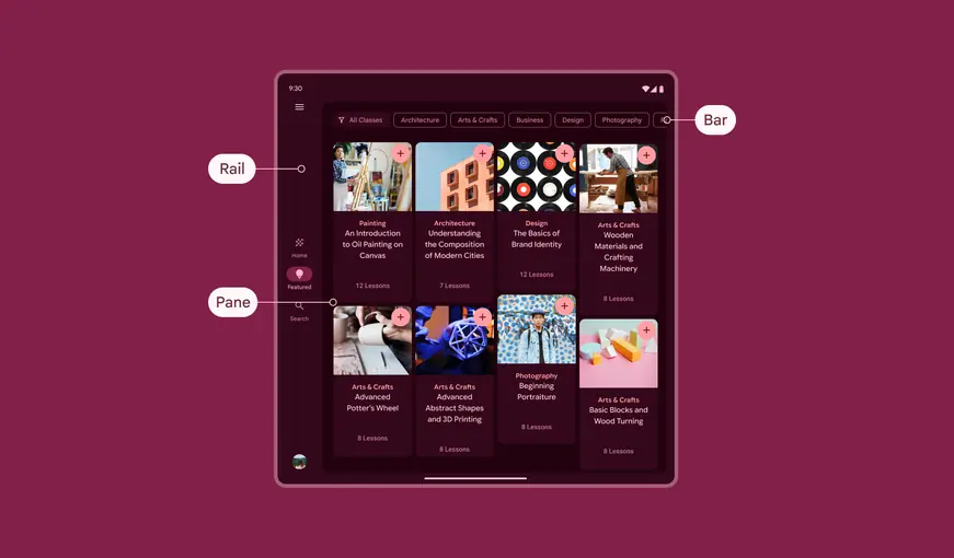
Use a feed layout to arrange elements like cards in a configurable grid for a quick, convenient view of a large amount of content.
List-detail
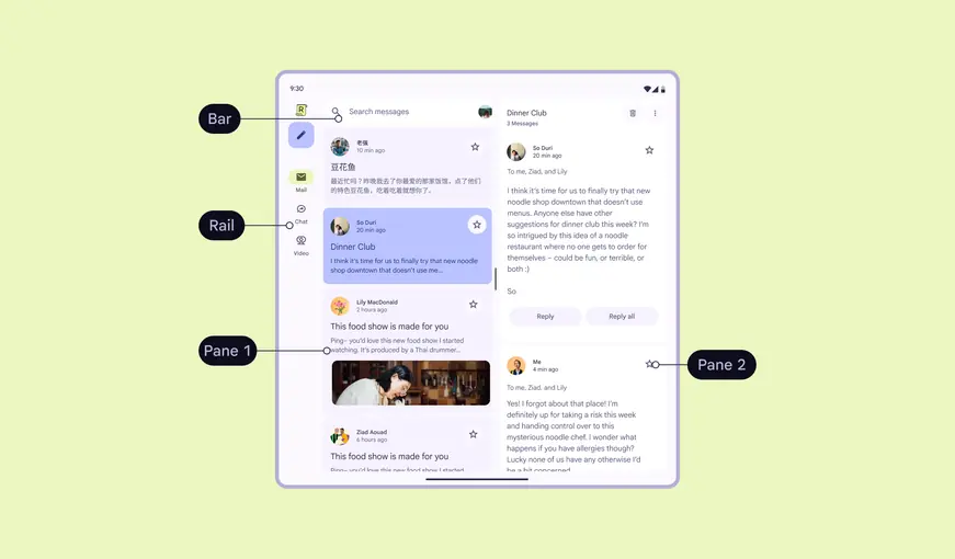
Use a list-detail layout to display explorable lists of items alongside each item’s details. This layout divides the window into two side-by-side panes.
Supporting pane
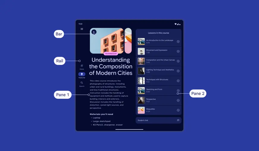
Use a supporting pane layout to organize content into primary and secondary sections:
- Primary display area: Contains the main content and occupies the majority of the window (typically about two-thirds)
- Secondary display area: Presents supporting content in a panel that takes up the remainder of the space
More on supporting pane layouts
Advanced custom layouts
To create a custom layout, build on top of canonical layouts or layer scaffold elements.
Layering
Use the levitate adaptive strategy to create a layered layout. Layering panes above other content can create a focused, task-oriented experience such as:
- Reviewing a shopping basket
- Responding to comments
- Creating a calendar event
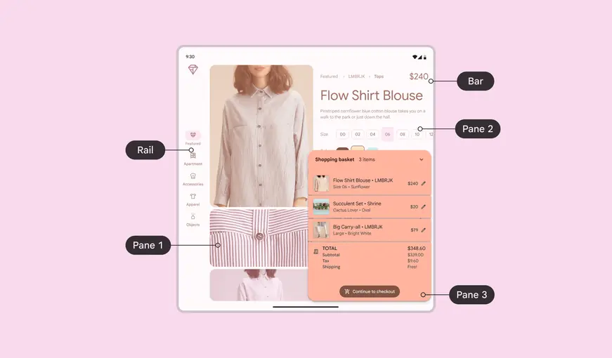
Layering panes helps people focus on a specific task