Loading indicator
Loading indicators show the progress of a process for a short wait time
Overview · Specs · Guidelines · Accessibility
Variants

- Loading indicator
| Variant | M3 | M3 Expressive |
|---|---|---|
| Loading indicator | -- | Available |
Configurations

- Default
- Contained
| Category | Configuration | M3 | M3 Expressive |
|---|---|---|---|
| Containment | Default | -- | Available |
| Containment | Contained | -- | Available |
Tokens & specs
Loading indicators have a single token set.
Design tokens
Token table
Machine-readable relationship table
Loading indicator tokens · 1 token set · 8 tokens · live token table · DSDB TOKEN_TABLE.68895be451a51c31
- Default context: Theme: Light · Platform: Android · Audience: 3P · Contrast: Default · iOS dark theme elevation: None · iOS weight setting: Default
- Not configurable here (group default used): Motion scheme: Standard · Font: Static · Language height: Small
- Other contexts: Theme: Dark · Contrast: Medium contrast, High contrast. "Other contexts" lists values that differ from the default when only that one context changes.
- Reference chain: aliases from the token to its source value (
token → alias → … → value). "—" means the token holds a literal value.
Loading indicator · md.comp.loading-indicator · 8 tokens
For loading indicators.
| Group | Token | Type | Reference chain | Resolved value | Other contexts |
|---|---|---|---|---|---|
| Color | md.comp.loading-indicator.container.color (deprecated) | Color | md.sys.color.secondary-container → md.ref.palette.secondary90 | #E8DEF8 | Dark: #4A4458 via md.ref.palette.secondary30Medium contrast: #625B71 via md.ref.palette.secondary40High contrast: #4A4458 via md.ref.palette.secondary30 |
| Color | md.comp.loading-indicator.contained.container.color | Color | md.sys.color.primary-container → md.ref.palette.primary90 | #EADDFF | Dark: #4F378B via md.ref.palette.primary30Medium contrast: #6750A4 via md.ref.palette.primary40High contrast: #4F378B via md.ref.palette.primary30 |
| Color | md.comp.loading-indicator.contained.active-indicator.color | Color | md.sys.color.on-primary-container → md.ref.palette.primary30 | #4F378B | Dark: #EADDFF via md.ref.palette.primary90Medium contrast: #FFFFFF via md.ref.palette.primary100High contrast: #FFFFFF via md.ref.palette.primary100 |
| Color | md.comp.loading-indicator.active-indicator.color | Color | md.sys.color.primary → md.ref.palette.primary40 | #6750A4 | Dark: #D0BCFF via md.ref.palette.primary80Medium contrast: #4F378B via md.ref.palette.primary30High contrast: #381E72 via md.ref.palette.primary20 |
| Size | md.comp.loading-indicator.container.height | Length | — | 48dp | — |
| Size | md.comp.loading-indicator.container.width | Length | — | 48dp | — |
| Size | md.comp.loading-indicator.active-indicator.size | Length | — | 38dp | — |
| Shape | md.comp.loading-indicator.container.shape | Shape | md.sys.shape.corner.full | Circular (fully rounded) | — |
Anatomy

- Active indicator
- Container
Color
Default
Color values are implemented through design tokens. For designers, this means working with color values that correspond with tokens; in implementation, a color value will be a token that references a value.
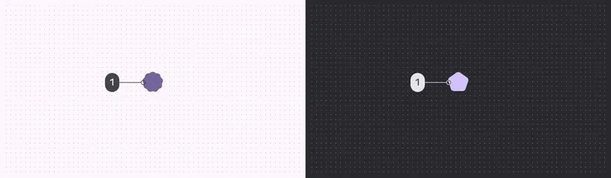
Loading indicator color roles used for light and dark schemes:
- Primary
Contained
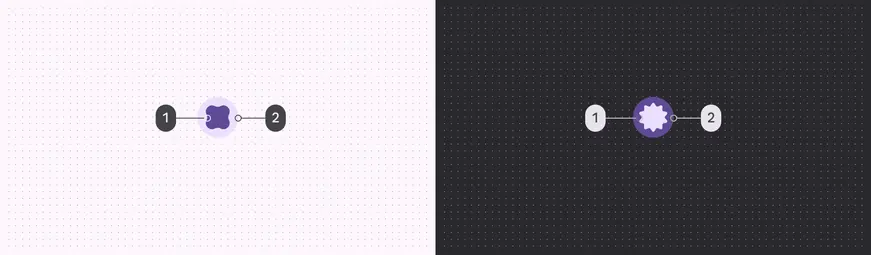
Contained loading indicator color roles used for light and dark schemes:
- On primary container
- Primary container
Measurements

To ensure sufficient margins, the size is 48dp while the shape container is 38dp