---
url: /components/loading-indicator/specs.md
description: Loading indicators show the progress of a process for a short wait time
---
# Loading indicator
Loading indicators show the progress of a process for a short wait time
[Overview](overview.md) · **Specs** · [Guidelines](guidelines.md) · [Accessibility](accessibility.md)
## Variants

1. Loading indicator
| Variant | M3 | M3 Expressive |
| ----------------- | :-: | :-----------: |
| Loading indicator | -- | Available |
## Configurations

1. Default
2. Contained
| Category | Configuration | M3 | M3 Expressive |
| ----------- | ------------- | :-: | :-----------: |
| Containment | Default | -- | Available |
| Containment | Contained | -- | Available |
## Tokens & specs
Loading indicators have a single token set.
::: token-table token-table-68895be451a51c31-07386fca
**Loading indicator tokens** · 1 token set · 8 tokens · [live token table](https://m3.material.io/components/loading-indicator/specs) · DSDB `TOKEN_TABLE.68895be451a51c31`
* Default context: Theme: Light · Platform: Android · Audience: 3P · Contrast: Default · iOS dark theme elevation: None · iOS weight setting: Default
* Not configurable here (group default used): Motion scheme: Standard · Font: Static · Language height: Small
* Other contexts: Theme: Dark · Contrast: Medium contrast, High contrast. "Other contexts" lists values that differ from the default when only that one context changes.
* Reference chain: aliases from the token to its source value (`token → alias → … → value`). "—" means the token holds a literal value.
**Loading indicator** · `md.comp.loading-indicator` · 8 tokens
For loading indicators.
| Group | Token | Type | Reference chain | Resolved value | Other contexts |
| --- | --- | --- | --- | --- | --- |
| Color | `md.comp.loading-indicator.container.color` (deprecated) | Color | `md.sys.color.secondary-container` → `md.ref.palette.secondary90` | `#E8DEF8` | Dark: `#4A4458` via `md.ref.palette.secondary30`
Medium contrast: `#625B71` via `md.ref.palette.secondary40`
High contrast: `#4A4458` via `md.ref.palette.secondary30` |
| Color | `md.comp.loading-indicator.contained.container.color` | Color | `md.sys.color.primary-container` → `md.ref.palette.primary90` | `#EADDFF` | Dark: `#4F378B` via `md.ref.palette.primary30`
Medium contrast: `#6750A4` via `md.ref.palette.primary40`
High contrast: `#4F378B` via `md.ref.palette.primary30` |
| Color | `md.comp.loading-indicator.contained.active-indicator.color` | Color | `md.sys.color.on-primary-container` → `md.ref.palette.primary30` | `#4F378B` | Dark: `#EADDFF` via `md.ref.palette.primary90`
Medium contrast: `#FFFFFF` via `md.ref.palette.primary100`
High contrast: `#FFFFFF` via `md.ref.palette.primary100` |
| Color | `md.comp.loading-indicator.active-indicator.color` | Color | `md.sys.color.primary` → `md.ref.palette.primary40` | `#6750A4` | Dark: `#D0BCFF` via `md.ref.palette.primary80`
Medium contrast: `#4F378B` via `md.ref.palette.primary30`
High contrast: `#381E72` via `md.ref.palette.primary20` |
| Size | `md.comp.loading-indicator.container.height` | Length | — | `48dp` | — |
| Size | `md.comp.loading-indicator.container.width` | Length | — | `48dp` | — |
| Size | `md.comp.loading-indicator.active-indicator.size` | Length | — | `38dp` | — |
| Shape | `md.comp.loading-indicator.container.shape` | Shape | `md.sys.shape.corner.full` | `Circular (fully rounded)` | — |
:::
## Anatomy

1. Active indicator
2. Container
## Color
### Default
Color values are implemented through [design tokens](../../foundations/design-tokens/overview.md "Design tokens are the building blocks of all UI elements. The same tokens are used in designs, tools, and code."). For designers, this means working with color values that correspond with tokens; in implementation, a color value will be a token that references a value.
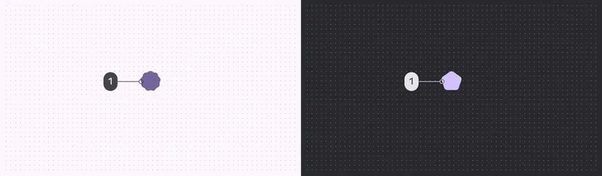
Loading indicator color roles used for light and dark schemes:
1. Primary
### Contained
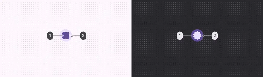
Contained loading indicator color roles used for light and dark schemes:
1. On primary container
2. Primary container
## Measurements

To ensure sufficient margins, the size is 48dp while the shape container is 38dp