Icons
Icons are small symbols to easily identify actions and categories
Overview · Designing icons · Applying icons
Design principles
Icons are an essential element of any interface, packing an informative punch into a small form factor. They’re designed to be simple, modern, friendly, and sometimes quirky. To ensure consistency and readability, their limited size means that each icon must strictly adhere to guidance while still expressing essential characteristics.
Do

Simplify icons for greater clarity and legibility
Don't

Don’t be overly literal. Avoid complex icons.
Do

Make icons graphic and bold
Don't

Don’t use delicate or loose organic shapes
Do

Use and maintain a consistent visual style throughout one icon set
Don't

Avoid mixing styles for one icon set
Icon sizes and layout
Standard (Baseline) icon size
Standard icons are displayed as 24dp x 24dp. For pixel-perfect accuracy, create icons for viewing at 100% scale.
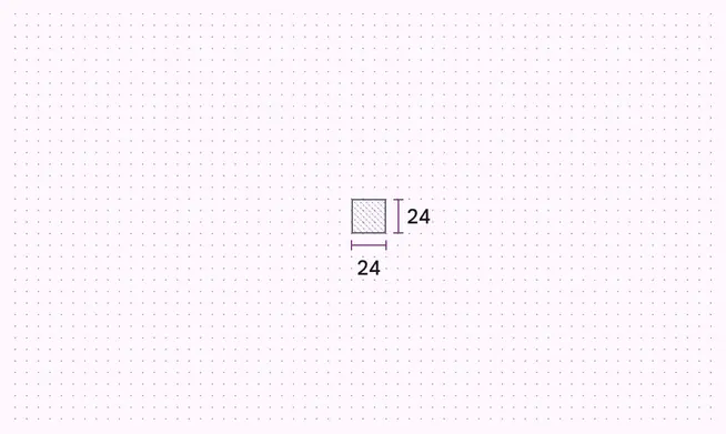
24dp grid at 100% scale
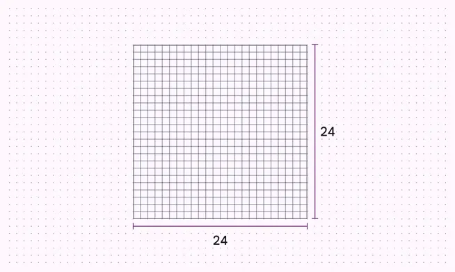
24dp grid at 1000% scale
Additional optical icon sizes
Icons support additional sizes: 20dp, 40dp, and 48dp, with 20dp primarily for desktop, dense layouts, and small scale visuals, and 40dp and 48dp optimized for display or headline type, plus larger screen sizes.
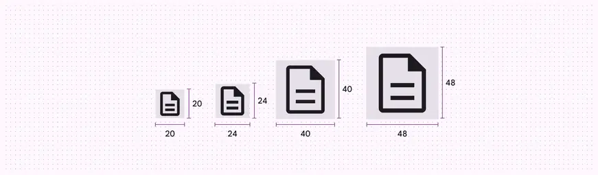
Supported icon sizes: 20dp, 24dp, 40dp, and 48dp
Standard (Baseline) icon layout
Icon content should remain inside of the live area, which is the region of an image that is unlikely to be hidden from view (such as an area where sidebars appear upon scrolling).
If additional visual weight is needed, content may extend into the padding between the live area and the trim area (the complete size of a graphic). No parts of the icon should extend outside of the trim area.
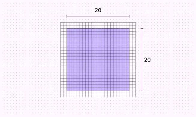
Live area
Icon content is limited to the 20dp x 20dp live area, with 2dp of padding around the perimeter
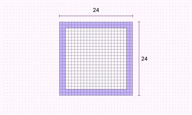
Padding
2dp of padding surrounds the live area
Do

Icon content is limited to the 20dp-x-20dp live area, with 2dp of padding around the perimeter
Caution
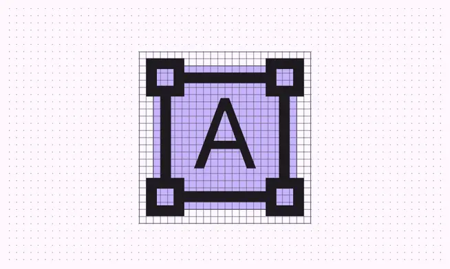
If additional visual weight is needed, content may extend into the padding between the live area and the trim area
Don't
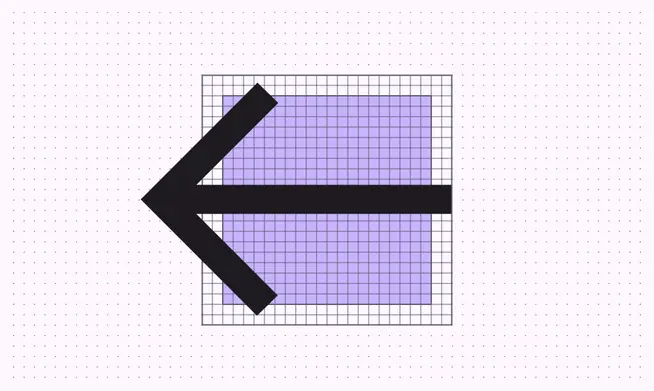
No parts of the icon should extend outside of the trim area
Grid and keyline shapes
Icon design template
If your design requires an icon that isn’t covered by the over 2,000 variations in Google Font’s icon library, you may want to create your own. Download this 24dp keyline template* (ZIP file) to design custom icons in Adobe Illustrator.
*This template is available under Apache 2.0. By downloading this file, you agree to the Google Terms of Service. The Google Privacy Policy describes how data is handled in this service.
Icon grid and keyline
The icon grid establishes clear rules for the consistent, but flexible, positioning of graphic elements.
Keyline shapes are the foundation of the grid. By using these core shapes as guidelines, you can maintain consistent visual proportions across system icons.
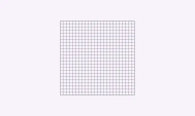
Grid
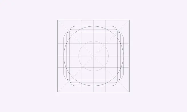
24dp grid at 1000% scale
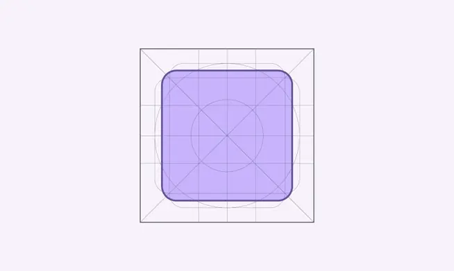
Square height and width, 18dp
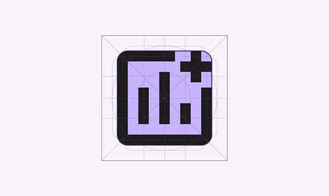
Icon drawn using square keyline
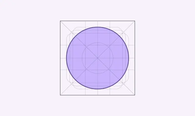
Circle diameter, 20dp
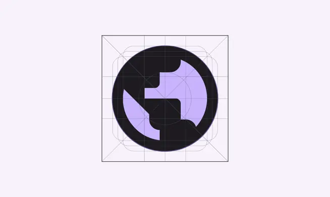
Icon drawn using circle keyline
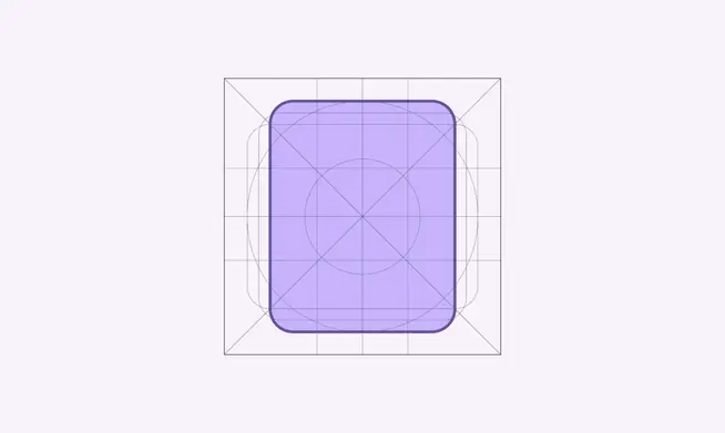
Vertical rectangle height, 20dp, and width, 16dp
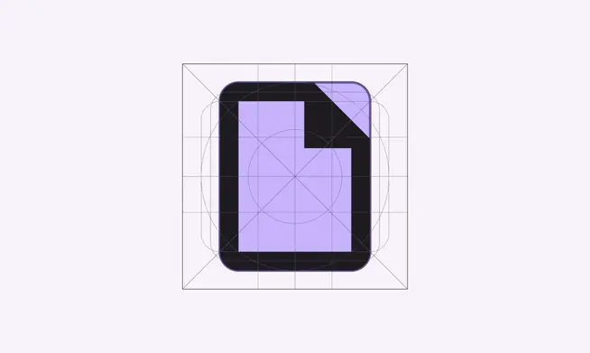
Icon drawn using vertical rectangle keyline
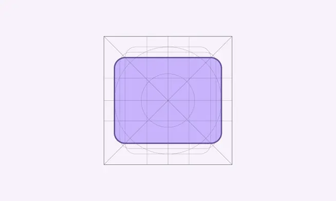
Horizontal rectangle height, 16dp, and width, 20dp

Icon drawn using horizontal rectangle keyline
Do
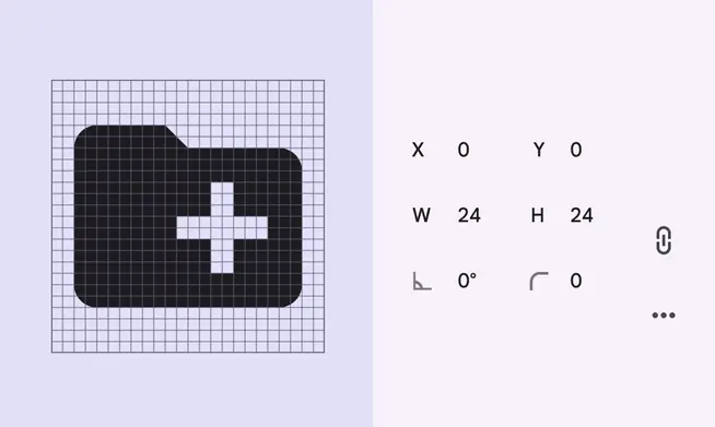
Position icons “on pixel” within the icon grid
Don't
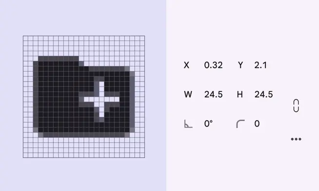
Don’t place the icon on a coordinate that isn’t “on pixel”
Icon metrics
Anatomy
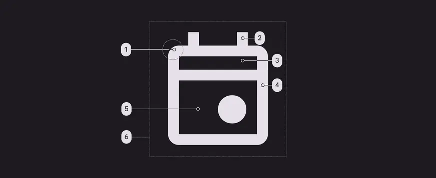
- Corner
- Stroke terminal
- Counter stroke
- Stroke
- Counter area
- Bounding area
Corners
Corner radii are 2dp by default. For the outlined style symbols, interior corners are square, not rounded. For shapes 2dp wide or less, stroke corners shouldn’t be rounded.
For the rounded style symbols, both exterior and interior corner radii are rounded and for the sharp style symbols, both exterior and interior corners radii reduce from 2dp to 0dp.
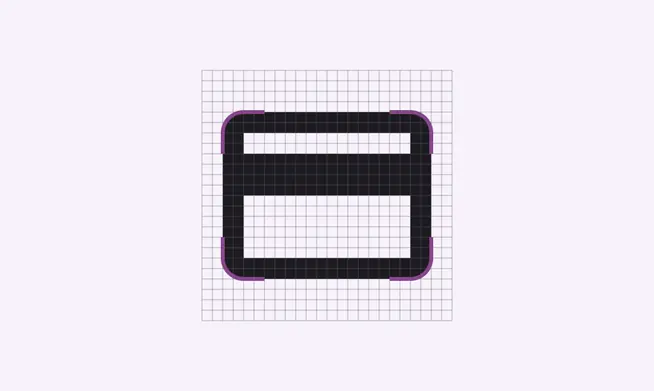
Exterior corners with 2dp corner radii
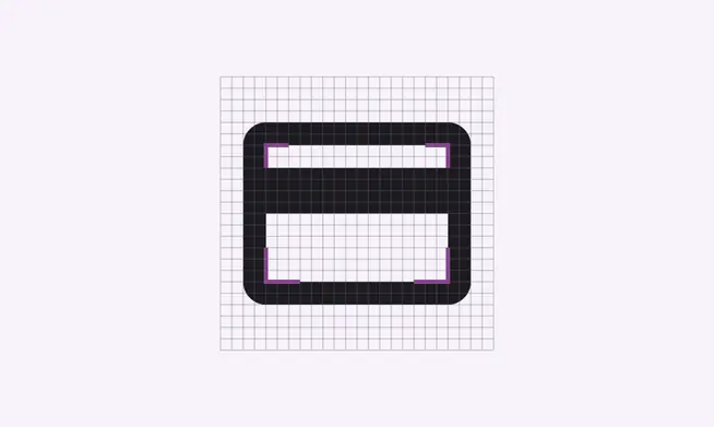
Interior corners shouldn’t be rounded
Caution
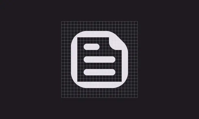
Overly round corners reduces the symbol’s legibility
Don't

Don’t use inconsistent corner radii
Weight and stroke
The recommended stroke weight for icons is 2dp or the regular weight (400), which includes curves, angles, and both interior and exterior strokes. Material Symbols can provide a range of weights between thin (100) and bold (700).
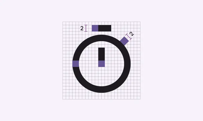
Timer icon at the regular stroke weight (400)
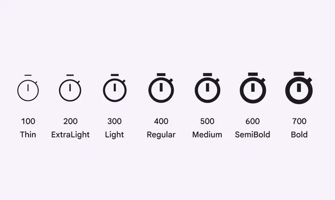
Timer symbol shown across a 100–700 weight range
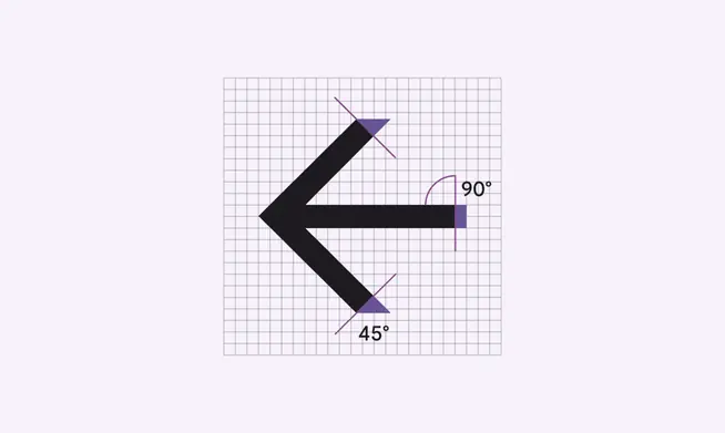
Stroke terminal on an icon
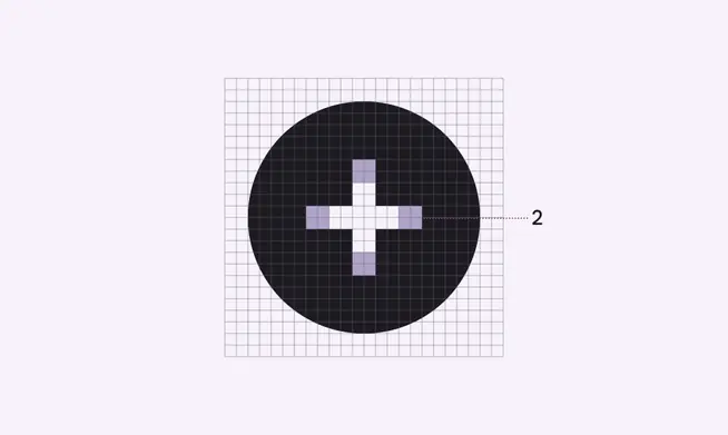
Counter stroke on an icon

Use consistent stroke weights and squared stroke terminals
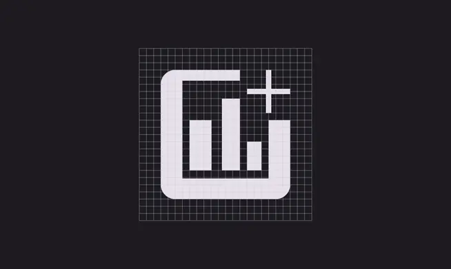
Don’t use inconsistent stroke weights or rounded stroke terminals
Complex icon shapes
If an icon requires complex details, subtle adjustments can be made to improve its legibility. These adjustments are referred to as optical corrections. Any optical correction should use the geometric forms on which all other icons are based, without skewing or distorting those shapes.
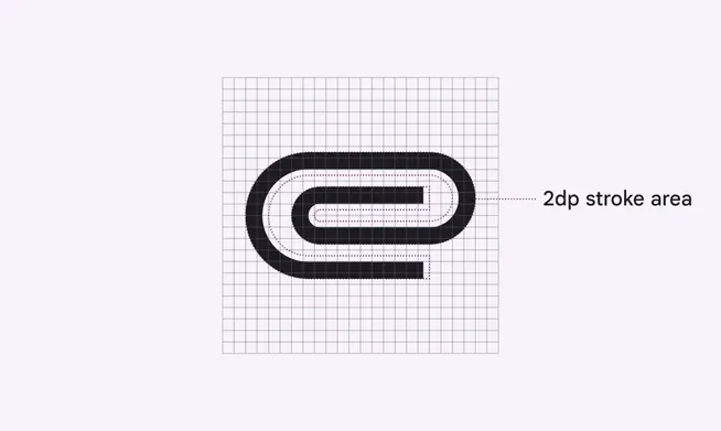
The paperclip icon uses 1.5dp of the possible 2dp stroke area to fit multiple curves within the 24dp x 24dp icon space
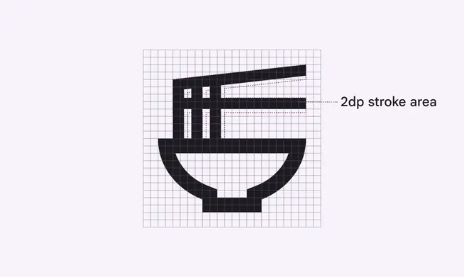
The ramen bowl icon uses 1.5dp stroke and 2dp stroke together within the 24 x 24dp icon space
Do

Make icons face forward
Don't

Don’t tilt, rotate, or make icons appear dimensional