Advanced customizations
Apply, define, or adjust colors to create a fine-tuned, unique color experience
Overview · Apply colors · Define new colors · Adjust existing colors
You can apply colors in places or ways that aren’t provided by default.
Combine multiple color schemes
Use multiple color schemes in the same app experience, such as a baseline scheme combined with a dynamic content-based scheme.
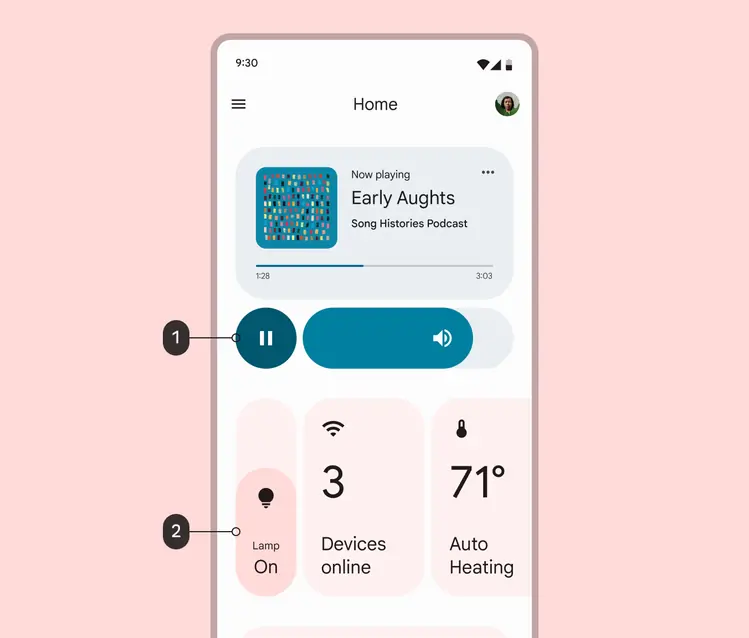
This smart home control screen combines two color schemes:
- A teal content-based color scheme from the local album art, applied to media controls
- A red user-generated color scheme from the user's wallpaper, applied to the rest of the UI
Why
If your app features content-rich moments, such as a media player, it can enhance a user’s experience by applying local color based on that content.
How
- Start from a baseline or user-generated dynamic scheme to create a consistent color foundation in your app.
- On top of this foundation, map content-based color roles to contained spaces to emphasize or celebrate content. For example, a music app might derive color from a specific album’s artwork to build upon the personal connection to a music library.
Best practices
- Consider where content exists in the UI and where content-based color can enhance a person’s experience. Your existing app structure can suggest contained areas for content-based color to live.
- Build hierarchy & direct attention: When many types of information and actions share a screen, use content-based color to add hierarchy and draw attention to the content.
- Link and associate content on a screen: In lists and collections of repeated items that benefit from differentiation, content-based color can help associate related elements. This helps people quickly distinguish and pair related information, such as a list item and its associated action.
- Immerse users in content color: Full-screen content-based color moments can orient users within a content-driven experience, such as a media control or a purchase flow.
- Pair content-based color with its source content: Keep the source for content-based color visible on a screen using the content color. This way users are shown where a content-based color originates. Avoid applying content-based color in spaces where the content itself isn’t visible.
- Limit the number of color source types per screen: Limit a screen to two color schemes from different source types. Too many color schemes on the same screen may lead to confusion and visual disarray. For example, a baseline or user-generated color scheme can be combined with one type of on-screen content (such as album art).
- Don’t replace semantic colors: Use caution when applying content-based color in places where a semantic color or conventional color meaning is important for usability. For example, a common red error message or a common green positive action shouldn’t be replaced with dynamic content-based color because it may interfere with someone’s understanding.
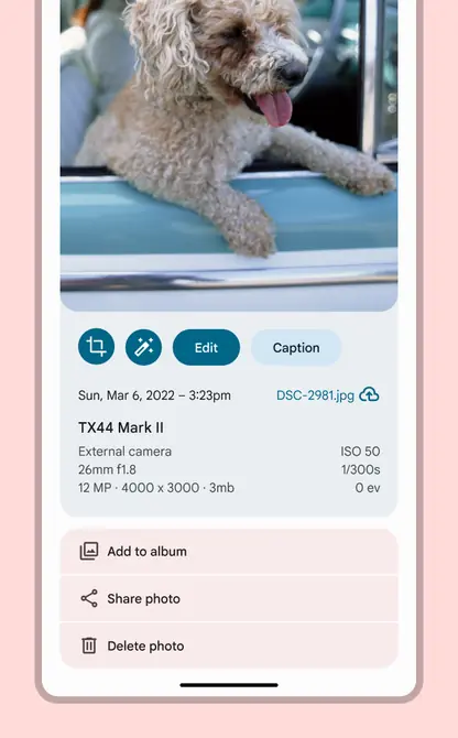
When many types of information and actions share a screen, use content-based color to add hierarchy and draw attention to the content. This screen uses a content-based scheme sourced from the photo to draw attention to the photo editing controls.

In lists and collections of repeated items that benefit from differentiation, content-based color can help associate related elements. This helps people quickly distinguish and pair related information, such as a list item and its associated action. In this list of activities, each card is colored with a scheme sourced from its main image.
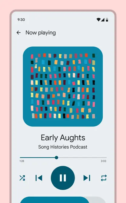
Full-screen content-based color moments can orient users within a content-driven experience, such as a media control or a purchase flow. This media control screen is colored entirely in a scheme sourced from the in-context album art.
Map or remap colors on UI elements
You can change a component’s default color mapping, or apply colors to your own custom components.
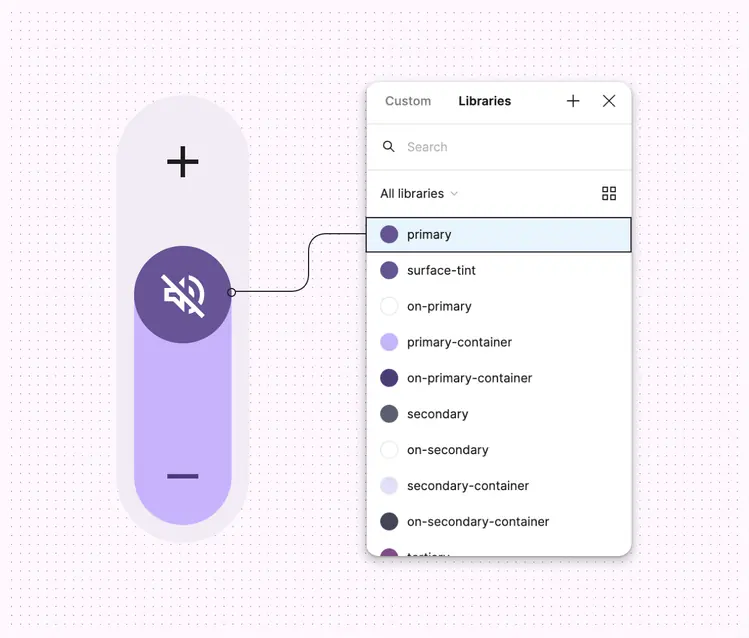
Colors can be remapped on existing Material components, or can be mapped as desired to custom-built components, such as this unique volume slider.
Why
You want to map colors to a custom-built component or change a Material Component’s default color mapping to improve its function (such as visual contrast) or style.
How
Choose an appropriate color role based on how the color is used (see color roles) and how well the role supports your intended design expression.
Design
- In Figma, select the component or element you want to remap so that you see its colors in the Design panel on the right of the screen
- To remap a color, hover on the color row in the Design panel and select the Style icon (four dots). This opens a selection dialog.
- Search for your theme name to see the available color roles
- Select the color role that most closely matches that color's use case in the component. For example, the background color of a component could be replaced with the surface color role and the color for text or icons could be on surface. See Color roles for more information on what color to use where.
- Select Use style to apply that color to the selected objects
- Repeat until all colors in the component have been replaced with color roles from your scheme
Best practices
- Make sure to use color roles that support Material's contrast requirements for the component. Any color roles starting with "on-" are guaranteed to have sufficient contrast with the corresponding color role. Other color role pairs may not meet the 4.5:1 (small text) and 3:1 (large text) Material contrast requirements.
- If you’re applying a dynamic scheme, test how the color on the component appears under different themes (such as light and dark; red, yellow, green and blue) to ensure it looks as desired in dynamic color
- Always apply color roles rather than static values or tonal palette values, as these colors will break with light and dark themes, contrast control, and other features. If the color in a role does not meet your needs, you can define new colors or adjust existing colors.