Advanced customizations
Apply, define, or adjust colors to create a fine-tuned, unique color experience
Overview · Apply colors · Define new colors · Adjust existing colors
You can control the color algorithm’s output to adjust the appearance of colors within the roles provided by default.
Define your own baseline scheme
You can input colors to define your own baseline scheme.
Why
You may want to define your own baseline scheme so your app’s colors stay static (ie. does not change with dynamic color), such as to reflect your brand colors. By providing your own custom input colors for the primary, secondary, tertiary, and neutral colors in the scheme, Material will provide back the scheme’s regular color roles with values derived from your reference colors.
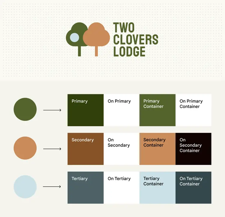
You can input your own colors to produce a static baseline scheme. In this example, colors from the logo are inputted to produce primary, secondary, and tertiary colors.
How
Using the Material Theme Builder, input your own colors for primary, secondary, tertiary, neutral, and neutral variant. The Theme Builder will generate a color scheme with values based on your inputs, and the given color roles can be used in the same manner as those from any other Material scheme.
Best practices
- Conventionally, primary and tertiary colors are the most visually prominent in the scheme, with tertiary appearing complementary to primary by changing its hue. Secondary, neutral variant, and neutral colors match primary in hue but are progressively less chromatic in that order. Input your colors into the appropriate category to maintain similar relationships as designed by Material, and ensure expected and visually pleasing results when those colors are mapped to components.
- If the colors provided back from your input color appear differently than expected, you can enable or disable color fidelity. Color fidelity is a feature that adjusts colors’ tones to match that of your input color.
- If the 26+ standard color roles do not meet your needs, you may need to define custom color roles.
Define your own dynamic scheme
You can define color algorithm rules to produce your own dynamic scheme.
Why
Control the appearance of your app’s colors while respecting dynamic color. For example, you may want your app to match the user’s wallpaper theme, but appear more vibrant than the default dynamic theme colors.
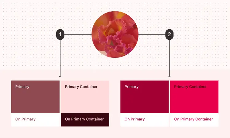
You can define your own dynamic scheme to reflect a user's wallpaper but control other aspects such as the colors' vibrancy.
- Colors produced dynamically from a user's red wallpaper following default specs
- Colors produced dynamically from the same wallpaper following custom-defined specs
How
- Material generates the color scheme by following hue and chroma values specified for each group of colors (primary, secondary, tertiary, neutral, and neutral variant). For more information, see how the system works. To adjust the appearance of these colors and produce your own dynamic scheme, you must provide your own hue and chroma values for each of these color groups.
- Once these values are known, you may define your own scheme variant and call Material Color Utilities (MCU) to dynamically generate the scheme and provide color values for each role in the scheme.
Best practices
- Defining custom color roles should be considered only if you cannot achieve your desired colors with other Material color solutions.
- If the colors provided back from your input color appear differently than intended, you can enable or disable color fidelity. Color fidelity is a feature that adjusts colors’ tones to match that of your input color.
- If the color roles provided by Material out of the box do not meet your needs, you may need to define custom color roles for greater control over their appearance.
Use color fidelity
You can apply color fidelity to make scheme colors better match your input colors.
Why
Material scheme colors are mapped to tones (lightness or darkness) to achieve visually accessible color pairings with sufficient contrast between foreground and background elements. In some cases, these tones can prevent colors from appearing as intended, such as when a color is too light to appear vibrant. Color fidelity is a feature that adjusts tones in these cases to produce the intended visual results without harming visual contrast.
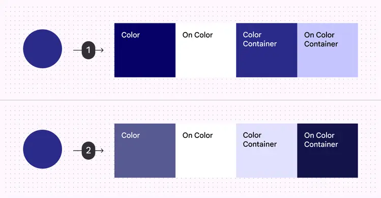
Color fidelity adjusts tones in color roles to produce the closest match to your input color. In this example, colors are produced from a dark purple input with and without color fidelity.
- Color roles produced with color fidelity
- Color roles produced without color fidelity
How
- In the Material Theme Builder, you can toggle the “match color” option on your input color to enable or disable fidelity. By default, fidelity is enabled when you use Theme Builder to create a custom baseline scheme or define static colors.
- In code, you can flag color roles in your scheme with a boolean which will enable or disable fidelity for those colors.
Best practices
- When producing a custom baseline scheme or defining static colors, you may wish to toggle fidelity on and off to determine which setting better suits your desired design.
- Because color fidelity adjusts tones (lightness or darkness of colors), to ensure accessible contrast, remember to pair appropriate colors roles together, such as a background color with its corresponding foreground “on” color.
Harmonize colors
In dynamic schemes, you can automatically adjust the hue of static colors so they look better alongside the scheme’s primary color.
Why
Static colors may visually clash with a scheme’s dynamically changing colors. To improve visual harmony, Material provides an optional ‘harmonize’ function that slightly adjusts static colors to look better in dynamic schemes.
Colors that are closer in hue appear more pleasing together than colors with hues farther apart. Based on this principle, harmonization adjusts the hue of static colors, making them closer to the hue of the scheme’s primary color.
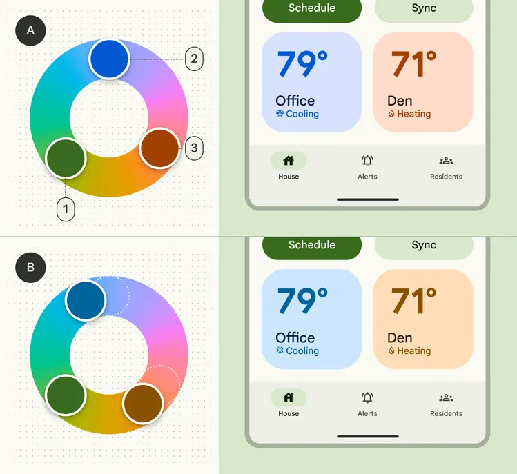
In this example, the color scheme has:
- Green as the primary color
- Static blue
- Static orange
When harmonized, those static colors change hue, moving closer to the primary color on the color wheel. The resulting colors appear more visually pleasing together because they are closer in hue.
To preserve the semantic meaning of static colors (such as a red to communicate errors), harmonization limits the amount that a color’s hue can change. Harmonized colors will become warmer or cooler in hue without appearing like another type of color.

To preserve the semantic meaning of colors, harmonization limits the amount that a color’s hue can change. For example, a red color (1) can become cooler (2) or warmer (3) in hue, but will not appear purple or orange.
How
- In the Material Theme Builder, you can toggle harmonization on and off within the overflow menu for each static color you have added to the scheme.
- In code, use the ‘Blend’ function from Material Color Utilities to harmonize colors
Best practices
- Harmonization will adjust a static color differently depending on the scheme’s primary color, so check the results under a variety of schemes to see the range of how they can appear in dynamic color.
- Don’t harmonize colors whose appearance should stay absolutely consistent, such as brand colors.