Scaffold
A fundamental UI design structure that provides a standard platform for assembling key components
Overview · Bars · Rails · Panes
Panes
All layouts are made up of 1–3 panes. The type of layout and amount of panes you choose should depend on the breakpoint (previously window size classes) and the type of product being built.
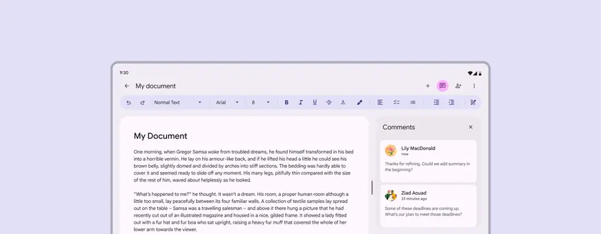
Layouts often include multiple panes that work together
All layouts are made up of 1–3 visible panes. The type of layout and amount of panes you choose should depend on the breakpoint and the type of product you're building.
| Breakpoint | Recommended pane total | Other pane totals |
|---|---|---|
| Compact | 1 | -- |
| Medium | 1 | 2 |
| Expanded | 2 | 1 |
| Large | 2 | 1 |
| Extra-large | 2 | 1, 3 |
Panes can be:
- Fixed: Width doesn’t change based on available space
- Flexible: Width changes based on available space, and can grow and shrink
All layouts need at least one flexible pane.
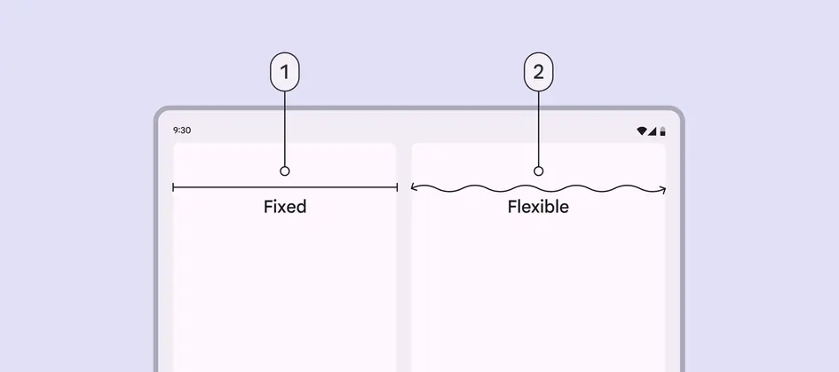
- Fixed pane
- Flexible pane
Panes can be permanent or temporary. Temporary panes can appear and be dismissed when necessary, affecting the layout and size of other panes.
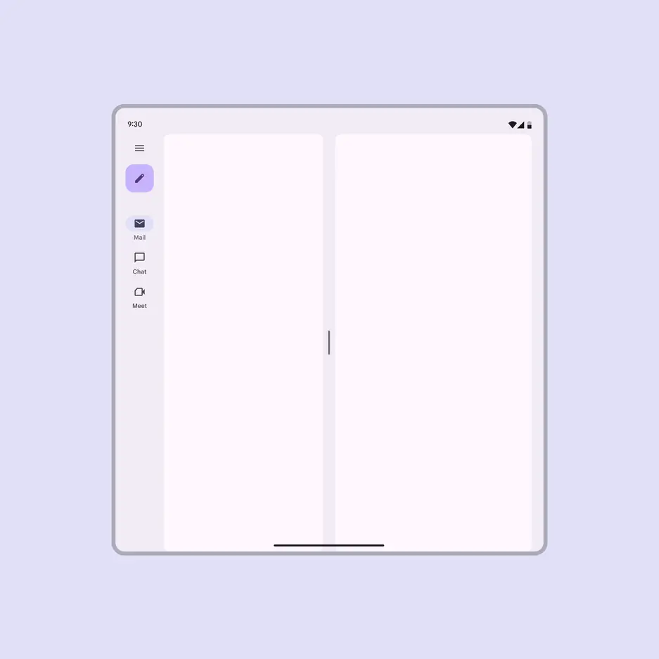
Panes can be displayed permanently side by side
Temporary panes can be dismissed
Single-pane layouts
Single-pane layouts use one flexible pane that extends to fit the available space in a layout’s width. They can be used at any breakpoint, but are recommended for compact and medium.
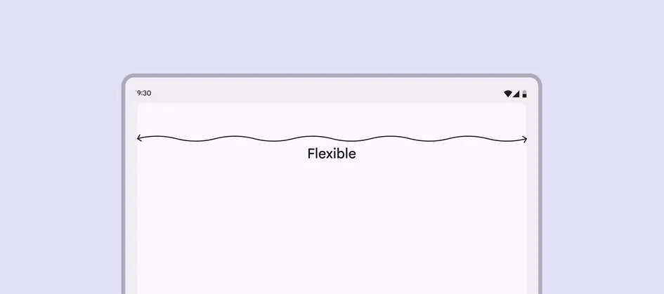
A single flexible pane adapts to fit any breakpoint
Two-pane layouts
Split-pane layout
A split-pane layout keeps the spacer visually centered. It’s best for foldable devices and dynamic layouts.
When a navigation rail or drawer is present, it only reduces the size of one pane. The other pane remains at 50% of the window width.
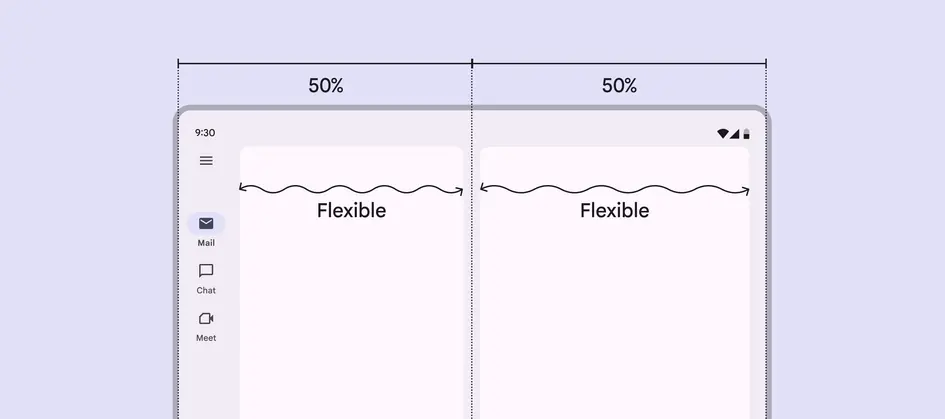
The navigation and first pane should be 50% of the window width to keep the spacer centered
With a navigation bar, or no navigation, both panes span 50% of the window width by default.
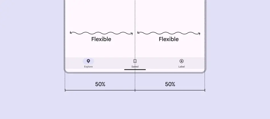
With no navigation rail visible, split-pane layouts set each pane to 50% width by default
Fixed-and-flexible layout
This layout is common for expanded, large, and extra-large breakpoints. The fixed-and-flexible panes can appear in whichever order is best for the content.
The fixed pane is often temporary, and used for side sheets or lists with light information density.
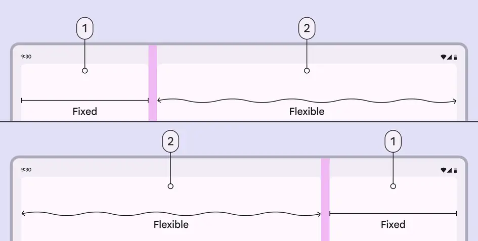
- Fixed pane
- Flexible pane
Three-pane layouts
While less common, the extra-large breakpoint supports using a standard side sheet as a third pane. When the side sheet is present, the expanded navigation rail can remain visible, change into a collapsed navigation rail, or hide completely. Don't use more than three panes.
Note: Fixed panes at this breakpoint are recommended to be 412dp, but side sheets have a default maximum width of 400dp.
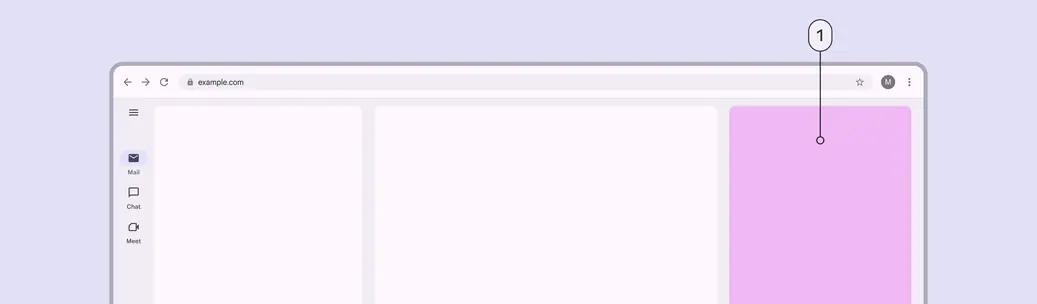
- A standard side sheet can be used as a third pane
Pane expansion & resizing
Panes can be resized, expanded, and collapsed using drag handles.
- In a split-pane layout, both flexible panes can be freely adjusted, or can snap to certain widths.
- In a fixed-and-flexible layout, the drag handle can fully collapse and expand the fixed pane. This makes it easy to switch between a single-pane and two-pane layout.
The drag handle should also toggle between layout sizes when selected. This can be a tap, double tap, or long press.
Drag handles can adjust pane size in a list-detail layout
At expanded, large, and extra-large breakpoints, two-pane layouts can be customized to snap to set widths when resized.
The recommended custom widths are:
- 360dp
- 412dp
- Split-pane with spacer centered visually
Panes can snap to custom widths when releasing the drag handle
Persistent pane resizing
The persistent resizing behavior remembers a person's pane width preference. Use this for most resizable layouts.
Pane widths persist even after a person closes the app
The width persists even after a breakpoint change. This means that if a two-pane layout is collapsed to one pane at any size, it’ll remain collapsed even when changing breakpoints.
When a two-pane layout is resized to a single full-width pane, that pane should remain at full-width after switching breakpoints
Temporary pane resizing
The temporary resizing behavior doesn't remember a person’s preferences for pane width. This is primarily used in supporting pane layouts where resizing is uncommon.
Supporting pane layouts can have a pane drag handle to temporarily resize the secondary content
With temporary resizing, panes should always return to the default layout after the pane or product is closed and reopened. This ensures content is a suitable size for most interactions.
The pane width can be temporarily adjusted using the drag handle, but will return to the default layout
Displaying multiple panes
Multiple panes can be displayed in three ways: co-planar, floating, or docked. The layout depends on breakpoint, what the pane does, and how people interact with it:
- Co-planar: Two side-by-side panes. To stay accessible, persistent utilities like tool panels should be co-planar with primary content.
- Floating: A small pane displays above larger panes. Temporary tasks should remain floating regardless of breakpoint, such as a dialog.
- Docked: A small pane pinned to the edge of a window. For example, a bottom sheet can be docked to show additional actions.
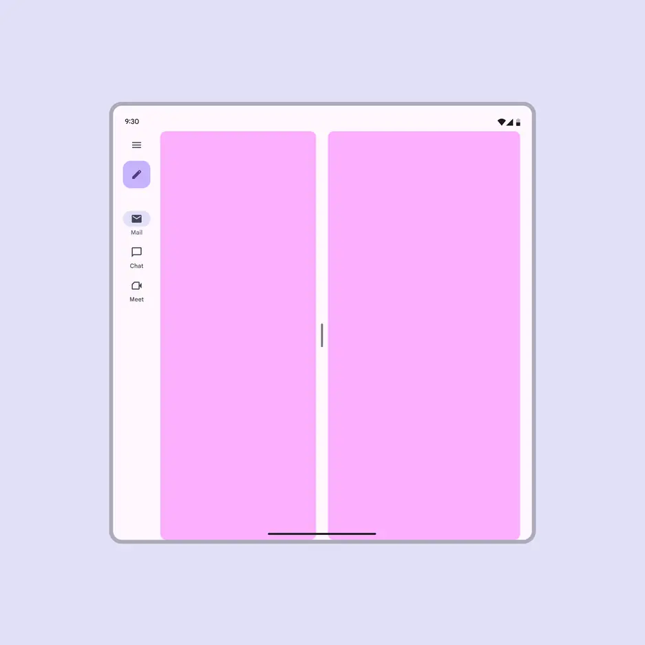
Co-planar: Panes are displayed side by side
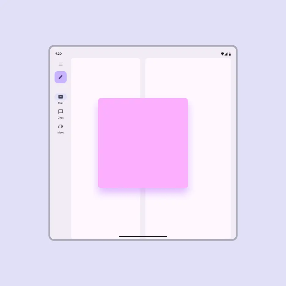
Floating: A pane is displayed above other panes or content, like a dialog
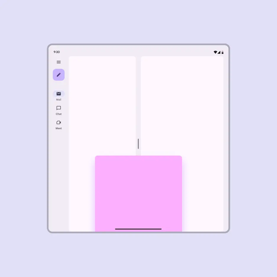
Docked: A pane is displayed above other panes and one of its edges extends beyond one side of the screen, like a bottom sheet
How panes adapt
Pane layouts can adapt using three strategies: show and hide, levitate, or reflow. When a window is resized or changes orientation, these strategies allow panes to reorganize themselves to preserve context and meaning.
Show and hide
As the breakpoint size or orientation changes, panes can enter and exit the screen or appear next to one another.
A pane can be shown or hidden depending on the available space and orientation
Levitate
Panes can be elevated above other content as floating or docked panes. This strategy helps panes appear relative to their triggers.
Floating panes:
- Appear in front of the body content
- Can be customized to be dragged or resized
When adding controls that resize or move a floating pane, provide accessible controls.
A co-planar pane can float when switching breakpoint or orientation
On large screens:
- Floating panes are the default
- The scrim behind a floating pane is optional
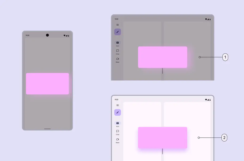
- Floating pane with a scrim
- Floating pane without a scrim
Docked panes are usually at the bottom of the window, like a bottom sheet.
At medium and expanded breakpoints, docked panes can adapt into floating panes.
A docked pane can adapt into a floating pane at medium and expanded breakpoints
Alternatively, at medium and expanded breakpoints, a docked pane can adapt into a co-planar pane.
A docked pane can also adapt into a co-planar pane at medium and expanded breakpoints
On large screens, consider changing docked panes into co-planar panes.
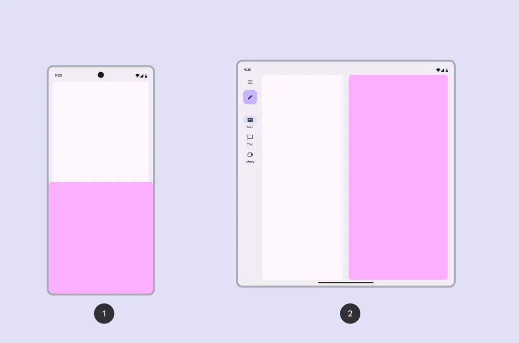
- A compact screen can have a docked pane
- On a large screen, it should change to a co-planar pane
Reflow
Panes can be reorganized on screen as the breakpoint or orientation changes, also known as reflow.
For example, in a vertical orientation, the supporting pane can move underneath the primary pane.
In a vertical orientation, the supporting pane can move below the primary pane
Reflow also applies to breakpoints. When there’s not enough horizontal space for panes, they can stack vertically instead.
Panes can change size, location, and orientation when switching screen sizes
Spatial panels
On XR devices, pane layouts can be presented in disconnected spatial panels. These panels must have clear containment to make them easy to see on any background.
The content in a spatial panel can use implicit grouping when the pane has an explicit container to distinguish it from the environment.
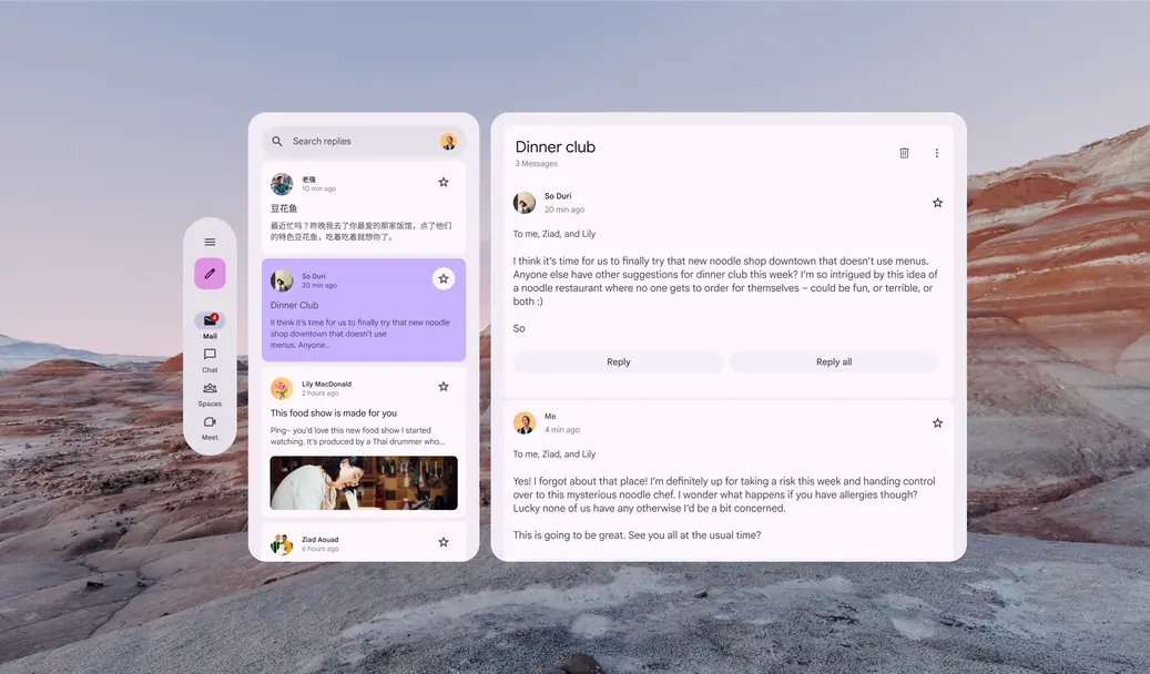
When a pane uses explicit containment, content can use implicit grouping
Accessibility considerations
Coplanar panes
- The focus order should match the visual arrangement of the panes on screen
Floating panes
Modal floating pane:
- When active, the elements behind it can’t be interacted with
- Focus moves automatically to the first element in the pane, and when the pane is closed, focus moves back to the element that triggered it, like a dialog
- If triggered automatically, focus should still move to it, but when it’s closed, focus should go to the next most logical element on screen
- It disappears when a person interacts with something behind it.
Non-modal floating pane:
- When open, other parts of a product can be interacted with
- Focus should be able to move to and from the pane
- The pane should be available in a logical reading order of the screen
Docked panes
- Have the same focus requirements as modal and non-modal panes
- The focus order should match the visual arrangement of the panes on screen