Layout overview
Layout is the visual and strategic arrangement of elements on a screen
Overview · Parts of layout · Adaptive design

- Use layout to organize all elements in a screen, signal hierarchy, and draw attention to key actions
- Adapt layouts to compact, medium, expanded, large, and extra-large breakpoints (previously window size classes)
- Build from an established canonical layout example
- Design for bidirectionality to support both left-to-right (LTR) and right-to-left (RTL) languages
- Apply consistent arrangement, sizing, and spacing to create a functional layout structure
- Material layout guidance is implemented on Android and applies to web
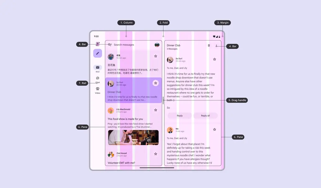
- Column
- Fold
- Margin
- Bar
- Drag handle
- Pane
- Rail
Availability & resources
| Type | Resource | Status |
|---|---|---|
| Design | M3 Design Kit (Figma) | Available |
| Design | Spacing system & tokens | Available |
| Implementation | Jetpack Compose: Canonical layouts | Available |
| Implementation | Jetpack Compose: Rulers | Available |
| Implementation | Android Views (MDC-Android): Canonical layouts | Available |
| Implementation | Jetpack Compose: Navigation3 | Available |
What's new
When creating new layouts, use the layout scaffold, start from a canonical layout example, and ensure layouts scale across breakpoints.
May 2026
Layout structure and design:
- Introduced layout scaffold, to create adaptive layouts efficiently
- New adaptive guidelines for mobile, desktop, and spatial devices
- Updated canonical layout examples
- Spacing system
Naming:
- Window size classes renamed to breakpoints
- Responsive layout renamed to adaptive design
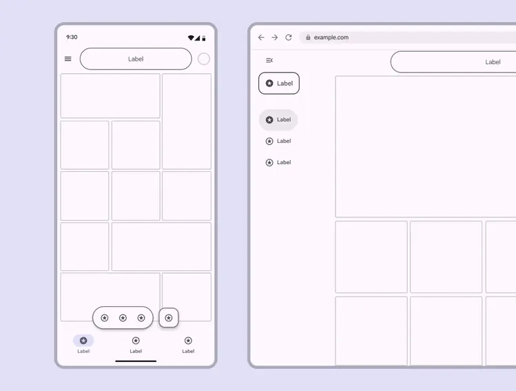
The Material layout scaffold enables layouts to adapt across different screen sizes
Layout terms
- Adaptive design: Techniques that allow an interface to dynamically respond to contexts like user preferences, device type, state, and breakpoints
- Bars: Can frame the page to help people navigate through a product, and typically house the app bar and bottom navigation bar
- Bidirectionality: A writing system that displays text and content from right-to-left (RTL)
- Breakpoints: Opinionated window sizes where a layout changes to match available space, device conventions, and ergonomics (previously window size classes)
- Column: One or more vertical blocks of content within a pane
- Drag handle: The component that resizes panes
- Fold: A flexible area of the screen or a hinge that separates two displays on foldable devices
- Gap: The space between components or elements within a container
- Margin: The space between the edge of the screen and any elements inside of it
- Multi-window mode: Enables multiple apps to share the same screen simultaneously
- Pane: A layout container that houses other components and elements within a single app. A pane can be fixed, flexible, floating, or semi-permanent.
- Rails: The perimeter space surrounding panes that holds key elements such as navigation rails, toolbars, and pane control
- Right-to-left (RTL) language: Languages written and read right-to-left, such as Arabic, Hebrew, and Farsi, used by over 2 billion people
- Rulers: An opinionated set of global alignment lines that help organize building blocks in a layout
- Safety region: Zones reserved for system UI elements outside the application space, such as status bar or gesture bar
- Scaffold: A fundamental UI design structure that provides a standard platform for assembling key screen components
- Spacer: The space between two panes on a foldable device