Grids & spacing
Grids and spacing organize content and actions for any layout
Overview · Grids · Spacing · Density
- Grids create a consistent foundation and adapt across breakpoints (previously window size classes)
- Use spacing to group related information and direct people’s attention to key actions
- Density helps people see and compare more information in data-heavy views
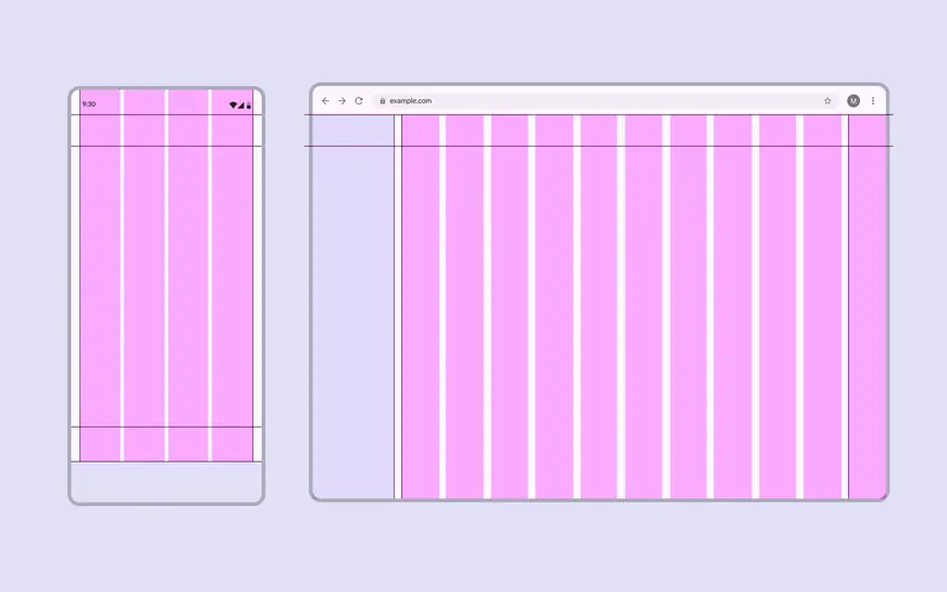
Layouts in Material are based on a grid that adapts across all screen sizes
Availability & resources
| Type | Resource | Status |
|---|---|---|
| Design | M3 Design Kit (Figma) | Available |
| Design | Spacing system & tokens | Available |
| Implementation | Jetpack Compose: Rulers | Available |
What’s new
May 2026
- How to use grids and rulers to adapt layouts across devices
- Expressive spacing guidelines
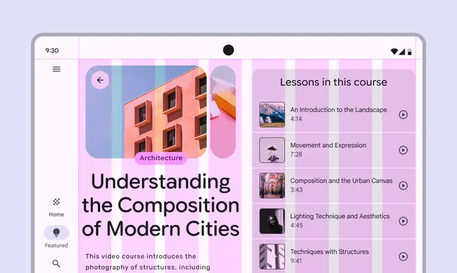
As screen size increases, additional columns allow for a richer layout