Grids & spacing
Grids and spacing organize content and actions for any layout
Overview · Grids · Spacing · Density
- Layouts in Material are based on a grid that adapts across all breakpoints (previously window size classes)
- Parts of the layout scaffold like rails and panes are positioned on this grid to create consistent adaptive layouts
- The structure and spacing values used in a grid can add personality to a product’s layout
How to use grids
Start with placing grid columns
Grids adapt across breakpoints. As the size increases, column count, width, and spacing change as well.
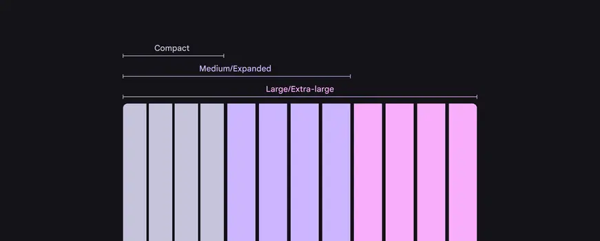
The number and size of columns changes based on breakpoints
When moving between sizes, column count may increase to show more content or controls.
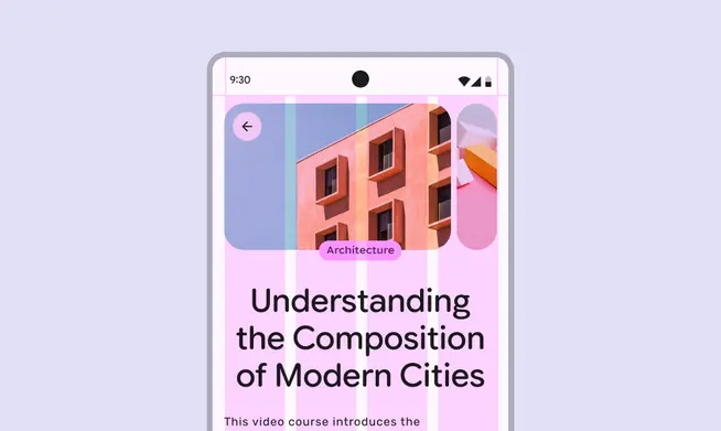
On compact screens, fewer columns are used to create a focused layout
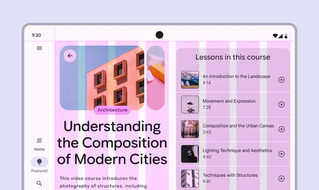
As screen size increases, for example when a foldable screen is unfolded, additional columns allow for a richer layout
Place bars & rails
Populate regions of the layout scaffold that are closest to the edges of the screen’s usable space first. This may include:
- Bars like the navigation bar and rail
- Components like toolbars and app bars
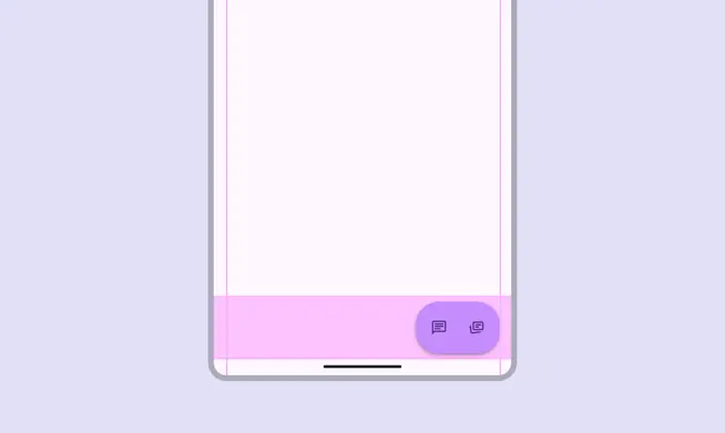
The bar region can contain a toolbar
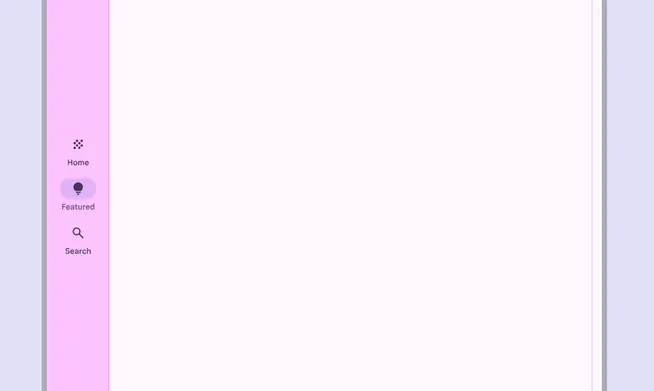
The rail region on larger screens usually contains a navigation rail
Place panes
Next, populate the main region of the screen with panes with content and components, based on available space and structure.
See the canonical layout examples for ideas on which panes are appropriate for a product.
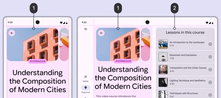
- Primary pane
- Supporting pane
Rulers & alignment
Rulers are a set of recommended global alignment lines that help create consistent focal points in a product, while keeping content and components consistently aligned.
How to implement rulers in Compose
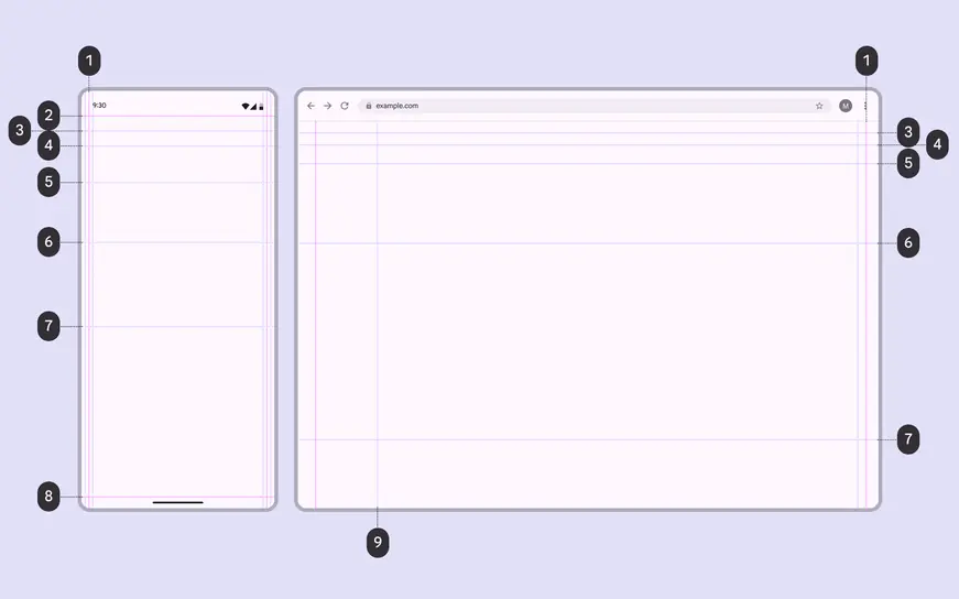
- Margin
- Bar or safety region
- Title
- Content 1
- Content 2
- Content 3
- Content 4
- Bar or safety region
- Rail
Bar & safety rulers
Bar and safety rulers reserve space for system UI elements like the status bar and gesture navigation.
They ensure actionable content like app bars aren’t covered by system UI.
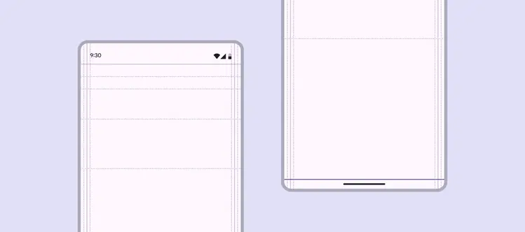
Bar and safety rulers align to the edges of a screen’s usable space, providing a reference for where system UI like the status bar or gesture navigation appear
Title rulers
The title ruler creates consistency for the screen’s title, aligning the text, icons, and other components in an app bar.
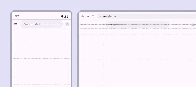
The title ruler aligns with the title in an app bar
Content rulers
Use content rulers to align and anchor key content, such as headlines and carousels.
- First content ruler: Emphasizes major blocks like hero images, headlines, or primary components
- Secondary rulers: Determine where supplementary text or actions begin
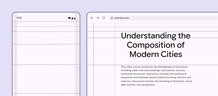
Content rulers offer flexible alignment options to help create a consistent layout across a product
Realigning primary components or content to a content ruler can create strong hierarchy and visual rhythm across a product
Ruler options
Margin rulers come with some wiggle room to determine how tight or loose a product’s content feels on-screen. The standard ruler can be adjusted to the left or right.
Choosing a narrower or wider margin can create or remove negative space, or create expressive moments in a content-forward product.
Margin rulers can adjust to create more or less negative space
Rulers can also be used to create more immersive experiences. For example, a photo grid can take the full width of the screen, while components like search use wider margins.

Rulers allow components and media to use different margin widths