Selection
Selection is how people interact with UI elements or choose which items to act on

- Selection is shown through changes to surface color or other visible elements
- An entire component can be selected, or just certain parts in a component
- Selection can be performed via tap, cursor, keyboard, or voice
Resources
| Type | Link | Status |
|---|---|---|
| Design | Design Kit (Figma) | Available |
Selection indicators
Selections are displayed using a check mark icon, a checkbox component, a change in surface color, or a combination.
Selections are inherited by the following components:
- Cards
- Checkboxes
- Chips
- Data tables
- Icon buttons
- List items
- Menu items
- Pickers
- Radio buttons
- Segmented buttons
- Sliders
- Switch
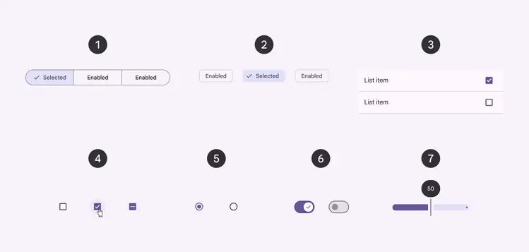
Selected components:
- Segmented buttons
- Chips
- List items
- Checkboxes
- Radio buttons
- Switch
- Slider
The following components use an active indicator to represent which item is currently selected:
- Navigation bar
- Navigation drawer
- Navigation rail
- Tabs
The color and shape of the active indicator varies between components. In these components, only one item should be selected at a time.
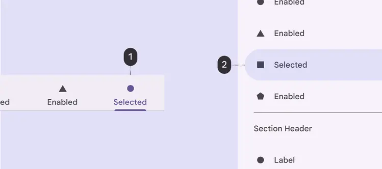
Selected components with active indicators:
- Tab
- Navigation drawer
Types of selection
Touch
On touch devices, select items using:
- Long press touch or two-finger touch
- Selection shortcut, if available, such as tapping an avatar
Items in a list selected via touch
Entering and exiting selection mode
To select an item and enter selection mode, long press the item or use a shortcut, such as tapping the item’s avatar. To select additional items, tap each of them.
To exit a selection mode, tap each selected item until they’re unselected, or tap an action on the toolbar.
Entering and exiting selection mode
Larger selections
To select multiple items simultaneously, long press and drag across items. Don’t use this gesture combination if it is already in use to pick up and move items, like cards.
Do
Long press and drag can be used together to select items in batches
Don't
If the long press and drag combination is already in use to pick up and move components, like cards, then the combined gesture can’t also be used for selecting items in batches
Click
On desktop, checkboxes are always visible when selection is the primary activity. When selection is secondary, checkboxes (or other indicators) are displayed:
- As a single checkbox for that item on hover
- For all items after one item is selected
To make a selection, hover over an item to reveal a checkbox. The checkbox can then be clicked.
Checkboxes are visible by default in this table because selection is a primary activity