Toolbars
Toolbars display frequently used actions relevant to the current page.
Overview · Specs · Guidelines · Accessibility
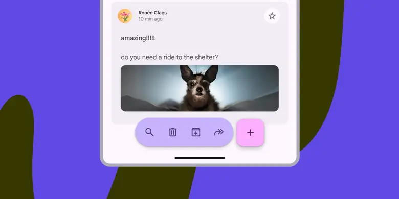
- Two expressive variants: docked toolbar and floating toolbar
- Use the vibrant color style for greater emphasis
- Can display a wide variety of control types, like buttons, icon buttons, and text fields
- Can be paired with FABs to emphasize certain actions
- Don’t show at the same time as a navigation bar
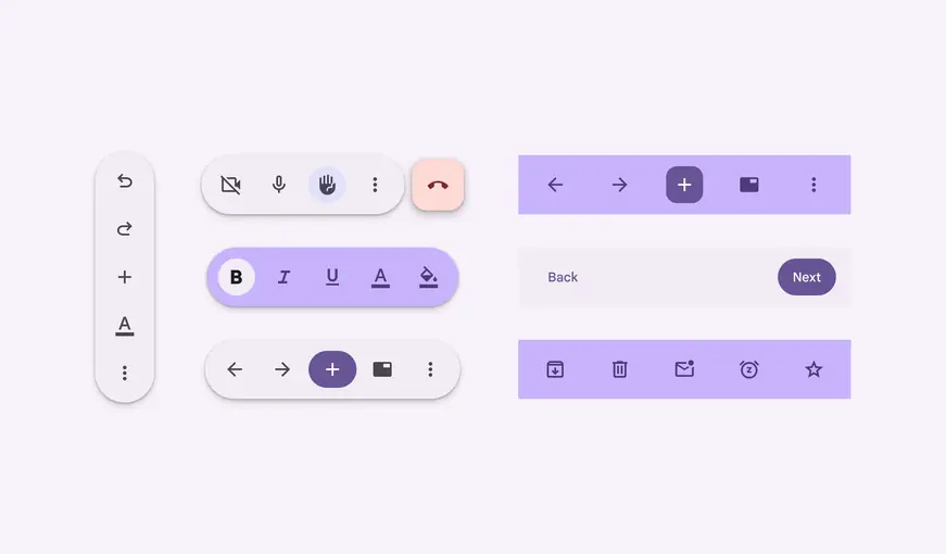
Configurations of floating toolbars
Availability & resources
| Type | Resource | Status |
|---|---|---|
| Design | Design Kit (Figma) | Available |
| Implementation | Jetpack Compose - Bottom app bar | Available |
| Implementation | Jetpack Compose: Expressive - Docked toolbar | Available |
| Implementation | Jetpack Compose: Expressive - Floating toolbar | Available |
| Implementation | Android Views (MDC-Android) - Bottom app bar | Available |
| Implementation | Android Views (MDC-Android): Expressive - Docked toolbar | Available |
| Implementation | Android Views (MDC-Android): Expressive - Floating toolbar | Available |
| Implementation | Flutter - Bottom app bar | Available |
| Implementation | Web | Unavailable |
M3 Expressive update
The bottom app bar is no longer recommended and should be replaced with the docked toolbar, which functions similarly, but is shorter and has more flexibility. The floating toolbar was created for more versatility, greater amounts of actions, and more variety in where it's placed. More on GM3 Expressive
Variants and naming:
Added docked toolbar to replace bottom app bar
- Size: Shorter height
- Color: Standard or vibrant
- Flexibility: More layout and element options
Added floating toolbar with the following configurations:
- Layout: Horizontal or vertical
- Color: Standard or vibrant
- Flexibility: Can hold many elements and components. Can be paired with FAB.
Bottom app bar is still available, but not recommended
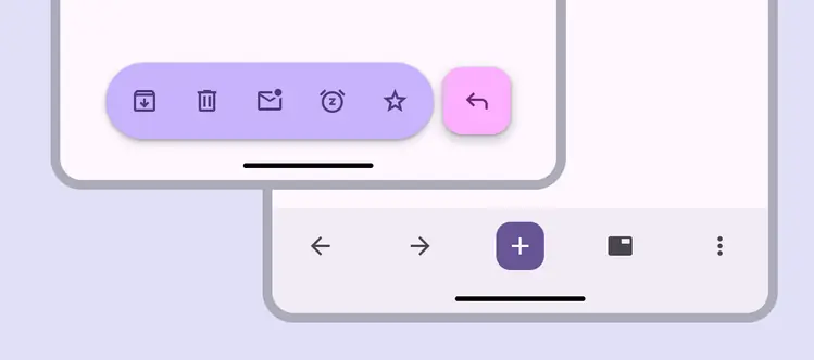
- Floating, vibrant color scheme and paired with FAB
- Docked with embedded primary action instead of FAB
Differences from M2
- Color: New color mappings and compatibility with dynamic color
- Elevation: No shadow
- Layout: Container height is taller and the FAB is now contained within the app bar container
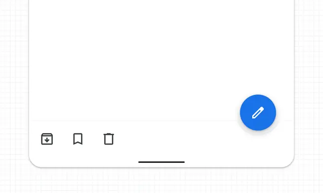
M2: Bottom app bar had higher elevation of 8dp and didn't contain the FAB
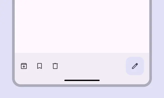
M3: Bottom app bar has new colors, a taller container, no elevation or shadow, and contains the FAB