Text fields
Text fields let users enter text into a UI. They typically appear in forms and dialogs.
Overview · Specs · Guidelines · Accessibility

- Make sure text fields look interactive
- Two variants: filled and outlined
- The text field’s state (blank, with input, error, etc) should be visible at a glance
- Keep labels and error messages brief and easy to act on
- Text fields commonly appear in forms and dialogs
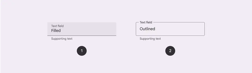
- Filled text field
- Outlined text field
Availability & resources
| Type | Resource | Status |
|---|---|---|
| Design | Design Kit (Figma) | Available |
| Implementation | Flutter | Available |
| Implementation | Jetpack Compose | Available |
| Implementation | Android Views (MDC-Android) | Available |
| Implementation | Web | Available |
Differences from M2
- Color: New color mappings and compatibility with dynamic color

Text fields have new color mappings