Switch
Switches toggle the selection of an item on or off. Switches are the best way to let users adjust settings.
Overview · Specs · Guidelines · Accessibility

Switches change settings and other options immediately
Usage
Switches are best used to adjust settings and other standalone options.
They make a binary selection:
- On and off
- True and false
The effects of a switch should start immediately, without needing to save.
Use a switch to turn an option on and off
Use switches to:
- Toggle a single item on or off
- Immediately activate or deactivate something
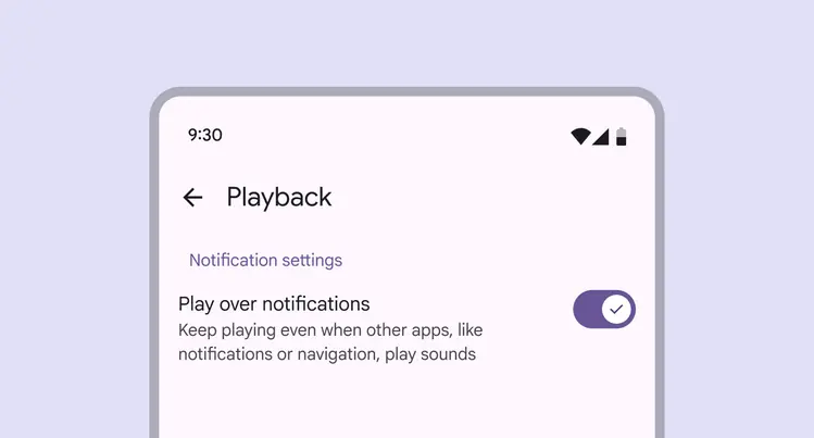
Switches are commonly used on mobile to turn settings on or off
Switches control binary options, not opposing ones. A binary option represents a single selection that's either on or off.
Opposing options are when only one option in a set can be selected at a time, like a list or map view. Use a connected button group instead.
Do
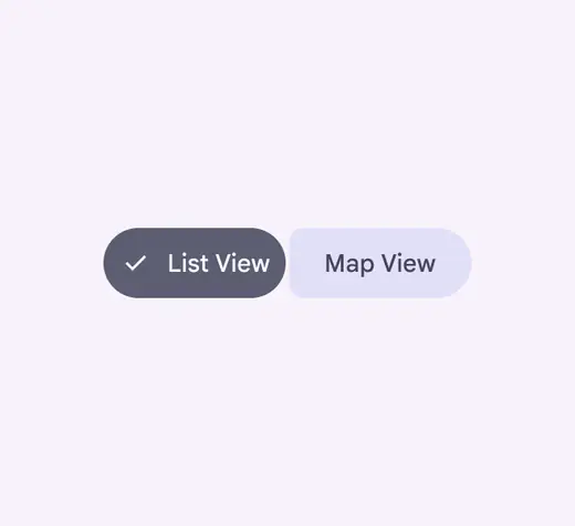
Use a connected button group to choose between opposing options
Don't

Avoid using switches to toggle between opposing options
Alternate selection controls
Checkboxes, radio buttons, and switches are the three main kinds of selection controls. They help people make choices, like selecting options or turning settings on and off.
Use checkboxes to select multiple related options in a list.
Use radio buttons to select a single option in a list.
Use switches to select standalone or more verbose options in a list, like settings.
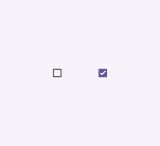
Checkboxes

Radio buttons
Do
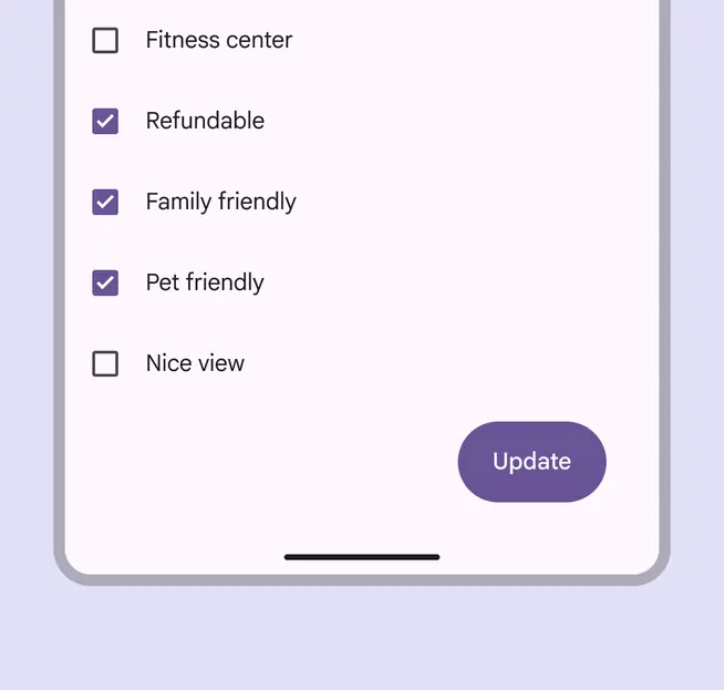
Use checkboxes (not switches) to let people select one or more options from a list
Don't
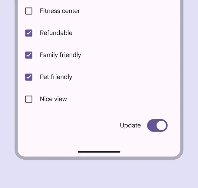
A switch can't replace a button. People expect a call to action to be a button, not a switch.
Do
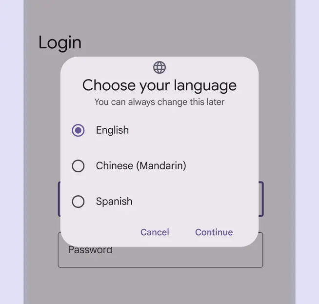
Use radio buttons (not switches) when only one item can be selected from a list
Don't
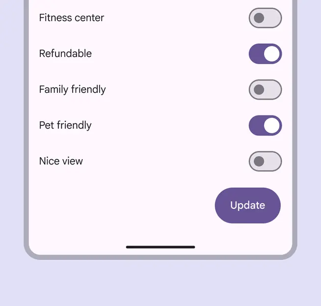
Avoid using a switch to select multiple options that require people to save. Switches should be immediate. Use checkboxes instead.
Anatomy

- Track
- Handle
- Icon (optional)
Icon (optional)
The switch handle can contain an optional icon.
The icon within the handle should always communicate the switch's selection
Icons can be used to visually emphasize the switch’s selection. The icon’s meaning should be clear and unambiguous to help the people understand whether switch is on or off.
Do
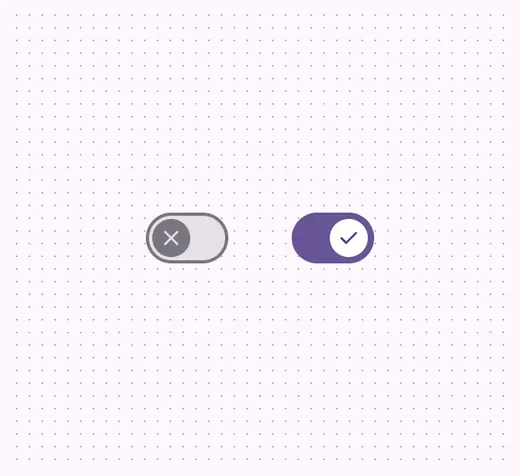
Use icons that clearly communicate whether the switch is on or off, such as an X and a checkmark
Don't
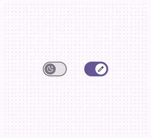
Avoid using more ambiguous or non-binary icons, such as a moon or edit icon
Label text
Switches should always be paired with an inline label describing what the switch controls when selected.
Do
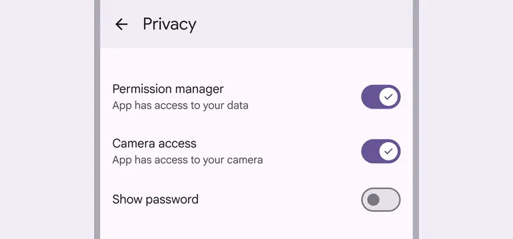
Keep labels short and direct. A label should describe what the control does when the switch is on.
Don't
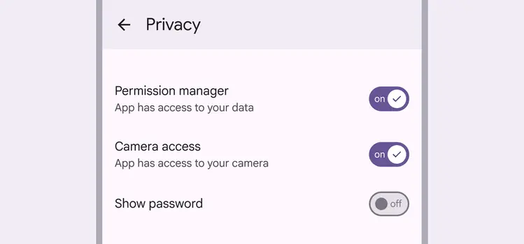
Don't add label text into the switch; the font size would be too small to be accessible. Use an appropriate icon instead.
Placement
Switches are often arranged in stacked layouts.
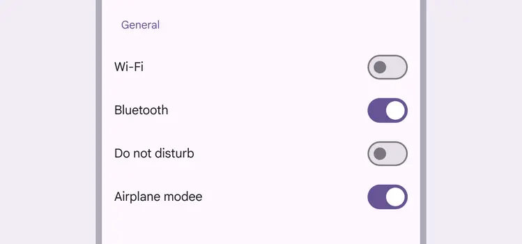
Settings screens are common places to use switches
Behavior
A switch is successfully toggled when the handle slides to the other side of the track after an interaction.
When selected, the switch handle slides to the opposite end of the track
When a person toggles a switch, its handle size changes and the corresponding action takes effect immediately.
The on state of the switch is indicated by a larger handle size