Split buttons
Split buttons combine a primary action with a secondary action in a single component.
Overview · Specs · Guidelines · Accessibility
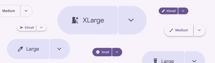
Split buttons come in many sizes and colors
Usage
Split buttons are used to add a menu of actions alongside a main action. This reduces visual complexity by hiding extra options. Split buttons work well alone or alongside common buttons and icon buttons.
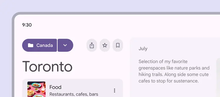
Split buttons on their own can grab attention
Split buttons have five recommended sizes. These sizes match the sizes offered on buttons and icon buttons:
- Extra small
- Small (default)
- Medium
- Large
- Extra large
Scale up the split button in large breakpoints, or to create more emphasis in smaller windows.
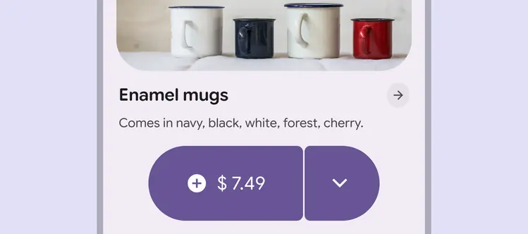
Using large split buttons on small screens can add extra emphasis for hero moments
Split buttons can be used alongside other buttons and button groups.
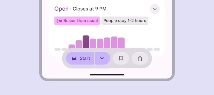
Split buttons work harmoniously with regular buttons
Split buttons can be of different sizes from other buttons on the page, especially since they take up more space.
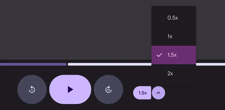
The most prominent controls can be larger while secondary controls in a split button can be smaller
The split button typically opens a menu, but can be customized to open other components like cards.
Do
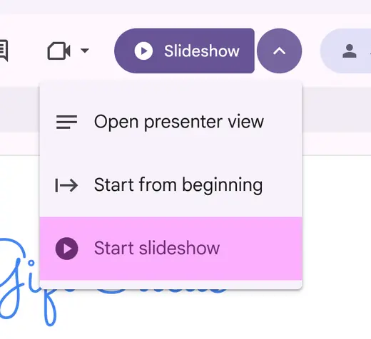
Open a menu from a split button
Don't
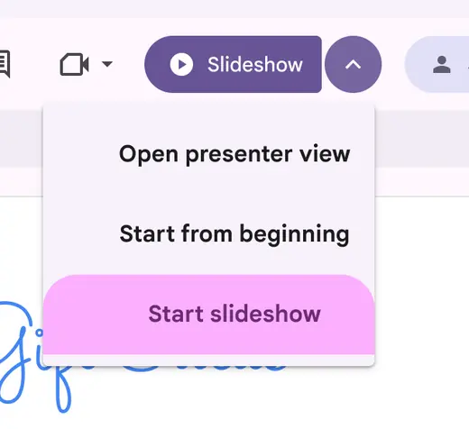
Avoid modifying the menu in unusual ways
Anatomy

- Leading button
- Icon
- Label text
- Trailing button
The leading button should be brief, just one or two words, with an icon that best matches the action.
The trailing button should always have the expand and collapse icon since it rotates when selected. Avoid modifying the icon.
Don't
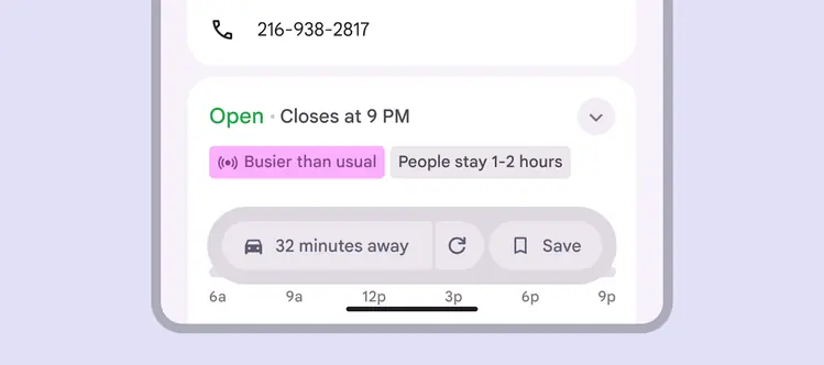
Avoid using very long labels or changing the trailing icon
In right-to-left languages, the component layout is mirrored.
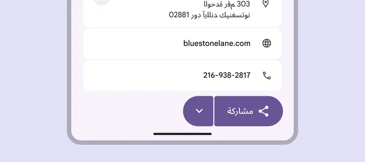
Split buttons mirror the order of elements in right-to-left languages
Behavior
The split button uses the standard motion scheme (not the expressive motion scheme) when rotating the menu button.
The menu button rotates inwards 180° when opened and closed.
Selecting the menu button rotates the icon inwards and applies shape morph
Menu placement
When using the split button with a menu, align the menu with the trailing button when possible.
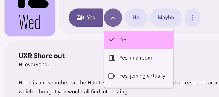
Align the menu with the trailing button
If there’s not enough room, align the menu to one of the sides of the button.
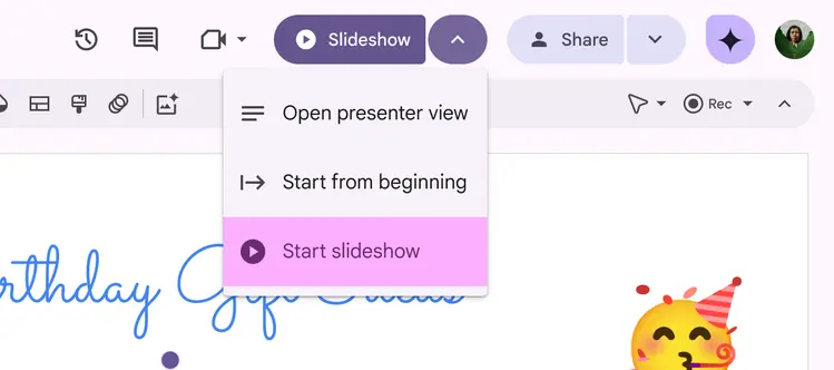
If not possible, align the menu to the side of the leading or trailing button
Depending on breakpoint, scroll position, and other factors, the menu may need to appear elsewhere around the button. Always try to align it with one of the edges of the button.
The menu should be 4dp from the split button.
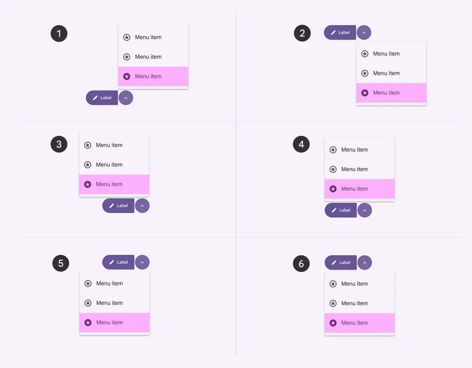
- Top aligned to trailing button
- Bottom aligned to trailing button
- Top right-aligned
- Top left-aligned
- Bottom right-aligned
- Bottom left-aligned