Sliders
Sliders let users make selections from a range of values. There are four configurations: continuous, discrete, centered, range selection.
Overview · Specs · Guidelines · Accessibility

- Three variants: Standard, centered, range
- Has five sizes, vertical and horizontal orientation, and an optional inset icon
- Sliders should present the full range of available values
- The slider value should take effect immediately
Sliders change values along a range
Availability & resources
| Type | Resource | Status |
|---|---|---|
| Design | Design Kit (Figma) | Available |
| Implementation | Flutter | Available |
| Implementation | Jetpack Compose | Available |
| Implementation | Jetpack Compose: Expressive | Available |
| Implementation | Android Views (MDC-Android) | Available |
| Implementation | Android Views (MDC-Android): Expressive | Available |
| Implementation | Web | Available |
| Implementation | Web: Expressive | Unavailable |
M3 Expressive update
May 2025
The slider includes expressive configurations for orientation, shape sizes, and an inset icon. More on M3 Expressive
Updated on Android Views (MDC-Android) and Jetpack Compose.
Variants and naming:
- Changed continuous slider to standard slider
- The discrete slider is now the stops configuration
New configurations:
- Orientation: Horizontal, vertical
- Optional inset icon (standard slider only)
- Sizes: XS (existing default), S, M, L, XL
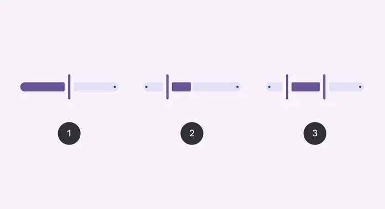
- Standard slider
- Centered slider
- Range slider
Previous updates
Visual refresh to improve non-text contrast
Dec 2023: Updated on Android Views (MDC-Android) and Jetpack Compose.
- Configuration: Added centered configuration and range selection
- Shape: New shape for slider tracks and handles. Slider elements change shape when selected.
- Motion: Slider handle adjusts width upon selection. Slider tracks adjust in shape when sliding to the edge.
- Color: Refreshed color mappings
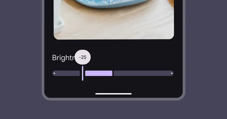
M3 visual refresh: Sliders have a stop indicator, larger label text, and a vertical handle that narrows when pressed. Centered sliders start from the middle instead of the leading edge.
Differences from M2
- Color: New color mappings and compatibility with dynamic color
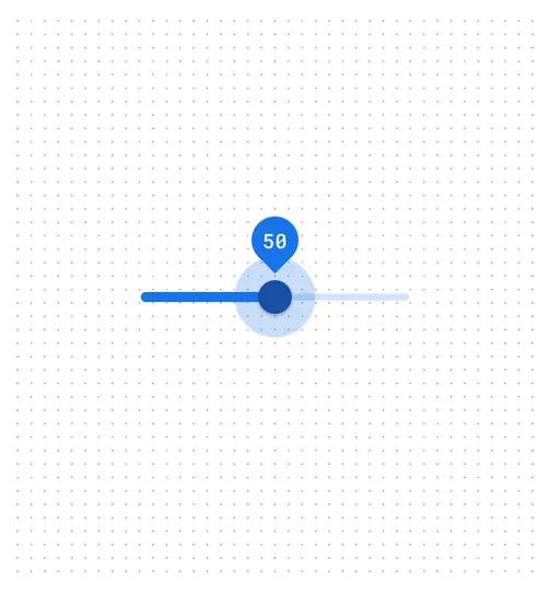
M2: Sliders have a circular handle and a small label when pressed

M3: Sliders have new color mappings and support dynamic color