Search
Search lets people enter a keyword or phrase to get relevant information. Search bars can display suggested keywords or phrases as the user types.
Overview · Specs · Guidelines · Accessibility
When focused, a search bar can show a list of search suggestions. As text is entered, search results appear.
Usage
Search helps people find information quickly.
Use search for products with many items to manage, such as files or messages.
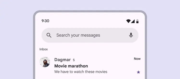
Search helps people find information in large inboxes like messages or emails
Different ways to search
The search entry point is dependent on a product’s needs, and should be easy to find:
- Search bar: Use to search contents in a specific view, like Search your messages
- Search app bar: Use this app bar variant when search is the primary, global function
- Search icon button: Use when search is a secondary action or not the main focus
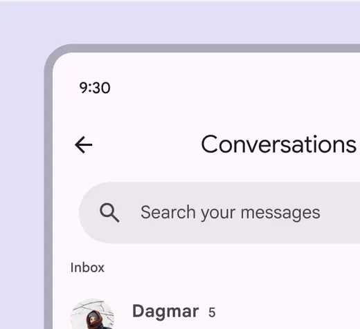
Add a search bar below a title to search specific content
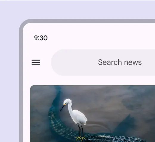
For global search, use a persistent search app bar, integrated into an app bar
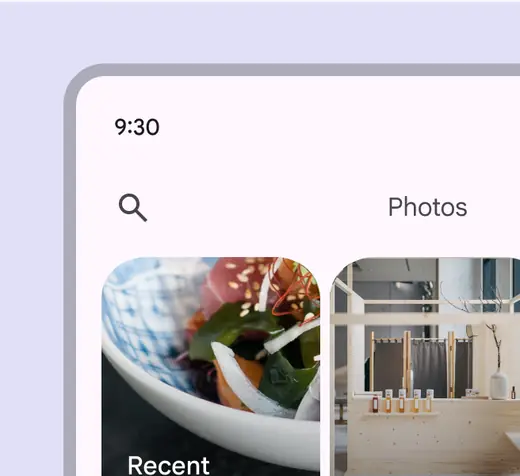
Use a search icon button when search is a secondary action
Focused search
When a search entry point is selected, it opens focused search.
- Search suggestions can appear before text is entered
- Search results can show as someone is typing or after a search is executed
- Individual elements maintain their own interaction states when search is focused
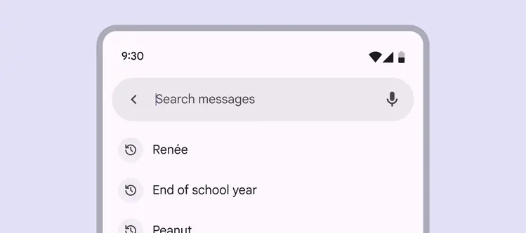
When focused, a search bar expands to show search suggestions or results in a list
If search is the primary action, focused search can be a standalone destination reached from a navigation bar.
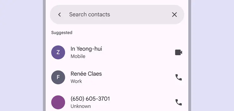
Focused search can be a standalone destination, reached by selecting an item in a navigation bar
Search suggestions & results
Search suggestions and results both appear in a list component by default.
To help people find information quickly, consider adding variety and context, such as:
- Leading icons related to suggestions
- Category labels, like Recent, Contacts, or Suggestions
- Avatars or other high-priority items
- Filter chips to narrow down results
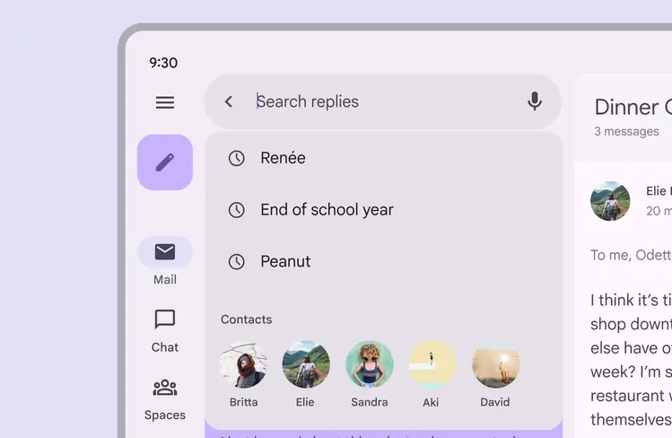
Include high-priority items like avatars in search suggestions or results
Gaps
Use gaps to separate a list of suggestions or results into groups.
More on using gaps in lists
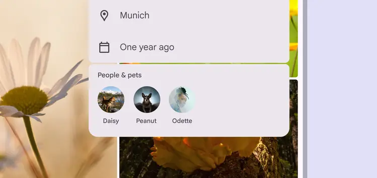
To separate list items into distinct groups, use a gap
Placement
A search bar is typically placed at the top of a screen to remain prominent and accessible. Its location depends on whether search is the primary focus of a product or a secondary action.
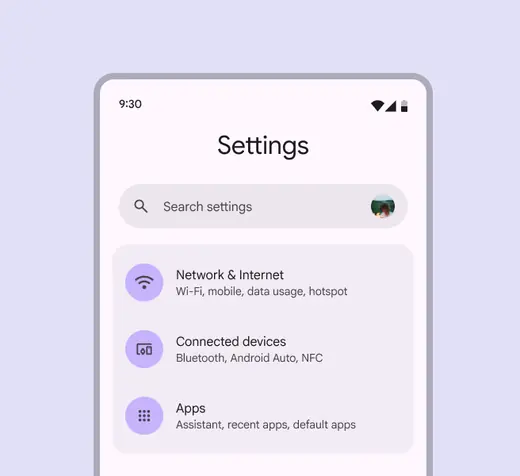
A search bar can be the primary focus of a page
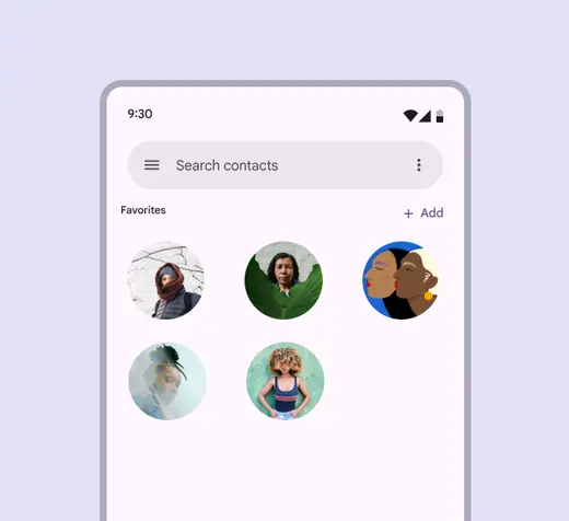
Search bars should usually be placed at the top of the content
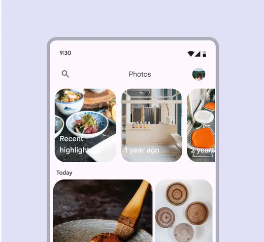
Search can be a secondary action
Focused search layouts
When focused, search suggestions and results appear in a list below the search bar.
There are two layout options:
- Docked opens a list below the search bar, with a scrim covering main content
- Full-screen expands to fill the screen
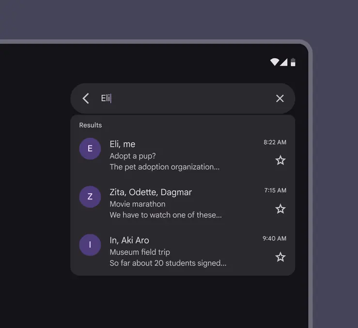
Docked layout on a tablet
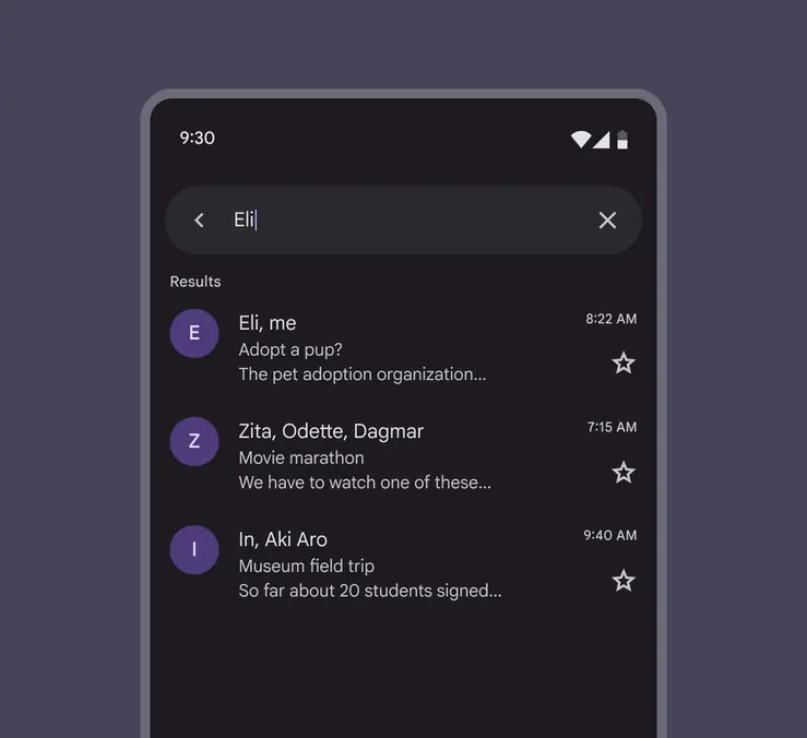
Full-screen layout on mobile
Anatomy
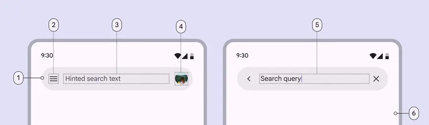
- Search bar container
- Leading icon
- Supporting text
- Avatar or trailing icon (optional)
- Input text
- Container for search suggestions or results
Search bar container
In the contained style, the search bar container remains the same shape in both the unfocused and focused states. Avoid changing the container behavior.
The container’s margins should be:
- Unfocused: 24dp
- Focused: 12dp
In the divided (baseline) style, a divider separates the search bar and results.
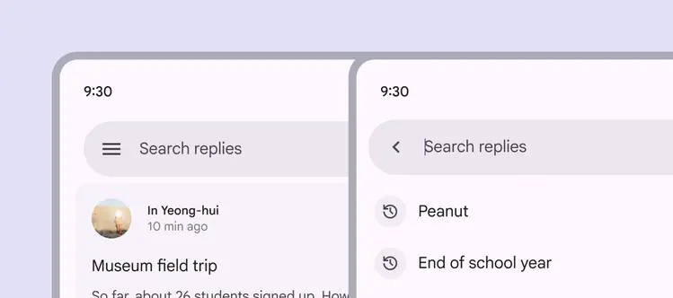
Search bar containers have persistent, rounded corners
Container color
Search bars use the surface container high color role. This role applies when the screen background is white or a tonal surface color, ensuring the container has clear contrast.
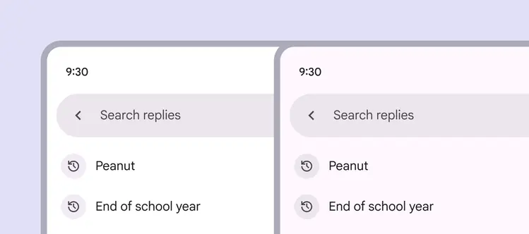
Search bars use surface container high to provide clear contrast
Avoid using a surface container high color on a surface container background. This can cause the search bar to blend in, making it difficult for people to find.
To ensure proper contrast, use surface container roles that are more than one step apart.
Caution
Using a surface container high color on a surface container background reduces contrast and may affect accessibility
Icons & icon buttons
Leading icons
The leading side of a search bar should include either:
- A navigational icon button, such as a menu or arrow
- A non-functional search icon
A search bar can contain a non-functional search icon
Trailing icons
A search bar should have one or two trailing icons or icon buttons.
Trailing actions can include:
- Additional modes of searching like voice search
- A separate high-level action such as current location or profile
- An overflow menu
- A decorative search icon
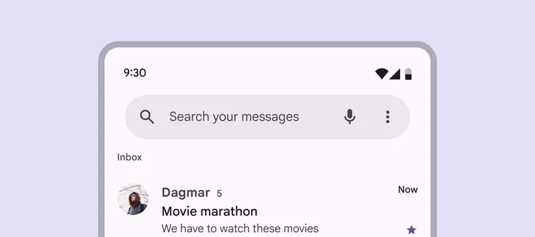
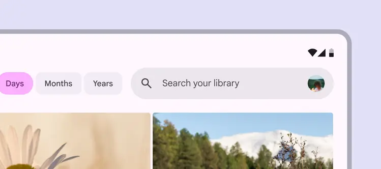
Use a maximum of two trailing icons
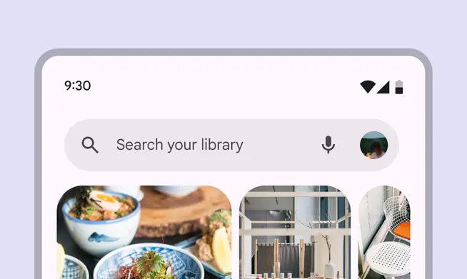
Combine an avatar with up to one other trailing icon button
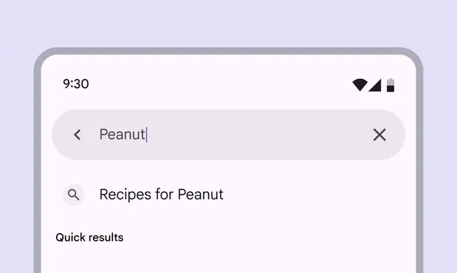
Focused search can show an optional clear icon to remove input text
Text
Hinted search text
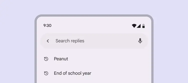
Provide a short description of the information people can search, like Search replies or Search your messages.
Input text
When a person starts typing, the hinted text is replaced with the input text.
Hinted search text is replaced when a search query is entered
Adaptive design
The search bar position and alignment should scale with the layout, and stay close to the searchable content.
In most cases, a search bar should:
- Stay in its pane and scale in width accordingly
- Internal elements anchor to the left and right as the parent container scales
Keep the search bar close to the content a person can search
Focused search
When focused, search can switch between showing suggestions or results in a:
- Docked layout: Best for medium and expanded windows
- Full-screen layout: Default for compact breakpoints
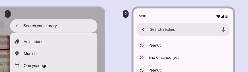
- A docked layout on a large screen
- A full-screen layout, the default for compact screens
Search suggestions or results should swap from full-screen in compact windows to docked in larger breakpoints.
Search suggestions and results should adapt to fit different window sizes
Behavior
Focused search
When a search bar is selected, search becomes focused and can:
- Show historical suggestions before typing
- Show suggestions or results as someone is typing
- Wait to show suggestions or results until a search is queried
The back icon releases focus, dismisses any suggestions or results, and returns the search bar to its original state.
When focused, a list of search suggestions can appear
Focus is released when the back icon is selected
Scroll
Depending on needs, a search bar can:
- Scroll away with content, then reappear when a person begins scrolling up
- Remain fixed at the top of the screen
A search bar can scroll up with content, then reappear when a person scrolls down
Search results
To execute a search, a person can:
- Type a query and press Enter
- Select a suggestion or result without querying a search
Search results appear in a list below the bar, and scroll beneath the bar.
For accessibility, focused search needs a clear status indicator that it’s searching content, like a search icon or Results label. More on search accessibility
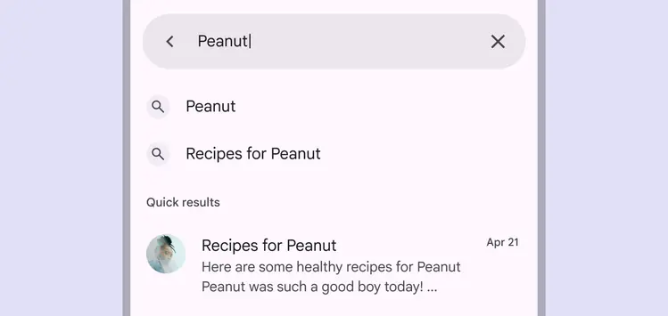
Show search results in a compact, organized list, with an indicator like Quick results
When search results are queried, the input text should remain visible, but not in focus.
Search suggestions and results display in a list, and the input text remains visible
Predictive back
On Android, predictive back allows a person to swipe left or right on search.
- Search detaches from the screen edge to signal the full-screen layout will minimize
- The previous screen is revealed in a preview
More predictive back design guidance
The search surface and content scale back in the direction of the gesture