Navigation drawer
Navigation drawers let people switch between UI views on larger devices. Navigation drawers provide access to destinations in your app.
Overview · Specs · Guidelines · Accessibility
Note
The navigation drawer is no longer recommended in the Material 3 Expressive update. For those who have updated, use an expanded navigation rail, which has mostly the same functionality of the navigation drawer and adapts better across breakpoints.

Usage
Navigation drawers provide access to destinations and app functionality, such as switching accounts. They can either be permanently on-screen or opened and closed by a navigation menu icon. One navigation destination is always active.
Navigation drawers are recommended for:
- Apps with 5 or more top-level destinations
- Apps with 2 or more levels of navigation hierarchy
- Quick navigation between unrelated destinations
- Replacing the navigation rail or navigation bar on large screens
Do
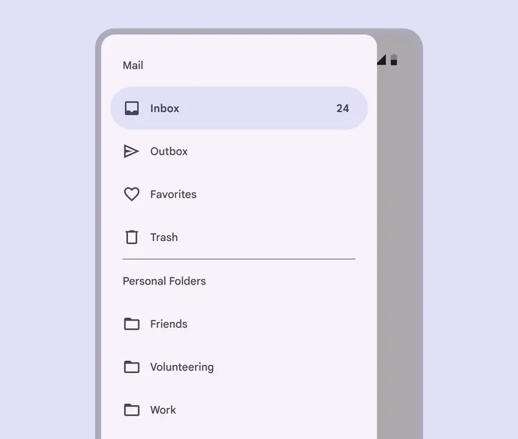
Use a navigation drawer for 5 or more primary destinations, or more than 1 level of navigation hierarchy
Avoid using a navigation drawer with other primary navigation components, such as a navigation bar.
Instead, choose a single navigation component based on product requirements and breakpoints:
- Navigation bars for compact breakpoints
- Navigation rails for medium and expanded breakpoints
- Standard navigation drawers for expanded, large and extra-large breakpoints
Caution
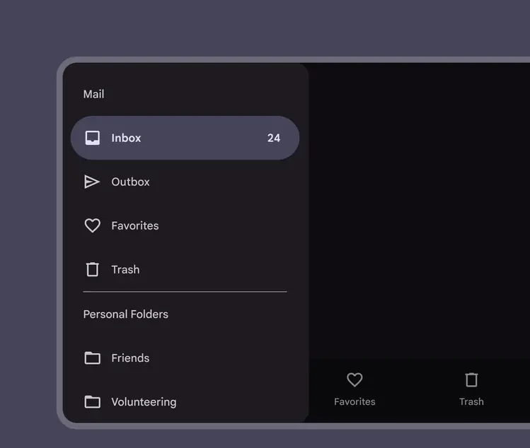
Avoid using two navigation components on the same screen
There are two variants of navigation drawers:
- Standard navigation drawer
- Modal navigation drawer
Standard navigation drawer
Modal navigation drawer
Standard navigation drawer
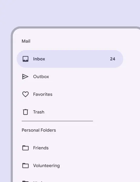
Standard navigation drawers provide access to drawer destinations and app content for layouts in expanded, large, and extra-large breakpoints.
Standard drawers can be permanently visible (best for frequently switching destinations) or opened and closed by tapping a menu icon (best for focusing more on screen content).
In medium and compact breakpoints, use modal drawers instead.
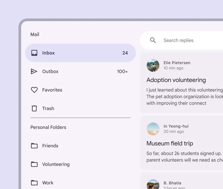
Standard navigation drawer providing access to drawer destinations next to app content
Modal navigation drawer
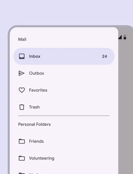
Modal navigation drawers use a scrim to block interaction with the rest of an app’s content, and don’t affect the screen’s layout grid.
Modal navigation drawers can be used in any breakpoint, but are primarily used in compact and medium sizes where space is limited or prioritized for app content.
They can be swapped with standard drawers on expanded, large, and extra-large breakpoints.
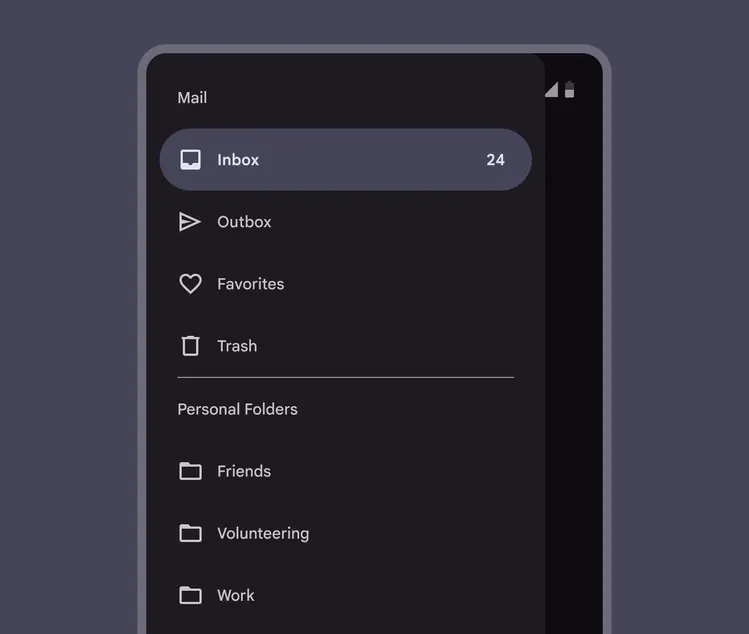
Modal navigation drawer using a scrim to block interaction with the rest of an app’s content
Modal navigation drawers are always opened by an action outside of the drawer, such as clicking a navigation menu icon in a navigation rail.
Modal drawers can be dismissed by:
- Selecting a drawer item
- Tapping the scrim
- Swiping toward the drawer’s anchoring edge (for example, swiping right-to-left for a left-aligned navigation drawer)
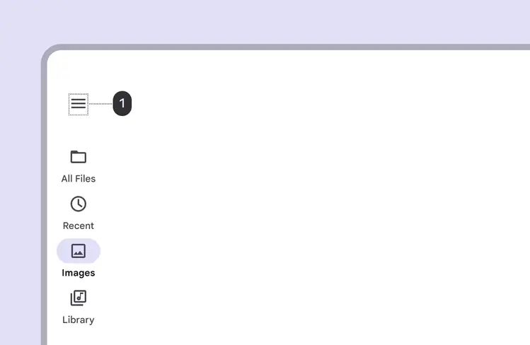
A modal drawer opened by an action such as clicking a navigation menu icon (1)
Modal drawers can be dismissed by tapping the scrim or swiping the drawer toward its anchoring screen edge.
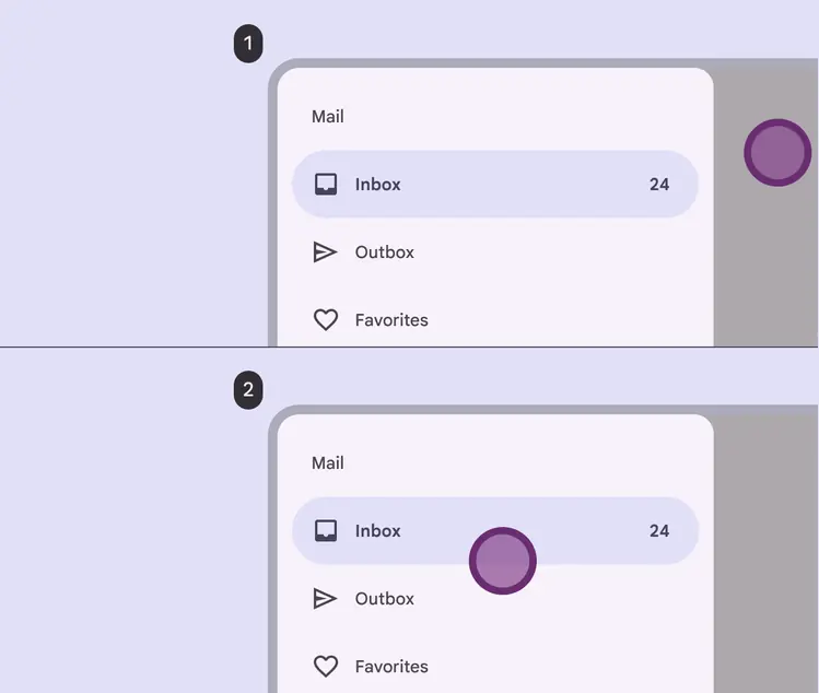
1. Dismiss by tapping the scrim
2. Dismiss by swiping the drawer
Anatomy
Navigation drawers are essentially a list contained within a side sheet. They can also include headers, subheads, and dividers to organize longer lists.
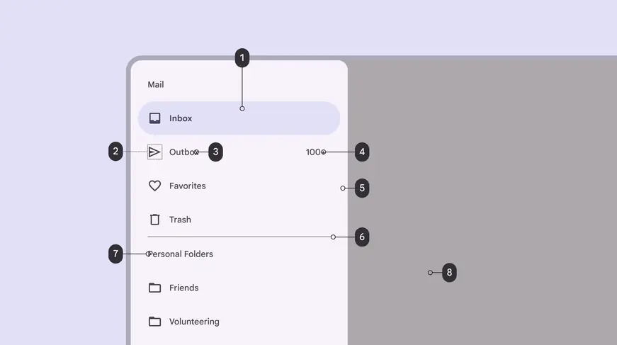
Navigation drawers can include headers, subheads, and dividers to organize longer lists
- Active Indicator
- Icon
- Label
- Badge label
- Sheet
- Divider
- Section label (optional)
- Scrim
Sheet
A sheet holds all navigation drawer elements. Side sheets are used as the container for standard and modal navigation drawers.
Navigation drawers that open from the side are always placed on the start edge of the screen, on the left for left-to-right (LTR) languages, and on the right for right-to-left (RTL) languages.
Do
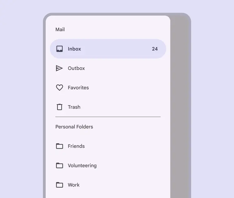
A navigation drawer opens from the left side of the screen for left-to-right languages
Divider (optional)
Dividers can be used to separate groups of destinations within the navigation drawer.
Do
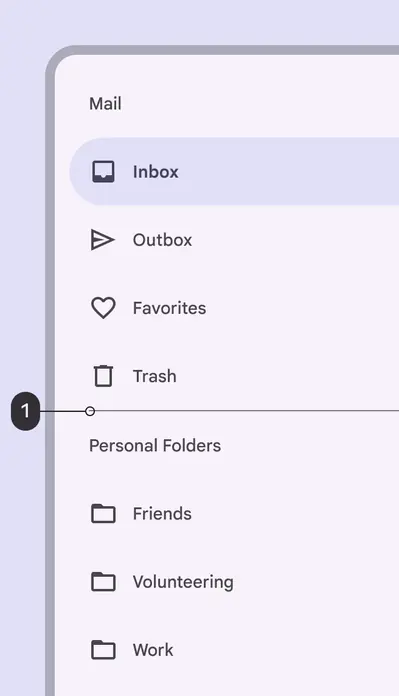
Use full-width dividers (1) to separate groups of destinations
Don't
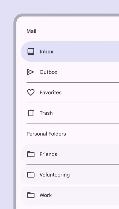
Don’t use dividers to separate individual destinations
Active indicator
The active indicator is a background shape communicating which destination of the navigation drawer is currently being displayed.

The active indicator (1) is a background shape communicating which destination of the navigation drawer is currently being displayed
Label text and icons
Destinations in a navigation drawer take the form of actionable list items. Each item describes its destination using label text and an optional icon.

Actionable list items in a navigation drawer describe each destination using (1) an optional icon and (2) required label text
Label text should be clear and short enough that it isn’t cut off by the sheet.

Navigation drawers can use text labels without icons
Do
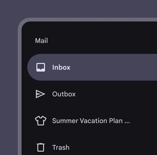
Keep text labels concise, but truncate them if they extend beyond the container width
Don't
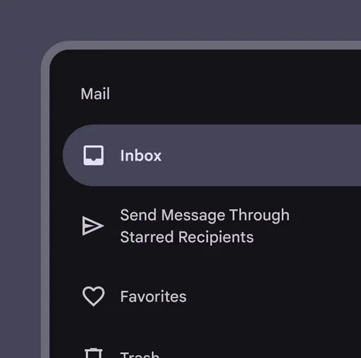
Don’t wrap label text
Don't
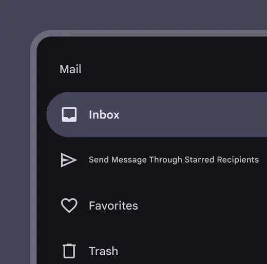
Don’t shrink text size in order to fit a text label on a single line
Icons can supplement labels as indicators of a destination. When used, they should always be placed before text. Other app components and content should reference these icons.
Do
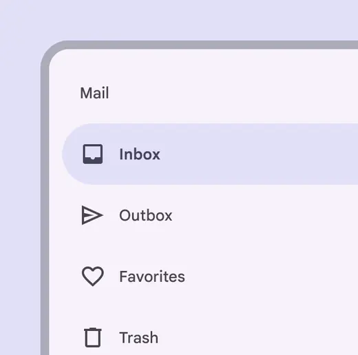
Use recognizable icons when conventions exist
Don't
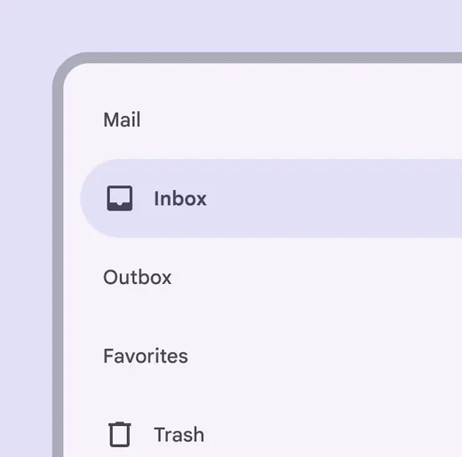
Don’t apply icons to some destinations and not others. Icons should be used for all destinations, or none.
Section label (optional)
Short subhead section labels can help group related destinations in the navigation drawer.
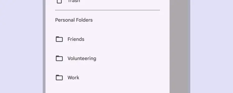
Related destinations can be grouped using short subhead section labels in the navigation drawer
Scrim (modal only)
Modal navigation drawers use a scrim to block interaction with the rest of the app. The scrim is placed directly behind the drawer’s sheet and can be tapped or clicked to dismiss the drawer.
Scrim applied behind a modal navigation drawer
Responsive layout
A product’s navigation component should change to suit the breakpoint and form factor of the screen.
Modal navigation drawers can be used at any breakpoint but are most common in compact and medium breakpoints.
Standard navigation drawers are best for expanded, large, and extra-large breakpoints.
Use a transition when swapping components. For example, when switching from a portrait to landscape layout, the navigation rail should transform into a navigation drawer.
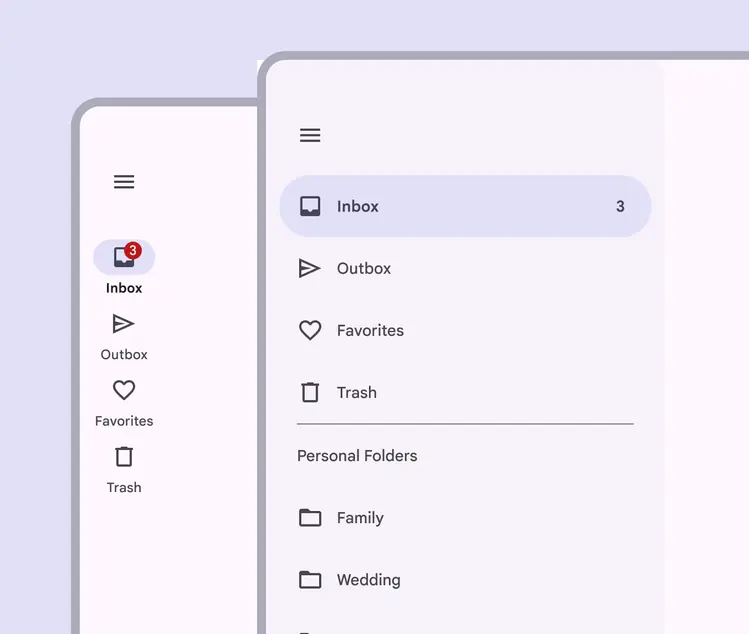
Standard navigation drawers change size to suit the device’s screen
Compact breakpoint
Use modal navigation drawers in compact breakpoints. Or swap the drawer for a navigation bar.
On web, when the screen size is smaller than 320 CSS pixels, swap the navigation drawer for a navigation bar to ensure accessibility.
Use a modal navigation drawer on mobile screens
Medium & expanded breakpoints
Use a modal navigation drawer alone or with a navigation rail on medium and expanded breakpoints.
When a navigation rail and modal navigation drawer are used together, the drawer can repeat destinations in the navigation rail as long as the drawer offers enough visual separation between levels of the navigation hierarchy.
A standard navigation drawer can be used in single pane layouts in expanded breakpoints.
Use a navigation rail on tablet screens, or also allow a drawer to open and close via a menu icon
Large and extra-large breakpoints
For web experiences on laptop and desktop devices, use either a standard navigation drawer, or a navigation rail that transitions into a modal navigation drawer.
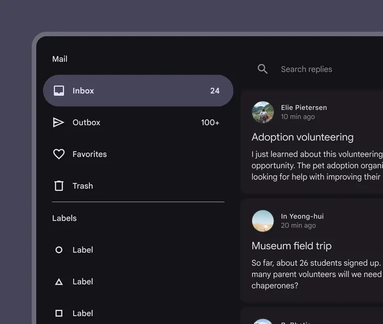
Use a standard navigation drawer on large and desktop screens
Behavior
Scrolling
Navigation drawers can be vertically scrolled, independent of the rest of the screen’s content and UI. If the list of navigation destinations is longer than the height of the drawer, the drawer’s contents can be scrolled within the drawer.
When a navigation drawer is scrolled, the body content should remain stationary
Visibility
Dismissible standard drawers can be used for layouts that prioritize content (such as a photo gallery) or for apps where users are unlikely to switch destinations often. They should use a visible navigation menu icon to open and close the drawer.
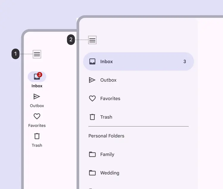
A standard dismissible navigation drawer is opened and closed by tapping the navigation menu icon in the app bar (1), and remains open until the menu icon is tapped again (2)
Permanently visible standard drawers allow quick navigation between unrelated destinations. They can’t be closed or dismissed by the user.
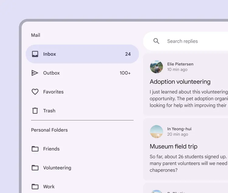
A permanently-visible standard navigation drawer on desktop
Appearing
When a navigation drawer animates on screen, it uses an enter and exit transition pattern.
A navigation drawer animating on screen