Menus
Menus display a list of choices on a temporary surface. Menus can open from a variety of components, including icon buttons and text fields.
Overview · Specs · Guidelines · Accessibility
A menu in the vibrant color style is more expressive, and one with standard colors is more utilitarian
Usage
Use a menu to show a temporary set of actions. To show actions on screen at all times, use a toolbar instead.
A menu takes up less space than a set of radio buttons or chips.
Color options
Menus have two color mappings:
- Standard: Surface-based, lower visual emphasis
- Vibrant: Tertiary-based, higher visual emphasis
Vibrant menus are more prominent, and should be used sparingly.
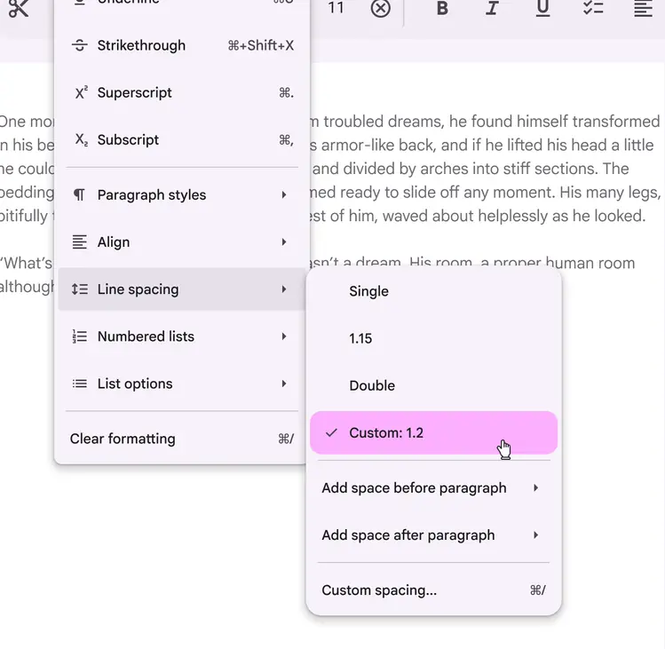
On web, menus can open submenus
Opening menus
Menus temporarily appear in front of all other permanent UI elements.
A menu should open when a person:
- Selects an element, such as an icon, button, or text field
- Performs a specific action to trigger the menu, like right-click or press-and-hold
Use menus in situations that need extra actions, like:
- Overflow menus
- Text field dropdown menus
- Select menus
- Context menus
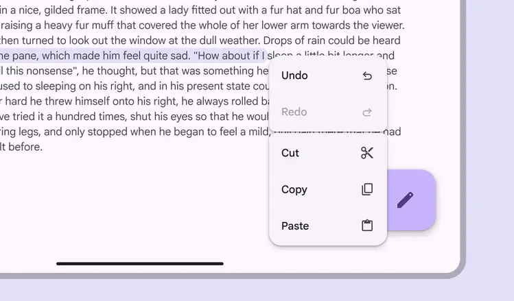
Menus appear in front of all other UI elements
Menu groups
Vertical menu items can be grouped by adding a divider or small gap. Use groups to bundle similar actions together.
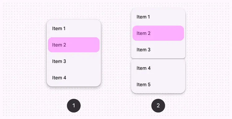
Menu items can be grouped to be more scannable:
- Standard vertical menu
- Grouped vertical menu
Context menus
Context menus provide a list of additional actions a person can take on an item. A secondary click, like a right-click on a mouse or a two-finger tap on a trackpad, opens a context menu.
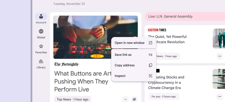
A context menu appears when right clicking with a mouse or trackpad. It can reveal key actions related to the associated content.
Anatomy
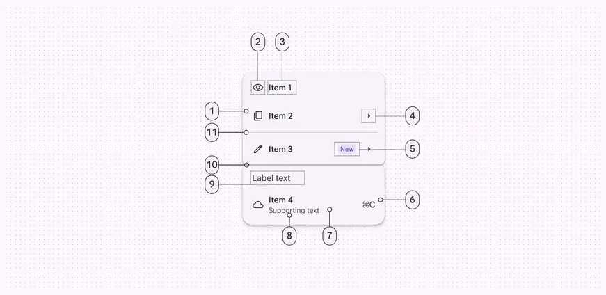
- Menu item
- Leading icon (optional)
- Menu item text
- Trailing icon (optional)
- Badge (optional)
- Trailing text (optional)
- Container
- Supporting text (optional)
- Label text (optional)
- Gap (optional)
- Divider (optional)
Menu items
Menu items can include label text, leading icons, trailing icons, and keyboard commands.
When a menu item can only be used under specific conditions, it should appear disabled rather than be removed.
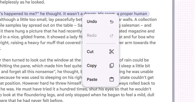
The Redo action is disabled when that action isn’t available
Gaps & dividers (optional)
Gaps and dividers can be used to separate and group menu items.
Gaps
Use a gap to visually divide menu items into distinct groups. Gaps are more expressive than dividers and make the relationship between items clear.
- Avoid changing the size of the gap
- Limit the number of gaps in a menu to one or two
- Don’t use gaps in scrollable menus
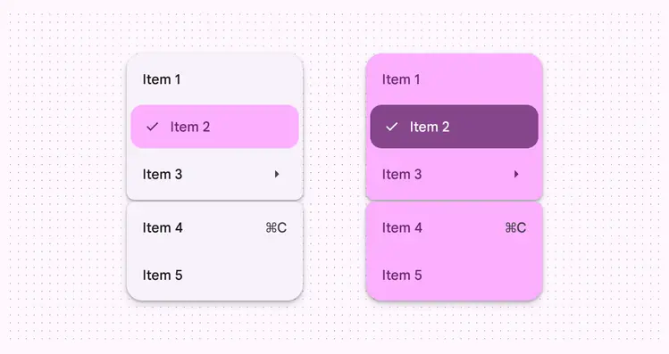
Gaps separate menu items using expressive shapes
Note
Gaps are not currently available on web
Dividers
Dividers create a more subtle separation between items. Use a divider for:
- Scrollable menus
- Text fields with a dropdown menu, where a grouped treatment isn’t appropriate
On web, use a divider to separate menu items.
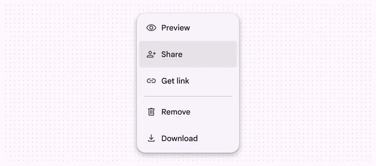
Dividers separate menu items in baseline menus and on web
Flexibility & slots
Menus have custom slots that support more flexible item layouts.
When creating a complicated menu, think of the menu item as a container with a swappable slot.
Slots work best with simple content such as:
- Images
- Progress indicators
- Color swatches
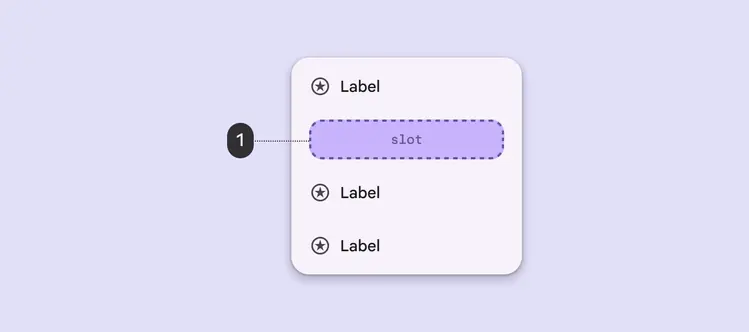
Slots can appear anywhere in a menu
Slot accessibility
Use caution when adding slots to menus:
- Make sure the menu remains accessible
- Elements must follow the rules and interaction patterns of the menu component
- Keep the same menu item padding
- Targets should be 48x48dp or larger
Don't add buttons, switches, or other direct actions into the menu item. Nested elements should only perform one action. Adding multiple actions can break keyboard navigation and screen reader functionality.
More on required accessibility guidelines
Caution
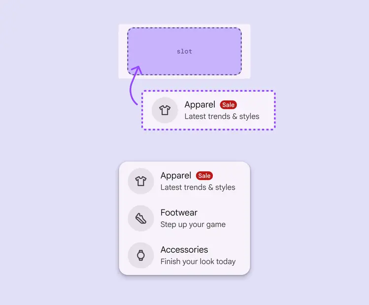
Reserve the use of slots for use cases that maintain the menu’s accessibility and functionality
Placement
A menu is positioned relative to the window edge. It typically appears below, next to, or in front of the element that generates it.
If a menu is in a position to be cut off, it should automatically reposition to appear to the left, right, or above the element that generates it.
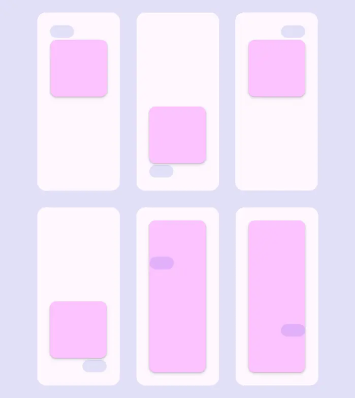
Menus can appear around or in front of the element that opened them
Submenus
Submenus should open next to the parent menu item without overlapping it.
Submenus are best used on large screens where there's space. See adaptive guidance for alternatives on mobile.
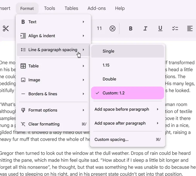
Position submenus to the side of the parent item
Note
Submenus are not currently available on Jetpack Compose
Adaptive design
Compact breakpoints
Consider adapting menus into bottom sheets on small screens. They have more space to display additional items and longer labels.
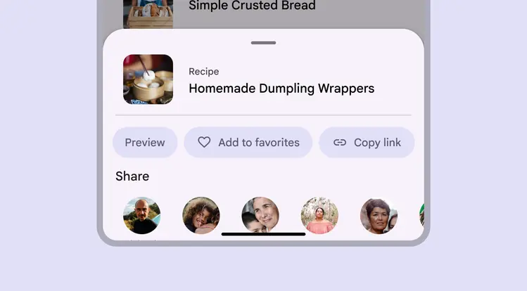
A bottom sheet can replace a menu on smaller screens
Other breakpoints
On medium and expanded windows, menus are most effective as they appear in context with the content. On larger screens, menus can also display more items, and can use submenus to organize complex sets of options.
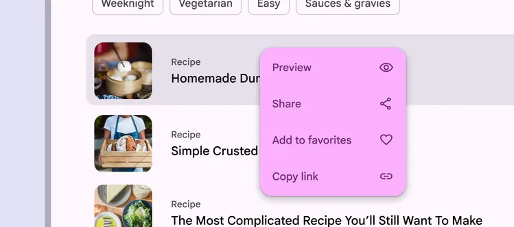
On large screens, a menu is often more appropriate than a bottom sheet
Behavior
Appearing
A menu can appear when a person interacts with an element on the page, like a button, text field, filter chip, or highlighted text.
A menu’s position on screen affects where and how it appears. If opened at the top of the screen, it expands downwards to avoid being cropped.
Menus at different positions on a screen open in different directions, adapting to the available space
A menu can open from a split button
A menu can appear in context, like next to highlighted text or a selected image
A menu can open from a text field
A menu can open from a filter chip
Motion
Menus use an enter and exit transition. This animation creates a relationship between the menu and the element that generates it.
When a menu expands, the trigger element becomes pressed. When an item is selected, a ripple appears on touch.
A menu expands when opened, and has a ripple when an item is selected
In dense products, such as on desktop, menus can open instantly to reduce motion.
Desktop menus can open instantly
Filtering
A menu can include a text field to filter options. This pattern is also known as autocomplete.
As someone types, the list of menu options filters to show relevant results. This helps people quickly find the right option from a long list.
Menu items ease into their new position as the menu is filtered.
As a person types in the text field, the menu options filter to match the input
Scrolling
Menus can scroll when all menu items can’t display at once. In this state, menus show a persistent scrollbar.
Don’t use gaps if a menu scrolls; this is currently unsupported.
When content is scrollable, menus display scrollbars
Selecting
When a menu is opened, the corresponding button or icon button should remain the same visually, with the addition of a pressed state.
This should happen even when opening from a keyboard shortcut.
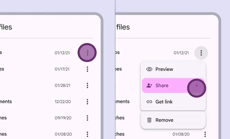
Tapping the icon triggers a menu. Choosing a menu option doesn’t change the icon generating the menu.
Single- and multi-select menus
Menus can allow either single-select or multi-select actions:
- Single-select menus can have one item selected at a time. When a new item is selected, the previously selected item is automatically unselected.
- Multi-select menus can have many selected items. They stay open until the person dismisses the menu.
More on selection accessibility requirements
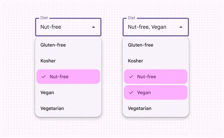
Menus can be single- or multi-select
Focus
When a menu has multiple submenus, focus follows the current hovered or focused submenu.
Shape morphing
As a person moves from one submenu to the next, the corners of the focused submenu become more rounded, while the unfocused submenu becomes less rounded. This adds a dynamic quality to menu interactions.
On a custom menu, the corner shape changes to indicate focus as the cursor moves across submenus
Density
On web only, density levels control the spacing between elements. Increasing density decreases the top and bottom padding. More on layout density
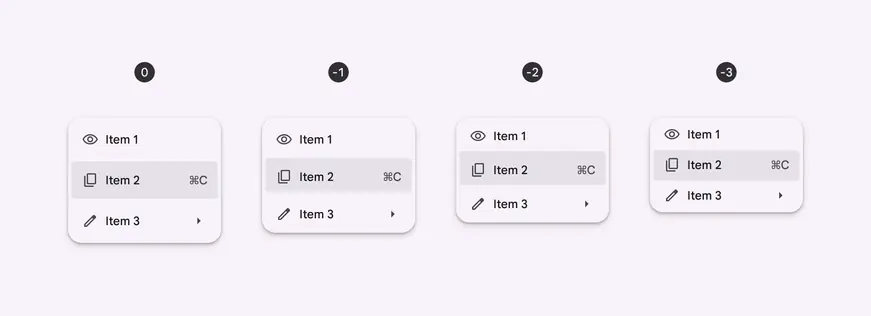
Density of menus from 0 to -3