Lists
Lists are continuous, vertical indexes of text or images.
Overview · Specs · Guidelines · Accessibility
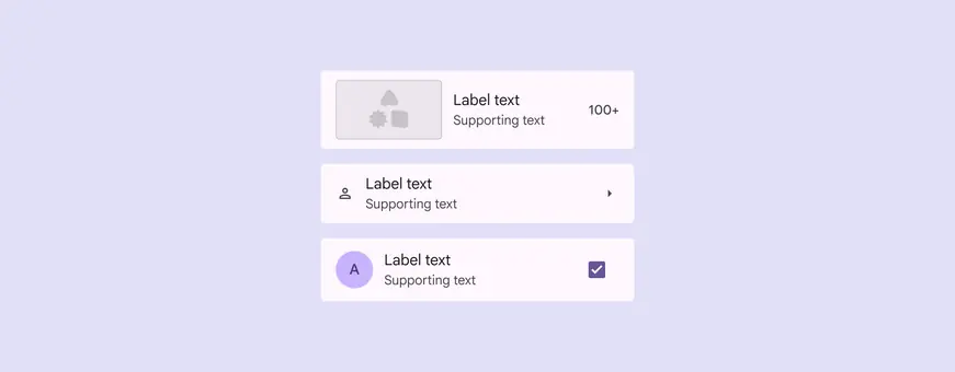
Lists can include a range of layout combinations:
- Leading images, videos, icons, or avatars
- Trailing text, icons, or icon buttons
Usage
Lists are vertical groups of text, icons, images, and other elements, optimized for reading comprehension.
List items can contain multiple actions at once, like selection, icon buttons, overflow menus, and more.
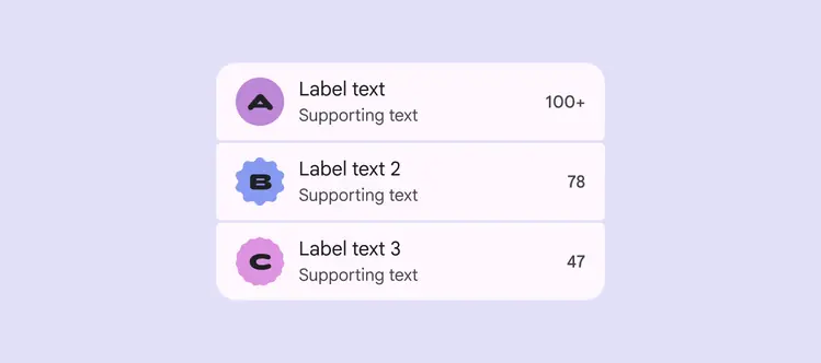
A clear visual hierarchy makes lists easy to scan and read
Use lists for communicating or selecting discrete items, such as choosing from a set of colors.
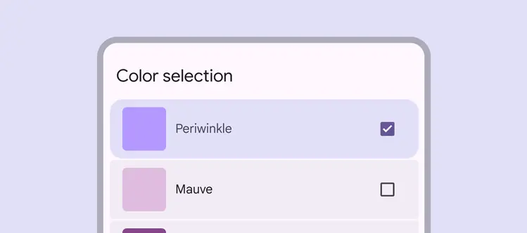
Lists are an organized way to add imagery and supporting elements to selection. In this color selection example, the list contains color swatches, color names, and a checkbox action.
A list should be easy to scan. Any element can be used to anchor and align list item content.
Place supporting visuals and primary text in the same position in each list item.
Don’t vary the position of elements within a list.
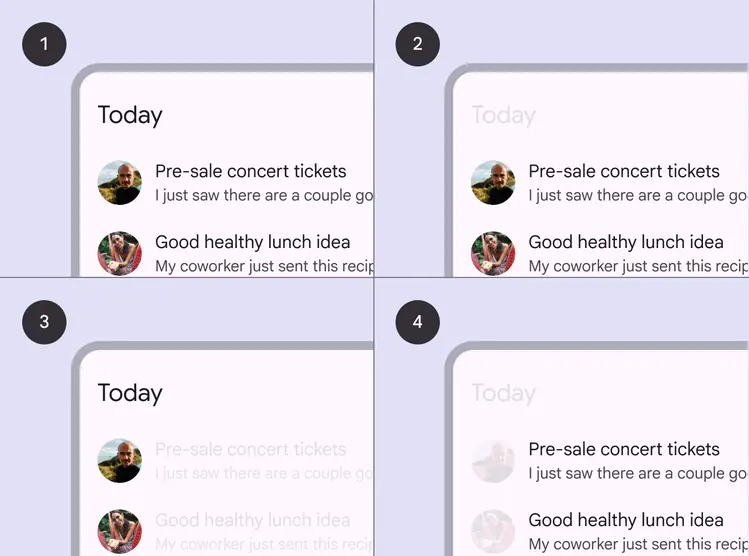
- Sample list
- Content placement in a row
- Supporting visuals are aligned for easy scanning
- Primary text is aligned for easy scanning
List items can adapt to different lengths of text:
Label text only
A list item can contain a single line of label text. If the text doesn’t fit on one line, it can wrap or be truncated.
Label text with supporting text
A list item can include supporting text below the label text. Both the label and supporting text can wrap or be truncated.
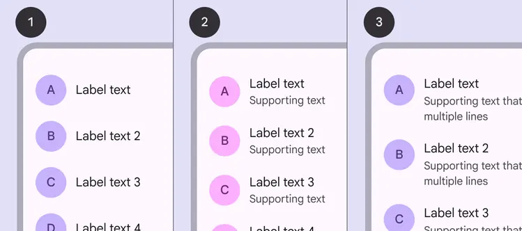
Three examples of list item sizes:
- Label text only
- Label text with supporting text on one line
- Label text with supporting text that wraps to two lines
Anatomy
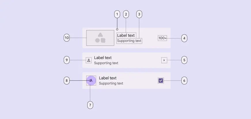
Container and label text are required. All other elements are optional:
- Container
- Label text
- Supporting text
- Trailing text
- Trailing icon
- Trailing selection control - checkbox, radio button, switch
- Leading avatar container
- Leading avatar text
- Leading icon
- Leading media - image or video
Container
List containers hold all list items and their elements. List item size is determined by the tallest element within the list item. See layout measurements
When a list item features an image, consider customizing the container color to use a content-based color scheme. This should be applied to either the enabled state or for an interaction.
A list item can include a leading image and a vibrant color
Label & supporting text
Keep label text brief.
To ensure list items are scannable:
- Limit supporting text to one to three lines
- Truncate supporting text, depending on screen size

Limit supporting text to one to three lines
Icons
Leading icon
A leading icon should provide a quick visual cue that relates to the item's label text, helping people scan the list.
Trailing icon
A trailing icon is often used to communicate status or indicate an action, like Show more.
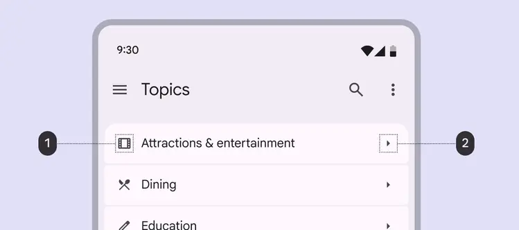
- Leading icons should relate to the label text
- Trailing icons can communicate an action
Leading media
List items can contain a leading avatar, image, or video. Anchor visuals to the leading edge of the list to improve scannability.
Leading video thumbnails can open a video player or even play within the list.
Do
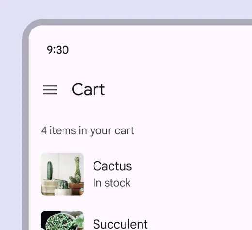
Place supporting visuals, like thumbnails, at the leading edge of a row to improve scannability
Caution
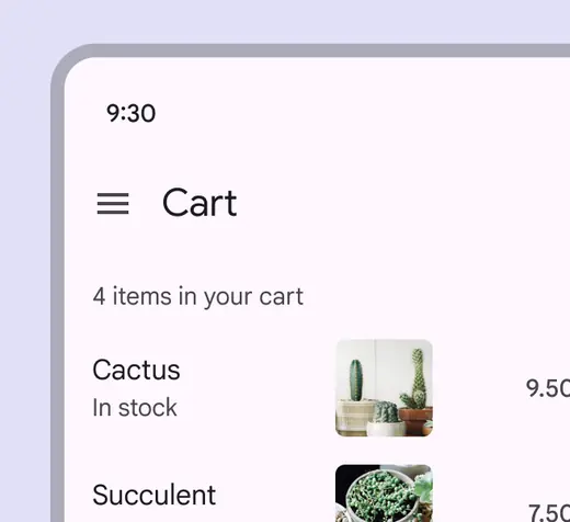
Avoid placing visuals in the center of a row because it makes the list difficult to scan
Avatars
List items can include images in circular or expressive shapes to represent a person or entity.
Use square or rectangular images for other content, such as products or videos.

Use an expressive, circular avatar to represent a person or entity
Primary & secondary actions
Use spacing to draw attention to the most important aspect of the list item, usually the primary action area or key content.
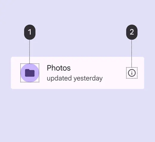
The primary action takes up more space:
1. Primary action area
2. Secondary action area
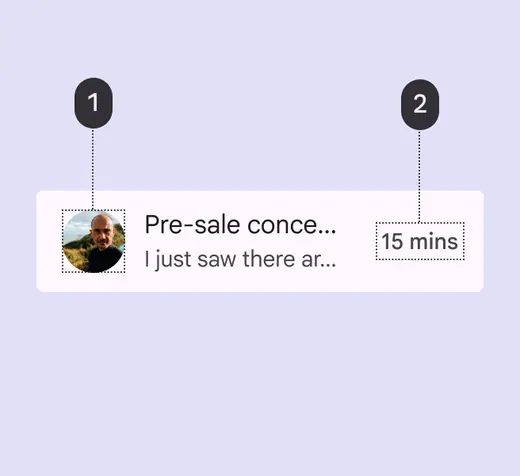
Align content by importance:
1. More distinguishing content
2. Less distinguishing content
Trailing text
Trailing text can provide additional meta-information about a list item, such as a price, count, or other details.
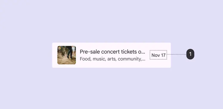
Use trailing text for supplemental details, like a price, count, or date
Selection controls
Selection controls display list item actions. Position controls at the leading or trailing end of a list item:
- Use checkboxes to select multiple items
- Use switches to toggle settings on or off
- Use radio buttons to select a single item
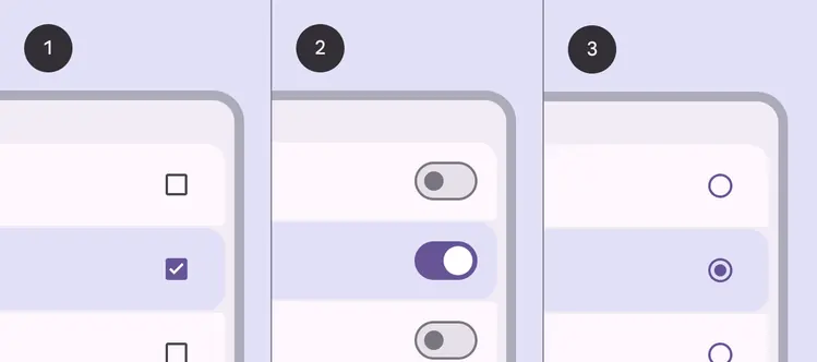
List items with:
- Checkboxes
- Switches
- Radio buttons
Gaps & dividers
Gaps or dividers can separate lists into items and groups:
- Use gaps for contained lists. Gaps leverage expressive shape and containment tactics.
- Limit dividers to uncontained or complex lists, only when a stronger visual separation is necessary.
Do
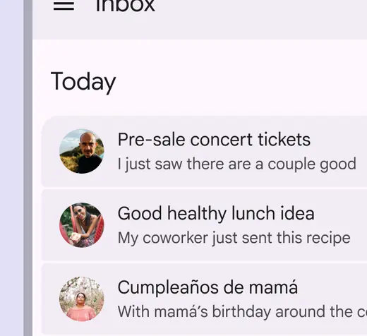
Use segmented gaps and filled list items to define a list group
Caution
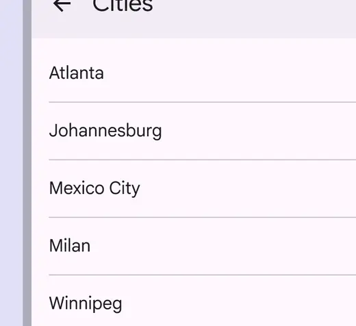
Limit the use of dividers to uncontained lists
Adaptive design
Line length
In fluid layouts, avoid excessively long lines of text when expanding containers and text-heavy components. This often means changing margins and typography properties as the container scales.
Do
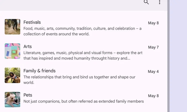
Adjust margins to create a more comfortable line length for reading
Adapt the width of the list container based on a line’s length, or by switching to a multi-column layout.
Do
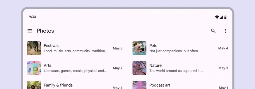
A multi-column layout can help break up content when needed
The ideal line length for text is typically between 40 to 60 characters, but large-screen devices can accommodate up to 120 characters per line. If a line of text is close to 120 characters in length, consider increasing the line height to improve readability .
Don't
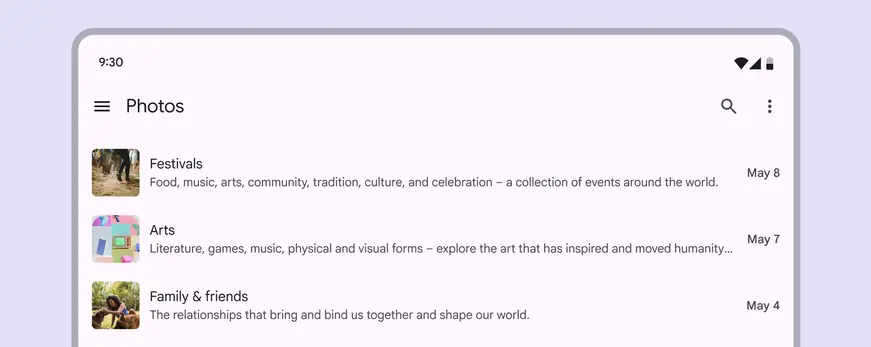
Don’t scale components without adjusting other affected areas of the screen, such as text length. This can result in line lengths that make reading difficult.
A list with a compact breakpoint can become part of a two-column layout at an expanded breakpoint, adjusting the amount of information shown in each list item.
Reduce the amount of information shown at compact breakpoints
Adapt list elements & layout
Lists can change their layout to adapt to different breakpoints. This affects the size and placement of content.
For example, a list at a compact breakpoint can adjust margins, spacing, or density to better fit an expanded window.
On larger screens, lists can show more content, like supporting text and larger imagery
Swap components
Lists are just a compact composition of images, text, and actions. Other components, like cards and carousels, use the same elements but take up more space.
At larger breakpoints, consider swapping a list to a component with a similar purpose to take advantage of available space.
Information displayed in list items on mobile can change to cards on tablet and desktop
Compact breakpoints
Lists should extend edge-to-edge in compact windows. Selecting a list item should open a page with the details.
On small screens, people can navigate between lists and full-screen detailed views
Medium & expanded breakpoints
Medium and expanded breakpoints, such as tablet and desktop screens, can display primary and secondary content in the same view.
For example, a list and the detailed information can appear side-by-side.
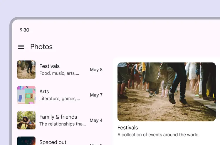
On larger screens, a list-detail view can be more appropriate
At a larger breakpoint, a list may transform into a carousel.
Lists can transform into carousels in expanded windows
Lists can also show more or less content as they scale up and down in size.
For example, a list item can reveal more content when the component expands.
List items reveal supporting text at expanded breakpoints
Behavior
List selection modes
The selected state applies to the entire list item. For example, when an item with a checkbox is selected, both the list item and the checkbox show a selected state.
Single-select
Lists can feature a single-selection component such as a radio button.
Single-select list items:
- Don’t support multi-actions
- Can’t have secondary nested actions
- Shouldn’t use checkboxes
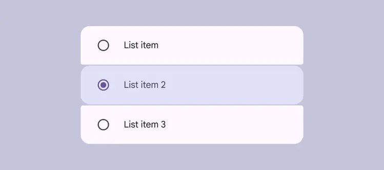
Use radio buttons to allow a single selection in a list
Multi-select
Multi-select lists allow for multiple list items to be toggled on.
Multi-select list items:
- Pair well with checkboxes and switches
- Can’t have secondary nested actions
- Shouldn’t use radio buttons
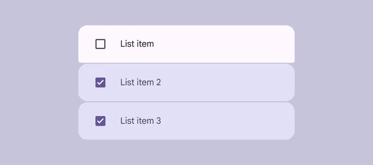
Use checkboxes or switches for multi-select lists
Single-action
In a single-action list, the entire list item performs one action, such as navigating to a new page.
Single-action list items:
- Can’t have secondary nested actions
- Can’t be toggled into a persistent selected state
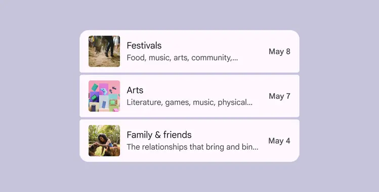
Use a single-action list for a primary action, like navigation
Multi-action
Multi-action lists can support multiple nested actions within a list item.
The primary action should take up the majority of the space in the leading and content positions.
Place supplementary actions, like a bookmark or menu, in the trailing position.
More on multi-action accessibility
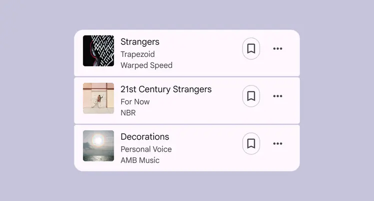
Place supplementary actions in the trailing position of a list item
Non-interactive
Non-interactive lists can organize information in a scannable way. They don’t perform any actions and can’t be selected.
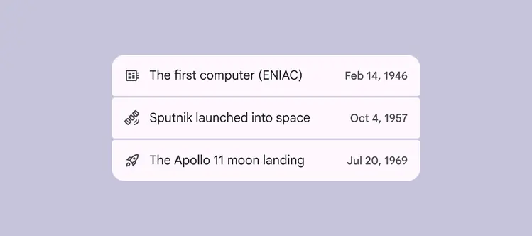
Use non-interactive lists to make information easy to scan
List interactions
Expand & collapse
List items containing other list items can expand and collapse in a folder-like manner, to reveal or hide content.
Tapping a list item expands it vertically across the entire screen using a container transform transition pattern.
To expand a list item, display a parent-child transition
Swipe
On Android, list items can reveal buttons on swipe. Use a mix of button styles for visual interest and hierarchy.
The primary action must be the final end-aligned option. A full swipe triggers this action, clearing the list item and all other actions off-screen.
Swipeable list items should include alternative ways to access hidden actions, such as a more icon.
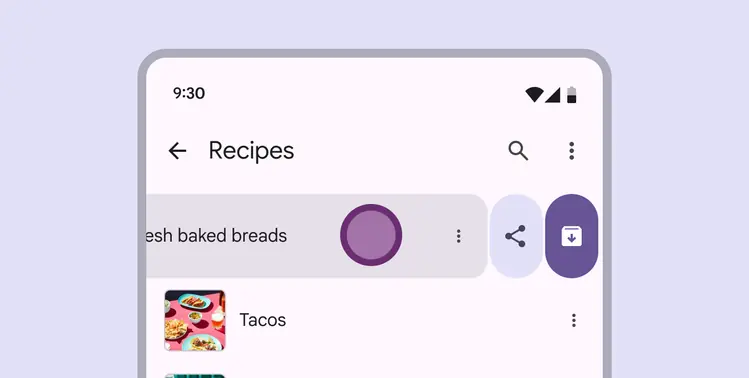
When a list item is swiped, it can be archived or reveal more actions