FABs
Floating action buttons (FABs) help people take primary actions. They’re used to represent the most important action on a screen, such as Create or Reply.
Overview · Specs · Guidelines · Accessibility

- Use a FAB for the most common or important action on a screen
- Make sure the icon in a FAB is clear and understandable
- FABs persist on the screen when content is scrolling
- Three variants: FAB, medium FAB, large FAB

- FAB
- Medium FAB
- Large FAB
Availability & resources
| Type | Resource | Status |
|---|---|---|
| Design | Design Kit (Figma) | Available |
| Implementation | Flutter | Available |
| Implementation | Jetpack Compose | Available |
| Implementation | Jetpack Compose: Expressive | Available |
| Implementation | Android Views (MDC-Android) | Available |
| Implementation | Android Views (MDC-Android): Expressive | Available |
| Implementation | Web | Available |
| Implementation | Web: Expressive | Unavailable |
M3 Expressive update
May 2025
The FAB has new sizes to match the extended FAB and more color options. The small FAB is no longer recommended. More on M3 Expressive
Variants and naming:
- Added medium FAB size
- Small FAB size is no longer recommended
- FAB and large FAB sizes are unchanged
- FAB variants are based on size, not color
Color:
Added tone color styles:
- Primary
- Secondary
- Tertiary
Renamed existing tonal color styles to match their token names:
- Primary to Primary container
- Secondary to Secondary container
- Tertiary to Tertiary container
- The values haven't changed
Surface color FABs are no longer recommended
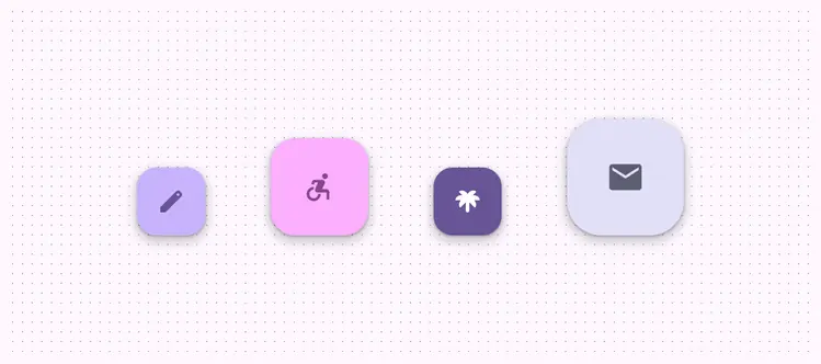
FABs have updated colors and sizes
Differences from M2
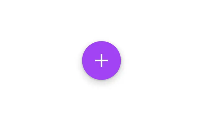
M2: FABs are circles and always have a drop shadow
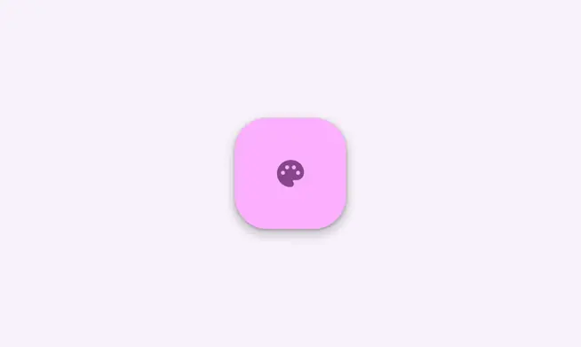
M3: FABs have a boxier shape, can use dynamic color, and include a new large FAB variation