FAB menu
The floating action button (FAB) menu opens from a FAB to display multiple related actions
Overview · Specs · Guidelines · Accessibility
Use cases
People should be able to do the following using assistive technology:
- Navigate and interact with the FAB menu
- Ensure focus is correct when navigating through the menu
Interaction & style
FAB menu elements meet the minimum target size of 48dp.
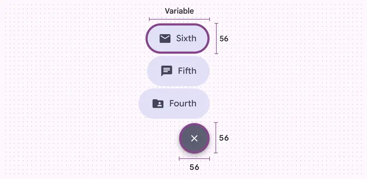
FAB menus have 48x48dp minimum width and sufficient spacing by default
When the FAB menu can scroll, make sure the items scroll behind the close button.
The close button should always be easy to access and unobstructed.
Do
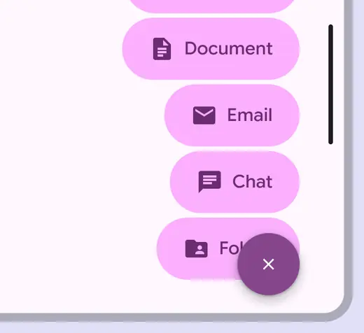
Allow the menu items to scroll behind the close button
Don't
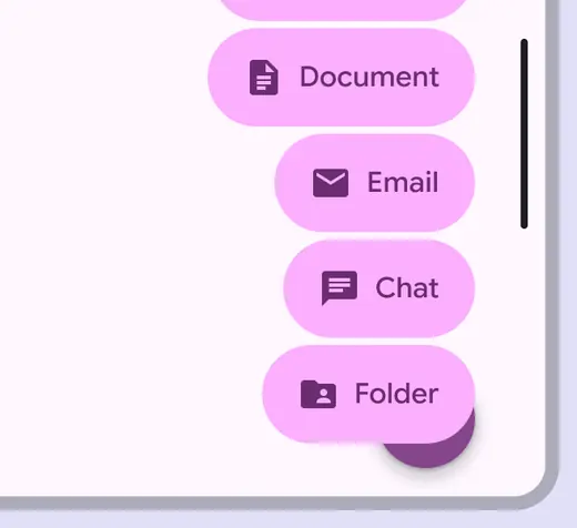
Don’t obstruct the close button in short screens like horizontal orientation
Initial focus
When the FAB is selected, the FAB menu opens, and initial focus remains on the close button, which takes the place of the original FAB.
Then the focus moves from the top menu item to the bottom.
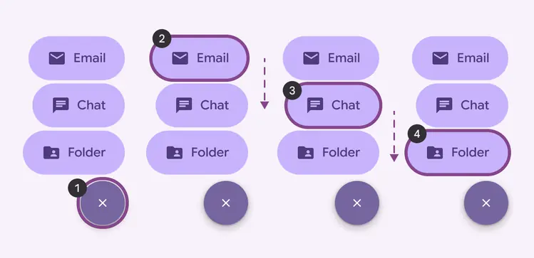
Focus lands on the close button. People can then navigate through all the items.
- Close button
- First menu item
- Second menu item
- Third menu item
Keyboard navigation
| Keys | Actions |
|---|---|
| Tab | Navigate to the next interactive element |
| Space or Enter | Activate the focused button or item |
Labeling elements
Android
On Android, a FAB menu’s close button should include a state to tell screen readers what action will occur when it's toggled. The close button should be labeled:
- Label: Toggle menu
- Role: Button
- State: Expanded or collapsed
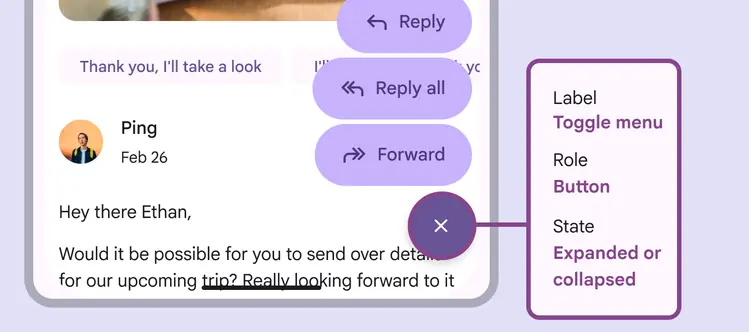
On Android, the close button accessibility labels should include a toggle menu label, button role, and an expanded or collapsed state
FAB menu items should be labeled:
- Label: Match the item’s UI text, such as Reply all
- Role: Button
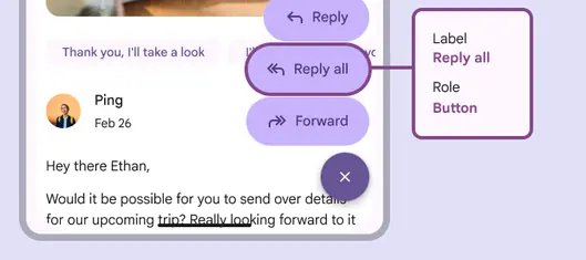
Label FAB menu items to match their UI text, like Reply all, and use the button role
Web
On web, a FAB menu is a combination of a FAB and a menu component. The FAB opens the menu. Follow the accessibility guidelines for FABs and menus.
The FAB's accessibility label should describe the menu that the FAB will open.