Extended FABs
Extended floating action buttons (extended FABs) help people take primary actions, just like FABs. They’re wider than FABs and include a text label, providing more detail and a larger target surface.
Overview · Specs · Guidelines · Accessibility
Use cases
People should be able to do the following using assistive technology:
- Navigate to and activate the extended FAB
Interaction & style
To make it easier for users of screen readers to reach a primary action such as an extended FAB, consider placing the action in the upper left region of large web screens, like in an expanded navigation rail.
In smaller windows, the best place for the extended FAB is the lower right corner of a screen.
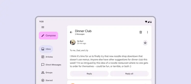
Extended FABs can be placed in the expanded navigation rail
Do
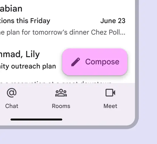
Place extended FABs in an easy-to-reach place that doesn’t obstruct other actions
Don't
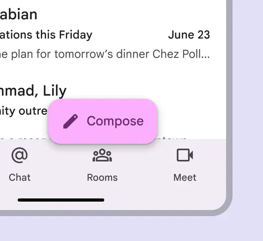
Don’t place extended FABs over another actionable element
Initial focus
Ensure the extended FAB is prioritized in the overall focus order to create an efficient experience for people who navigate UIs with assistive tech.
On mobile, the focus order may start with the app bar, move to the navigation bar, and then skip past any other content on the page to land on the extended FAB.
When using an extended FAB, both the visible label and icon should be treated as one focusable element. The extended FAB doesn’t need a tooltip because it already has a visible label.
Do
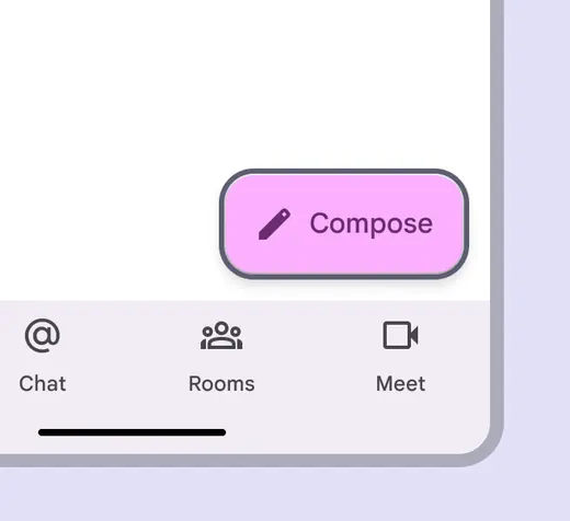
Ensure extended FABs get focus when navigating with assistive technology
Don't
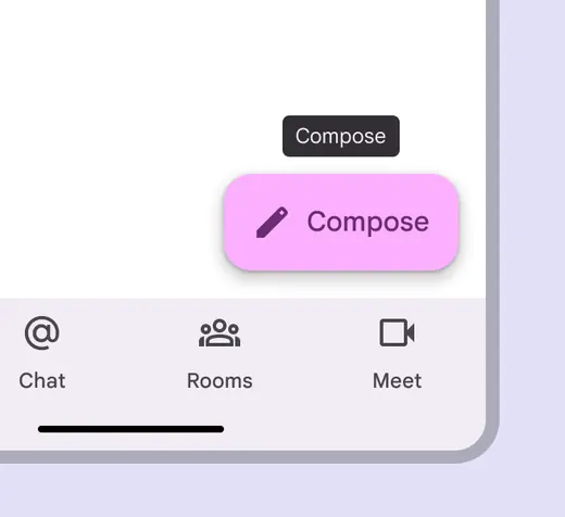
Tooltips aren’t required since the extended FAB has label text
Keyboard navigation
| Keys | Actions |
|---|---|
| Tab | Moves focus to the extended FAB |
| Space or Enter | Activates the extended FAB |
Labeling elements
To ensure the action is clear, use consistent icons and text labels, such as a Compose icon with a Compose text label.
The icon and text label combination should have one distinct purpose.
The accessibility label must include the same first word as the visible label. For example, if the visible button is Create, then the accessibility label might say Create a new invite.
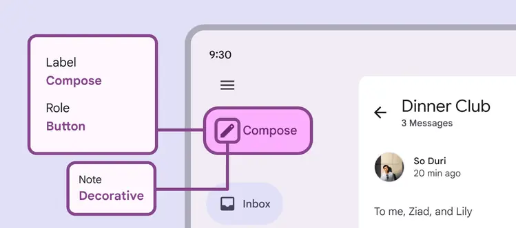
The accessibility label reads Compose to match the extended FAB's displayed label