Date pickers
Date pickers let people select a date, or a range of dates. Date pickers can display past, present, or future dates.
Overview · Specs · Guidelines · Accessibility
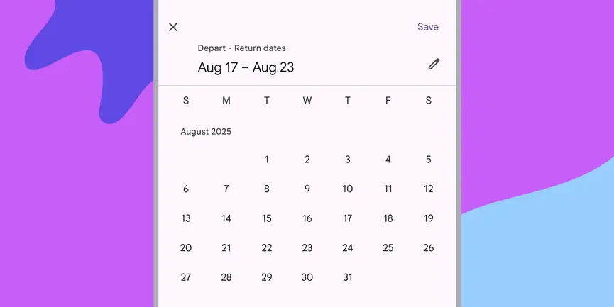
- Date pickers can display past, present, or future dates
- Three variants: docked, modal, modal input
- Clearly indicate important dates, such as current and selected days
- Follow common patterns, like a calendar view
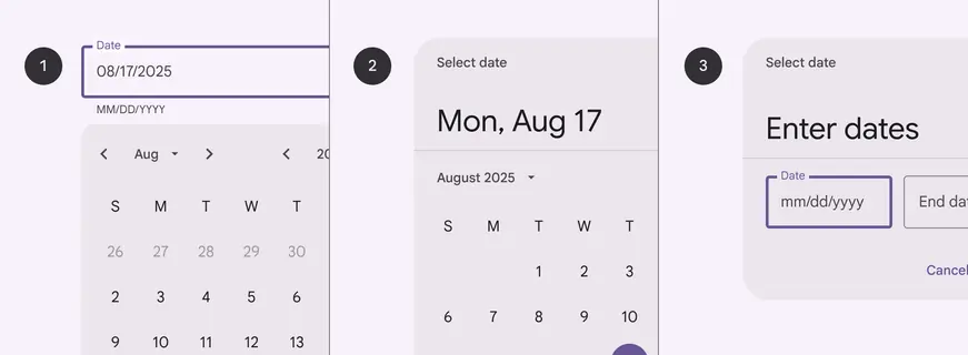
- Docked date picker
- Modal date picker
- Modal date input
Availability & resources
| Type | Resource | Status |
|---|---|---|
| Design | Design Kit (Figma) | Available |
| Implementation | Flutter | Available |
| Implementation | Jetpack Compose | Available |
| Implementation | Android Views (MDC-Android) | Available |
| Implementation | Web | Unavailable |
Differences from M2
- Typography and spacing: Titles and labels are larger and have increased spacing to accommodate 48dp target size
- Color: New color mappings and compatibility with dynamic color
- Variants: The three variants of date pickers have been renamed to not be device-dependent. The former desktop date picker is now known as the docked date picker. The former mobile date picker and date input are now known as modal date picker and modal date input to reinforce that the user must take an action.
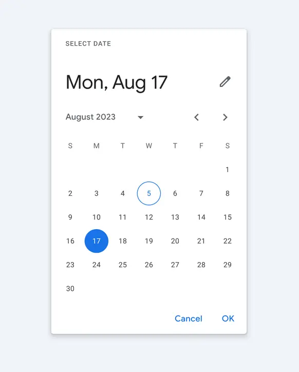
M2: Date pickers had a drop shadow and different color mappings
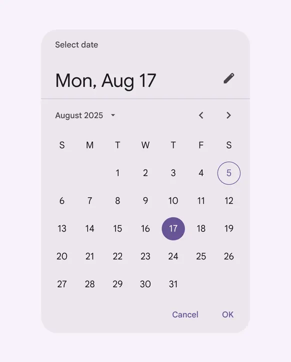
M3: Date pickers have larger typography, no shadow, and new color mappings compatible with dynamic color