Cards
Cards display content and actions about a single subject.
Overview · Specs · Guidelines · Accessibility
Use cases
People should be able to do the following using assistive technology:
- Navigate to a card and the elements within a card
- Get appropriate feedback based on input type documented under Interaction & style
Interaction & style
A card can be a non-actionable container that holds actions like buttons and links, or it can be directly actionable without any buttons or links. This is to avoid stacking actionable elements. An action shouldn’t be placed on an actionable surface.
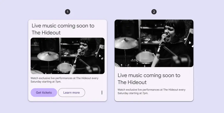
- Non-actionable card with buttons
- Directly actionable card with no buttons
Touch
When a user taps on a directly actionable card, a touch ripple appears across the card, indicating feedback.
Non-actionable cards don’t ripple.
Touch: Tap
Dragging and dismissing
To meet Material's accessibility standards, any dragging and swiping interactions need a single-pointer alternative, like selecting the same actions from a menu.
For example, tapping a card, or pressing and holding, should open a menu to change its position in a list. That menu could also contain an action to delete the card.
Use containers like bottom sheets or menus to show single-pointer options
It isn’t recommended to place menus on top of the card on the draggable state. If doing so is necessary, ensure that the interaction can be completed.
Caution
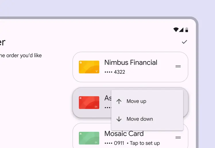
Ensure that the menu doesn't cover the card
Cursor
When a directly actionable card is hovered, the hover state provides a visual cue to the person that the element is interactive. Non-actionable cards don’t have a hover state.
When a directly actionable card is clicked, a ripple appears, providing feedback.
Cursor: Hover, Click
Keyboard
A focus indicator appears around actionable elements when tabbing through cards. This provides a visual cue to a person that the destination is now focused and an action can be taken.
A person can Tab to navigate between actionable elements of the cards. If the cards are non-actionable, Tab navigates directly to the actionable buttons or links within the cards.
When engaging with a focused actionable card or element using the Space or Enter key, an action is performed or a secondary action is available, such as a menu.
Within the menu, a person is able to Arrow through the menu items, Space or Enter to select an item, or Tab to exit.
Keyboard: Tab, Arrows
Focus
All interactive elements of cards need a tab stop so they can be focused. Directly actionable cards are tab stops.
For non-actionable cards, the card itself is not a tab stop. However, every actionable element in the card is a tab stop so they’re all visited before focus navigates to the next card.
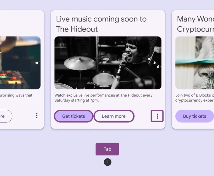
Use Tab to navigate through all buttons in a card
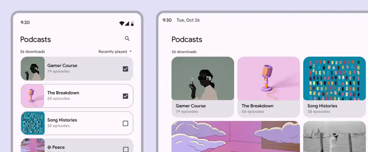
Card layouts can change on different devices
Keyboard navigation
| Keys | Actions |
|---|---|
| Tab | Move to the next actionable element Directly actionable cards: Move to next card container Non-actionable cards with actionable elements: Move to next actionable element |
| Space or Enter | Confirm action |
Labeling elements
The informative contents of a card are verbalized when navigating to them using a screen reader. If an image in a card is purely decorative, hide it from screen readers. All actionable elements must receive both screen reader and keyboard focus.
Directly actionable cards can have the button or link role, depending on how they’re used.
Non-actionable cards are purely containers, so they don’t need a role.
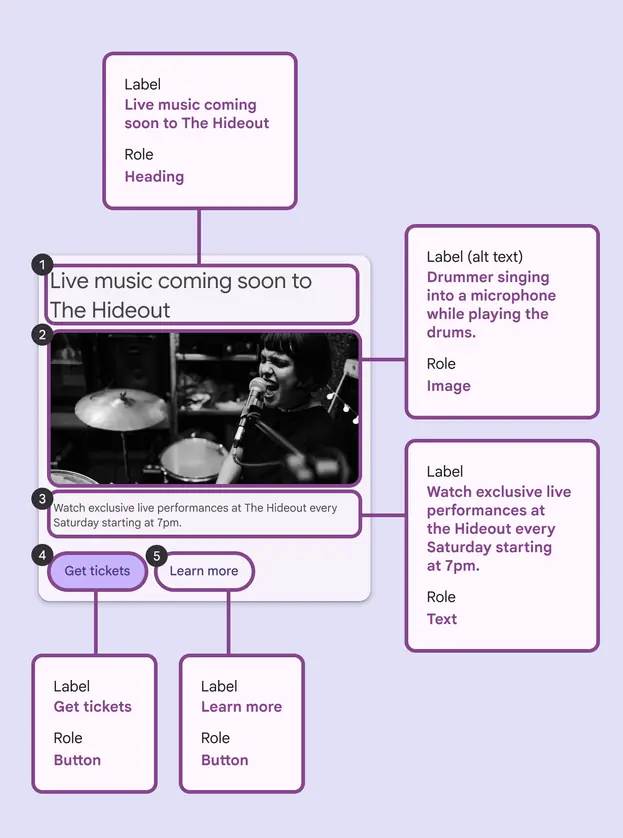
Non-actionable card elements are navigable, focused in order, and verbalized when in focus. In this example, the order is:
- Heading
- Image
- Body text
- Primary button
- Secondary button