Components
Components are interactive building blocks for creating a user interface. They can be organized into categories based on their purpose: Action, containment, communication, navigation, selection, and text input.

Buttons
Do
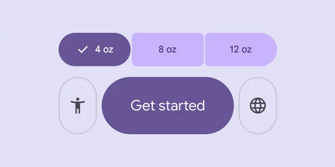
Button groups organize buttons and add interactions between them
Do
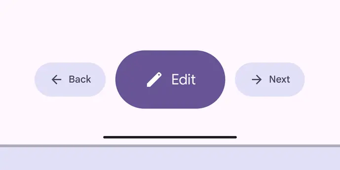
Buttons prompt most actions in a UI
Do
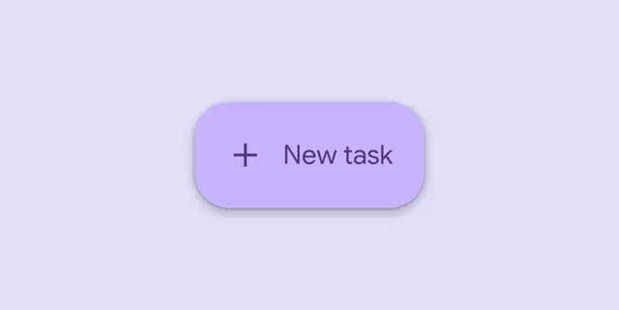
Extended floating action buttons (extended FABs) help people take primary actions
Do
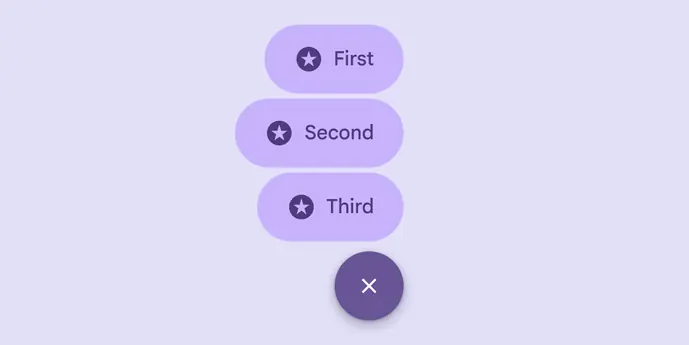
The floating action button (FAB) menu opens from a FAB to display multiple related actions
Do
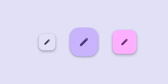
Floating action buttons (FABs) help people take primary actions
Do

Icon buttons help people take actions with a single tap
Do
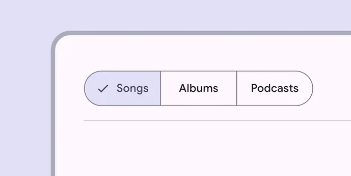
Segmented buttons help people select options, switch views, or sort elements
Do
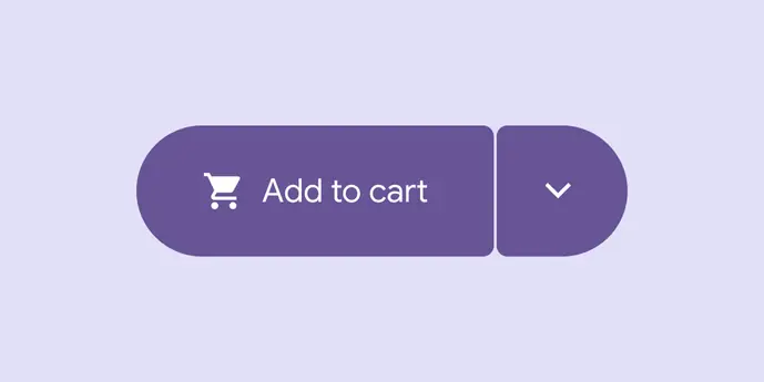
Split buttons open a menu to give people more options related to an action
Date & time pickers
Do
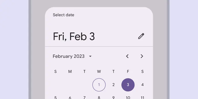
Date pickers let people select a date, or a range of dates
Do
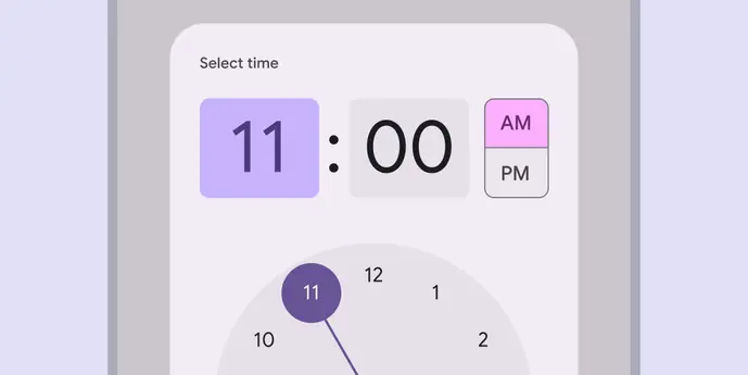
Time pickers help people select and set a specific time
Loading & progress
Do

Loading indicators show the progress of a process for a short wait time
Do

Progress indicators show the status of a process in real time
Navigation
Do
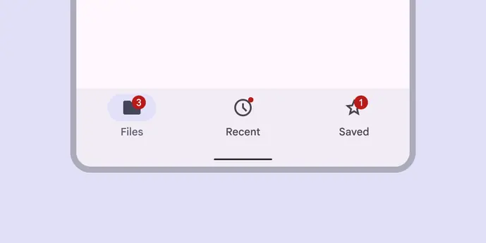
Navigation bars let people switch between UI views on smaller devices
Do
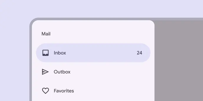
Navigation drawers let people switch between UI views on larger devices
Do
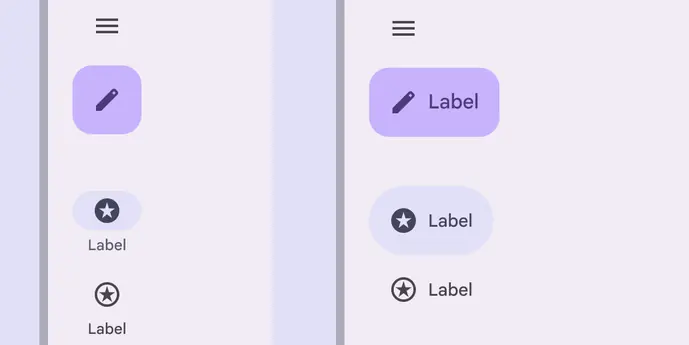
Navigation rails let people switch between UI views on mid-sized devices
Sheets
Do
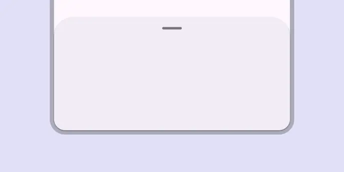
Bottom sheets show secondary content anchored to the bottom of the screen
Do
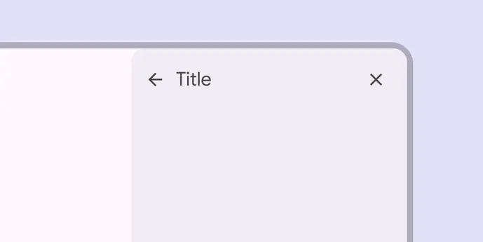
Side sheets show secondary content anchored to the side of the screen
All other components
Do
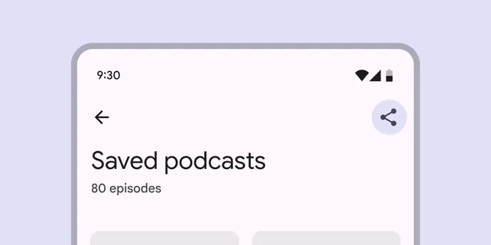
App bars are placed at the top of the screen to help people navigate through a product
Do
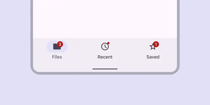
Badges show notifications, counts, or status information on navigation items and icons
Do
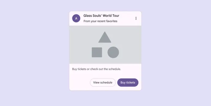
Cards display content and actions about a single subject
Do
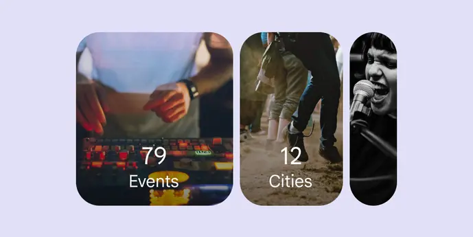
Carousels show a collection of items that can be scrolled on and off the screen
Do
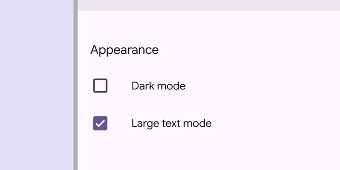
Checkboxes let users select one or more items from a list, or turn an item on or off
Do
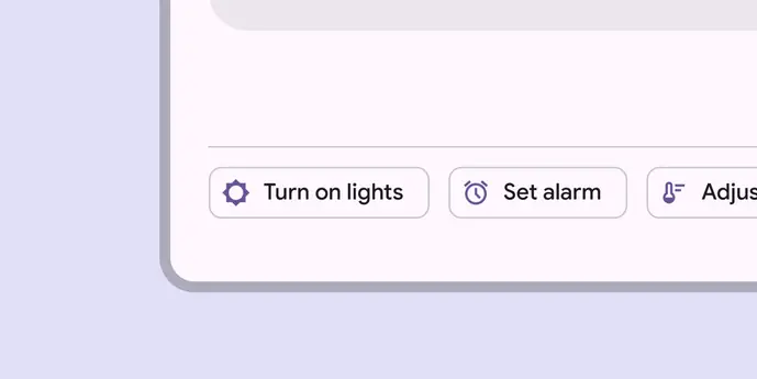
Chips help people enter information, make selections, filter content, or trigger actions
Do
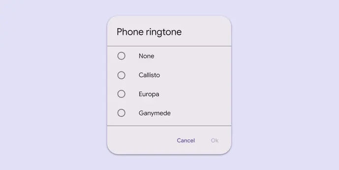
Dialogs provide important prompts in a user flow
Do
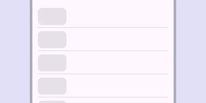
Dividers are thin lines that group content in lists or other containers
Do
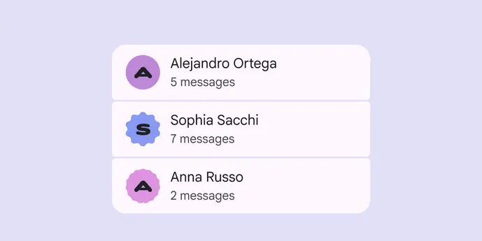
Lists are continuous, vertical indexes of text and images
Do
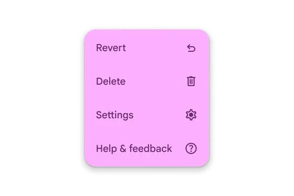
Menus display a list of choices on a temporary surface
Do
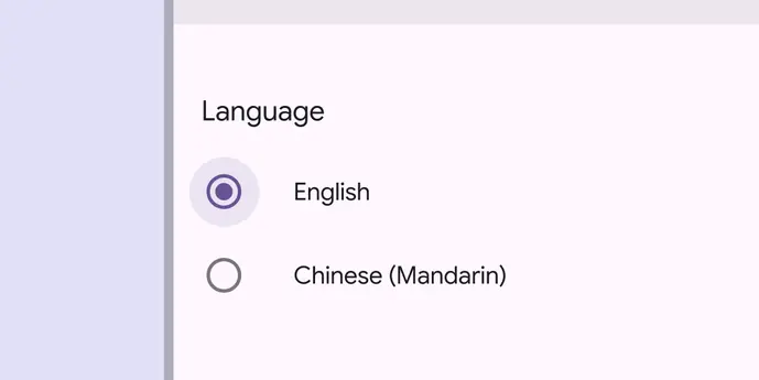
Radio buttons let people select one option from a set of options
Do
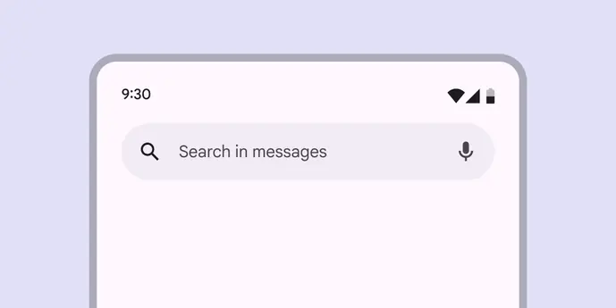
Search lets people enter a keyword or phrase to get relevant information
Do
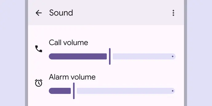
Sliders allow users to make selections from a range of values
Do
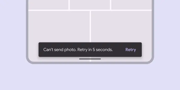
Snackbars show short updates about app processes at the bottom of the screen
Do
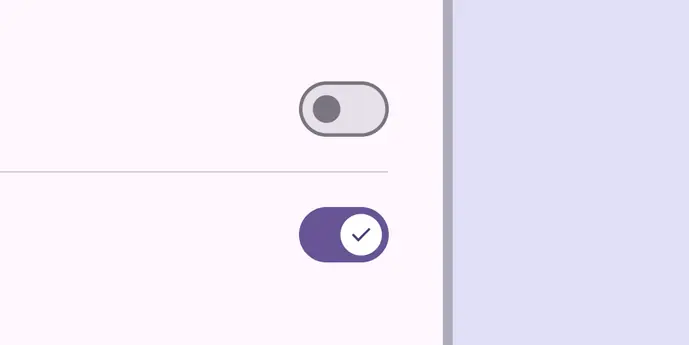
Switches toggle the selection of an item on and off
Do
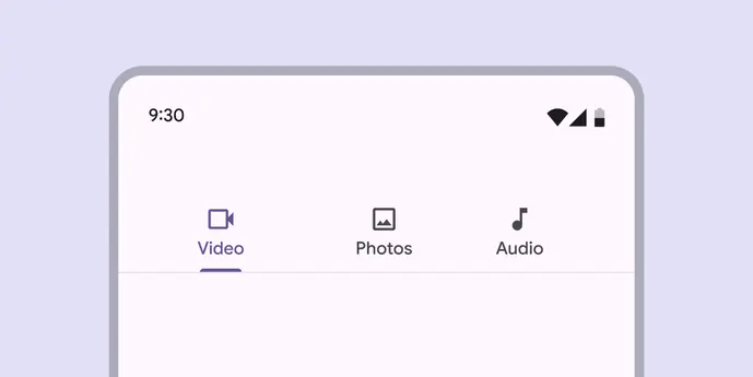
Tabs organize content across different screens and views
Do
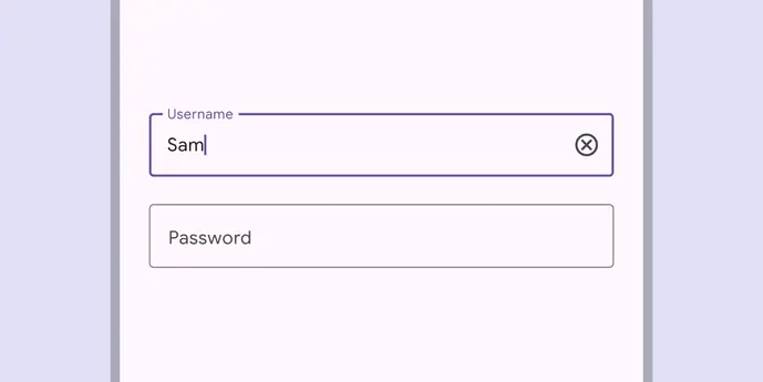
Text fields let users enter text into a UI
Do
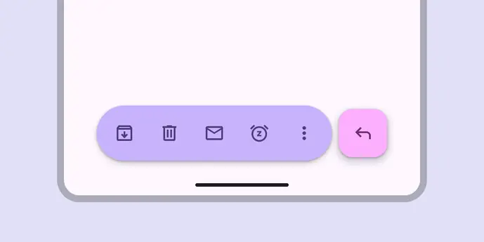
Toolbars display frequently used actions relevant to the current page
Do
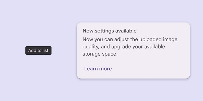
Tooltips display brief labels or messages