---
url: /styles/color/advanced/define-new-colors.md
description: >-
Apply, define, or adjust colors to create a fine-tuned, unique color
experience
---
# Advanced customizations
Apply, define, or adjust colors to create a fine-tuned, unique color experience
[Overview](overview.md) · [Apply colors](apply-colors.md) · **Define new colors** · [Adjust existing colors](adjust-existing-colors.md)
You can add colors to your scheme to extend the color roles provided by Material out of the box.
## Define static colors
*Formerly known as custom colors*
You can define additional colors in your scheme that stay static even when other colors dynamically change. When you input a desired reference color, Material will return four derived color roles that align with the design of existing roles in the color scheme.
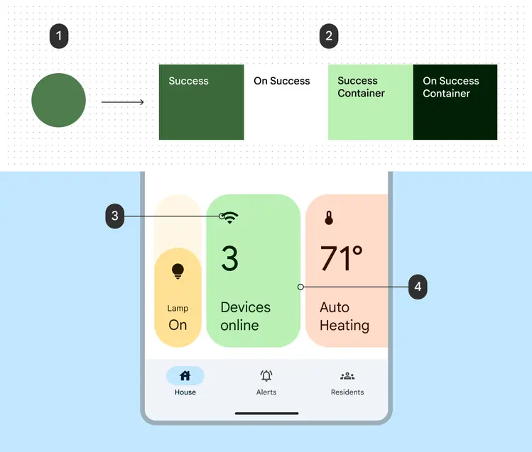
In this example, a static green color called Success is defined in addition to the scheme, and applied to UI to indicate a success state.
1. Green source color used to generate color values for four new color roles
2. A set of new "Success" color roles derived from the source color
3. **On success container** color applied to the WiFi icon
4. **Success container **color applied to a card container
### Why
You may need to apply static colors in your app for brand expression or to communicate semantic meaning, like a green success state. By defining these colors using the Material system, they'll work with existing Material colors and support features like dynamic color and user-controlled contrast.
### How
Use the [Material Theme Builder](https://www.figma.com/community/plugin/1034969338659738588/material-theme-builder "Material Theme Builder (MTB) is a Figma plugin that allows markers to emulate the color extraction process for dynamic color and create custom tonal schemes.") to input a custom color. Material will return four color roles derived from that reference color. The main color, on-main color, container color, and on-container color all follow the conventions of the accent colors in the main scheme, and can be applied to your UI according to the same relationships. See [*map or remap colors on UI elements*](apply-colors.md#d15f5373-c03b-4282-a309-db569975d395) for more information.
### Best practices
* If the colors provided back from your input color appear differently than expected, you can enable or disable color fidelity. [Color fidelity](adjust-existing-colors.md#cb49eeb4-3bbd-4521-9612-0856c27f91ef) is a feature that adjusts colors’ tones to match that of your input color.
* Material provides the red Error color out of the box as an example of a static color, so you do not need to define your own static color for a semantic red color.
* If you are using static colors in a dynamic scheme, you can choose to [harmonize your static colors](adjust-existing-colors.md#1cc12e43-237b-45b9-8fe0-9a3549c1f61e) to the scheme’s primary color. This will shift your static colors’ hues slightly warmer or cooler for a more harmonious overall appearance, while retaining the semantic meaning associated with the colors’ hue range.
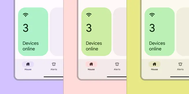
Static colors can be harmonized with dynamic color to appear harmonious with the overall color scheme
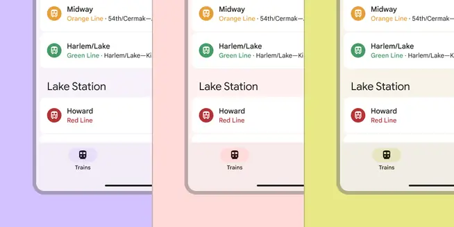
Colors can stay completely static and forgo harmonization if their values are tied to literal sources, such as brand colors or real-world signage
## Define custom color roles
You can define custom color roles in addition to those already existing in the color scheme. By defining these roles the same way Material does (specifying a reference palette, starting tones, and contrast requirements), these roles can achieve colors more specific to your needs while working seamlessly with features such as user-controlled contrast.
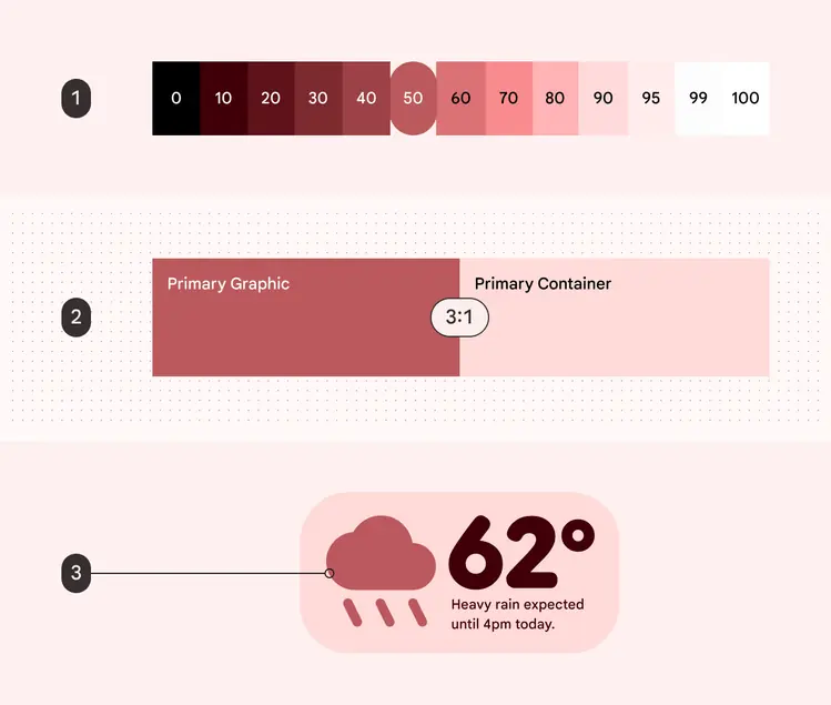
Example of creating a custom color role:
1. The primary tonal palette, with tone 50 specified as the **primary graphic** default value
2. Color swatch showing an accessible 3:1 contrast between **primary graphic** and **p**__rimary container__
3. The **primary graphic** color role is applied in a weather widget against the **primary container**
### Why
You may need to define your own custom color roles if the scheme’s existing colors or additional static colors don’t meet your product’s needs. In particular, you should create them within the Material system to respect dynamic colors and unlock other features like user-controlled contrast.
### How
Abstract your new color into a color role by specifying the following criteria:
* **Palettes and reference tones:** For each color role, you must assign its value from a Material palette (primary, secondary, tertiary, neutral, neutralVariant, error) and a reference tone (for example: primary70, primary80, primary90…) for both light and dark themes.
* **Color pairings:** You must specify any visual relationships in your design, such as color pairs that are used together as foreground and background, or which should retain a tone delta between them (difference in lightness or darkness).
* **Contrast:** Confirm that custom foreground and background color pairings meet [Material's contrast minimums](../../../foundations/designing/color-contrast.md).
Once the above criteria are known, you can define the new color roles in your own dynamic color object. For each color role, you may then call Material Color Utilities (MCU) to generate the color value dynamically, according to different conditions such as user theming or contrast level.
### Best practices
Defining custom color roles should be considered only if you cannot achieve your desired colors with other Material color solutions.