---
url: /foundations/layout/breakpoints/expanded.md
description: Breakpoints ensure layouts work across a wide range of devices
---
# Breakpoints
Breakpoints ensure layouts work across a wide range of devices
[Overview](overview.md) · [Compact](compact.md) · [Medium](medium.md) · **Expanded** · [Large & extra-large](large-extra-large.md)
Layouts for expanded [breakpoints](overview.md "Breakpoints are opinionated window sizes where a layout changes to match available space, device conventions, and ergonomics (previously window size classes).") are for **screen widths from 840dp to 1199dp.**

Two-pane layouts are often best for expanded breakpoints
## Navigation
Place navigation components close to edges of the window where they’re easier to reach. Use a [navigation rail](../../../components/navigation-rail/overview.md "Navigation rails let people switch between UI views on mid-sized devices."), either collapsed or expanded.
The navigation rail can be hidden in secondary destinations as long as the primary destination can still be accessed using a back button.
For sorting, filtering, or secondary navigation, use tabs or other components directly in the pane.
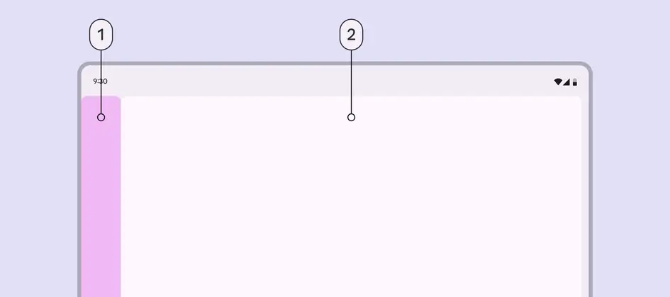
1. Navigation area
2. Single pane
## Panes
Use a single-pane or two-pane layout.
A two-pane layout is often best for expanded breakpoints. However, a single-pane layout can work when displaying visually- or information-dense content, such as videos.
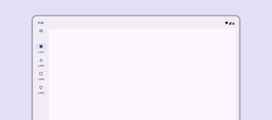
At an expanded breakpoint, reserve single-pane layouts for information-dense content
When using a [fixed-and-flexible](../scaffold/panes.md#92371c3b-587d-4c6f-8105-05b69dcec81a) layout, the fixed pane should have a width of 360dp by default.
In a fixed-and-flexible layout, the fixed pane is 360dp by default
A [split-pane layout](../scaffold/panes.md#dc7982b7-754c-410a-9e88-18a54557c87b) uses two flexible panes and visually centers the spacer by default.
The navigation and first pane are 50% of the window width to keep the spacer visually centered
## Spacing
Expanded layouts have a leading and trailing margin of 24dp.
The spacer between panes is 24dp.
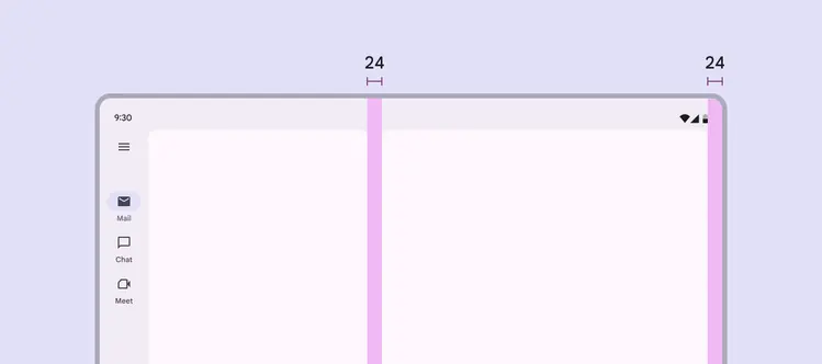
Use 24dp for margins and spacer in an expanded layout
## Special considerations
An expanded layout will need to transition dynamically to a compact or medium layout when:
* A foldable device is folded
* A tablet is rotated from landscape to portrait
* The app goes from full-screen to split-screen
* Multi-window mode is initiated
* A free-form window is resized
Consider how an expanded layout should change at medium and compact breakpoints