---
url: /foundations/interaction/states/overview.md
description: States show the interaction status of a component or UI element
---
# States
States show the interaction status of a component or UI element
**Overview** · [State layers](state-layers.md) · [Applying states](applying-states.md)

* States have two visual indicators to ensure accessibility
* States can be combined, such as selection and hover
* Apply states consistently across components
## Resources
| Type | Link | Status |
| :----: | ------------------------------------------ | --------- |
| Design | [Design Kit](http://goo.gle/m3-design-kit) | Available |
1\. [Enabled
](applying-states.md#39b2fc90-01db-41b5-b6f8-47be61ed1479)An enabled state communicates an interactive component or element.
2\. [Disabled](applying-states.md#4aff9c51-d20f-4580-a510-862d2e25e931)
A disabled state communicates an inoperable component or element.
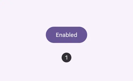
Enabled button
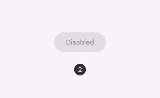
Disabled button
3\. [Hover](applying-states.md#71c347c2-dd75-485b-892e-04d2900bd844)
A hover state communicates when a user has placed a cursor above an interactive element.
4\. [Focused](applying-states.md#bc6d6853-48ef-490e-8076-448e89e69f0f)
A focused state communicates when a user has highlighted an element, using an input method such as a keyboard or voice.
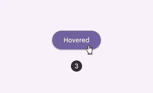
Hovered button
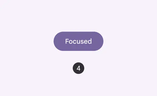
Focused button
5\. [Pressed](applying-states.md#c3690714-b741-492d-97b0-5fc1960e43e6)
A pressed state communicates a user tap.
6\. [Dragged](applying-states.md#c97582c4-5fef-42ce-9c34-71f8dcc5b8ad)
A dragged state communicates when a user presses and moves an element.
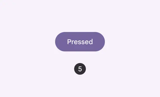
Pressed button
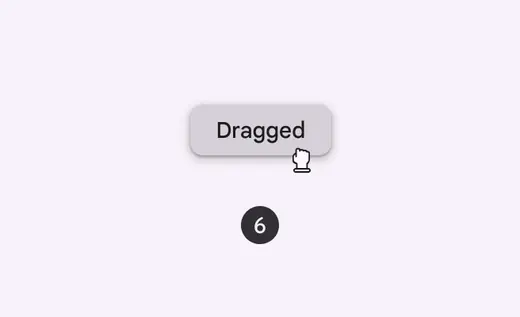
Dragged chip