---
url: /components/toolbars/specs.md
description: Toolbars display frequently used actions relevant to the current page.
---
# Toolbars
Toolbars display frequently used actions relevant to the current page.
[Overview](overview.md) · **Specs** · [Guidelines](guidelines.md) · [Accessibility](accessibility.md)
## Variants
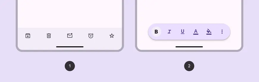
1. Docked toolbar
2. Floating toolbar
### Baseline variant
The baseline bottom app bar is no longer recommended. It should be replaced with the docked toolbar, which is very similar and more flexible.

1. Bottom app bar (not recommended)
| Variant | M3 | M3 Expressive |
| ---------------- | :-------: | :-----------------------------------------: |
| Docked toolbar | -- | Available |
| Floating toolbar | -- | Available |
| Bottom app bar | Available | Not recommended.
Use **docked toolbar**. |
::: info Note
Implementation differs per platform. On Jetpack Compose, the floating toolbar is a separate component from the docked toolbar and bottom app bar.
:::
## Configurations
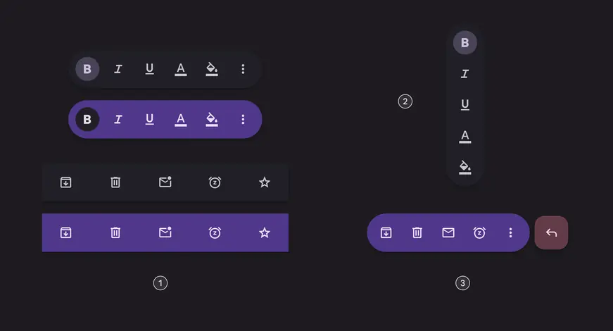
1. Standard and vibrant toolbars
2. Vertical floating toolbar
3. Floating toolbar with FAB
| Category | Configuration | M3 | M3 Expressive |
| ----------------------- | -------------------- | :-------------------------: | :-----------: |
| Color | Standard (default) | Available as bottom app bar | Available |
| Color | Vibrant | -- | Available |
| Floating toolbar layout | Horizontal (default) | -- | Available |
| Floating toolbar layout | Vertical | -- | Available |
| Other elements | With FAB | Available as bottom app bar | Available\* |
::: info Note
\*Implementation differs per platform. On Jetpack Compose, floating toolbar with FAB is [fully supported](https://developer.android.com/reference/kotlin/androidx/compose/material3/package-summary#HorizontalFloatingToolbar\(kotlin.Boolean,androidx.compose.ui.Modifier,androidx.compose.material3.FloatingToolbarColors,androidx.compose.foundation.layout.PaddingValues,androidx.compose.material3.FloatingToolbarScrollBehavior,androidx.compose.ui.graphics.Shape,kotlin.Function1,kotlin.Function1,androidx.compose.ui.unit.Dp,androidx.compose.ui.unit.Dp,kotlin.Function1\)). On other platforms, each component needs to be added separately.
:::
## Tokens & specs
Browse the component elements, attributes, tokens, and their values. [Jump to baseline bottom app bar specs](#ad142675-3e3b-43b8-ba53-12c1f0b7138d)
::: token-table token-table-2956a7939bf0879c-60569487
**Toolbars tokens** · 5 token sets · 106 tokens · [live token table](https://m3.material.io/components/toolbars/specs) · DSDB `TOKEN_TABLE.2956a7939bf0879c`
* Default context: Theme: Light · Platform: Android · Audience: 3P · Contrast: Default · iOS dark theme elevation: None · iOS weight setting: Default
* Not configurable here (group default used): Motion scheme: Standard · Font: Static · Language height: Small
* Other contexts: Theme: Dark · Contrast: Medium contrast, High contrast. "Other contexts" lists values that differ from the default when only that one context changes.
* Reference chain: aliases from the token to its source value (`token → alias → … → value`). "—" means the token holds a literal value.
**Toolbar - Color - Standard** · `md.comp.toolbar.standard` · 33 tokens
For standard docked and floating toolbars.
| Group | Token | Type | Reference chain | Resolved value | Other contexts |
| --- | --- | --- | --- | --- | --- |
| Enabled | `md.comp.toolbar.standard.button.container.color` | Color | `md.sys.color.surface-container` → `md.ref.palette.neutral94` | `#F3EDF7` | Dark: `#211F26` via `md.ref.palette.neutral12` |
| Enabled | `md.comp.toolbar.standard.selected.button.container.color` | Color | `md.sys.color.secondary-container` → `md.ref.palette.secondary90` | `#E8DEF8` | Dark: `#4A4458` via `md.ref.palette.secondary30`
Medium contrast: `#625B71` via `md.ref.palette.secondary40`
High contrast: `#4A4458` via `md.ref.palette.secondary30` |
| Enabled | `md.comp.toolbar.standard.icon.color` | Color | `md.sys.color.on-surface-variant` → `md.ref.palette.neutral-variant30` | `#49454F` | Dark: `#CAC4D0` via `md.ref.palette.neutral-variant80`
Medium contrast: `#322F37` via `md.ref.palette.neutral-variant20`
High contrast: `#000000` via `md.ref.palette.neutral-variant0` |
| Enabled | `md.comp.toolbar.standard.selected.icon.color` | Color | `md.sys.color.on-secondary-container` → `md.ref.palette.secondary30` | `#4A4458` | Dark: `#E8DEF8` via `md.ref.palette.secondary90`
Medium contrast: `#FFFFFF` via `md.ref.palette.secondary100`
High contrast: `#FFFFFF` via `md.ref.palette.secondary100` |
| Enabled | `md.comp.toolbar.standard.label-text.color` | Color | `md.sys.color.on-surface-variant` → `md.ref.palette.neutral-variant30` | `#49454F` | Dark: `#CAC4D0` via `md.ref.palette.neutral-variant80`
Medium contrast: `#322F37` via `md.ref.palette.neutral-variant20`
High contrast: `#000000` via `md.ref.palette.neutral-variant0` |
| Enabled | `md.comp.toolbar.standard.selected.label-text.color` | Color | `md.sys.color.on-secondary-container` → `md.ref.palette.secondary30` | `#4A4458` | Dark: `#E8DEF8` via `md.ref.palette.secondary90`
Medium contrast: `#FFFFFF` via `md.ref.palette.secondary100`
High contrast: `#FFFFFF` via `md.ref.palette.secondary100` |
| Enabled | `md.comp.toolbar.standard.container.shape` | Shape | `md.sys.shape.corner.full` | `Circular (fully rounded)` | — |
| Enabled | `md.comp.toolbar.standard.container.color` | Color | `md.sys.color.surface-container` → `md.ref.palette.neutral94` | `#F3EDF7` | Dark: `#211F26` via `md.ref.palette.neutral12` |
| Disabled | `md.comp.toolbar.standard.disabled.icon.opacity` | Opacity | — | `0.38` | — |
| Disabled | `md.comp.toolbar.standard.disabled.label-text.color` | Color | `md.sys.color.on-surface` → `md.ref.palette.neutral10` | `#1D1B20` | Dark: `#E6E0E9` via `md.ref.palette.neutral90`
Medium contrast: `#000000` via `md.ref.palette.neutral0`
High contrast: `#000000` via `md.ref.palette.neutral0` |
| Disabled | `md.comp.toolbar.standard.disabled.label-text.opacity` | Opacity | — | `0.38` | — |
| Disabled | `md.comp.toolbar.standard.disabled.icon.color` | Color | `md.sys.color.on-surface` → `md.ref.palette.neutral10` | `#1D1B20` | Dark: `#E6E0E9` via `md.ref.palette.neutral90`
Medium contrast: `#000000` via `md.ref.palette.neutral0`
High contrast: `#000000` via `md.ref.palette.neutral0` |
| Hovered | `md.comp.toolbar.standard.selected.hovered.state-layer.color` | Color | `md.sys.color.on-secondary-container` → `md.ref.palette.secondary30` | `#4A4458` | Dark: `#E8DEF8` via `md.ref.palette.secondary90`
Medium contrast: `#FFFFFF` via `md.ref.palette.secondary100`
High contrast: `#FFFFFF` via `md.ref.palette.secondary100` |
| Hovered | `md.comp.toolbar.standard.hovered.state-layer.opacity` | Opacity | `md.sys.state.hover.state-layer-opacity` | `0.08` | — |
| Hovered | `md.comp.toolbar.standard.hovered.icon.color` | Color | `md.sys.color.on-surface-variant` → `md.ref.palette.neutral-variant30` | `#49454F` | Dark: `#CAC4D0` via `md.ref.palette.neutral-variant80`
Medium contrast: `#322F37` via `md.ref.palette.neutral-variant20`
High contrast: `#000000` via `md.ref.palette.neutral-variant0` |
| Hovered | `md.comp.toolbar.standard.selected.hovered.icon.color` | Color | `md.sys.color.on-secondary-container` → `md.ref.palette.secondary30` | `#4A4458` | Dark: `#E8DEF8` via `md.ref.palette.secondary90`
Medium contrast: `#FFFFFF` via `md.ref.palette.secondary100`
High contrast: `#FFFFFF` via `md.ref.palette.secondary100` |
| Hovered | `md.comp.toolbar.standard.hovered.label-text.color` | Color | `md.sys.color.on-surface-variant` → `md.ref.palette.neutral-variant30` | `#49454F` | Dark: `#CAC4D0` via `md.ref.palette.neutral-variant80`
Medium contrast: `#322F37` via `md.ref.palette.neutral-variant20`
High contrast: `#000000` via `md.ref.palette.neutral-variant0` |
| Hovered | `md.comp.toolbar.standard.selected.hovered.label-text.color` | Color | `md.sys.color.on-secondary-container` → `md.ref.palette.secondary30` | `#4A4458` | Dark: `#E8DEF8` via `md.ref.palette.secondary90`
Medium contrast: `#FFFFFF` via `md.ref.palette.secondary100`
High contrast: `#FFFFFF` via `md.ref.palette.secondary100` |
| Hovered | `md.comp.toolbar.standard.hovered.state-layer.color` | Color | `md.sys.color.on-surface-variant` → `md.ref.palette.neutral-variant30` | `#49454F` | Dark: `#CAC4D0` via `md.ref.palette.neutral-variant80`
Medium contrast: `#322F37` via `md.ref.palette.neutral-variant20`
High contrast: `#000000` via `md.ref.palette.neutral-variant0` |
| Focused | `md.comp.toolbar.standard.selected.focused.state-layer.color` | Color | `md.sys.color.on-secondary-container` → `md.ref.palette.secondary30` | `#4A4458` | Dark: `#E8DEF8` via `md.ref.palette.secondary90`
Medium contrast: `#FFFFFF` via `md.ref.palette.secondary100`
High contrast: `#FFFFFF` via `md.ref.palette.secondary100` |
| Focused | `md.comp.toolbar.standard.focused.state-layer.opacity` | Opacity | `md.sys.state.focus.state-layer-opacity` | `0.1` | — |
| Focused | `md.comp.toolbar.standard.focused.icon.color` | Color | `md.sys.color.on-surface-variant` → `md.ref.palette.neutral-variant30` | `#49454F` | Dark: `#CAC4D0` via `md.ref.palette.neutral-variant80`
Medium contrast: `#322F37` via `md.ref.palette.neutral-variant20`
High contrast: `#000000` via `md.ref.palette.neutral-variant0` |
| Focused | `md.comp.toolbar.standard.selected.focused.icon.color` | Color | `md.sys.color.on-secondary-container` → `md.ref.palette.secondary30` | `#4A4458` | Dark: `#E8DEF8` via `md.ref.palette.secondary90`
Medium contrast: `#FFFFFF` via `md.ref.palette.secondary100`
High contrast: `#FFFFFF` via `md.ref.palette.secondary100` |
| Focused | `md.comp.toolbar.standard.focused.label-text.color` | Color | `md.sys.color.on-surface-variant` → `md.ref.palette.neutral-variant30` | `#49454F` | Dark: `#CAC4D0` via `md.ref.palette.neutral-variant80`
Medium contrast: `#322F37` via `md.ref.palette.neutral-variant20`
High contrast: `#000000` via `md.ref.palette.neutral-variant0` |
| Focused | `md.comp.toolbar.standard.selected.focused.label-text.color` | Color | `md.sys.color.on-secondary-container` → `md.ref.palette.secondary30` | `#4A4458` | Dark: `#E8DEF8` via `md.ref.palette.secondary90`
Medium contrast: `#FFFFFF` via `md.ref.palette.secondary100`
High contrast: `#FFFFFF` via `md.ref.palette.secondary100` |
| Focused | `md.comp.toolbar.standard.focused.state-layer.color` | Color | `md.sys.color.on-surface-variant` → `md.ref.palette.neutral-variant30` | `#49454F` | Dark: `#CAC4D0` via `md.ref.palette.neutral-variant80`
Medium contrast: `#322F37` via `md.ref.palette.neutral-variant20`
High contrast: `#000000` via `md.ref.palette.neutral-variant0` |
| Pressed | `md.comp.toolbar.standard.selected.pressed.state-layer.color` | Color | `md.sys.color.on-secondary-container` → `md.ref.palette.secondary30` | `#4A4458` | Dark: `#E8DEF8` via `md.ref.palette.secondary90`
Medium contrast: `#FFFFFF` via `md.ref.palette.secondary100`
High contrast: `#FFFFFF` via `md.ref.palette.secondary100` |
| Pressed | `md.comp.toolbar.standard.pressed.state-layer.opacity` | Opacity | `md.sys.state.pressed.state-layer-opacity` | `0.1` | — |
| Pressed | `md.comp.toolbar.standard.pressed.icon.color` | Color | `md.sys.color.on-surface-variant` → `md.ref.palette.neutral-variant30` | `#49454F` | Dark: `#CAC4D0` via `md.ref.palette.neutral-variant80`
Medium contrast: `#322F37` via `md.ref.palette.neutral-variant20`
High contrast: `#000000` via `md.ref.palette.neutral-variant0` |
| Pressed | `md.comp.toolbar.standard.selected.pressed.icon.color` | Color | `md.sys.color.on-secondary-container` → `md.ref.palette.secondary30` | `#4A4458` | Dark: `#E8DEF8` via `md.ref.palette.secondary90`
Medium contrast: `#FFFFFF` via `md.ref.palette.secondary100`
High contrast: `#FFFFFF` via `md.ref.palette.secondary100` |
| Pressed | `md.comp.toolbar.standard.pressed.label-text.color` | Color | `md.sys.color.on-surface-variant` → `md.ref.palette.neutral-variant30` | `#49454F` | Dark: `#CAC4D0` via `md.ref.palette.neutral-variant80`
Medium contrast: `#322F37` via `md.ref.palette.neutral-variant20`
High contrast: `#000000` via `md.ref.palette.neutral-variant0` |
| Pressed | `md.comp.toolbar.standard.selected.pressed.label-text.color` | Color | `md.sys.color.on-secondary-container` → `md.ref.palette.secondary30` | `#4A4458` | Dark: `#E8DEF8` via `md.ref.palette.secondary90`
Medium contrast: `#FFFFFF` via `md.ref.palette.secondary100`
High contrast: `#FFFFFF` via `md.ref.palette.secondary100` |
| Pressed | `md.comp.toolbar.standard.pressed.state-layer.color` | Color | `md.sys.color.on-surface-variant` → `md.ref.palette.neutral-variant30` | `#49454F` | Dark: `#CAC4D0` via `md.ref.palette.neutral-variant80`
Medium contrast: `#322F37` via `md.ref.palette.neutral-variant20`
High contrast: `#000000` via `md.ref.palette.neutral-variant0` |
**Toolbar - Color - Vibrant** · `md.comp.toolbar.vibrant` · 33 tokens
For vibrant docked and floating toolbars.
| Group | Token | Type | Reference chain | Resolved value | Other contexts |
| --- | --- | --- | --- | --- | --- |
| Enabled | `md.comp.toolbar.vibrant.button.container.color` | Color | `md.sys.color.primary-container` → `md.ref.palette.primary90` | `#EADDFF` | Dark: `#4F378B` via `md.ref.palette.primary30`
Medium contrast: `#6750A4` via `md.ref.palette.primary40`
High contrast: `#4F378B` via `md.ref.palette.primary30` |
| Enabled | `md.comp.toolbar.vibrant.selected.button.container.color` | Color | `md.sys.color.surface-container` → `md.ref.palette.neutral94` | `#F3EDF7` | Dark: `#211F26` via `md.ref.palette.neutral12` |
| Enabled | `md.comp.toolbar.vibrant.icon.color` | Color | `md.sys.color.on-primary-container` → `md.ref.palette.primary30` | `#4F378B` | Dark: `#EADDFF` via `md.ref.palette.primary90`
Medium contrast: `#FFFFFF` via `md.ref.palette.primary100`
High contrast: `#FFFFFF` via `md.ref.palette.primary100` |
| Enabled | `md.comp.toolbar.vibrant.selected.icon.color` | Color | `md.sys.color.on-surface` → `md.ref.palette.neutral10` | `#1D1B20` | Dark: `#E6E0E9` via `md.ref.palette.neutral90`
Medium contrast: `#000000` via `md.ref.palette.neutral0`
High contrast: `#000000` via `md.ref.palette.neutral0` |
| Enabled | `md.comp.toolbar.vibrant.label-text.color` | Color | `md.sys.color.on-primary-container` → `md.ref.palette.primary30` | `#4F378B` | Dark: `#EADDFF` via `md.ref.palette.primary90`
Medium contrast: `#FFFFFF` via `md.ref.palette.primary100`
High contrast: `#FFFFFF` via `md.ref.palette.primary100` |
| Enabled | `md.comp.toolbar.vibrant.selected.label-text.color` | Color | `md.sys.color.on-surface` → `md.ref.palette.neutral10` | `#1D1B20` | Dark: `#E6E0E9` via `md.ref.palette.neutral90`
Medium contrast: `#000000` via `md.ref.palette.neutral0`
High contrast: `#000000` via `md.ref.palette.neutral0` |
| Enabled | `md.comp.toolbar.vibrant.container.shape` | Shape | `md.sys.shape.corner.full` | `Circular (fully rounded)` | — |
| Enabled | `md.comp.toolbar.vibrant.container.color` | Color | `md.sys.color.primary-container` → `md.ref.palette.primary90` | `#EADDFF` | Dark: `#4F378B` via `md.ref.palette.primary30`
Medium contrast: `#6750A4` via `md.ref.palette.primary40`
High contrast: `#4F378B` via `md.ref.palette.primary30` |
| Disabled | `md.comp.toolbar.vibrant.disabled.icon.opacity` | Opacity | — | `0.38` | — |
| Disabled | `md.comp.toolbar.vibrant.disabled.label-text.color` | Color | `md.sys.color.on-surface` → `md.ref.palette.neutral10` | `#1D1B20` | Dark: `#E6E0E9` via `md.ref.palette.neutral90`
Medium contrast: `#000000` via `md.ref.palette.neutral0`
High contrast: `#000000` via `md.ref.palette.neutral0` |
| Disabled | `md.comp.toolbar.vibrant.disabled.label-text.opacity` | Opacity | — | `0.38` | — |
| Disabled | `md.comp.toolbar.vibrant.disabled.icon.color` | Color | `md.sys.color.on-surface` → `md.ref.palette.neutral10` | `#1D1B20` | Dark: `#E6E0E9` via `md.ref.palette.neutral90`
Medium contrast: `#000000` via `md.ref.palette.neutral0`
High contrast: `#000000` via `md.ref.palette.neutral0` |
| Hovered | `md.comp.toolbar.vibrant.selected.hovered.state-layer.color` | Color | `md.sys.color.on-surface` → `md.ref.palette.neutral10` | `#1D1B20` | Dark: `#E6E0E9` via `md.ref.palette.neutral90`
Medium contrast: `#000000` via `md.ref.palette.neutral0`
High contrast: `#000000` via `md.ref.palette.neutral0` |
| Hovered | `md.comp.toolbar.vibrant.hovered.state-layer.opacity` | Opacity | `md.sys.state.hover.state-layer-opacity` | `0.08` | — |
| Hovered | `md.comp.toolbar.vibrant.hovered.icon.color` | Color | `md.sys.color.on-primary-container` → `md.ref.palette.primary30` | `#4F378B` | Dark: `#EADDFF` via `md.ref.palette.primary90`
Medium contrast: `#FFFFFF` via `md.ref.palette.primary100`
High contrast: `#FFFFFF` via `md.ref.palette.primary100` |
| Hovered | `md.comp.toolbar.vibrant.selected.hovered.icon.color` | Color | `md.sys.color.on-surface` → `md.ref.palette.neutral10` | `#1D1B20` | Dark: `#E6E0E9` via `md.ref.palette.neutral90`
Medium contrast: `#000000` via `md.ref.palette.neutral0`
High contrast: `#000000` via `md.ref.palette.neutral0` |
| Hovered | `md.comp.toolbar.vibrant.hovered.label-text.color` | Color | `md.sys.color.on-primary-container` → `md.ref.palette.primary30` | `#4F378B` | Dark: `#EADDFF` via `md.ref.palette.primary90`
Medium contrast: `#FFFFFF` via `md.ref.palette.primary100`
High contrast: `#FFFFFF` via `md.ref.palette.primary100` |
| Hovered | `md.comp.toolbar.vibrant.selected.hovered.label-text.color` | Color | `md.sys.color.on-surface` → `md.ref.palette.neutral10` | `#1D1B20` | Dark: `#E6E0E9` via `md.ref.palette.neutral90`
Medium contrast: `#000000` via `md.ref.palette.neutral0`
High contrast: `#000000` via `md.ref.palette.neutral0` |
| Hovered | `md.comp.toolbar.vibrant.hovered.state-layer.color` | Color | `md.sys.color.on-primary-container` → `md.ref.palette.primary30` | `#4F378B` | Dark: `#EADDFF` via `md.ref.palette.primary90`
Medium contrast: `#FFFFFF` via `md.ref.palette.primary100`
High contrast: `#FFFFFF` via `md.ref.palette.primary100` |
| Focused | `md.comp.toolbar.vibrant.selected.focused.state-layer.color` | Color | `md.sys.color.on-surface` → `md.ref.palette.neutral10` | `#1D1B20` | Dark: `#E6E0E9` via `md.ref.palette.neutral90`
Medium contrast: `#000000` via `md.ref.palette.neutral0`
High contrast: `#000000` via `md.ref.palette.neutral0` |
| Focused | `md.comp.toolbar.vibrant.focused.state-layer.opacity` | Opacity | `md.sys.state.focus.state-layer-opacity` | `0.1` | — |
| Focused | `md.comp.toolbar.vibrant.focused.icon.color` | Color | `md.sys.color.on-primary-container` → `md.ref.palette.primary30` | `#4F378B` | Dark: `#EADDFF` via `md.ref.palette.primary90`
Medium contrast: `#FFFFFF` via `md.ref.palette.primary100`
High contrast: `#FFFFFF` via `md.ref.palette.primary100` |
| Focused | `md.comp.toolbar.vibrant.selected.focused.icon.color` | Color | `md.sys.color.on-surface` → `md.ref.palette.neutral10` | `#1D1B20` | Dark: `#E6E0E9` via `md.ref.palette.neutral90`
Medium contrast: `#000000` via `md.ref.palette.neutral0`
High contrast: `#000000` via `md.ref.palette.neutral0` |
| Focused | `md.comp.toolbar.vibrant.focused.label-text.color` | Color | `md.sys.color.on-primary-container` → `md.ref.palette.primary30` | `#4F378B` | Dark: `#EADDFF` via `md.ref.palette.primary90`
Medium contrast: `#FFFFFF` via `md.ref.palette.primary100`
High contrast: `#FFFFFF` via `md.ref.palette.primary100` |
| Focused | `md.comp.toolbar.vibrant.selected.focused.label-text.color` | Color | `md.sys.color.on-surface` → `md.ref.palette.neutral10` | `#1D1B20` | Dark: `#E6E0E9` via `md.ref.palette.neutral90`
Medium contrast: `#000000` via `md.ref.palette.neutral0`
High contrast: `#000000` via `md.ref.palette.neutral0` |
| Focused | `md.comp.toolbar.vibrant.focused.state-layer.color` | Color | `md.sys.color.on-primary-container` → `md.ref.palette.primary30` | `#4F378B` | Dark: `#EADDFF` via `md.ref.palette.primary90`
Medium contrast: `#FFFFFF` via `md.ref.palette.primary100`
High contrast: `#FFFFFF` via `md.ref.palette.primary100` |
| Pressed | `md.comp.toolbar.vibrant.selected.pressed.state-layer.color` | Color | `md.sys.color.on-surface` → `md.ref.palette.neutral10` | `#1D1B20` | Dark: `#E6E0E9` via `md.ref.palette.neutral90`
Medium contrast: `#000000` via `md.ref.palette.neutral0`
High contrast: `#000000` via `md.ref.palette.neutral0` |
| Pressed | `md.comp.toolbar.vibrant.pressed.state-layer.opacity` | Opacity | `md.sys.state.pressed.state-layer-opacity` | `0.1` | — |
| Pressed | `md.comp.toolbar.vibrant.pressed.icon.color` | Color | `md.sys.color.on-primary-container` → `md.ref.palette.primary30` | `#4F378B` | Dark: `#EADDFF` via `md.ref.palette.primary90`
Medium contrast: `#FFFFFF` via `md.ref.palette.primary100`
High contrast: `#FFFFFF` via `md.ref.palette.primary100` |
| Pressed | `md.comp.toolbar.vibrant.selected.pressed.icon.color` | Color | `md.sys.color.on-surface` → `md.ref.palette.neutral10` | `#1D1B20` | Dark: `#E6E0E9` via `md.ref.palette.neutral90`
Medium contrast: `#000000` via `md.ref.palette.neutral0`
High contrast: `#000000` via `md.ref.palette.neutral0` |
| Pressed | `md.comp.toolbar.vibrant.pressed.label-text.color` | Color | `md.sys.color.on-primary-container` → `md.ref.palette.primary30` | `#4F378B` | Dark: `#EADDFF` via `md.ref.palette.primary90`
Medium contrast: `#FFFFFF` via `md.ref.palette.primary100`
High contrast: `#FFFFFF` via `md.ref.palette.primary100` |
| Pressed | `md.comp.toolbar.vibrant.selected.pressed.label-text.color` | Color | `md.sys.color.on-surface` → `md.ref.palette.neutral10` | `#1D1B20` | Dark: `#E6E0E9` via `md.ref.palette.neutral90`
Medium contrast: `#000000` via `md.ref.palette.neutral0`
High contrast: `#000000` via `md.ref.palette.neutral0` |
| Pressed | `md.comp.toolbar.vibrant.pressed.state-layer.color` | Color | `md.sys.color.on-primary-container` → `md.ref.palette.primary30` | `#4F378B` | Dark: `#EADDFF` via `md.ref.palette.primary90`
Medium contrast: `#FFFFFF` via `md.ref.palette.primary100`
High contrast: `#FFFFFF` via `md.ref.palette.primary100` |
**Toolbar - Docked** · `md.comp.toolbar.docked` · 7 tokens
For docked toolbars.
| Group | Token | Type | Reference chain | Resolved value | Other contexts |
| --- | --- | --- | --- | --- | --- |
| Color | `md.comp.toolbar.docked.container.color` (deprecated) | Color | `md.sys.color.surface-container` → `md.ref.palette.neutral94` | `#F3EDF7` | Dark: `#211F26` via `md.ref.palette.neutral12` |
| Size | `md.comp.toolbar.docked.container.leading-space` | Length | `md.sys.measurement.space200` | `16dp` | — |
| Size | `md.comp.toolbar.docked.container.trailing-space` | Length | `md.sys.measurement.space200` | `16dp` | — |
| Size | `md.comp.toolbar.docked.container.max-spacing` | Length | — | `32dp` | — |
| Size | `md.comp.toolbar.docked.container.min-spacing` | Length | — | `4dp` | — |
| Size | `md.comp.toolbar.docked.container.height` | Length | — | `64dp` | — |
| Shape | `md.comp.toolbar.docked.container.shape` | Shape | `md.sys.shape.corner.none` | `Rounded corners 0dp` | — |
**Toolbar - Floating** · `md.comp.toolbar.floating` · 18 tokens
For floating toolbars.
| Group | Token | Type | Reference chain | Resolved value | Other contexts |
| --- | --- | --- | --- | --- | --- |
| Color | `md.comp.toolbar.floating.vibrant.container.color` (deprecated) | Color | `md.sys.color.primary-container` → `md.ref.palette.primary90` | `#EADDFF` | Dark: `#4F378B` via `md.ref.palette.primary30`
Medium contrast: `#6750A4` via `md.ref.palette.primary40`
High contrast: `#4F378B` via `md.ref.palette.primary30` |
| Color | `md.comp.toolbar.floating.vibrant.button.unselected.icon.color` (deprecated) | Color | `md.sys.color.on-primary-container` → `md.ref.palette.primary30` | `#4F378B` | Dark: `#EADDFF` via `md.ref.palette.primary90`
Medium contrast: `#FFFFFF` via `md.ref.palette.primary100`
High contrast: `#FFFFFF` via `md.ref.palette.primary100` |
| Color | `md.comp.toolbar.floating.vibrant.button.unselected.text.color` (deprecated) | Color | `md.sys.color.on-primary-container` → `md.ref.palette.primary30` | `#4F378B` | Dark: `#EADDFF` via `md.ref.palette.primary90`
Medium contrast: `#FFFFFF` via `md.ref.palette.primary100`
High contrast: `#FFFFFF` via `md.ref.palette.primary100` |
| Color | `md.comp.toolbar.floating.vibrant.button.selected.icon.color` (deprecated) | Color | `md.sys.color.on-surface` → `md.ref.palette.neutral10` | `#1D1B20` | Dark: `#E6E0E9` via `md.ref.palette.neutral90`
Medium contrast: `#000000` via `md.ref.palette.neutral0`
High contrast: `#000000` via `md.ref.palette.neutral0` |
| Color | `md.comp.toolbar.floating.vibrant.button.selected.text.color` (deprecated) | Color | `md.sys.color.on-surface` → `md.ref.palette.neutral10` | `#1D1B20` | Dark: `#E6E0E9` via `md.ref.palette.neutral90`
Medium contrast: `#000000` via `md.ref.palette.neutral0`
High contrast: `#000000` via `md.ref.palette.neutral0` |
| Color | `md.comp.toolbar.floating.vibrant.button.selected.container.color` (deprecated) | Color | `md.sys.color.surface-container` → `md.ref.palette.neutral94` | `#F3EDF7` | Dark: `#211F26` via `md.ref.palette.neutral12` |
| Color | `md.comp.toolbar.floating.standard.container.color` (deprecated) | Color | `md.sys.color.surface-container` → `md.ref.palette.neutral94` | `#F3EDF7` | Dark: `#211F26` via `md.ref.palette.neutral12` |
| Size | `md.comp.toolbar.floating.horizontal.container.height` | Length | — | `64dp` | — |
| Size | `md.comp.toolbar.floating.vertical.container.width` | Length | — | `64dp` | — |
| Size | `md.comp.toolbar.floating.container.leading-space` | Length | `md.sys.measurement.space100` | `8dp` | — |
| Size | `md.comp.toolbar.floating.container.trailing-space` | Length | `md.sys.measurement.space100` | `8dp` | — |
| Size | `md.comp.toolbar.floating.container.external-padding` (deprecated) | Length | — | `16dp` | — |
| Size | `md.comp.toolbar.floating.horizontal.container.external-space` | Length | `md.sys.measurement.space200` | `16dp` | — |
| Size | `md.comp.toolbar.floating.vertical.container.external-space` | Length | `md.sys.measurement.space300` | `24dp` | — |
| Size | `md.comp.toolbar.floating.container.between-space` | Length | `md.sys.measurement.space50` | `4dp` | — |
| Size | `md.comp.toolbar.floating.container.height` (deprecated) | Length | — | `64dp` | — |
| Shape | `md.comp.toolbar.floating.container.shape` | Shape | `md.sys.shape.corner.full` | `Circular (fully rounded)` | — |
| Elevation | `md.comp.toolbar.floating.container.elevation` | Elevation | `md.sys.elevation.level3` | `6dp` | — |
**Toolbar - Floating - FAB** · `md.comp.toolbar.floating.fab` · 15 tokens
For floating toolbars with a FAB in them.
| Group | Token | Type | Reference chain | Resolved value | Other contexts |
| --- | --- | --- | --- | --- | --- |
| Expanded | `md.comp.toolbar.floating.fab.container.width` | Length | — | `56dp` | — |
| Expanded | `md.comp.toolbar.floating.fab.icon.size` | Length | — | `24dp` | — |
| Expanded | `md.comp.toolbar.floating.fab.container.shape` | Shape | `md.sys.shape.corner.large` | `Rounded corners 16dp` | — |
| Expanded | `md.comp.toolbar.floating.fab.container.elevation` | Elevation | `md.sys.elevation.level1` | `1dp` | — |
| Expanded | `md.comp.toolbar.floating.fab.container.height` | Length | — | `56dp` | — |
| Collapsed | `md.comp.toolbar.floating.fab.medium.container.width` | Length | — | `80dp` | — |
| Collapsed | `md.comp.toolbar.floating.fab.medium.icon.size` | Length | — | `28dp` | — |
| Collapsed | `md.comp.toolbar.floating.fab.medium.container.shape` | Shape | `md.sys.shape.corner.large-increased` | `Rounded corners 20dp` | — |
| Collapsed | `md.comp.toolbar.floating.fab.medium.container.elevation` | Elevation | `md.sys.elevation.level2` | `3dp` | — |
| Collapsed | `md.comp.toolbar.floating.fab.medium.container.height` | Length | — | `80dp` | — |
| Other | `md.comp.toolbar.floating.fab.between-space` | Length | `md.sys.measurement.space100` | `8dp` | — |
| Other | `md.comp.toolbar.floating.fab.standard.container.color` | Color | `md.sys.color.secondary-container` → `md.ref.palette.secondary90` | `#E8DEF8` | Dark: `#4A4458` via `md.ref.palette.secondary30`
Medium contrast: `#625B71` via `md.ref.palette.secondary40`
High contrast: `#4A4458` via `md.ref.palette.secondary30` |
| Other | `md.comp.toolbar.floating.fab.standard.icon.color` | Color | `md.sys.color.on-secondary-container` → `md.ref.palette.secondary30` | `#4A4458` | Dark: `#E8DEF8` via `md.ref.palette.secondary90`
Medium contrast: `#FFFFFF` via `md.ref.palette.secondary100`
High contrast: `#FFFFFF` via `md.ref.palette.secondary100` |
| Other | `md.comp.toolbar.floating.fab.vibrant.container.color` | Color | `md.sys.color.tertiary-container` → `md.ref.palette.tertiary90` | `#FFD8E4` | Dark: `#633B48` via `md.ref.palette.tertiary30`
Medium contrast: `#7D5260` via `md.ref.palette.tertiary40`
High contrast: `#633B48` via `md.ref.palette.tertiary30` |
| Other | `md.comp.toolbar.floating.fab.vibrant.icon.color` | Color | `md.sys.color.on-tertiary-container` → `md.ref.palette.tertiary30` | `#633B48` | Dark: `#FFD8E4` via `md.ref.palette.tertiary90`
Medium contrast: `#FFFFFF` via `md.ref.palette.tertiary100`
High contrast: `#FFFFFF` via `md.ref.palette.tertiary100` |
:::
## Anatomy
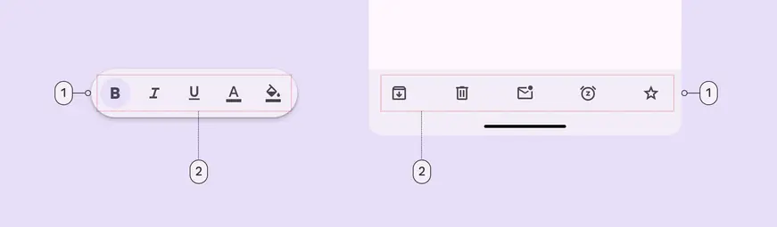
1. Container
2. Placed components
### Flexibility & slots
When configuring a toolbar, think of it as a container with several slots.
Each slot can be a different element. The most common elements are [icon buttons](../icon-buttons/specs.md "When configuring a toolbar, think of it as a container with several slots. Each slot can be a different element. The most common elements are icon buttons, buttons, and text fields."), [buttons](../buttons/specs.md "Buttons let people take action and make choices with one tap."), and [text fields](../text-fields/overview.md "Text fields let users enter text into a UI.").
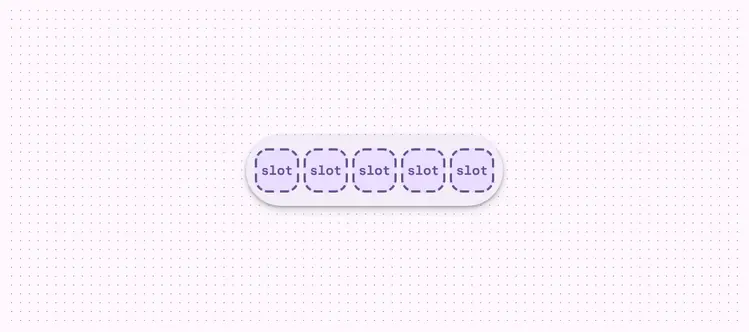
A toolbar is essentially a container with configurable slots
## Color
Color values are implemented through design tokens. For design, this means working with color values that correspond with tokens. For implementation, a color value will be a token that references a value. [Learn more about design tokens](../../foundations/design-tokens/overview.md)
### Standard
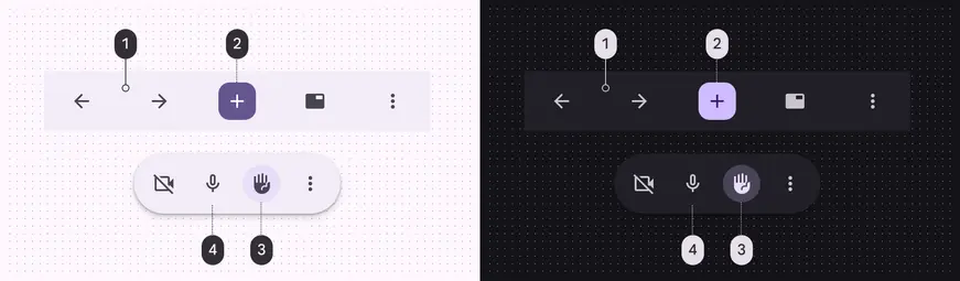
Standard color schemes and icon button types:
1. Surface container
2. Filled button (Primary, On primary)
3. Toggle tonal button (Secondary container, On secondary container)
4. Standard button (Primary)
### Vibrant
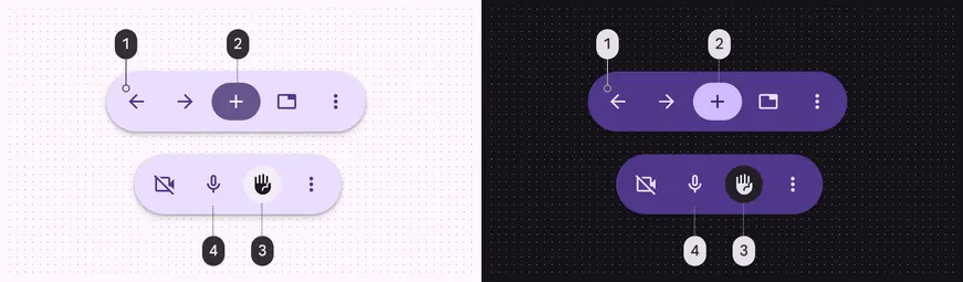
Vibrant color scheme and icon button types:
1. Primary container
2. Filled button (Primary, On primary)
3. Toggle tonal button: (Surface container, On surface)
4. Standard button (On primary container)
## Measurements
By default all toolbars are 64dp high, center-aligned, have equal padding between items, and have a minimum outside padding of 16dp.
### Docked toolbar
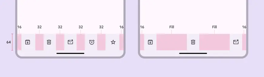
1. Default margins and padding
2. Margins and padding with leading, middle, and trailing content
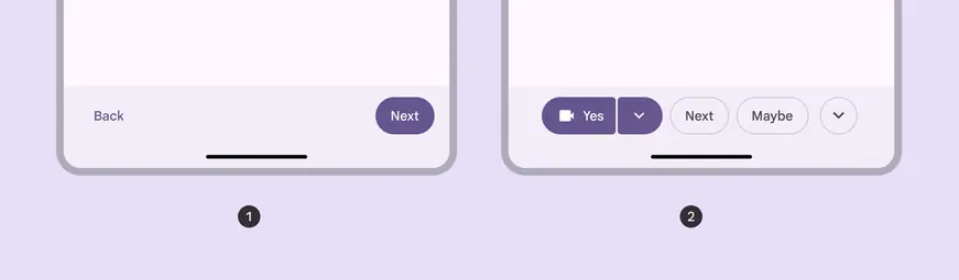
Alignment and padding can be configured to create unique layouts:
1. Left and right alignment
2. Center-aligned, 8dp padding between items
### Floating toolbar

Default padding of floating toolbar
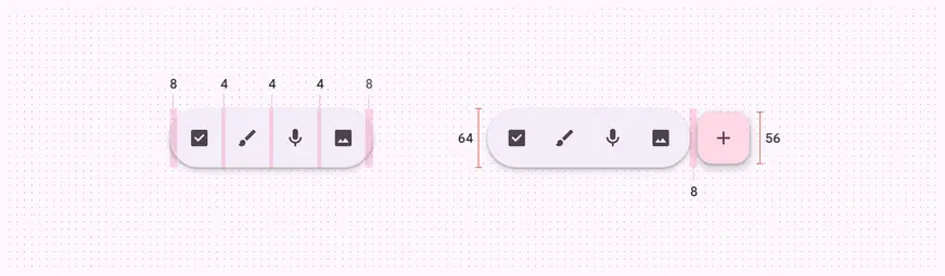
Floating toolbar size and padding measurements
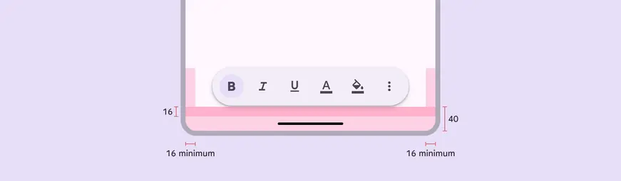
Floating toolbar margins
***
## Bottom app bar (baseline)

1. Container
### Tokens & specs
Bottom app bar tokens are in one token set.
::: token-table token-table-2956a7939bf0879c-9fec80ea
**Toolbars tokens** · 6 token sets · 112 tokens · [live token table](https://m3.material.io/components/toolbars/specs) · DSDB `TOKEN_TABLE.2956a7939bf0879c`
* Default context: none
* Not configurable here (group default used): Theme: Light · Platform: Android · Audience: 1P Baseline · Motion scheme: Standard · Font: Static · Contrast: Default · iOS dark theme elevation: None · iOS weight setting: Default · Language height: Small
* Reference chain: aliases from the token to its source value (`token → alias → … → value`). "—" means the token holds a literal value.
**Bottom app bar (baseline)** · `md.comp.bottom-app-bar` · 6 tokens
Baseline bottom app bar container tokens. For expressive, use \`md.comp.toolbar.docked\` and \`md.comp.toolbar.standard\` instead.
| Group | Token | Type | Reference chain | Resolved value |
| --- | --- | --- | --- | --- |
| Enabled › Container | `md.comp.bottom-app-bar.container.color` | Color | `md.sys.color.surface-container` | `#F0F4F9` |
| Enabled › Container | `md.comp.bottom-app-bar.container.shape` | Shape | `md.sys.shape.corner.none` | `Rounded corners 0dp` |
| Enabled › Container | `md.comp.bottom-app-bar.container.elevation` | Elevation | `md.sys.elevation.level2` | `3dp` |
| Enabled › Container | `md.comp.bottom-app-bar.container.surface-tint-layer.color` (deprecated) | Color | `md.sys.color.surface-tint` | `#6991D6` |
| Enabled › Container | `md.comp.bottom-app-bar.container.height` | Length | — | `80dp` |
| Enabled › Container | `md.comp.bottom-app-bar.with-fab.container.height` (deprecated) | Length | — | `72dp` |
**Toolbar - Docked** · `md.comp.toolbar.docked` · 7 tokens
For docked toolbars.
| Group | Token | Type | Reference chain | Resolved value |
| --- | --- | --- | --- | --- |
| Color | `md.comp.toolbar.docked.container.color` (deprecated) | Color | `md.sys.color.surface-container` | `#F0F4F9` |
| Size | `md.comp.toolbar.docked.container.leading-space` | Length | `md.sys.measurement.space200` | `16dp` |
| Size | `md.comp.toolbar.docked.container.trailing-space` | Length | `md.sys.measurement.space200` | `16dp` |
| Size | `md.comp.toolbar.docked.container.max-spacing` | Length | — | `32dp` |
| Size | `md.comp.toolbar.docked.container.min-spacing` | Length | — | `4dp` |
| Size | `md.comp.toolbar.docked.container.height` | Length | — | `64dp` |
| Shape | `md.comp.toolbar.docked.container.shape` | Shape | `md.sys.shape.corner.none` | `Rounded corners 0dp` |
**Toolbar - Floating** · `md.comp.toolbar.floating` · 18 tokens
For floating toolbars.
| Group | Token | Type | Reference chain | Resolved value |
| --- | --- | --- | --- | --- |
| Color | `md.comp.toolbar.floating.vibrant.container.color` (deprecated) | Color | `md.sys.color.primary-container` → `md.ref.palette.primary90` | `#D3E3FD` |
| Color | `md.comp.toolbar.floating.vibrant.button.unselected.icon.color` (deprecated) | Color | `md.sys.color.on-primary-container` → `md.ref.palette.primary30` | `#0842A0` |
| Color | `md.comp.toolbar.floating.vibrant.button.unselected.text.color` (deprecated) | Color | `md.sys.color.on-primary-container` → `md.ref.palette.primary30` | `#0842A0` |
| Color | `md.comp.toolbar.floating.vibrant.button.selected.icon.color` (deprecated) | Color | `md.sys.color.on-surface` → `md.ref.palette.neutral10` | `#1F1F1F` |
| Color | `md.comp.toolbar.floating.vibrant.button.selected.text.color` (deprecated) | Color | `md.sys.color.on-surface` → `md.ref.palette.neutral10` | `#1F1F1F` |
| Color | `md.comp.toolbar.floating.vibrant.button.selected.container.color` (deprecated) | Color | `md.sys.color.surface-container` | `#F0F4F9` |
| Color | `md.comp.toolbar.floating.standard.container.color` (deprecated) | Color | `md.sys.color.surface-container` | `#F0F4F9` |
| Size | `md.comp.toolbar.floating.horizontal.container.height` | Length | — | `64dp` |
| Size | `md.comp.toolbar.floating.vertical.container.width` | Length | — | `64dp` |
| Size | `md.comp.toolbar.floating.container.leading-space` | Length | `md.sys.measurement.space100` | `8dp` |
| Size | `md.comp.toolbar.floating.container.trailing-space` | Length | `md.sys.measurement.space100` | `8dp` |
| Size | `md.comp.toolbar.floating.container.external-padding` (deprecated) | Length | — | `16dp` |
| Size | `md.comp.toolbar.floating.horizontal.container.external-space` | Length | `md.sys.measurement.space200` | `16dp` |
| Size | `md.comp.toolbar.floating.vertical.container.external-space` | Length | `md.sys.measurement.space300` | `24dp` |
| Size | `md.comp.toolbar.floating.container.between-space` | Length | `md.sys.measurement.space50` | `4dp` |
| Size | `md.comp.toolbar.floating.container.height` (deprecated) | Length | — | `64dp` |
| Shape | `md.comp.toolbar.floating.container.shape` | Shape | `md.sys.shape.corner.full` | `Circular (fully rounded)` |
| Elevation | `md.comp.toolbar.floating.container.elevation` | Elevation | `md.sys.elevation.level3` | `6dp` |
**Toolbar - Color - Standard** · `md.comp.toolbar.standard` · 33 tokens
For standard docked and floating toolbars.
| Group | Token | Type | Reference chain | Resolved value |
| --- | --- | --- | --- | --- |
| Enabled | `md.comp.toolbar.standard.button.container.color` | Color | `md.sys.color.surface-container` | `#F0F4F9` |
| Enabled | `md.comp.toolbar.standard.selected.button.container.color` | Color | `md.sys.color.secondary-container` → `md.ref.palette.secondary90` | `#C2E7FF` |
| Enabled | `md.comp.toolbar.standard.icon.color` | Color | `md.sys.color.on-surface-variant` → `md.ref.palette.neutral-variant30` | `#444746` |
| Enabled | `md.comp.toolbar.standard.selected.icon.color` | Color | `md.sys.color.on-secondary-container` → `md.ref.palette.secondary30` | `#004A77` |
| Enabled | `md.comp.toolbar.standard.label-text.color` | Color | `md.sys.color.on-surface-variant` → `md.ref.palette.neutral-variant30` | `#444746` |
| Enabled | `md.comp.toolbar.standard.selected.label-text.color` | Color | `md.sys.color.on-secondary-container` → `md.ref.palette.secondary30` | `#004A77` |
| Enabled | `md.comp.toolbar.standard.container.shape` | Shape | `md.sys.shape.corner.full` | `Circular (fully rounded)` |
| Enabled | `md.comp.toolbar.standard.container.color` | Color | `md.sys.color.surface-container` | `#F0F4F9` |
| Disabled | `md.comp.toolbar.standard.disabled.icon.opacity` | Opacity | — | `0.38` |
| Disabled | `md.comp.toolbar.standard.disabled.label-text.color` | Color | `md.sys.color.on-surface` → `md.ref.palette.neutral10` | `#1F1F1F` |
| Disabled | `md.comp.toolbar.standard.disabled.label-text.opacity` | Opacity | — | `0.38` |
| Disabled | `md.comp.toolbar.standard.disabled.icon.color` | Color | `md.sys.color.on-surface` → `md.ref.palette.neutral10` | `#1F1F1F` |
| Hovered | `md.comp.toolbar.standard.selected.hovered.state-layer.color` | Color | `md.sys.color.on-secondary-container` → `md.ref.palette.secondary30` | `#004A77` |
| Hovered | `md.comp.toolbar.standard.hovered.state-layer.opacity` | Opacity | `md.sys.state.hover.state-layer-opacity` | `0.08` |
| Hovered | `md.comp.toolbar.standard.hovered.icon.color` | Color | `md.sys.color.on-surface-variant` → `md.ref.palette.neutral-variant30` | `#444746` |
| Hovered | `md.comp.toolbar.standard.selected.hovered.icon.color` | Color | `md.sys.color.on-secondary-container` → `md.ref.palette.secondary30` | `#004A77` |
| Hovered | `md.comp.toolbar.standard.hovered.label-text.color` | Color | `md.sys.color.on-surface-variant` → `md.ref.palette.neutral-variant30` | `#444746` |
| Hovered | `md.comp.toolbar.standard.selected.hovered.label-text.color` | Color | `md.sys.color.on-secondary-container` → `md.ref.palette.secondary30` | `#004A77` |
| Hovered | `md.comp.toolbar.standard.hovered.state-layer.color` | Color | `md.sys.color.on-surface-variant` → `md.ref.palette.neutral-variant30` | `#444746` |
| Focused | `md.comp.toolbar.standard.selected.focused.state-layer.color` | Color | `md.sys.color.on-secondary-container` → `md.ref.palette.secondary30` | `#004A77` |
| Focused | `md.comp.toolbar.standard.focused.state-layer.opacity` | Opacity | `md.sys.state.focus.state-layer-opacity` | `0.1` |
| Focused | `md.comp.toolbar.standard.focused.icon.color` | Color | `md.sys.color.on-surface-variant` → `md.ref.palette.neutral-variant30` | `#444746` |
| Focused | `md.comp.toolbar.standard.selected.focused.icon.color` | Color | `md.sys.color.on-secondary-container` → `md.ref.palette.secondary30` | `#004A77` |
| Focused | `md.comp.toolbar.standard.focused.label-text.color` | Color | `md.sys.color.on-surface-variant` → `md.ref.palette.neutral-variant30` | `#444746` |
| Focused | `md.comp.toolbar.standard.selected.focused.label-text.color` | Color | `md.sys.color.on-secondary-container` → `md.ref.palette.secondary30` | `#004A77` |
| Focused | `md.comp.toolbar.standard.focused.state-layer.color` | Color | `md.sys.color.on-surface-variant` → `md.ref.palette.neutral-variant30` | `#444746` |
| Pressed | `md.comp.toolbar.standard.selected.pressed.state-layer.color` | Color | `md.sys.color.on-secondary-container` → `md.ref.palette.secondary30` | `#004A77` |
| Pressed | `md.comp.toolbar.standard.pressed.state-layer.opacity` | Opacity | `md.sys.state.pressed.state-layer-opacity` | `0.1` |
| Pressed | `md.comp.toolbar.standard.pressed.icon.color` | Color | `md.sys.color.on-surface-variant` → `md.ref.palette.neutral-variant30` | `#444746` |
| Pressed | `md.comp.toolbar.standard.selected.pressed.icon.color` | Color | `md.sys.color.on-secondary-container` → `md.ref.palette.secondary30` | `#004A77` |
| Pressed | `md.comp.toolbar.standard.pressed.label-text.color` | Color | `md.sys.color.on-surface-variant` → `md.ref.palette.neutral-variant30` | `#444746` |
| Pressed | `md.comp.toolbar.standard.selected.pressed.label-text.color` | Color | `md.sys.color.on-secondary-container` → `md.ref.palette.secondary30` | `#004A77` |
| Pressed | `md.comp.toolbar.standard.pressed.state-layer.color` | Color | `md.sys.color.on-surface-variant` → `md.ref.palette.neutral-variant30` | `#444746` |
**Toolbar - Color - Vibrant** · `md.comp.toolbar.vibrant` · 33 tokens
For vibrant docked and floating toolbars.
| Group | Token | Type | Reference chain | Resolved value |
| --- | --- | --- | --- | --- |
| Enabled | `md.comp.toolbar.vibrant.button.container.color` | Color | `md.sys.color.primary-container` → `md.ref.palette.primary90` | `#D3E3FD` |
| Enabled | `md.comp.toolbar.vibrant.selected.button.container.color` | Color | `md.sys.color.surface-container` | `#F0F4F9` |
| Enabled | `md.comp.toolbar.vibrant.icon.color` | Color | `md.sys.color.on-primary-container` → `md.ref.palette.primary30` | `#0842A0` |
| Enabled | `md.comp.toolbar.vibrant.selected.icon.color` | Color | `md.sys.color.on-surface` → `md.ref.palette.neutral10` | `#1F1F1F` |
| Enabled | `md.comp.toolbar.vibrant.label-text.color` | Color | `md.sys.color.on-primary-container` → `md.ref.palette.primary30` | `#0842A0` |
| Enabled | `md.comp.toolbar.vibrant.selected.label-text.color` | Color | `md.sys.color.on-surface` → `md.ref.palette.neutral10` | `#1F1F1F` |
| Enabled | `md.comp.toolbar.vibrant.container.shape` | Shape | `md.sys.shape.corner.full` | `Circular (fully rounded)` |
| Enabled | `md.comp.toolbar.vibrant.container.color` | Color | `md.sys.color.primary-container` → `md.ref.palette.primary90` | `#D3E3FD` |
| Disabled | `md.comp.toolbar.vibrant.disabled.icon.opacity` | Opacity | — | `0.38` |
| Disabled | `md.comp.toolbar.vibrant.disabled.label-text.color` | Color | `md.sys.color.on-surface` → `md.ref.palette.neutral10` | `#1F1F1F` |
| Disabled | `md.comp.toolbar.vibrant.disabled.label-text.opacity` | Opacity | — | `0.38` |
| Disabled | `md.comp.toolbar.vibrant.disabled.icon.color` | Color | `md.sys.color.on-surface` → `md.ref.palette.neutral10` | `#1F1F1F` |
| Hovered | `md.comp.toolbar.vibrant.selected.hovered.state-layer.color` | Color | `md.sys.color.on-surface` → `md.ref.palette.neutral10` | `#1F1F1F` |
| Hovered | `md.comp.toolbar.vibrant.hovered.state-layer.opacity` | Opacity | `md.sys.state.hover.state-layer-opacity` | `0.08` |
| Hovered | `md.comp.toolbar.vibrant.hovered.icon.color` | Color | `md.sys.color.on-primary-container` → `md.ref.palette.primary30` | `#0842A0` |
| Hovered | `md.comp.toolbar.vibrant.selected.hovered.icon.color` | Color | `md.sys.color.on-surface` → `md.ref.palette.neutral10` | `#1F1F1F` |
| Hovered | `md.comp.toolbar.vibrant.hovered.label-text.color` | Color | `md.sys.color.on-primary-container` → `md.ref.palette.primary30` | `#0842A0` |
| Hovered | `md.comp.toolbar.vibrant.selected.hovered.label-text.color` | Color | `md.sys.color.on-surface` → `md.ref.palette.neutral10` | `#1F1F1F` |
| Hovered | `md.comp.toolbar.vibrant.hovered.state-layer.color` | Color | `md.sys.color.on-primary-container` → `md.ref.palette.primary30` | `#0842A0` |
| Focused | `md.comp.toolbar.vibrant.selected.focused.state-layer.color` | Color | `md.sys.color.on-surface` → `md.ref.palette.neutral10` | `#1F1F1F` |
| Focused | `md.comp.toolbar.vibrant.focused.state-layer.opacity` | Opacity | `md.sys.state.focus.state-layer-opacity` | `0.1` |
| Focused | `md.comp.toolbar.vibrant.focused.icon.color` | Color | `md.sys.color.on-primary-container` → `md.ref.palette.primary30` | `#0842A0` |
| Focused | `md.comp.toolbar.vibrant.selected.focused.icon.color` | Color | `md.sys.color.on-surface` → `md.ref.palette.neutral10` | `#1F1F1F` |
| Focused | `md.comp.toolbar.vibrant.focused.label-text.color` | Color | `md.sys.color.on-primary-container` → `md.ref.palette.primary30` | `#0842A0` |
| Focused | `md.comp.toolbar.vibrant.selected.focused.label-text.color` | Color | `md.sys.color.on-surface` → `md.ref.palette.neutral10` | `#1F1F1F` |
| Focused | `md.comp.toolbar.vibrant.focused.state-layer.color` | Color | `md.sys.color.on-primary-container` → `md.ref.palette.primary30` | `#0842A0` |
| Pressed | `md.comp.toolbar.vibrant.selected.pressed.state-layer.color` | Color | `md.sys.color.on-surface` → `md.ref.palette.neutral10` | `#1F1F1F` |
| Pressed | `md.comp.toolbar.vibrant.pressed.state-layer.opacity` | Opacity | `md.sys.state.pressed.state-layer-opacity` | `0.1` |
| Pressed | `md.comp.toolbar.vibrant.pressed.icon.color` | Color | `md.sys.color.on-primary-container` → `md.ref.palette.primary30` | `#0842A0` |
| Pressed | `md.comp.toolbar.vibrant.selected.pressed.icon.color` | Color | `md.sys.color.on-surface` → `md.ref.palette.neutral10` | `#1F1F1F` |
| Pressed | `md.comp.toolbar.vibrant.pressed.label-text.color` | Color | `md.sys.color.on-primary-container` → `md.ref.palette.primary30` | `#0842A0` |
| Pressed | `md.comp.toolbar.vibrant.selected.pressed.label-text.color` | Color | `md.sys.color.on-surface` → `md.ref.palette.neutral10` | `#1F1F1F` |
| Pressed | `md.comp.toolbar.vibrant.pressed.state-layer.color` | Color | `md.sys.color.on-primary-container` → `md.ref.palette.primary30` | `#0842A0` |
**Toolbar - Floating - FAB** · `md.comp.toolbar.floating.fab` · 15 tokens
For floating toolbars with a FAB in them.
| Group | Token | Type | Reference chain | Resolved value |
| --- | --- | --- | --- | --- |
| Expanded | `md.comp.toolbar.floating.fab.container.width` | Length | — | `56dp` |
| Expanded | `md.comp.toolbar.floating.fab.icon.size` | Length | — | `24dp` |
| Expanded | `md.comp.toolbar.floating.fab.container.shape` | Shape | `md.sys.shape.corner.large` | `Rounded corners 16dp` |
| Expanded | `md.comp.toolbar.floating.fab.container.elevation` | Elevation | `md.sys.elevation.level1` | `1dp` |
| Expanded | `md.comp.toolbar.floating.fab.container.height` | Length | — | `56dp` |
| Collapsed | `md.comp.toolbar.floating.fab.medium.container.width` | Length | — | `80dp` |
| Collapsed | `md.comp.toolbar.floating.fab.medium.icon.size` | Length | — | `28dp` |
| Collapsed | `md.comp.toolbar.floating.fab.medium.container.shape` | Shape | `md.sys.shape.corner.large-increased` | `Rounded corners 20dp` |
| Collapsed | `md.comp.toolbar.floating.fab.medium.container.elevation` | Elevation | `md.sys.elevation.level2` | `3dp` |
| Collapsed | `md.comp.toolbar.floating.fab.medium.container.height` | Length | — | `80dp` |
| Other | `md.comp.toolbar.floating.fab.between-space` | Length | `md.sys.measurement.space100` | `8dp` |
| Other | `md.comp.toolbar.floating.fab.standard.container.color` | Color | `md.sys.color.secondary-container` → `md.ref.palette.secondary90` | `#C2E7FF` |
| Other | `md.comp.toolbar.floating.fab.standard.icon.color` | Color | `md.sys.color.on-secondary-container` → `md.ref.palette.secondary30` | `#004A77` |
| Other | `md.comp.toolbar.floating.fab.vibrant.container.color` | Color | `md.sys.color.tertiary-container` → `md.ref.palette.tertiary90` | `#C4EED0` |
| Other | `md.comp.toolbar.floating.fab.vibrant.icon.color` | Color | `md.sys.color.on-tertiary-container` → `md.ref.palette.tertiary30` | `#0F5223` |
:::
### Color
Color values are implemented through design tokens. For designers, this means working with color values that correspond with tokens. In implementation, a color value will be a token that references a value. [Learn more about design tokens](../../foundations/design-tokens/overview.md)
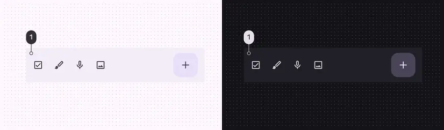
Bottom app bar color role used for light and dark themes:
1. Surface container
### Measurements
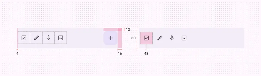
Bottom app bar padding and size measurements
### Common layouts
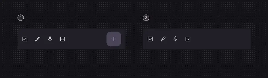
1. Icon buttons and FAB
2. Icon buttons and no FAB