---
url: /components/sliders/specs.md
description: >-
Sliders let users make selections from a range of values. There are four
configurations: continuous, discrete, centered, range selection.
---
# Sliders
Sliders let users make selections from a range of values. There are four configurations: continuous, discrete, centered, range selection.
[Overview](overview.md) · **Specs** · [Guidelines](guidelines.md) · [Accessibility](accessibility.md)
## Variants
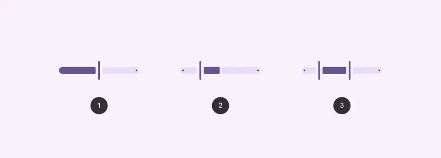
1. Standard
2. Centered
3. Range
| Variant | M3 | M3 Expressive |
| :------- | :------------------------------: | :--------------------------------: |
| Standard | Available as “continuous” slider | Available |
| Centered | Available (web only) | Available |
| Range | Available | Available |
| Discrete | Available | Available as “stops” configuration |
## Configurations
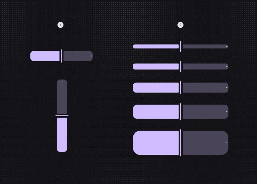
1. Orientation: Horizontal, vertical
2. Size: XS, S, M, L, XL
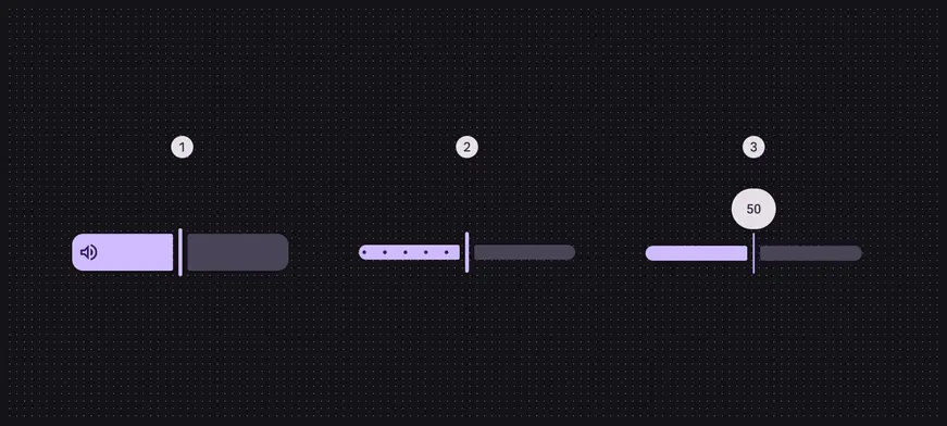
1. Inset icon
2. Stops
3. Value indicator
| Category | Configuration | M3 | M3 Expressive |
| :-------------- | :------------------- | :----------------------------: | :------------------------------------------------------------------------------------: |
| Inset icon | No (default) | Available | Available |
| Inset icon | Yes | -- | Available |
| Orientation | Horizontal (default) | Available | Available |
| Orientation | Vertical | -- | Available |
| Size | XS (default) | Available | Available |
| Size | S, M, L, XL | -- | Available on Android Views (MDC-Android).
Available as tokens on other platforms.\* |
| Stop indicators | No (default), Yes | Available as “discrete” slider | Available |
| Value Indicator | No (default), Yes | Available | Available |
> \*Configurations only available using tokens don’t have implemented presets in code. To change the size, swap the default size tokens `md.comp.slider.xsmall.[...]` with those of the desired size.
## Tokens & specs
Slider tokens are organized into a common token set, and token sets for each size. Switch token sets from the table’s menu. [Learn more about design tokens](../../foundations/design-tokens/overview.md)
::: token-table token-table-0045edb815f2325e-27347479
**Sliders tokens** · 6 token sets · 127 tokens · [live token table](https://m3.material.io/components/sliders/specs) · DSDB `TOKEN_TABLE.0045edb815f2325e`
* Default context: Theme: Light · Platform: Android · Audience: 3P · Font: Static · Contrast: Default · iOS dark theme elevation: None · iOS weight setting: Default
* Not configurable here (group default used): Motion scheme: Standard · Language height: Small
* Other contexts: Theme: Dark · Contrast: Medium contrast, High contrast. "Other contexts" lists values that differ from the default when only that one context changes.
* Reference chain: aliases from the token to its source value (`token → alias → … → value`). "—" means the token holds a literal value.
**Slider** · `md.comp.slider` · 96 tokens
Common tokens for all expressive slider sizes, and baseline sliders.
| Group | Token | Type | Reference chain | Resolved value | Other contexts |
| --- | --- | --- | --- | --- | --- |
| Disabled › \[Deprecated] Container | `md.comp.slider.with-tick-marks.disabled.container.color` (deprecated) | Color | `md.sys.color.on-surface` → `md.ref.palette.neutral10` | `#1D1B20` | Dark: `#E6E0E9` via `md.ref.palette.neutral90`
Medium contrast: `#000000` via `md.ref.palette.neutral0`
High contrast: `#000000` via `md.ref.palette.neutral0` |
| Disabled › \[Deprecated] Container | `md.comp.slider.disabled.stop-indicator.container.color` (deprecated) | Color | `md.sys.color.on-surface` → `md.ref.palette.neutral10` | `#1D1B20` | Dark: `#E6E0E9` via `md.ref.palette.neutral90`
Medium contrast: `#000000` via `md.ref.palette.neutral0`
High contrast: `#000000` via `md.ref.palette.neutral0` |
| Disabled › \[Deprecated] Container | `md.comp.slider.with-tick-marks.disabled.container.opacity` (deprecated) | Opacity | — | `0.38` | — |
| Disabled › \[Deprecated] Container | `md.comp.slider.disabled.stop-indicator.container.opacity` (deprecated) | Opacity | — | `0.38` | — |
| Disabled › Track | `md.comp.slider.disabled.active.track.color` | Color | `md.sys.color.on-surface` → `md.ref.palette.neutral10` | `#1D1B20` | Dark: `#E6E0E9` via `md.ref.palette.neutral90`
Medium contrast: `#000000` via `md.ref.palette.neutral0`
High contrast: `#000000` via `md.ref.palette.neutral0` |
| Disabled › Track | `md.comp.slider.disabled.active.track.opacity` | Opacity | — | `0.38` | — |
| Disabled › Track | `md.comp.slider.disabled.inactive.track.color` | Color | `md.sys.color.on-surface` → `md.ref.palette.neutral10` | `#1D1B20` | Dark: `#E6E0E9` via `md.ref.palette.neutral90`
Medium contrast: `#000000` via `md.ref.palette.neutral0`
High contrast: `#000000` via `md.ref.palette.neutral0` |
| Disabled › Track | `md.comp.slider.disabled.inactive.track.opacity` | Opacity | — | `0.12` | — |
| Disabled › Handle | `md.comp.slider.disabled.handle.color` | Color | `md.sys.color.on-surface` → `md.ref.palette.neutral10` | `#1D1B20` | Dark: `#E6E0E9` via `md.ref.palette.neutral90`
Medium contrast: `#000000` via `md.ref.palette.neutral0`
High contrast: `#000000` via `md.ref.palette.neutral0` |
| Disabled › Handle | `md.comp.slider.disabled.handle.elevation` (deprecated) | Elevation | `md.sys.elevation.level0` | `0dp` | — |
| Disabled › Handle | `md.comp.slider.disabled.handle.opacity` | Opacity | — | `0.38` | — |
| Disabled › Handle | `md.comp.slider.disabled.handle.width` | Length | — | `4dp` | — |
| Disabled › Stop indicator | `md.comp.slider.disabled.stop-indicator.color` (deprecated) | Color | `md.sys.color.on-surface` → `md.ref.palette.neutral10` | `#1D1B20` | Dark: `#E6E0E9` via `md.ref.palette.neutral90`
Medium contrast: `#000000` via `md.ref.palette.neutral0`
High contrast: `#000000` via `md.ref.palette.neutral0` |
| Disabled › Stop indicator | `md.comp.slider.disabled.stop-indicator.color-selected` (deprecated) | Color | `md.sys.color.inverse-on-surface` → `md.ref.palette.neutral95` | `#F5EFF7` | Dark: `#322F35` via `md.ref.palette.neutral20`
Medium contrast: `#FFFFFF` via `md.ref.palette.neutral100`
High contrast: `#FFFFFF` via `md.ref.palette.neutral100` |
| Disabled › Stop indicator | `md.comp.slider.disabled.active.stop-indicator.container.color` | Color | `md.sys.color.inverse-on-surface` → `md.ref.palette.neutral95` | `#F5EFF7` | Dark: `#322F35` via `md.ref.palette.neutral20`
Medium contrast: `#FFFFFF` via `md.ref.palette.neutral100`
High contrast: `#FFFFFF` via `md.ref.palette.neutral100` |
| Disabled › Stop indicator | `md.comp.slider.disabled.inactive.stop-indicator.container.color` | Color | `md.sys.color.on-surface` → `md.ref.palette.neutral10` | `#1D1B20` | Dark: `#E6E0E9` via `md.ref.palette.neutral90`
Medium contrast: `#000000` via `md.ref.palette.neutral0`
High contrast: `#000000` via `md.ref.palette.neutral0` |
| Hovered › \[Deprecated] State layer | `md.comp.slider.hover.state-layer.color` (deprecated) | Color | `md.sys.color.primary` → `md.ref.palette.primary40` | `#6750A4` | Dark: `#D0BCFF` via `md.ref.palette.primary80`
Medium contrast: `#4F378B` via `md.ref.palette.primary30`
High contrast: `#381E72` via `md.ref.palette.primary20` |
| Hovered › \[Deprecated] State layer | `md.comp.slider.hover.state-layer.opacity` (deprecated) | Opacity | `md.sys.state.hover.state-layer-opacity` | `0.08` | — |
| Hovered › Handle | `md.comp.slider.hover.handle.color` (deprecated) | Color | `md.sys.color.primary` → `md.ref.palette.primary40` | `#6750A4` | Dark: `#D0BCFF` via `md.ref.palette.primary80`
Medium contrast: `#4F378B` via `md.ref.palette.primary30`
High contrast: `#381E72` via `md.ref.palette.primary20` |
| Hovered › Handle | `md.comp.slider.hover.handle.width` | Length | — | `4dp` | — |
| Hovered › \[Deprecated] Stop | `md.comp.slider.hover.stop.color` (deprecated) | Color | `md.sys.color.primary` → `md.ref.palette.primary40` | `#6750A4` | Dark: `#D0BCFF` via `md.ref.palette.primary80`
Medium contrast: `#4F378B` via `md.ref.palette.primary30`
High contrast: `#381E72` via `md.ref.palette.primary20` |
| Focused › \[Deprecated] State layer | `md.comp.slider.focus.state-layer.color` (deprecated) | Color | `md.sys.color.primary` → `md.ref.palette.primary40` | `#6750A4` | Dark: `#D0BCFF` via `md.ref.palette.primary80`
Medium contrast: `#4F378B` via `md.ref.palette.primary30`
High contrast: `#381E72` via `md.ref.palette.primary20` |
| Focused › \[Deprecated] State layer | `md.comp.slider.focus.state-layer.opacity` (deprecated) | Opacity | `md.sys.state.focus.state-layer-opacity` | `0.1` | — |
| Focused › Handle | `md.comp.slider.focus.handle.color` (deprecated) | Color | `md.sys.color.primary` → `md.ref.palette.primary40` | `#6750A4` | Dark: `#D0BCFF` via `md.ref.palette.primary80`
Medium contrast: `#4F378B` via `md.ref.palette.primary30`
High contrast: `#381E72` via `md.ref.palette.primary20` |
| Focused › Handle | `md.comp.slider.focus.handle.width` | Length | — | `2dp` | — |
| Focused › Track | `md.comp.slider.focus.active.track.color` | Color | `md.sys.color.primary` → `md.ref.palette.primary40` | `#6750A4` | Dark: `#D0BCFF` via `md.ref.palette.primary80`
Medium contrast: `#4F378B` via `md.ref.palette.primary30`
High contrast: `#381E72` via `md.ref.palette.primary20` |
| Focused › Track | `md.comp.slider.focus.inactive.track.color` | Color | `md.sys.color.secondary-container` → `md.ref.palette.secondary90` | `#E8DEF8` | Dark: `#4A4458` via `md.ref.palette.secondary30`
Medium contrast: `#625B71` via `md.ref.palette.secondary40`
High contrast: `#4A4458` via `md.ref.palette.secondary30` |
| Focused › \[Deprecated] Stop | `md.comp.slider.focus.stop.color` (deprecated) | Color | `md.sys.color.primary` → `md.ref.palette.primary40` | `#6750A4` | Dark: `#D0BCFF` via `md.ref.palette.primary80`
Medium contrast: `#4F378B` via `md.ref.palette.primary30`
High contrast: `#381E72` via `md.ref.palette.primary20` |
| Pressed (ripple) › \[Deprecated] State layer | `md.comp.slider.pressed.state-layer.color` (deprecated) | Color | `md.sys.color.primary` → `md.ref.palette.primary40` | `#6750A4` | Dark: `#D0BCFF` via `md.ref.palette.primary80`
Medium contrast: `#4F378B` via `md.ref.palette.primary30`
High contrast: `#381E72` via `md.ref.palette.primary20` |
| Pressed (ripple) › \[Deprecated] State layer | `md.comp.slider.pressed.state-layer.opacity` (deprecated) | Opacity | `md.sys.state.pressed.state-layer-opacity` | `0.1` | — |
| Pressed (ripple) › Handle | `md.comp.slider.pressed.handle.color` | Color | `md.sys.color.primary` → `md.ref.palette.primary40` | `#6750A4` | Dark: `#D0BCFF` via `md.ref.palette.primary80`
Medium contrast: `#4F378B` via `md.ref.palette.primary30`
High contrast: `#381E72` via `md.ref.palette.primary20` |
| Pressed (ripple) › Handle | `md.comp.slider.pressed.handle.width` | Length | — | `2dp` | — |
| Pressed (ripple) › Track | `md.comp.slider.pressed.active.track.color` | Color | `md.sys.color.primary` → `md.ref.palette.primary40` | `#6750A4` | Dark: `#D0BCFF` via `md.ref.palette.primary80`
Medium contrast: `#4F378B` via `md.ref.palette.primary30`
High contrast: `#381E72` via `md.ref.palette.primary20` |
| Pressed (ripple) › Track | `md.comp.slider.pressed.inactive.track.color` | Color | `md.sys.color.secondary-container` → `md.ref.palette.secondary90` | `#E8DEF8` | Dark: `#4A4458` via `md.ref.palette.secondary30`
Medium contrast: `#625B71` via `md.ref.palette.secondary40`
High contrast: `#4A4458` via `md.ref.palette.secondary30` |
| Pressed (ripple) › \[Deprecated] Stop | `md.comp.slider.pressed.stop.color` (deprecated) | Color | `md.sys.color.primary` → `md.ref.palette.primary40` | `#6750A4` | Dark: `#D0BCFF` via `md.ref.palette.primary80`
Medium contrast: `#4F378B` via `md.ref.palette.primary30`
High contrast: `#381E72` via `md.ref.palette.primary20` |
| Pressed (ripple) › Value indicator | `md.comp.slider.value-indicator.container.color` | Color | `md.sys.color.inverse-surface` → `md.ref.palette.neutral20` | `#322F35` | Dark: `#E6E0E9` via `md.ref.palette.neutral90` |
| Pressed (ripple) › Value indicator | `md.comp.slider.value-indicator.label.label-text.font` | Font names | `md.sys.typescale.label-large.font` → `md.ref.typeface.plain` | `Roboto` | — |
| Pressed (ripple) › Value indicator | `md.comp.slider.value-indicator.label.label-text.color` | Color | `md.sys.color.inverse-on-surface` → `md.ref.palette.neutral95` | `#F5EFF7` | Dark: `#322F35` via `md.ref.palette.neutral20`
Medium contrast: `#FFFFFF` via `md.ref.palette.neutral100`
High contrast: `#FFFFFF` via `md.ref.palette.neutral100` |
| Pressed (ripple) › Value indicator | `md.comp.slider.value-indicator.label.label-text.line-height` | Line height | `md.sys.typescale.label-large.line-height` | `20pt` | — |
| Pressed (ripple) › Value indicator | `md.comp.slider.value-indicator.label.label-text.size` | Font size | `md.sys.typescale.label-large.size` | `14pt` | — |
| Pressed (ripple) › Value indicator | `md.comp.slider.value-indicator.label.label-text.tracking` | Font tracking | `md.sys.typescale.body-large.tracking` | `0.5pt` | — |
| Pressed (ripple) › Value indicator | `md.comp.slider.value-indicator.label.label-text.weight` | Font weight | `md.sys.typescale.body-large.weight` → `md.ref.typeface.weight-regular` | `400` | — |
| Pressed (ripple) › Value indicator | `md.comp.slider.value-indicator.active.bottom-space` | Length | `md.sys.measurement.space150` | `12dp` | — |
| Enabled › Container | `md.comp.slider.with-tick-marks.container.size` (deprecated) | Length | — | `2dp` | — |
| Enabled › Container | `md.comp.slider.with-tick-marks.container.shape` (deprecated) | Shape | `md.sys.shape.corner.full` | `Circular (fully rounded)` | — |
| Enabled › Container | `md.comp.slider.with-tick-marks.active.container.color` (deprecated) | Color | `md.sys.color.on-primary` → `md.ref.palette.primary100` | `#FFFFFF` | Dark: `#381E72` via `md.ref.palette.primary20` |
| Enabled › Container | `md.comp.slider.active.stop-indicator.container.color` | Color | `md.sys.color.on-primary` → `md.ref.palette.primary100` | `#FFFFFF` | Dark: `#381E72` via `md.ref.palette.primary20` |
| Enabled › Container | `md.comp.slider.with-tick-marks.active.container.opacity` (deprecated) | Opacity | — | `0.38` | — |
| Enabled › Container | `md.comp.slider.active.stop-indicator.container.opacity` | Opacity | — | `1` | — |
| Enabled › Container | `md.comp.slider.with-tick-marks.inactive.container.color` (deprecated) | Color | `md.sys.color.on-surface-variant` → `md.ref.palette.neutral-variant30` | `#49454F` | Dark: `#CAC4D0` via `md.ref.palette.neutral-variant80`
Medium contrast: `#322F37` via `md.ref.palette.neutral-variant20`
High contrast: `#000000` via `md.ref.palette.neutral-variant0` |
| Enabled › Container | `md.comp.slider.inactive.stop-indicator.container.color` | Color | `md.sys.color.on-secondary-container` → `md.ref.palette.secondary30` | `#4A4458` | Dark: `#E8DEF8` via `md.ref.palette.secondary90`
Medium contrast: `#FFFFFF` via `md.ref.palette.secondary100`
High contrast: `#FFFFFF` via `md.ref.palette.secondary100` |
| Enabled › Container | `md.comp.slider.with-tick-marks.inactive.container.opacity` (deprecated) | Opacity | — | `0.38` | — |
| Enabled › Container | `md.comp.slider.inactive.stop-indicator.container.opacity` | Opacity | — | `1` | — |
| Enabled › Container | `md.comp.slider.label.container.height` (deprecated) | Length | — | `28dp` | — |
| Enabled › Container | `md.comp.slider.label.container.color` (deprecated) | Color | `md.sys.color.primary` → `md.ref.palette.primary40` | `#6750A4` | Dark: `#D0BCFF` via `md.ref.palette.primary80`
Medium contrast: `#4F378B` via `md.ref.palette.primary30`
High contrast: `#381E72` via `md.ref.palette.primary20` |
| Enabled › Container | `md.comp.slider.label.container.elevation` (deprecated) | Elevation | `md.sys.elevation.level0` | `0dp` | — |
| Enabled › Container | `md.comp.slider.active.container.opacity` (deprecated) | Opacity | — | `1` | — |
| Enabled › Container | `md.comp.slider.inactive.container.opacity` (deprecated) | Opacity | — | `1` | — |
| Enabled › \[Deprecated] Label text | `md.comp.slider.label.label-text.font` (deprecated) | Font names | `md.sys.typescale.label-medium.font` → `md.ref.typeface.plain` | `Roboto` | — |
| Enabled › \[Deprecated] Label text | `md.comp.slider.label.label-text.size` (deprecated) | Font size | `md.sys.typescale.label-medium.size` | `12pt` | — |
| Enabled › \[Deprecated] Label text | `md.comp.slider.label.label-text.line-height` (deprecated) | Line height | `md.sys.typescale.label-medium.line-height` | `16pt` | — |
| Enabled › \[Deprecated] Label text | `md.comp.slider.label.label-text.weight` (deprecated) | Font weight | `md.sys.typescale.label-medium.weight` → `md.ref.typeface.weight-medium` | `500` | — |
| Enabled › \[Deprecated] Label text | `md.comp.slider.label.label-text.tracking` (deprecated) | Font tracking | `md.sys.typescale.label-medium.tracking` | `0.5pt` | — |
| Enabled › \[Deprecated] Label text | `md.comp.slider.label.label-text.color` (deprecated) | Color | `md.sys.color.inverse-on-surface` → `md.ref.palette.neutral95` | `#F5EFF7` | Dark: `#322F35` via `md.ref.palette.neutral20`
Medium contrast: `#FFFFFF` via `md.ref.palette.neutral100`
High contrast: `#FFFFFF` via `md.ref.palette.neutral100` |
| Enabled › \[Deprecated] Label text | `md.comp.slider.label.label-text.font-size` (deprecated) | Font size | `md.sys.typescale.label-medium.size` | `12pt` | — |
| Enabled › Track | `md.comp.slider.active.track.height` | Length | — | `16dp` | — |
| Enabled › Track | `md.comp.slider.inactive.track.height` | Length | — | `16dp` | — |
| Enabled › Track | `md.comp.slider.active.track.shape` | Shape | `md.sys.shape.corner.full` | `Circular (fully rounded)` | — |
| Enabled › Track | `md.comp.slider.active.track.outer-corner.corner-size` | Shape | `md.sys.shape.corner.full` | `Circular (fully rounded)` | — |
| Enabled › Track | `md.comp.slider.active.track.inner-corner.corner-size` | Shape | — | `Rounded corners: top-right 2dp, bottom-right 2dp` | — |
| Enabled › Track | `md.comp.slider.inactive.track.shape` | Shape | `md.sys.shape.corner.full` | `Circular (fully rounded)` | — |
| Enabled › Track | `md.comp.slider.track.elevation` (deprecated) | Elevation | `md.sys.elevation.level0` | `0dp` | — |
| Enabled › Track | `md.comp.slider.active.track.color` | Color | `md.sys.color.primary` → `md.ref.palette.primary40` | `#6750A4` | Dark: `#D0BCFF` via `md.ref.palette.primary80`
Medium contrast: `#4F378B` via `md.ref.palette.primary30`
High contrast: `#381E72` via `md.ref.palette.primary20` |
| Enabled › Track | `md.comp.slider.inactive.track.color` | Color | `md.sys.color.secondary-container` → `md.ref.palette.secondary90` | `#E8DEF8` | Dark: `#4A4458` via `md.ref.palette.secondary30`
Medium contrast: `#625B71` via `md.ref.palette.secondary40`
High contrast: `#4A4458` via `md.ref.palette.secondary30` |
| Enabled › Handle | `md.comp.slider.handle.height` | Length | — | `44dp` | — |
| Enabled › Handle | `md.comp.slider.handle.width` | Length | — | `4dp` | — |
| Enabled › Handle | `md.comp.slider.handle.shape` | Shape | `md.sys.shape.corner.full` | `Circular (fully rounded)` | — |
| Enabled › Handle | `md.comp.slider.handle.elevation` (deprecated) | Elevation | `md.sys.elevation.level1` | `1dp` | — |
| Enabled › Handle | `md.comp.slider.handle.shadow-color` (deprecated) | Color | `md.sys.color.shadow` → `md.ref.palette.neutral0` | `#000000` | — |
| Enabled › Handle | `md.comp.slider.handle.color` | Color | `md.sys.color.primary` → `md.ref.palette.primary40` | `#6750A4` | Dark: `#D0BCFF` via `md.ref.palette.primary80`
Medium contrast: `#4F378B` via `md.ref.palette.primary30`
High contrast: `#381E72` via `md.ref.palette.primary20` |
| Enabled › Handle | `md.comp.slider.active.handle.color` | Color | `md.sys.color.primary` → `md.ref.palette.primary40` | `#6750A4` | Dark: `#D0BCFF` via `md.ref.palette.primary80`
Medium contrast: `#4F378B` via `md.ref.palette.primary30`
High contrast: `#381E72` via `md.ref.palette.primary20` |
| Enabled › Handle | `md.comp.slider.active.handle.height` | Length | — | `44dp` | — |
| Enabled › Handle | `md.comp.slider.active.handle.width` | Length | — | `4dp` | — |
| Enabled › Handle | `md.comp.slider.with-overlap.handle.outline.color` (deprecated) | Color | `md.sys.color.on-primary` → `md.ref.palette.primary100` | `#FFFFFF` | Dark: `#381E72` via `md.ref.palette.primary20` |
| Enabled › Handle | `md.comp.slider.with-overlap.handle.outline.width` (deprecated) | Length | — | `1dp` | — |
| Enabled › Handle | `md.comp.slider.active.handle.shape` | Shape | `md.sys.shape.corner.full` | `Circular (fully rounded)` | — |
| Enabled › Handle | `md.comp.slider.active.handle.leading-space` | Length | `md.sys.measurement.space75` | `6dp` | — |
| Enabled › Handle | `md.comp.slider.active.handle.trailing-space` | Length | `md.sys.measurement.space75` | `6dp` | — |
| Enabled › Handle | `md.comp.slider.active.handle.padding` | Length | `md.sys.measurement.space75` | `6dp` | — |
| Enabled › \[Deprecated] Subhead | `md.comp.slider.label.label-text.type` (deprecated) | Typography | composite
font names: `md.comp.slider.label.label-text.font` → `md.sys.typescale.label-medium.font` → `md.ref.typeface.plain`
font weight: `md.comp.slider.label.label-text.weight` → `md.sys.typescale.label-medium.weight` → `md.ref.typeface.weight-medium`
font size: `md.comp.slider.label.label-text.size` → `md.sys.typescale.label-medium.size`
line height: `md.comp.slider.label.label-text.line-height` → `md.sys.typescale.label-medium.line-height`
font tracking: `md.comp.slider.label.label-text.tracking` → `md.sys.typescale.label-medium.tracking` | `Roboto · weight 500 · size 12pt · line height 16pt · tracking 0.5pt` | — |
| Enabled › \[Deprecated] State layer | `md.comp.slider.state-layer.size` (deprecated) | Length | — | `40dp` | — |
| Enabled › Stop indicator | `md.comp.slider.stop-indicator.size` | Length | — | `4dp` | — |
| Enabled › Stop indicator | `md.comp.slider.stop-indicator.shape` | Shape | `md.sys.shape.corner.full` | `Circular (fully rounded)` | — |
| Enabled › Stop indicator | `md.comp.slider.stop-indicator.trailing-space` | Length | `md.sys.measurement.space50` | `4dp` | — |
| Enabled › Stop indicator | `md.comp.slider.stop-indicator.color` | Color | `md.sys.color.on-secondary-container` → `md.ref.palette.secondary30` | `#4A4458` | Dark: `#E8DEF8` via `md.ref.palette.secondary90`
Medium contrast: `#FFFFFF` via `md.ref.palette.secondary100`
High contrast: `#FFFFFF` via `md.ref.palette.secondary100` |
| Enabled › Stop indicator | `md.comp.slider.stop-indicator.color-selected` | Color | `md.sys.color.on-primary` → `md.ref.palette.primary100` | `#FFFFFF` | Dark: `#381E72` via `md.ref.palette.primary20` |
**Slider - Size - Xsmall** · `md.comp.slider.xsmall` · 5 tokens
For expressive XS sliders.
| Group | Token | Type | Reference chain | Resolved value | Other contexts |
| --- | --- | --- | --- | --- | --- |
| Active track | `md.comp.slider.xsmall.active.track.shape.leading` | Length | — | `8dp` | — |
| Active track | `md.comp.slider.xsmall.active.track.height` | Length | — | `16dp` | — |
| Inactive track | `md.comp.slider.xsmall.inactive.track.shape.trailing` | Length | — | `8dp` | — |
| Inactive track | `md.comp.slider.xsmall.inactive.track.height` | Length | — | `16dp` | — |
| Handle | `md.comp.slider.xsmall.active.handle.height` | Length | — | `44dp` | — |
**Slider - Size - Small** · `md.comp.slider.small` · 5 tokens
For expressive small sliders.
| Group | Token | Type | Reference chain | Resolved value | Other contexts |
| --- | --- | --- | --- | --- | --- |
| Active track | `md.comp.slider.small.active.track.shape.leading` | Length | — | `8dp` | — |
| Active track | `md.comp.slider.small.active.track.height` | Length | — | `24dp` | — |
| Inactive track | `md.comp.slider.small.inactive.track.shape.trailing` | Length | — | `8dp` | — |
| Inactive track | `md.comp.slider.small.inactive.track.height` | Length | — | `24dp` | — |
| Handle | `md.comp.slider.small.active.handle.height` | Length | — | `44dp` | — |
**Slider - Size - Medium** · `md.comp.slider.medium` · 7 tokens
For expressive medium sliders.
| Group | Token | Type | Reference chain | Resolved value | Other contexts |
| --- | --- | --- | --- | --- | --- |
| Active track | `md.comp.slider.medium.active.track.shape.leading` | Length | — | `12dp` | — |
| Active track | `md.comp.slider.medium.active.track.height` | Length | — | `40dp` | — |
| Inactive track | `md.comp.slider.medium.inactive.track.shape.trailing` | Length | — | `12dp` | — |
| Inactive track | `md.comp.slider.medium.inactive.track.height` | Length | — | `40dp` | — |
| Handle | `md.comp.slider.medium.active.handle.height` | Length | — | `44dp` | — |
| Icon | `md.comp.slider.medium.icon.padding` | Length | — | `6dp` | — |
| Icon | `md.comp.slider.medium.icon.size` | Length | — | `24dp` | — |
**Slider - Size - Large** · `md.comp.slider.large` · 7 tokens
For expressive large sliders.
| Group | Token | Type | Reference chain | Resolved value | Other contexts |
| --- | --- | --- | --- | --- | --- |
| Active track | `md.comp.slider.large.active.track.shape.leading` | Length | — | `16dp` | — |
| Active track | `md.comp.slider.large.active.track.height` | Length | — | `56dp` | — |
| Inactive track | `md.comp.slider.large.inactive.track.shape.trailing` | Length | — | `16dp` | — |
| Inactive track | `md.comp.slider.large.inactive.track.height` | Length | — | `56dp` | — |
| Handle | `md.comp.slider.large.active.handle.height` | Length | — | `68dp` | — |
| Icon | `md.comp.slider.large.icon.size` | Length | — | `24dp` | — |
| Icon | `md.comp.slider.large.icon.padding` | Length | — | `6dp` | — |
**Slider - Size - Xlarge** · `md.comp.slider.xlarge` · 7 tokens
For expressive XL sliders.
| Group | Token | Type | Reference chain | Resolved value | Other contexts |
| --- | --- | --- | --- | --- | --- |
| Active track | `md.comp.slider.xlarge.active.track.shape.leading` | Length | — | `28dp` | — |
| Active track | `md.comp.slider.xlarge.active.track.height` | Length | — | `96dp` | — |
| Inactive track | `md.comp.slider.xlarge.inactive.track.shape.trailing` | Length | — | `28dp` | — |
| Inactive track | `md.comp.slider.xlarge.inactive.track.height` | Length | — | `96dp` | — |
| Handle | `md.comp.slider.xlarge.active.handle.height` | Length | — | `108dp` | — |
| Icon | `md.comp.slider.xlarge.icon.size` | Length | — | `32dp` | — |
| Icon | `md.comp.slider.xlarge.icon.padding` | Length | — | `8dp` | — |
:::
## Anatomy

1. Value indicator (optional)
2. Stop indicators (optional)
3. Active track
4. Handle
5. Inactive track
6. Inset icon (optional)
## Color
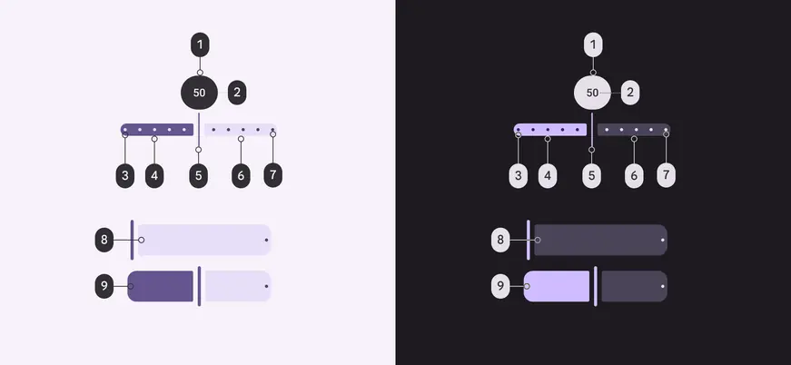
Slider color roles used for light and dark schemes:
1. Inverse surface
2. Inverse on surface
3. Primary
4. On primary
5. Primary
6. Secondary container
7. On secondary container
8. On secondary container
9. On primary
## States
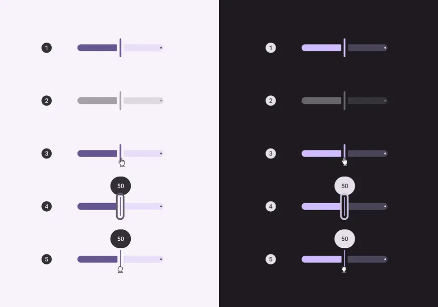
1. Enabled
2. Disabled
3. Hovered
4. Focused
5. Pressed
## Measurements
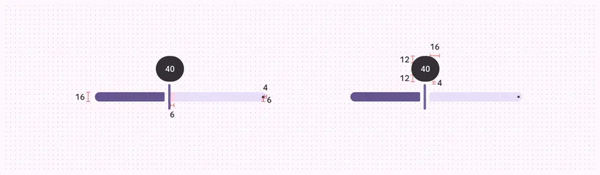
Padding and size measurements for common sliders
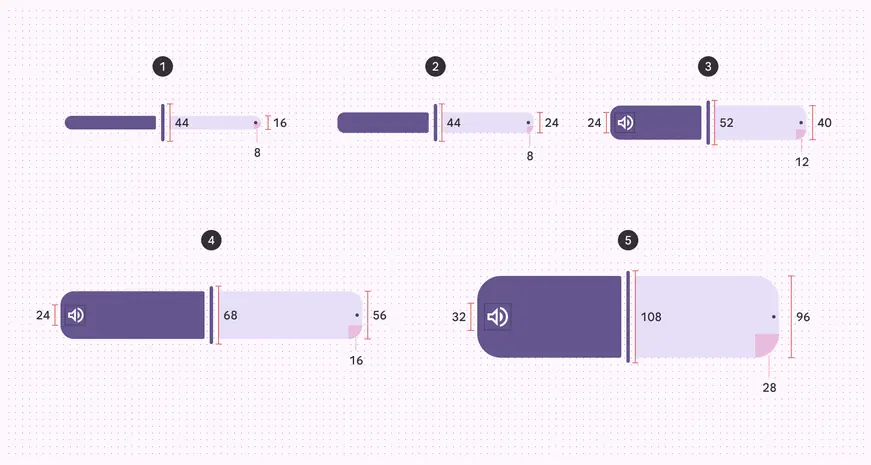
Padding and size measurements for XS, S, M, L, and XL sliders
| Attribute | XS | S | M | L | XL |
| :--------------------: | :--: | :--: | :--: | :--: | :---: |
| Track height | 16dp | 24dp | 40dp | 56dp | 96dp |
| Label container height | 44dp | 44dp | 44dp | 44dp | 44dp |
| Label container width | 48dp | 48dp | 48dp | 48dp | 48dp |
| Handle height | 44dp | 44dp | 52dp | 68dp | 108dp |
| Handle width | 4dp | 4dp | 4dp | 4dp | 4dp |
| Track shape | 8dp | 8dp | 12dp | 16dp | 28dp |
| Inset icon size | -- | -- | 24dp | 24dp | 32dp |